Here is a map in the style of Tim Wallace’s definitive map of the 2016 US Presidential Election.
This is a small snapshot of Tim’s maps, for reference…
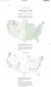
Tim’s unique take, and beautiful craftsmanship, show two Americas, one of Trump and one of Clinton. But I wondered if there was an opportunity to illustrate, via the same novel technique used by Tim, an America where islands of remarkably bipartisan populations rise up among a more polarized sea. With his permission, I took a crack at making a version of that map…
Why?
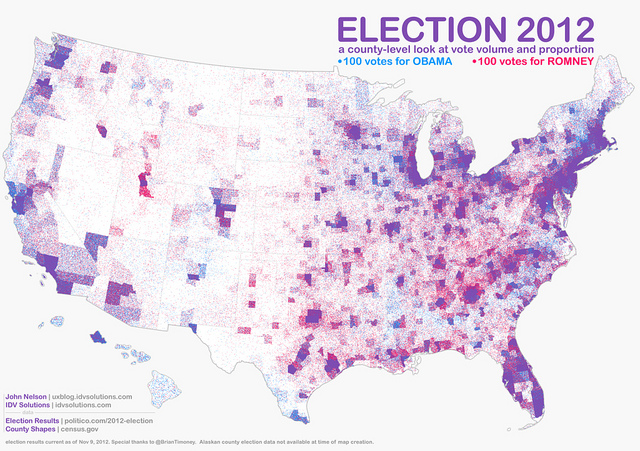
I made this dot density map, below, years ago to illustrate for my son, Bear, the importance of a normalized, truer, picture of American voting. But what stood out to me the most was just how purple the resulting map was. Only traces of the partisan colors red and blue remained, at this scale. And I thought that was sort of beautiful, it its way, and I was happy to accidentally show Bear that, from this perspective, our similarities are much more profound than our differences.
It was from this perspective that I thought an “Islands” map, like Tim Wallace’s, could paint an interesting picture of a politically blended America. And I’m happy with how it turned out.
Also, since I’m such a nerd, I’m happy to show you how to make it, too!
Here’s how to make this “Blended America” map in ArcGIS Pro…
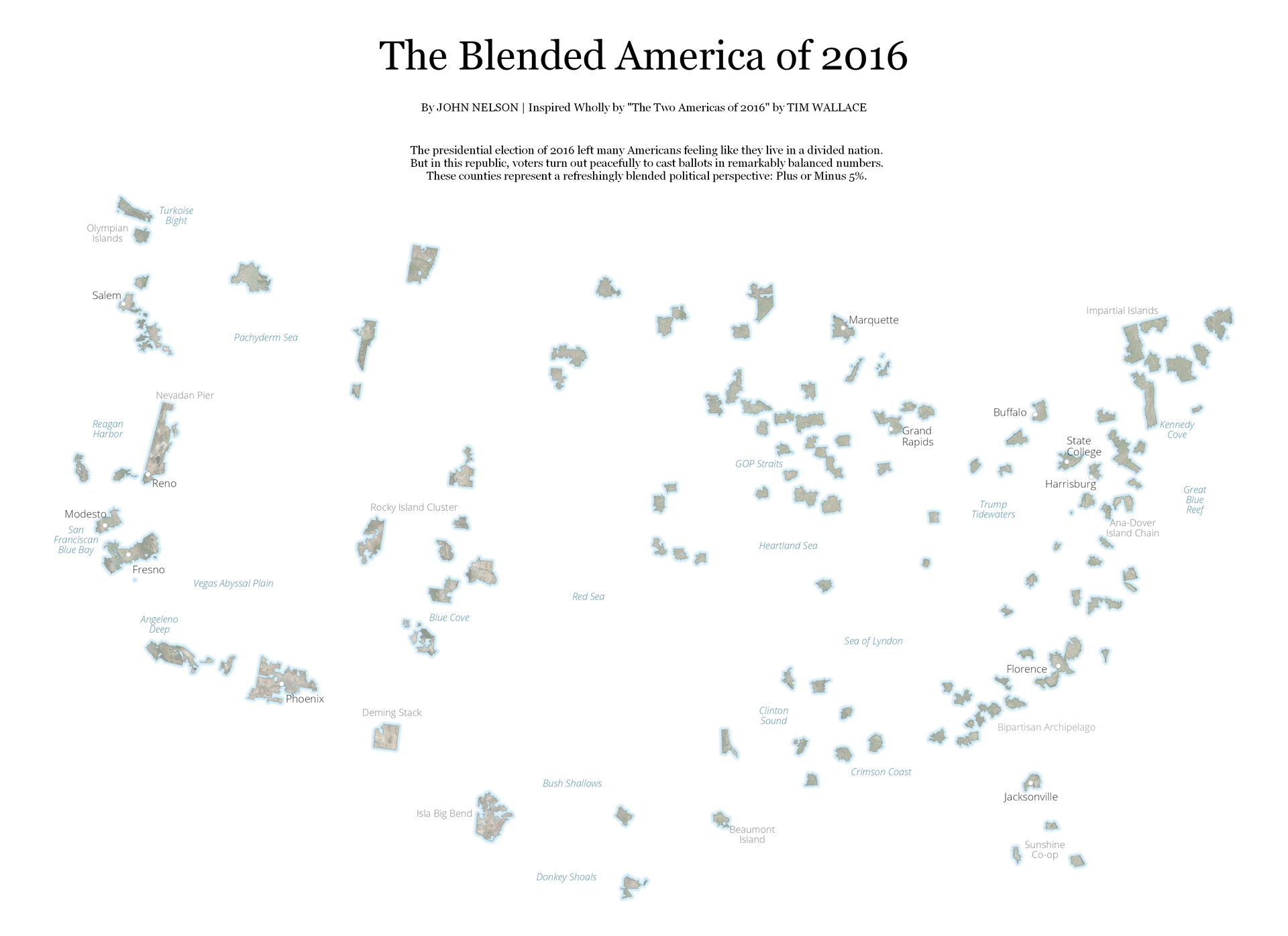
Tim’s map shows nuanced coastlines skirting islands of faint satellite imagery. Around these islands he painted in a faint water’s edge gradient effect. He provides labels of real place names, for context, and also playful names for the resulting imaginary land/water features.
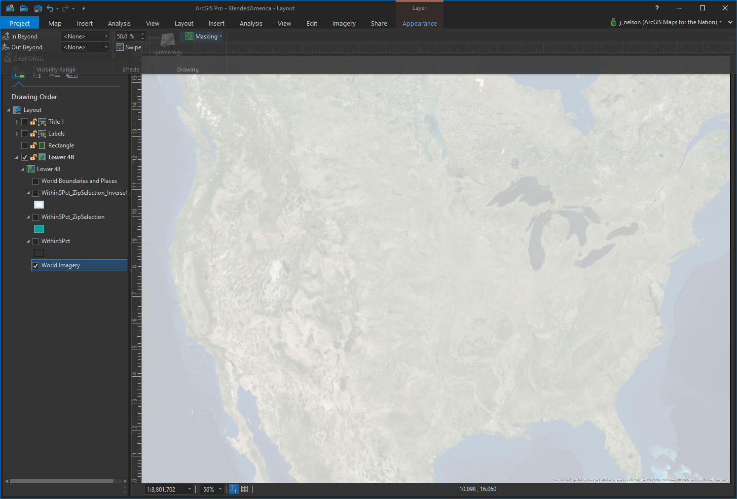
Let’s start out with an imagery basemap. In the Appearance tab, I set the transparency to 50%.
Next, I added a county-level layer of 2016 presidential election results. I queried the attributes to select, and retain, only those counties with a + or – 5% voting margin. I’ve heard these places called “battlegrounds” but I much prefer “blended”.
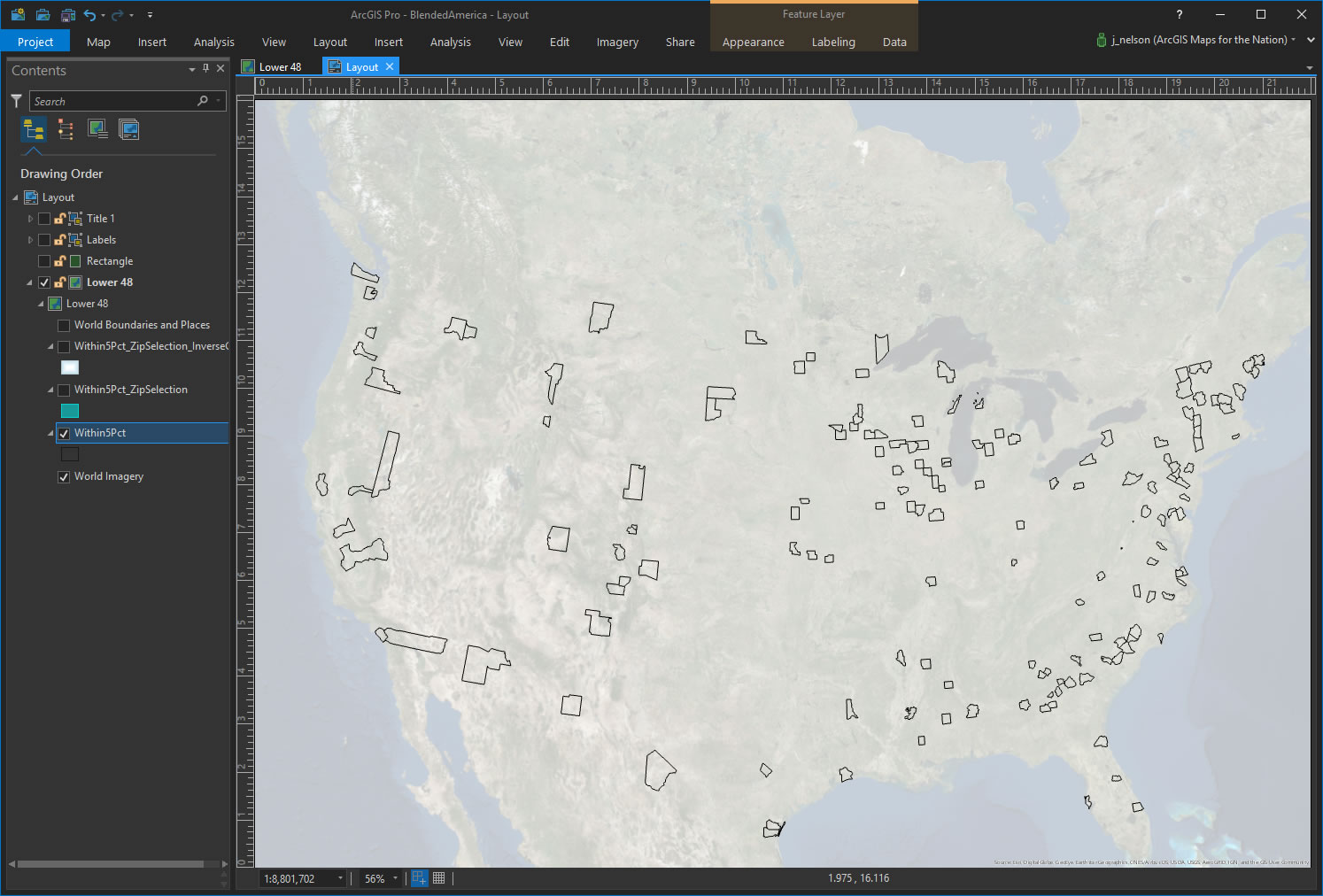
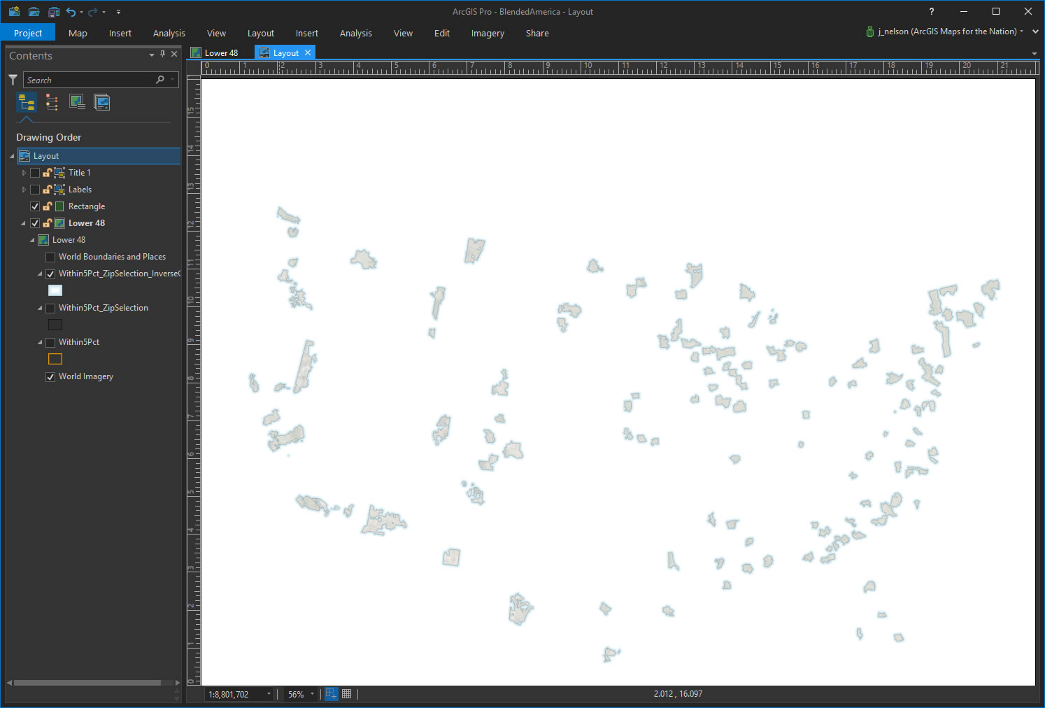
There they are! But counties are often quite rigidly drawn so my “proto-islands” are far too regular and boxy. Tim did a great job of giving his islands an organic sinuous shape. How did he do it?? I don’t know.
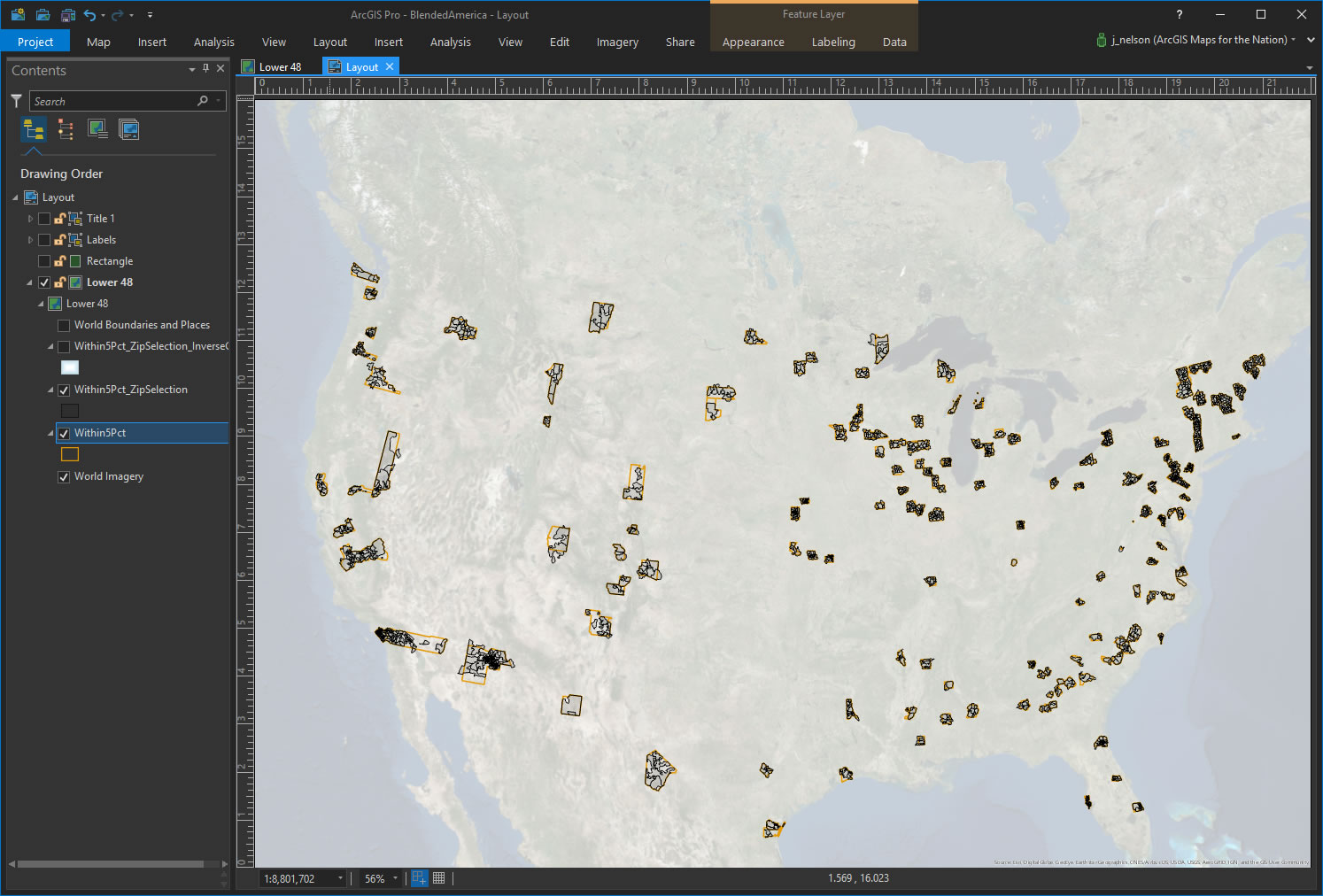
But I had an idea for how I might en-bend-ify these counties. Zip Code Tabulation Areas (ZCTAs) are comparatively small, very irregularly shaped, and do not generally share borders with counties. Plus, there is the added bonus that ZCTAs only exist where people live.
So, I ran a spatial query to select and retain only those ZCTAs that have their centers in one of my blended counties.
Then I dissolved all those ZCTAs into a single shape.
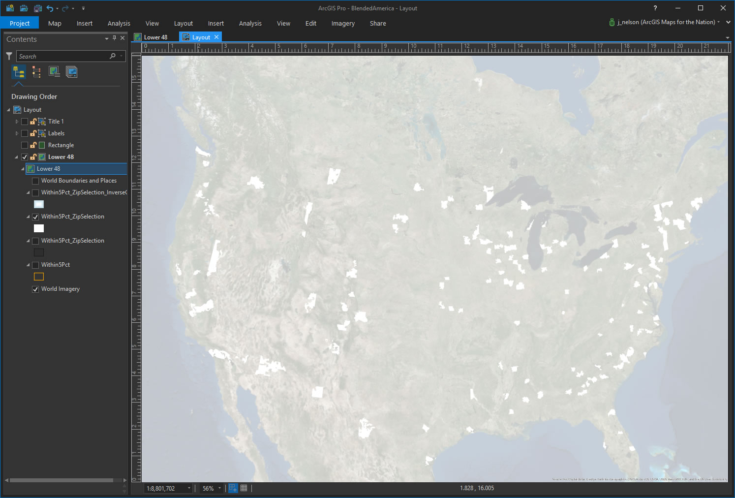
I made a new layer and drew a big polygon over all of the continental United States. Then, I used the ZCTA shape like a cookie cutter to punch holes in this big new polygon. The result was a rectangle with the ZCTA bits erased. I can see the imagery through the holes. Neat.
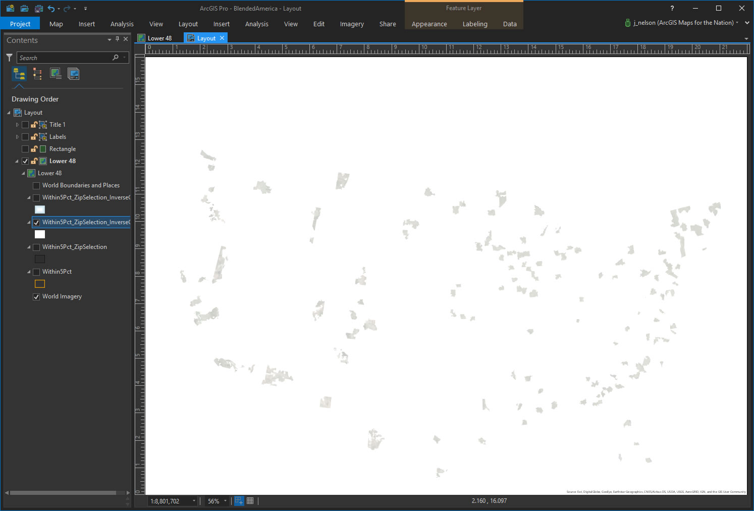
Now to make these things look like islands. In this layer’s Symbology panel, I gave the polygon a thin faint gray stroke, like Tim’s islands. But how to achieve that coastal water glow that he has (without making a bunch of unwieldy buffers)? Happily, there is a handy little option for setting a polygon’s fill called “Gradient fill”. This is handy for highlighting an area of interest, like in Cooper Thomas’ epic map. But since we have a reversed-out shape covering the US, we can use it to create a coastal water effect.
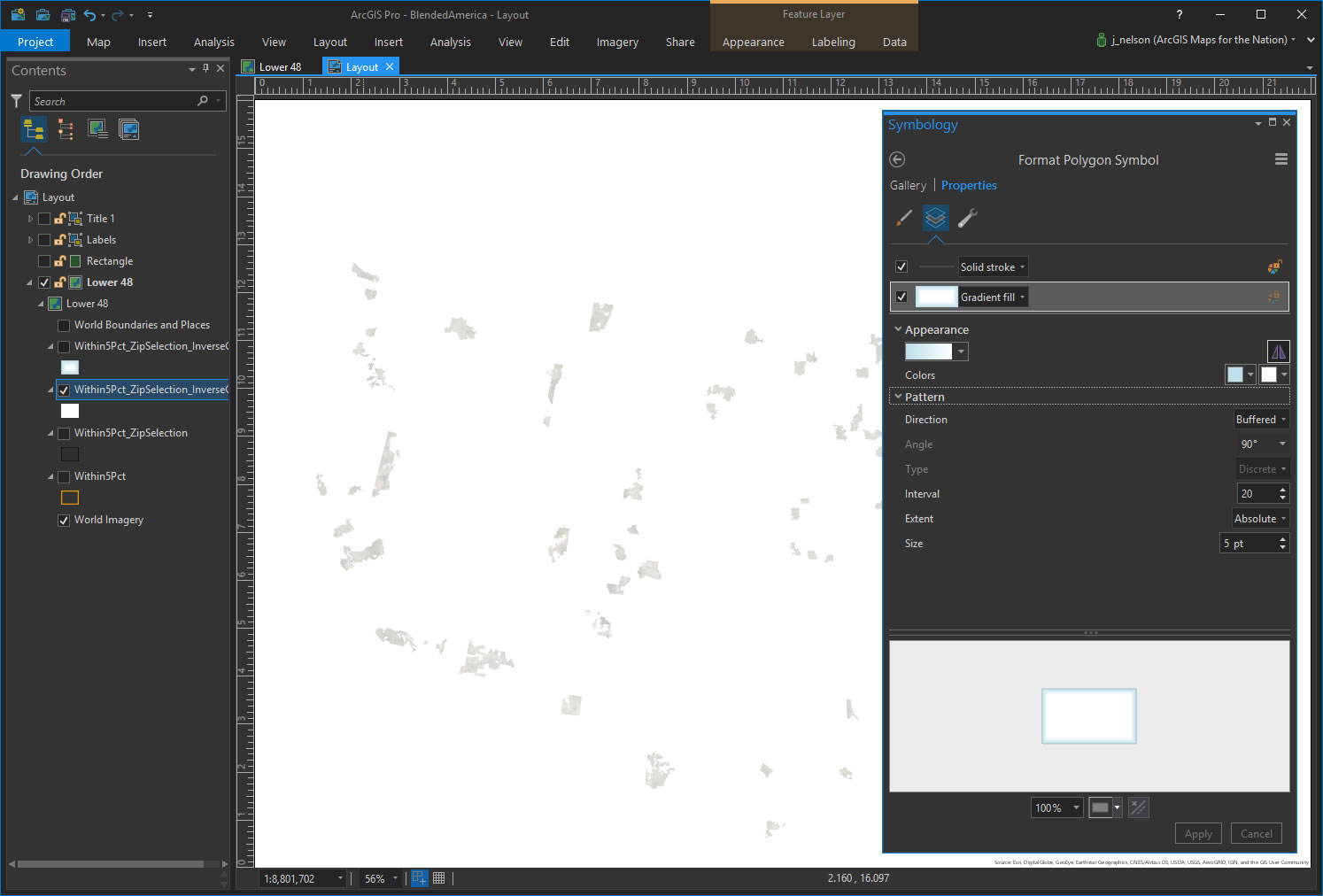
And here is the result. Hey alright, a passable water glow!
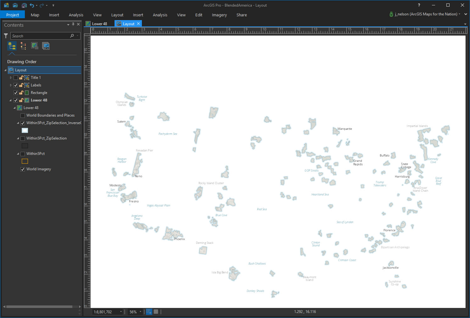
In the layout, I can now start to add all sorts of labels to this map. Since my geography is fake islands, and an implied fake sea, I can’t use the standard attribute-driven layer tool (I don’t have attributes!) I just manually placed some real city labels, some made up island labels and some made up water labels. In the spirit of Tim’s maps. It was fun.
All that remained was a big newsy title and by-line. These were added the same way.
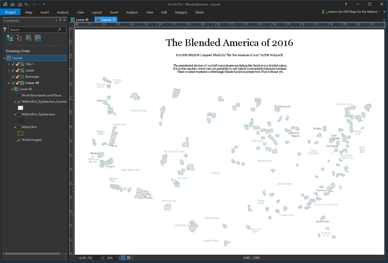
Then, in the Share tab, I exported the map as an image, ready to bounce around the internet for a bit.

There it is. My best attempt to pay homage to Tim Wallace’s Two Americas maps but from a slightly different perspective, and also in the sneaky spirit of cartographic reverse-engineering.
Happy Homage Mapping! John

Article Discussion: