Are you a wildlife ecologist with field data for observed presence locations of a plant species and want to estimate the species’ presence in a broader study area? Also, understand the impact that climate change will have on the habitat of a sensitive species? Or are you a transportation planner with car accident fatality data and you want to analyze what factors are related to fatal car accidents and what you can do in the planning process to improve the situations?
If your answer is yes to any of the above questions, then you should probably be interested in the new Presence-only Prediction (MaxEnt) geoprocessing tool in the Spatial Statistics toolbox in ArcGIS Pro 2.9. At the Developer Summit 2022 plenary, Alberto Nieto offered a glimpse of what can be accomplished with this new tool. I highly suggest you check out this plenary video if you haven’t yet. And this blog post will help you to get your first successful run of the tool using the same dataset in the video with step-by-step guidance.
Define the presence-only problem
Just a little bit of background on why we developed this tool. The tool is based on a well-established algorithm in modeling species distribution ranges over geographical domains. Usually, this type of data only has presence locations where people have access to and can install cameras, but you still have a lot of places inside your study area that are not accessible to human beings and you can’t know if the species ever occur or not. And this is a type of presence-only problem that is something that you can’t solve using the existing spatial statistics tools. Usually, you need a walkaround to create some random points in your study area and treat them as known absence locations with 100% certainty, which in fact is not the case. Actually, this tool has been requested by our users for almost a decade, and we finally bring it to the ArcGIS platform in Pro 2.9.
Quick view of the algorithm
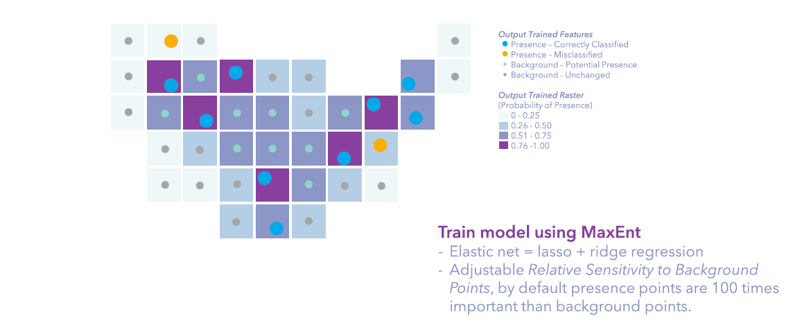
The tool estimates the presence of a phenomenon in a study area using previously known presence locations and explanatory factors. The easiest way to understand this tool is to think of it as a special logistic regression. First, it adds some transformations to the explanatory variables, so adding a little bit complex to your model but also better fit and better prediction power. Second, it just has smaller punishments on background points, since background points are locations in the study area that are potential to see the presence of the species or phenomenon, so what we care most is whether presence locations are predicted to be present, but not really worried if background locations are predicted to be absent. Third, it uses elastic net, which is a combination of lasso regression and ridge regression, to eliminate non-necessary variables and give relatively small betas to the variables.
Like most machine learning methods, you will train, validate, and predict. And you can do all these things inside the Presence-Only Prediction tool, together with some upfront data processing steps, including spatial thinning, adding basis expansion, etc. Also, the tool provides a lot of diagnostics in Geoprocessing Messages and charts to help you interpret the results and tweak your model.
Desert tortoise and bioclimate data
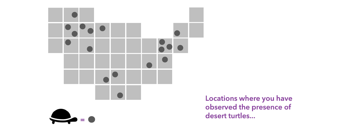
Today we focus on the presence of an endangered species, the desert tortoise. Global Biodiversity Information Facility (GBIF) offers free and open access to biodiversity data, from where we downloaded the worldwide occurrences of desert tortoise by searching its scientific name, Gopherus agassizii. They have been found in Southern California, Nevada, Utah, Arizona, and Mexico. As mentioned in the article The loneliness of the desert tortoise, from The Economist journal, it’s a once-abundant species that struggles to survive today.
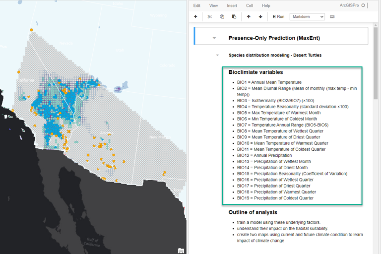
The underlying factors to explain the probability of desert tortoise’s presence we’re going to use today is the Köppen-Geiger climate classification zones (a categorical data) from World Bank, together with 19 bioclimate variables (a continuous dataset describing annual trends, seasonality, and some extreme conditions of temperature and precipitation) from WorldClim. Both websites provide data on the current period and the future under various scenarios.
The workflow
Using step by step instruction, we will show you how to:
- Prepare the project for analysis
- Run the tool to train, validate, and predict the probability of presence under current climate condition
- Understand what’s happening behind the scene
- Interpret the maps, diagnostics, and charts
- Rerun the tool to predict under future climate condition
Prepare the project for analysis
1. Download the ArcGIS Pro project package ppkx and double click to open.
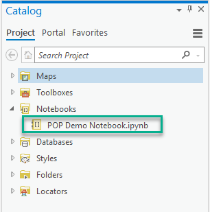
2. In the Catelog pane, open the POP Demo Notebook.ipynb under Notebooks accordion.
3. Drag the POP Demo Notebook view to the right side of your project and you can read the details about the meaning of the 19 Bioclimate variables, and take a quick look at the arcpy command for running the tool.
4. Download the multi-band raster containing the forecast of 19 bioclimate variables under a certain scenario for the year 2081 to the year 2100.
Your project now contains all the inputs and expected outputs for the following step. If you don’t run the tool from UI, the notebook has the arcpy command stored. If you want to take a closer at the tool, let’s go for it!
Run the tool to train, validate, and predict
5. On the ribbon, on the Analysis tab, in the Geoprocessing group, click Tools.
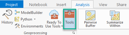
The Geoprocessing pane opens.
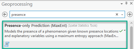
6. In the Geoprocessing pane, in the search box, type presence. In the search results, click Presence-only Prediction (MaxEnt) to open the tool dialog.
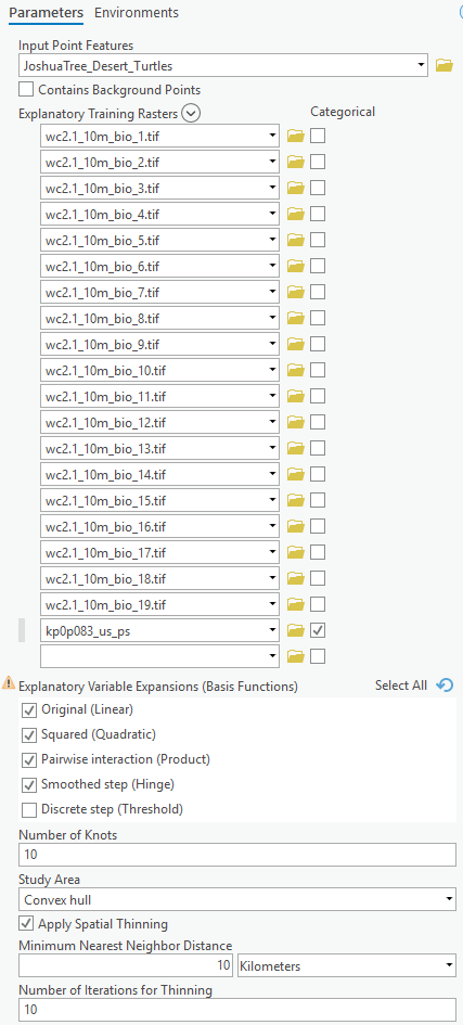
7. In the Presence-only Prediction (MaxEnt) geoprocessing tool, change the following parameters:
-
- For Input Point Features, specify JoshuaTree_Desert_Turtles.
- For Explanatory Training Rasters, add 1_10m_bio_1.tif to wc2.1_10m_bio_10.tif using the Add Many button. After the rasters are loaded into the tool, add wc2.1_10m_bio_11.tif to wc2.1_10m_bio_19.tif using the Add Many button again, in this way, the bioclimate rasters will be adding according to numeric order. And finally, add kp0p083_us_ps, and check Categorical.
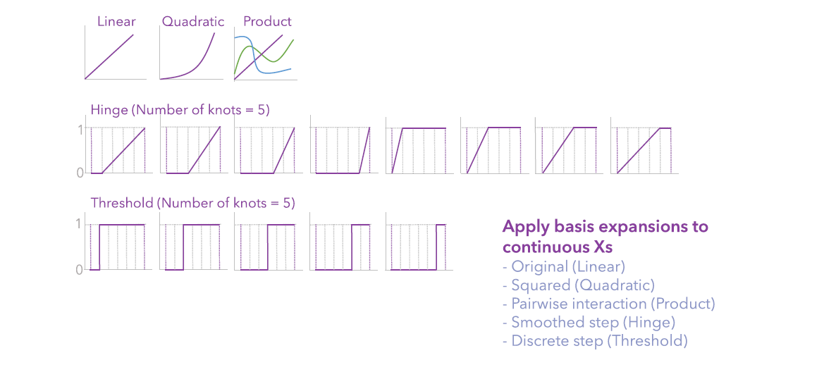
- For Explanatory Variable Expansions (Basis Functions), in addition to Original (Linear) by default, check Squared (Quadratic), Pairwise interaction (Product), and Smoothed Step (Hinge).
- For Number of Knots, leave it as default, which is 10.
- For Study Area, leave is as default, which is Convex hull (of all the Input Point Features).
- Check Apply Spatial Thinning. It may take a while for the tool to load.
- For Minimum Nearest Neighbor Distance, type 10 and specify Kilometers from the dropdown list.
- For Number of Iterations for Thinning, leave it as default, which is 10.
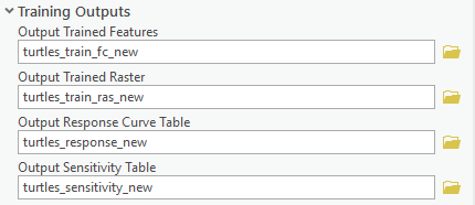
8. Expand the Training Outputs accordion in the tool, change the following parameters:
-
- For Output Trained Features, type turtles_train_fc_new.
- For Output Trained Raster, type
- For Output Response Curve Table, type
- For Output Sensitivity Table, type
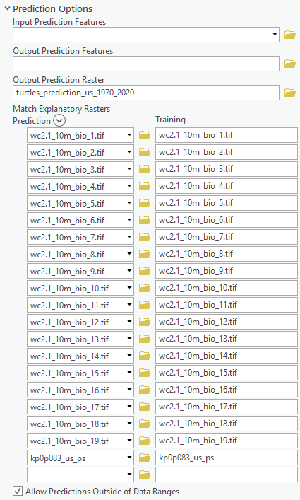
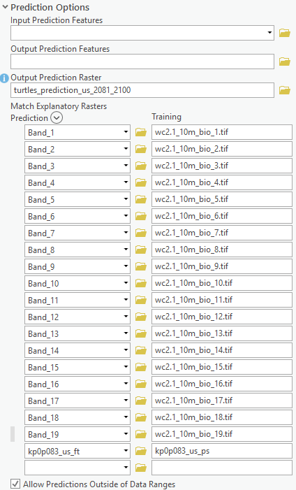
9. Expand the Prediction Options accordion in the tool, change the following parameters:
-
- For Output Prediction Raster, type
- Once done, Match Explanatory Raster will be automatically filled.
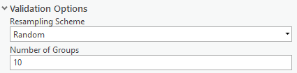
10. Expand the Validation Options accordion in the tool, change the following parameters:
-
- For Resampling Scheme, specify Random.
- For Number of Groups, type 10.
Click Run.
Understand what’s happening behind the scene
Behind the scene, the tool is:
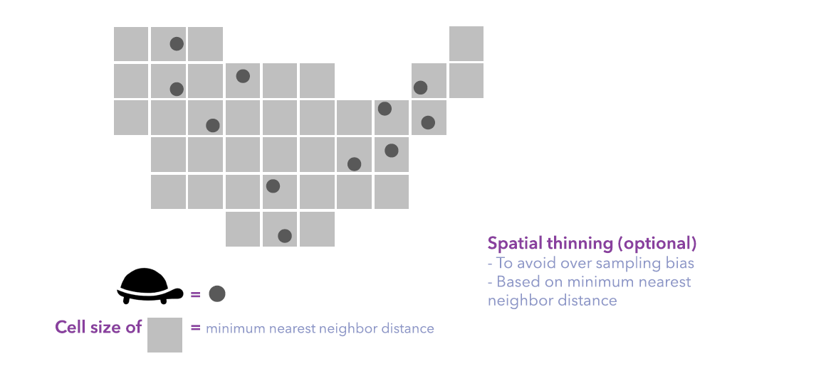
- thinning the presence points to be at least 10 km apart to avoid sampling bias.
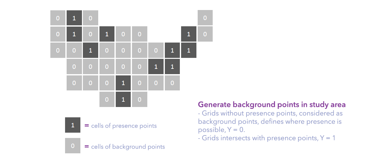
- Inside the study area, in this case, the convex hull of presence points, generating background points at the centroid of grids (cell size = thinning distance = 10 km) that don’t intersect with any presence points.
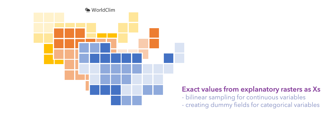
- extracting values from the explanatory rasters, to be specific, using a bilinear sampling method for continuous variables, and creating dummy fields for categorical variables.
- transforming the continuous variables using basis expansion functions to add complexity to the model for a better fit.
- training a maxent model using elastic net regression, to make coefficients as small as possible and eliminate any non-significant variables from the model.
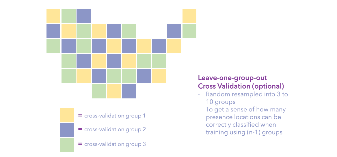
- Randomly resampling all presence and background points into 10 groups and using leave-one-group-out cross-validation to validate the model.
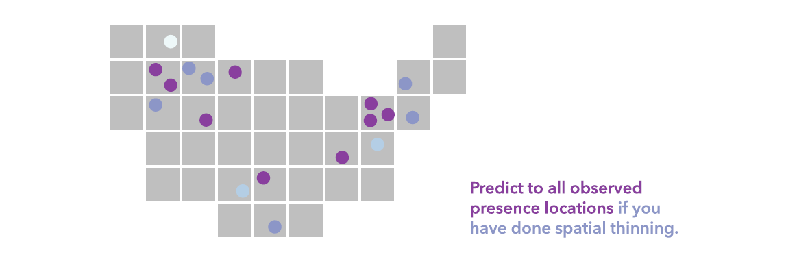
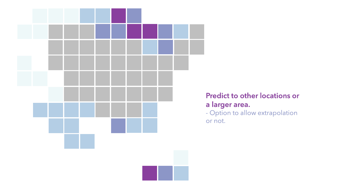
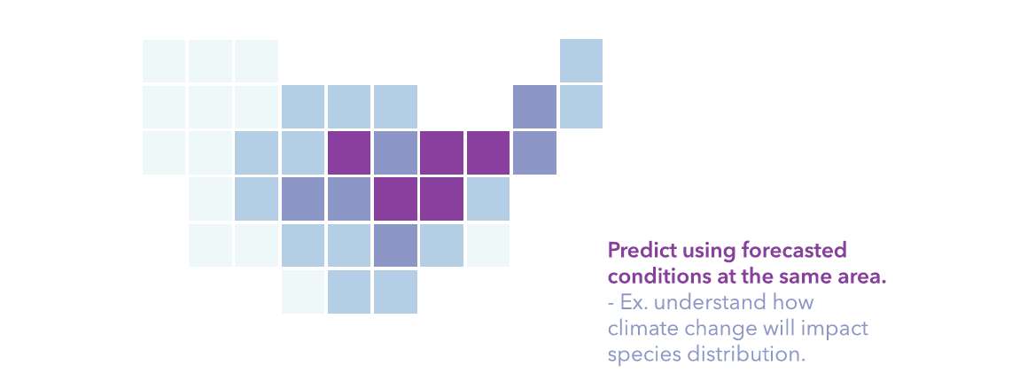
- Predicting the probability of presence to all the observed presence locations if you have done spatial thinning, or predict to other locations, or predict to the future. In the previous run, we predicted for the entire United States.
Interpret the maps, diagnostics, and charts
Maps
The Output Trained Features show four classification results, big blue dots are presence points correctly classified as presence, big yellow dots are presence points that are misclassified, small green dots are background points that are classified as potential presence locations, and the small grey dots are background points that have a low chance of presence. The model is very powerful in identifying the suitable habitat in California, Nevada, and Utah, basically the Mojave Desert, but missed the presence points in Arizona, New Mexico, and points at the edge.

The Output Trained Raster and Output Prediction Raster are both symbolized with the four manual intervals of the probability of the presence of desert turtles. The darker purple means a higher chance of observing desert turtles or more suitable habitats. The only difference for the two rasters is that the Output Trained Raster is bounded by the study area, in this case, the convex hull of the input presence points, while the Output Prediction Raster is bounded by the least common area of matched explanatory rasters.

")
Diagnostics
The tool generates plenty of diagnostics tables in the Geoprocessing Messages window to help you fine-tune the parameters wisely and find the best model. It’s usually a good practice to run only the training and validation part of the model to compare the diagnostics before you settle down to the best model and start prediction.
11. Click View Details in the geoprocessing progress bar, click the Messages tab to check diagnostics.
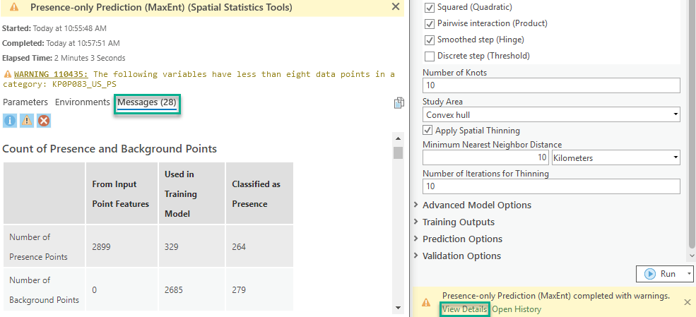
The diagnostics tables include:
- The Count of Presence and Background Points table contains these counts from user’s Input Point Features, used in training (after spatial thinning if asked by user and generating background points internally if input point features are presence points only), and classified as presence points by the model. This could give you a quick view of the accuracy of the model.
- The Model Characteristics table contains all the important information from the parameter setting. This offers the convenience of no need to go back and forth from the Parameters tab to the Messages tab.
- The Model Summary table contains the Omission Rate under the given Presence Probability Cutoff (0.5 by default) and the AUC of the model. Omission Rate tells how much percentage of presence points is incorrectly classified as a low chance of presence, which is the most important criteria to tell if the model is good or not. AUC means the area under the ROC curve. AUC closer to 0.5 means the model has little prediction power. AUC closer to 1 means a better model.
- The Regression Coefficients table contains all the variables (after basis expansion) that get non-zero coefficients from the maxent model. If they exist in the table, it means there are some significant impacts on the presence probability by the variable. For hinge and threshold variables, the name contains the original variable name and the knot order.
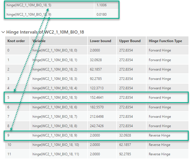
- The Hinge Intervals and Threshold Intervals tables can be expanded to show the lower and upper bound of each knot. Using these tables to understand which specific range of values of the variable has a significant impact on the probability.
- The Cross-Validation Summary table contains the size of training and validation groups in each run, and the percentage of presence and background points in the validation group are classified as presence locations.
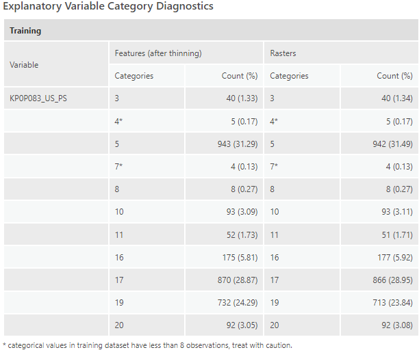
- The Explanatory Variable Range Diagnostics and Explanatory Variable Category Diagnostics tables compare the range or categories of each initial explanatory variable in training and prediction. So, we can get a better idea if we extrapolate too much in the prediction part.
To be noticed, the Presence-only Prediction (MaxEnt) tool is the first Geoprocessing tool that includes the expandable tables as accordions in the messages tab. Also, starting from Pro 2.9, all the diagnostics messages can be rendered beautifully in ArcGIS Notebook.
Charts
The first important chart to examine is the Classification Result Percentages chart with the user-defined cutoff, by default, it’s 0.5.
12. In the Contents pane, double-click the Classification Result Percentages (Cutoff = 0.5) chart derived from the turtles_train_fc_new layer to open the chart.
13. In the chart view, click on the blue bar, you will see 80.24% of presence points are correctly classified as presence locations. Then click on the green bar, you will see 10.39% background points are picked up as potential presence locations, which is not a bad rate.
When you click on the chart, you will see those points are also highlighted on the map, so this will help you to identify WHERE the model is performing well and WHERE isn’t.

Then you may ask another question, how to increase the percentage of presence points that are correctly classified? Without changing the model itself, one thing we can do is to choose a different cutoff other than 0.5.
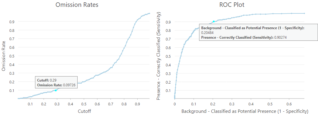
14. In the Contents pane, double-click the Omission Rates chart and ROC Plot chart derived from the turtles_sensitivity_new stand-alone table to open the charts.
15. In the chart view, click any point in one chart, you will see the data point resulting from the same cutoff rate that will be highlighted on the other chart.
16. Click on a point in the Omission Rates chart that just a little bit underneath the Omission Rate equals 0.1. So if we want an Omission Rate that is slightly less than 10%, we can use 0.29 as the Cutoff instead, and in this case, we will pick up 20.48% background points as potential presence locations, which is also a good rate.
17. Click on other points if you are interested in getting an even smaller omission rate.
Another important question to ask is how to examine the magnitude and direction of the impact of each explanatory variable (including distance features and rasters). Every variable included in the Regression Coefficients table in the Geoprocessing message should be considered as important in the model. However, the estimates of coefficients cannot be interpreted the same way as linear regression coefficients since:
- 1) internally we have done standardization to all the raw explanatory variables,
- 2) basis expansions on the raw explanatory variables make that you can’t just tell the impact of one variable based on the estimate of the coefficient of itself but should also check any other basis expansion variables involved in this specific variable. That’s saying, there is probably not a single direction of impact but different impacts at different range sections of the variable.
- 3) regularization has occurred in the optimization, that is we penalize coefficients to make them smaller and eliminate some unnecessary complexity of the model
With such consideration, we would suggest using the two super useful partial response plots derived from the Output Response Curve Table. One chart is for continuous variables, and the other chart is for categorical variables. They both summarize and visualize the impact of each bioclimate variable on the probability of presence. The idea behind the two charts is, if we use the average of the other continuous variables and the majority category of the other categorical variable, how’s the presence probability change along with the change of this specific variable. More importantly, the partial response curves of continuous variables are using their real values instead of standardized values, thus much easier to interpret. The charts can’t directly tell you the predictive power of the variables but will be super helpful for identifying suitable and unsuitable situations based on each variable.
18. In the Contents pane, double-click the Partial Response of Continuous Variables chart derived from the turtles_response_new stand-alone table to open the chart.
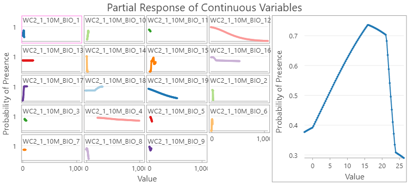
19. In the chart view, you will see the new small-multiple of line charts shown in grids to the left, with a Preview window to the right. The Preview chart is highlighted by a pink outline in the grids. Currently, it’s highlighting the response curve of WC2_1_10M_BIO1, the annual mean temperature. The presence probability of desert turtles will be low if the annual mean temperature is too low or too high, it increases fast from 0 to 15 °C and then goes downs afterward, and even faster after hitting 20 °C.
20. Click on the grid line chart titled WC2_1_10M_BIO18, the precipitation of warmest quarter, the preview will be updated. Hover over the two elbow points in the preview chart to check the exact values in both x-axis and y-axis. It can be interpreted as the probability of presence is relatively low when precipitation of warmest quarter is less than around 150 millimeters, then the probability increases almost linearly as the precipitation of warmest quarter increases, and hit the roof of 0.98 when precipitation of warmest quarter is more than 270 millimeters.
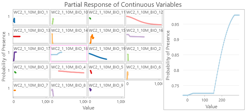
21. Click on other grid line charts if you are interested in other bioclimate variables.
22. Go back to the Contents pane, double-click Partial Response of Categorical Variables chart derived from turtles_response_new stand-alone table to open the chart view. You will see the bar chart including ONLY the climate zone categories that presence points intersect with. It is actually also a grid bar chart but in this case, we only have one categorical variable, thus only one grid chart without a Preview window. Here is what type of climate zone each x-axis label is corresponded to:
-
- 5 = Arid, steppe, cold
- 11 = Temperate, dry summer, warm summer
- 16 = Temperate, dry summer, hot summer
- 17 = Arid, desert, cold
- 19 = Arid, desert, hot
- 20 = Arid, steppe, hot
23. In the Chart Properties pane, on the Data tab:
-
- Under Data Labels, check Label Bars.
- The label of probabilities will be shown on top of the bars.

24. In the Geoprocessing Messages window, scroll down to the bottom of the Regression Coefficients table to see the significant categories of climate zone and their estimated coefficients.
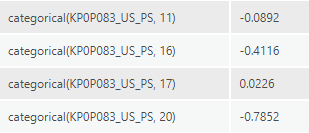
25. Scroll down again to look at the Explanatory Variable Categorical Diagnostics Different from the x-axis labels in the grid bar chart, this table contains all the categories of presence plus background points after spatial thinning. So, this table is telling you more about the study area. We can say the most common category is Category 5 (Arid, steppe, cold), followed by category 17 (Arid, desert, cold) and category 19 (Arid, desert, hot). The other categories are much less common in the study area.
Compare the bar chart and the estimated coefficients help us to interpret the impact of each climate zone. Category 5 is the most common climate zone type, and holding other bioclimate variables at their average values, the presence probability will be 0.72448. The third most common category, Category 19 (Arid, desert, hot) has no significant change thus have the same chance of desert turtle occurrence. In the second most common category, Category 17 (Arid, desert, cold), the probability gets higher, while in some less common climate zone types, type 11, 16, and 20, the probability gets lower.
Rerun the tool to predict under future climate condition
26. In the Presence-only Prediction (MaxEnt) geoprocessing tool, keep all previous set parameters the same, only change the following parameters under Prediction Options accordion:
-
- For Output Prediction Raster, type
- For Match Explanatory Raster, specify Prediction column with the relative single band of the multi-band raster containing the forecasts of 19 bioclimate variables. For example, to match wc2.1_10m_bio_1.tif, specify wc2.1_10m_bioc_BCC-CSM2-MR_ssp126_2081-2100.tif\Band_1 in the Prediction column. And to match wc2.1_10m_bio_2.tif, specify wc2.1_10m_bioc_BCC-CSM2-MR_ssp126_2081-2100.tif\Band_2 in the Prediction column, so on so forth, until the 19th bioclimate raster. And to match kp0p083_us_ps, specify kp0p083_us_ft in the Prediction column. It takes a while for the tool to validate your input of each row, so thanks for your patience here.
Click Run.
Let’s look at the result by comparing the Output Prediction Raster of the two runs side-by-side. We can see less suitable locations in California and Arizona by the end of this century. But there may be more suitable habitats occurring in other southern states.
")
Final Thoughts
While the tool should be mostly used by running this kind of species distribution model, the presence prediction problem spans a variety of domains and applications, like the presence of fire incidents, fatality in car crashes, finding landmines for national security. The use cases are endless.
Besides, in this tool, you can switch between two modes, presence points only and giving both presence and background locations. And based on whether you think the background has a high chance of being potential presence locations, or background points are representing absence, you can fine-tune this model in the Advanced Model Options accordion to put additional expertise of the data into the model.
We’re excited to finally bring this tool to our users in Pro 2.9 after 3 releases of development and please get your hand dirty with the tool and share your feedback with us!

Article Discussion: