What we choose to watch on TV says a lot about who we are and what we’re into. Of course viewing preferences between different sports will have a strong regional pattern, but what about the more subtle difference of preferring the collegiate level or the professional level within the same sport? That’s pretty interesting, too!
Armed with some Esri Demographic data, let’s look at how likely the percentage of folks in each US county watch men’s college basketball or professional basketball on TV. It’s March, right? Time for some madness! I’ll lead you through the dark and cobwebby labyrinth of this cartographer’s thought process. Hold your breath, we’re going in!
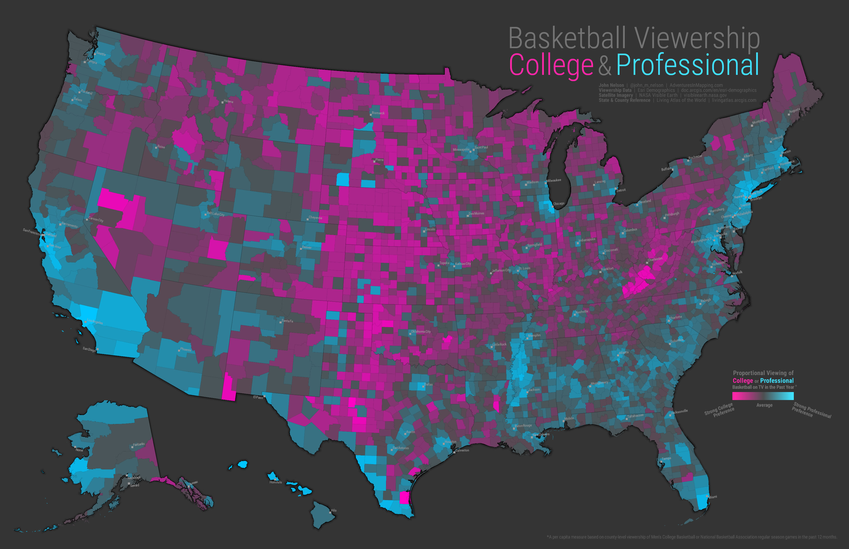
This is a pretty standard cartographic treatment. The choropleth map illustrates the ratio of college viewership to professional viewership via standard deviations. Muted gray counties are average; pink counties tend to watch college and blue counties tend to watch pros.
Ok, that’s cool. Definitely some regional trends going on! The east and west coasts certainly favor professional basketball, with some more pockets of interest in the Deep South and urban areas of the Midwest. Meanwhile the Heartland is full-on college basketball -especially in the Appalachian band in West Virginia and Kentucky. Not terribly surprising if you’re very familiar with perennial college basketball powerhouses.
While this map is really good at illustrating those regional trends, it doesn’t really give us the (true) impression that way more people live along the coasts and in urban areas. It’s super one-dimensional in that way.
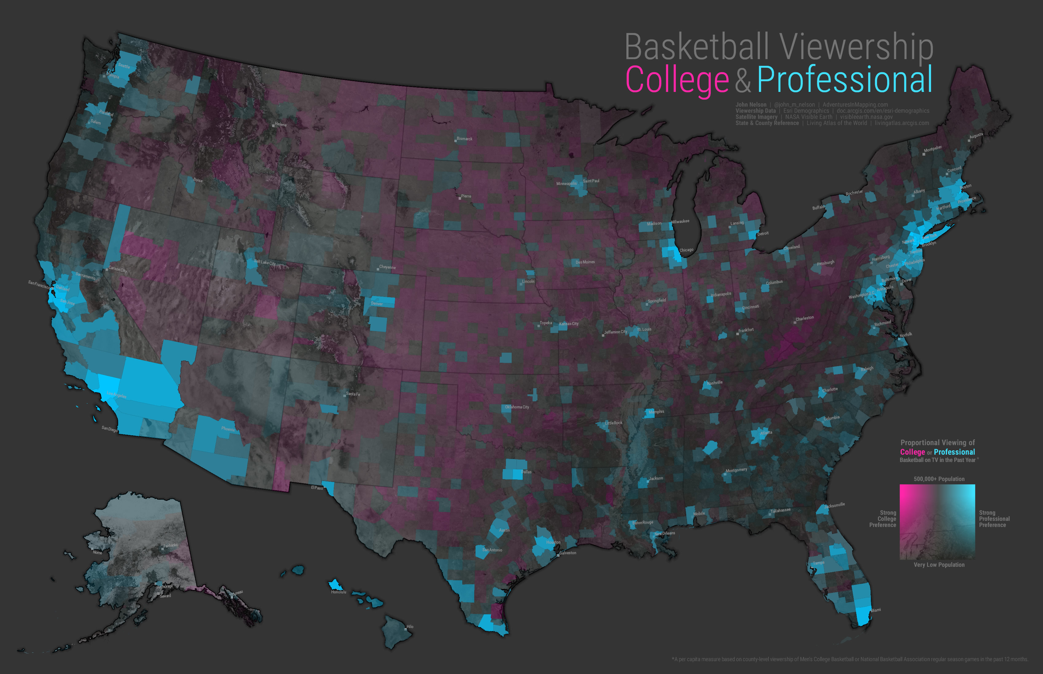
Is there a way to add the dimension of overall population, in order to provide an additional facet of understanding of this college/pro phenomenon? Sure there is! We can take this map and, in addition to the symbolization of color, include a transparency setting to tone down very low population counties (this ability to crank out bivariate maps is one of ArcGIS Pro’s awesomest features). This helps to show not only where we humans tend to favor college or pro basketball, where we humans actually live. So here is a bivariate map of viewership and population…
Wow, now I get a much clearer picture that high-population areas tend to watch professional basketball. The sea of pink in the American Heartland has faded back -commensurate with its population. There’s a lot of truth to peel off here.
This is cool, but I’m relying totally on the part of my brain that can compare hues. If I looked at it too long I’d tend to overheat and forget who I was for about a half hour or so.
We humans tend to be a bit better at associating the visual scale of something with quantity. It’s only natural. So maybe instead of a choropleth map, like that first one up there that only relies on color, I should try a graduated symbol map?
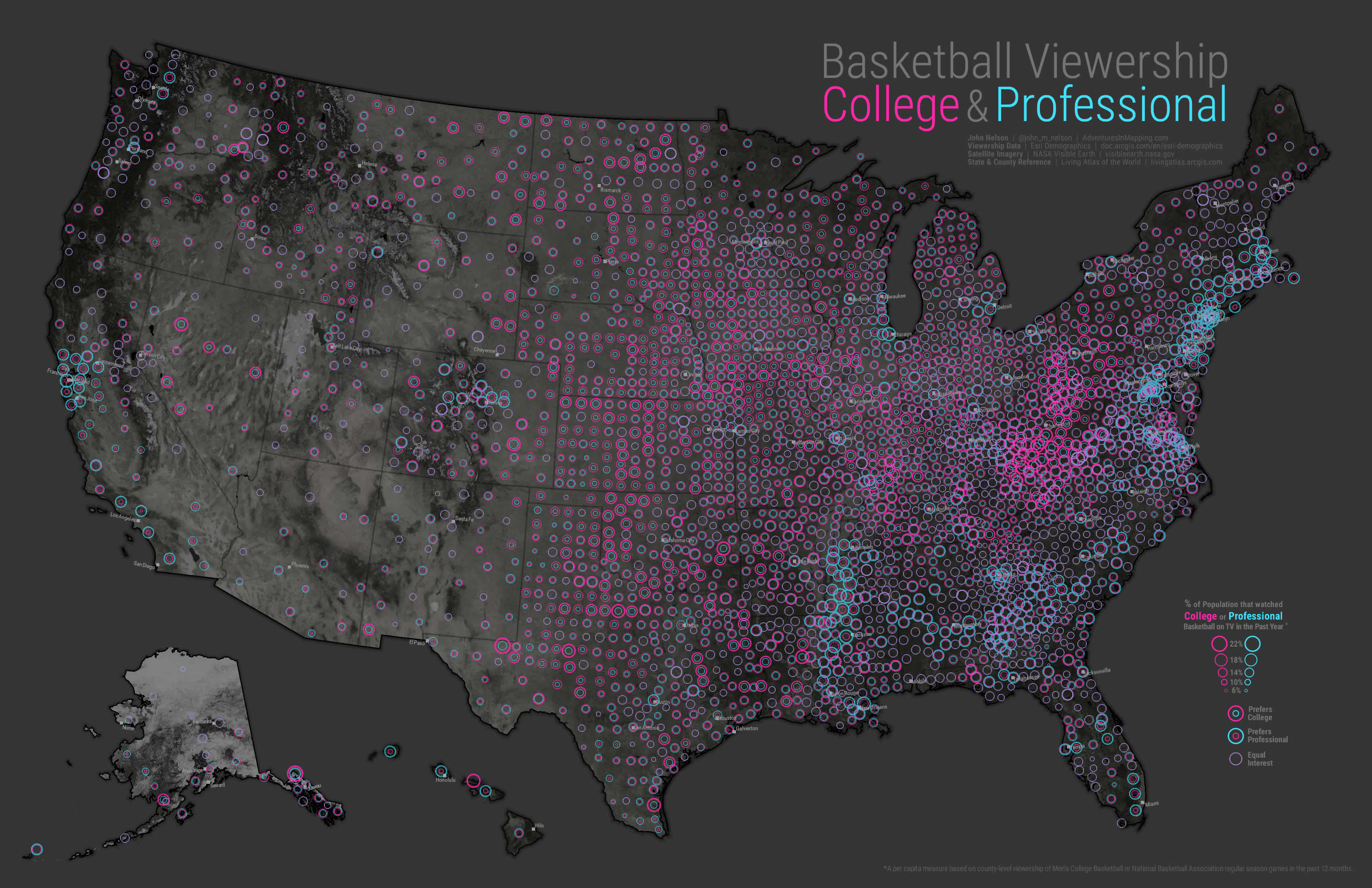
Ok, so now instead of the pure abstraction of a color gradient representing a ratio, I can use more literal symbology and tie affiliation and magnitude to symbols…
Well…that should have worked. In theory. I like that we are now leveraging more of our cognitive wet works to lend interpretation to this map, but shoot they just overlap each other so much that it’s sort of hard to tell what’s going on.
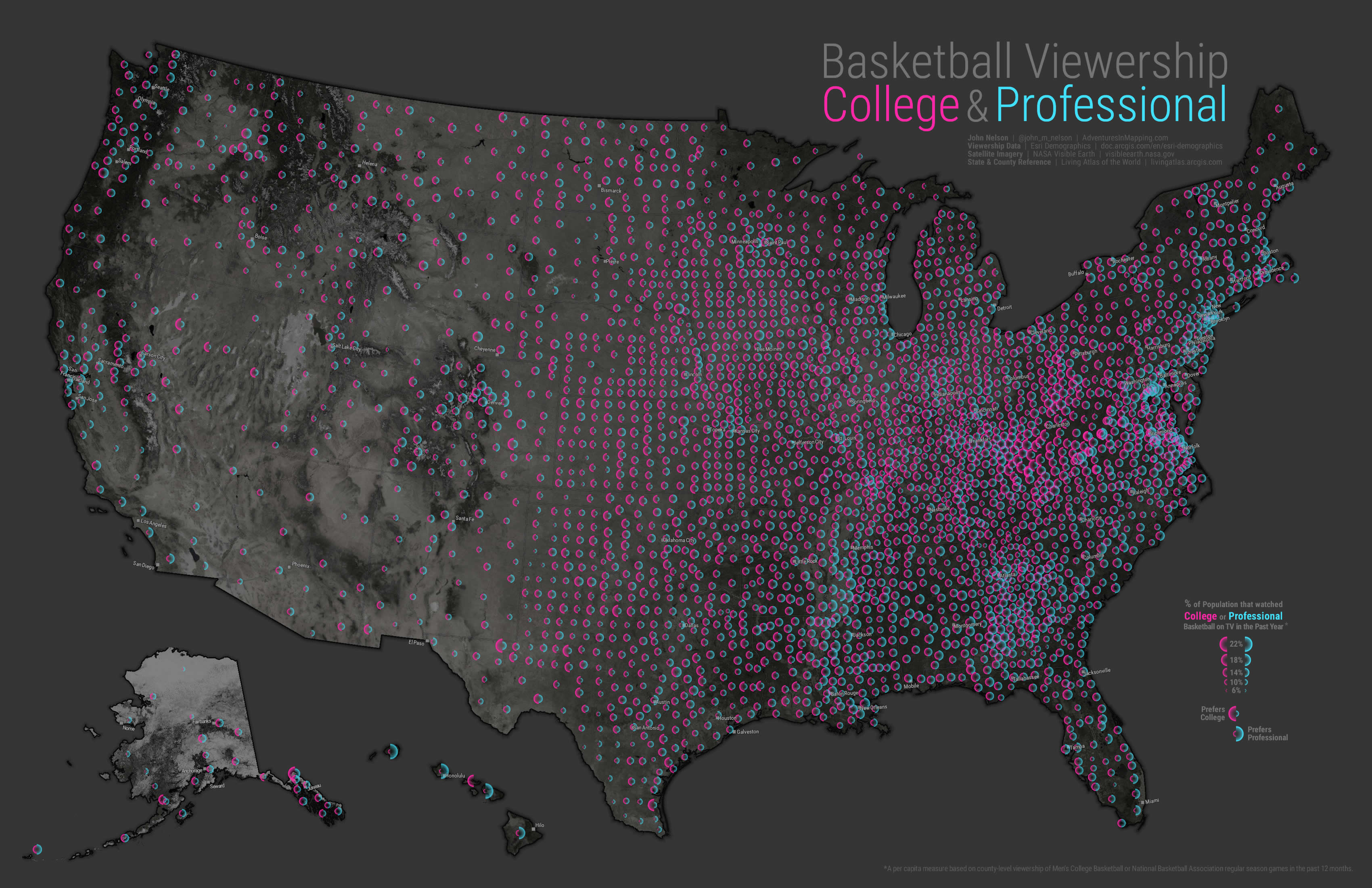
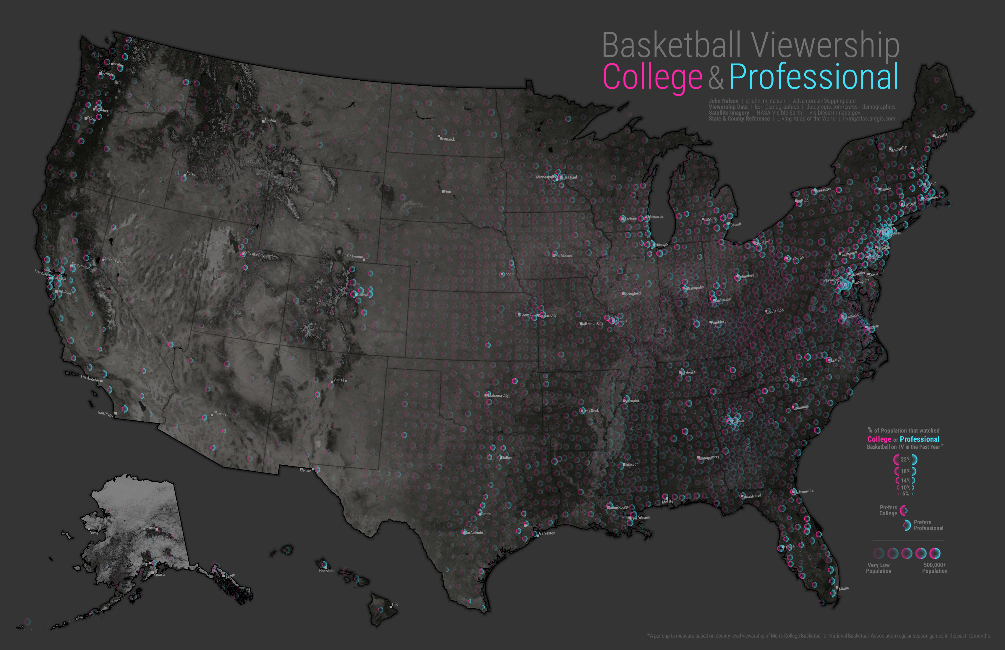
Say, what if instead of a full circle for our graduated symbol, we just use a half-circle, so that counties with similar college and pro basketball viewing magnitudes don’t cover each other up? We can split these suckers in half! Then we’d have more of a comparative, head to head, approach per county. Ok, so I made these two graphics to use as my symbols…
I gave them a light gradient fill instead of only a semi-circle ring perimeter so that they would appear to touch even when they were quite different in scale, lending a bit of visual continuity. The map looks like this…
I like it! Now, rather than a dizzying array of rings, there is a clear visual impression of two comparative values. Would you like to navigate around a full-on interactive version of this map? Here is a Story Map that gives you a guided tour through some interesting regions and you can interrogate counties to your heart’s content.
Ok…I hate to ask, but did this map give you a unsettling sense of revulsion? If so, find some comfort here.
While a symbol map like this also does a much better job at normalizing for area than the choropleth map did, we still don’t get a sense for where there are more or less people -only the viewing preferences of those people. So like the choropleth map, we can tie transparency to overall population to create a bivariate map of college/pro basketball viewing preference and how many people are doing that viewing. Actually, it’s more like a trivariate map, since the map above is already sort of a bivariate map (college symbols and pro symbols at the same data point).
And here it is where the symbol opacity is tied to underlying population. While this is a more complete picture of the phenomenon, a lot of visual information is lost in the name of cartographic truth. Every map lies in some way, and has some nugget of truth to communicate. In the end, it’s important to remember that maps are just communication devices, and we have to find that balance between the amount and type of information to display with how effectively that composition communicates.
Each of these maps is effective at some things and lacking in others. Each map highlights something different, providing a new facet for understanding a phenomenon. There is no one best way to make a map.
But the best maps are the ones that actually get made. So think about what your mapped phenomenon has to say, and go ahead and map it!
Happy Mapping, John



Article Discussion: