It’s not you, it’s them. They just need a little bit of space right now. In fact, the more space they get the more space they need.
What
First, let’s appreciate the magnificence of some outstanding examples from our forebearers. Here is a snapshot I took of a big varnished old wall map of Michigan townships that I found at a place called “Turkeyville.”
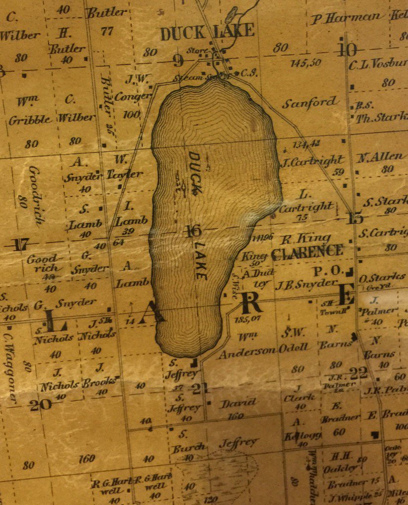
The linework is incredible. And see how the lines have an increased separation with each ring? This, in mimicking the appearance of an actual water ripple that might emanate from a tossed pebble, also serves to create a dropshadow effect. The edge of the water feature has a denser spacing so it gives the coastline an edge that, when seen at a distance, has an appealing dimensionality.
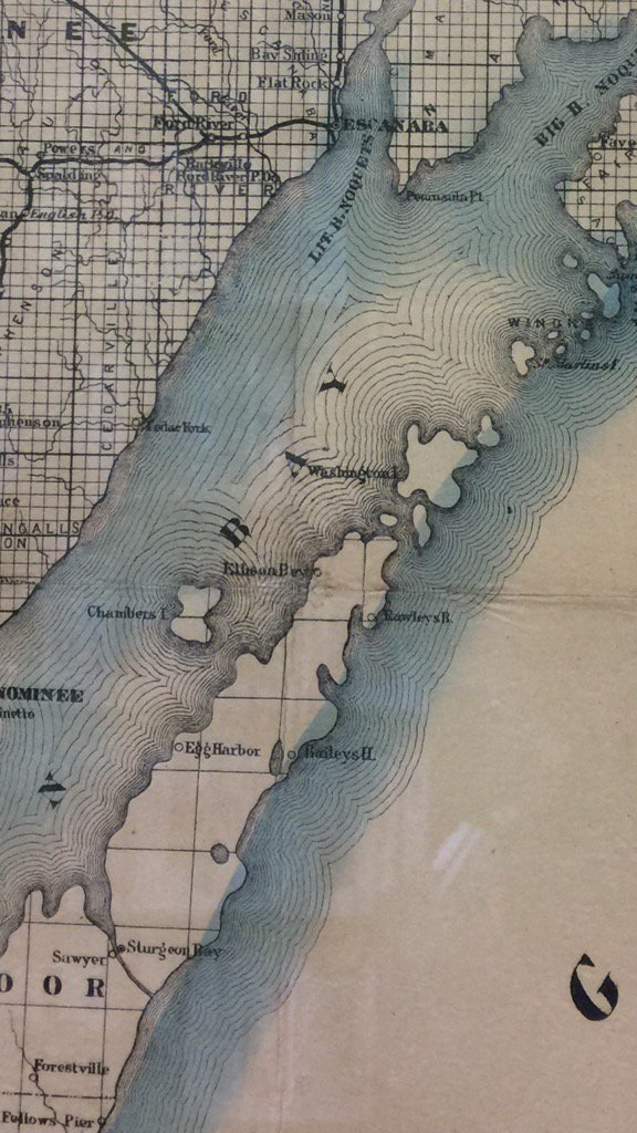
Here’s an other example I saw hanging on the wall of the Petoskey, Mi, library. It’s a Cram’s sectional map from 1883. These water lines are also iteratively increased in their separation. This spacing rate is more than the map, above. Pay no mind to the alarmingly hastily applied watercolor tinting.
So let’s think about that rate of water line spacing. If the spacing were the same for each water line ring, that would give it a spacing of 100%. If the distance doubled with every ring, that would be a spacing of 200%. How much or little the spacing changes is wholly up to you, the cartographer. Daniel Huffman, a mighty-thoughtful cartographer, has written a paper in Cartographic Perspectives on this. If you have a couple minutes, it’s welllll worth the read.
How?
Water lines could be a really interesting way for you to bestow a beautiful crafted quality to your maps. And it’s a pretty straightforward process in Arc GIS Pro, using the Multiple Ring Buffer tool.
With any feature type (though, in this regard, polygons make by far the most sense), you just define a set of distances around which you’d like to add the buffer rings. If your layer is water bodies, then the buffer distances will be negative (inner rings, for your water features) so they render within your polygons. If you are buffering land then distances should be positive so the water lines appear outside the land.
One tip for the Multiple Ring Buffer tool. When you define your distances, you have to do it one at a time. Add a distance, then when you hit tab or give something else focus, a new empty text box will appear for another distance. C’est la vie.
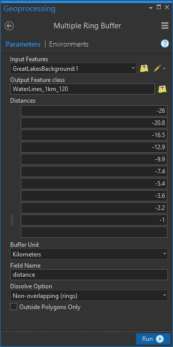
But wait, how did I come up with these arbitrary looking distances?? I’ve carefully and tenderly crafted this handy dandy water line distance calculator for you (and me)…
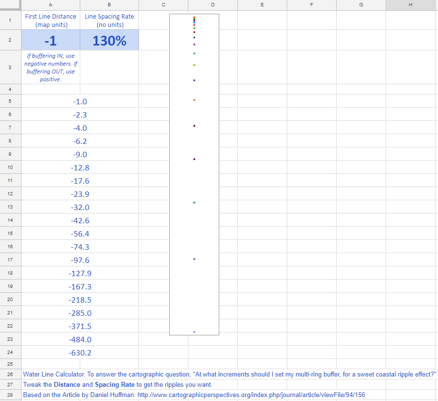
You could also use this calculator to set up pixel-based line offsets in a graphic design program, if you so choose.
How Far?
Just far enough, that’s how far. Daniel Huffman likes a spacing of 120%. I lean closer to 130%. But I am also pretty intrigued by the rather trippy phi-inspired offset of 161%. Let’s take some looks together…
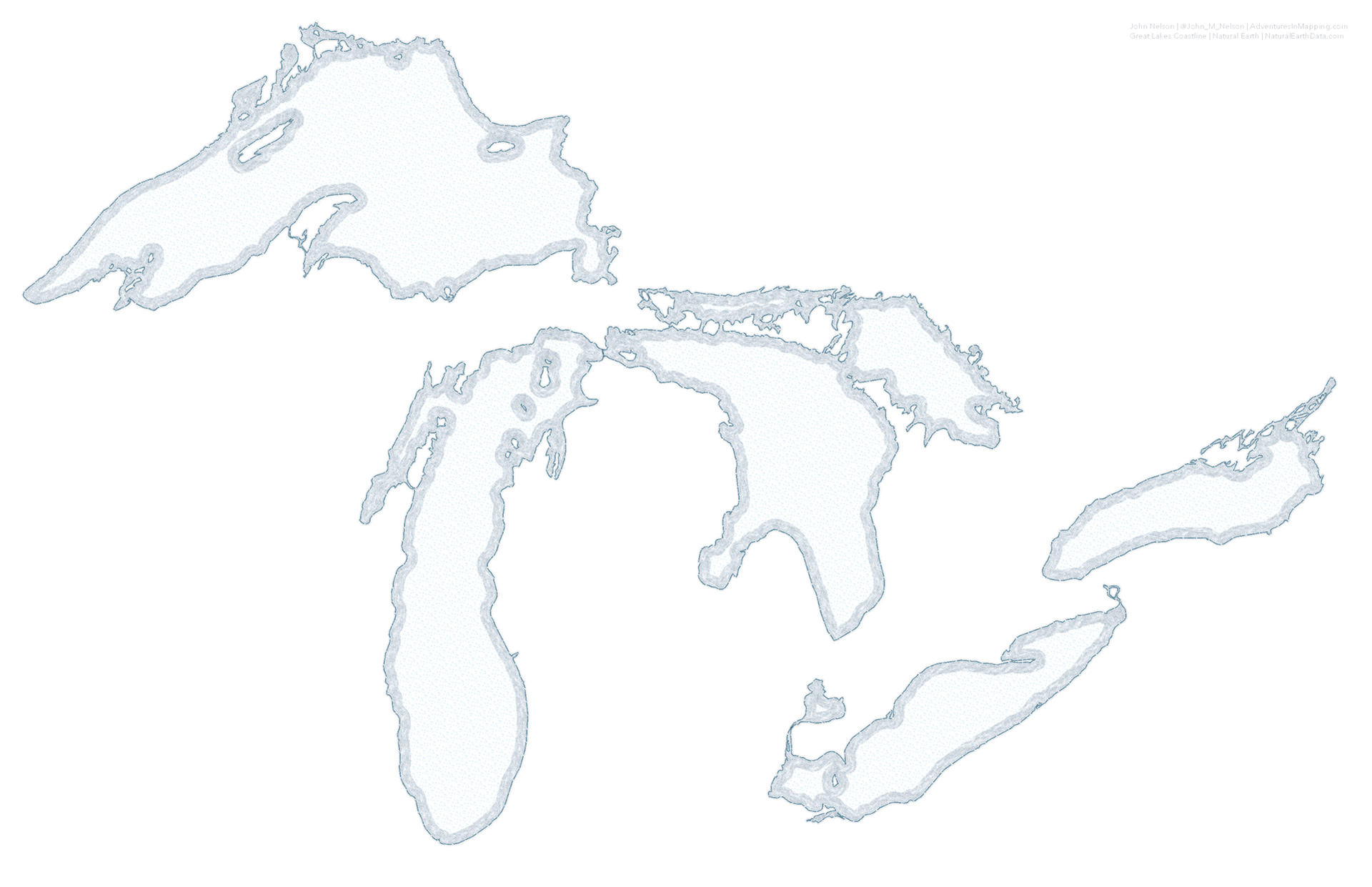
100%. No increase in spacing. Booooorrrrriiiiing…
110%. Slightly less Booooorrrrriiiiing…
120%. Ok, these are some professional looking offsets!

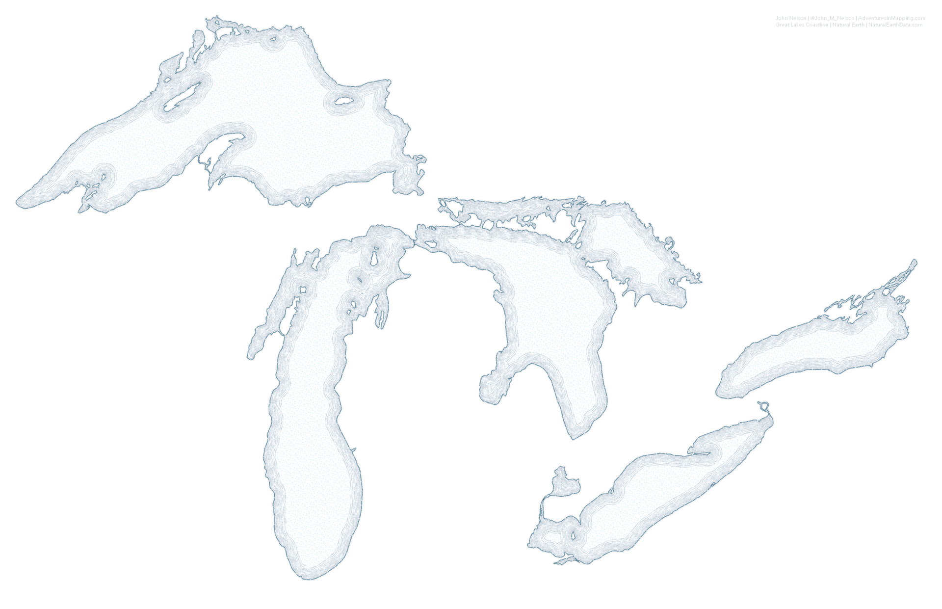
Oh but I like 130% a bit more…

This one is pretty erratic, but the more I look at it the more I dig it…
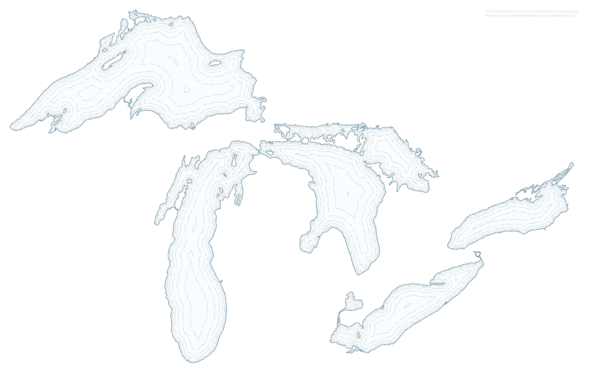
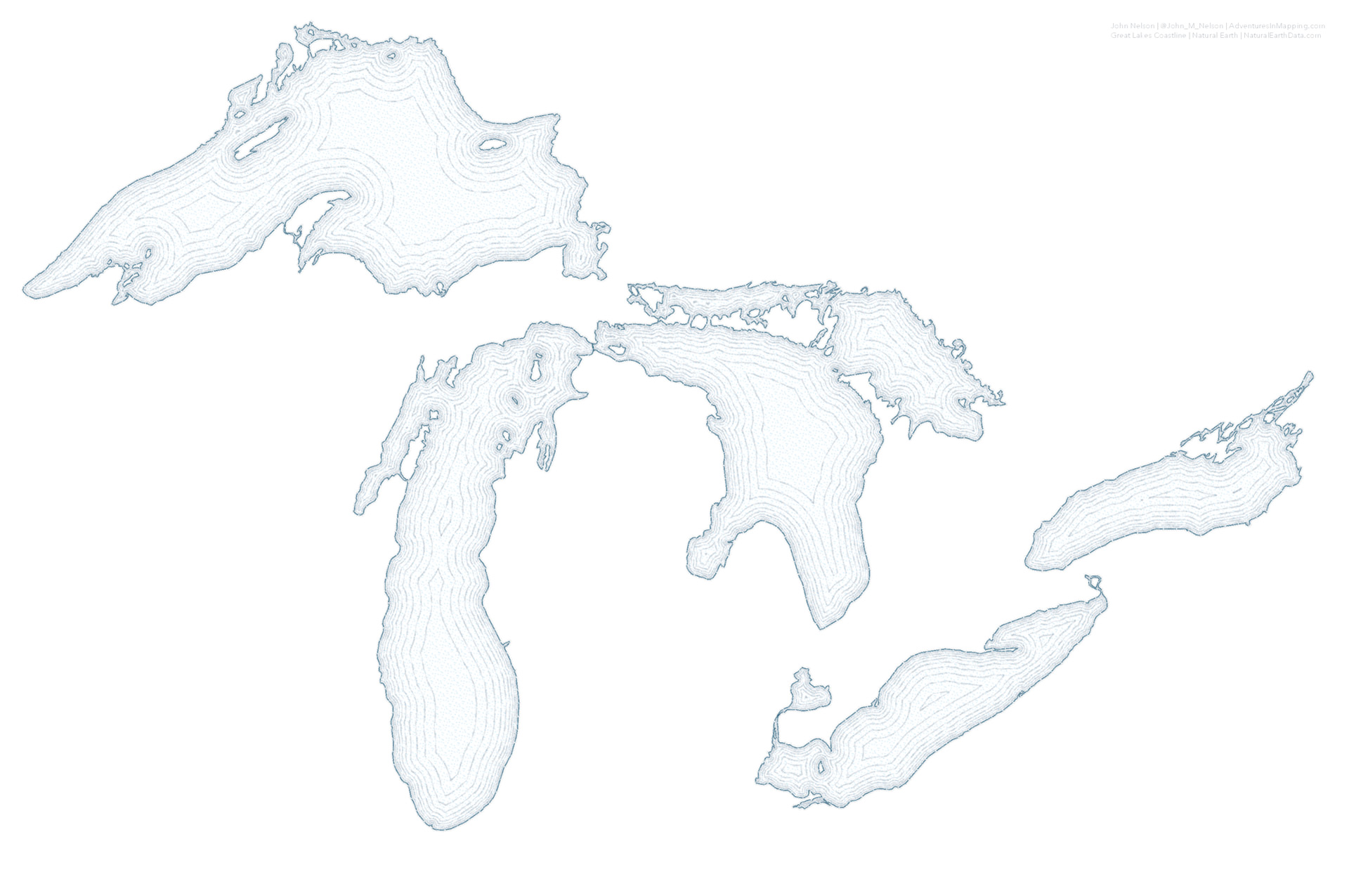
When you were making cookies as a kid, did you ever want to just see what happened if you made ONE GIANT COOKIE instead of a bunch of little ones? Here is the cartographic equivalent. This is all of the above offsets shown at once…
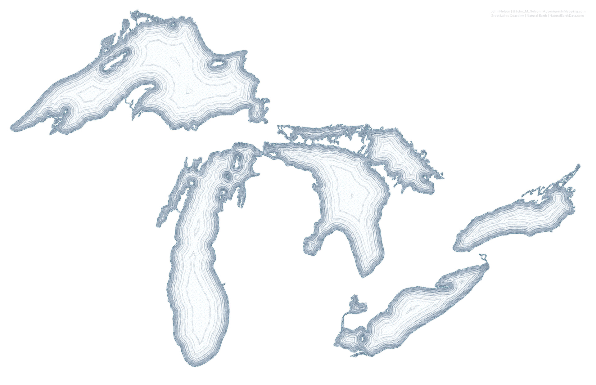
And I like it! It sort of reminds me of a cross-section of an agate.
Steal This Style
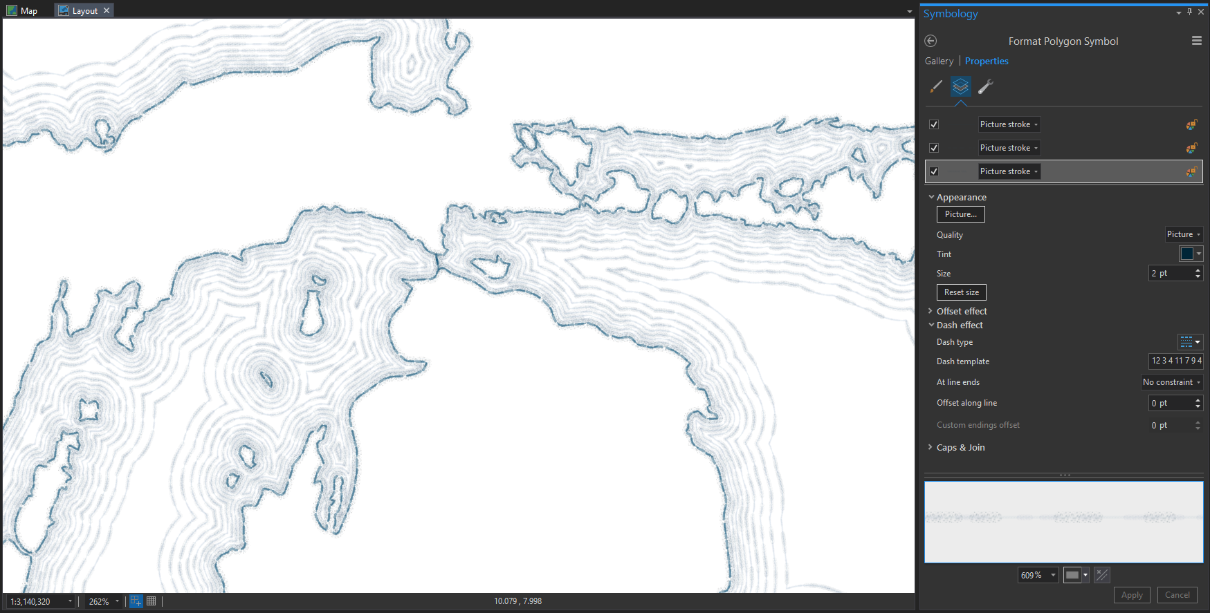
Say, did you notice that these water line examples have sort of a sketchy hand-drawn stroke? That’s because I tried to make them look like they have a sketchy hand-drawn stroke. It is a multi-layered symbol that uses dashes and picture strokes to look like pen or graphite on a textured surface. I mean, if you are making water lines, why not go all the way?
You can download my ArcGIS Pro style file here. And here are instructions on how to add the style to your project for crafty use on your buffer polygons.
So that’s that. Water lines via the Multiple Ring Buffer tool in ArcGIS Pro and the crafty little distance calculator spreadsheet. Also the hand-drawn stroke style.
P.S. If you are really into the retro hand-drawn aesthetic, you might like this post on a coastal stipple effect. It’s a bit like water lines but…you know…something else. And if you are into THAT then you will certainly be intrigued by this series on creating a fantasy map aesthetic in Pro.
Happy Water Line Mapping! John

Article Discussion: