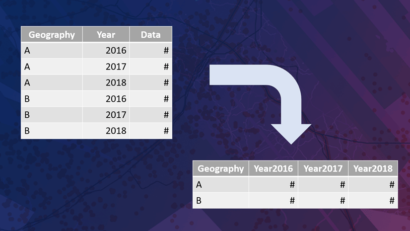
We’ve all been there, we open up a data table for the first time, only to see that it is “stacked” or “long” – meaning that it has more than one record per geography. For example, a dataset may have a record for each state and for each year. Why are so many tabular datasets long? Good relational databases are set up this way so that adding new years’ worth of data doesn’t require a schema change of adding a new field. Also, additional rows are often smaller in file size than additional columns in most database programs.
GIS vector data works well when one record in the table corresponds to one point, line, or polygon on the map. We don’t want duplicate features on our map, or duplicate features slowing down our processing time. If a dataset has multiple dimensions (multiple years or categories, in addition to multiple locations), we tend to prefer a “wide” dataset in which those multiple years or categories are different attribute fields.
Transform long data to wide data with the Pivot Table tool
Fortunately, there is a tool called Pivot Table in ArcGIS Pro’s Data Management toolbox that is designed to transform long data to wide data. As the tool’s name implies, it pivots rows into columns to reshape a table so that it is more suitable for joining to features based on a common attribute.
To start, add your table to a geodatabase (.gdb). You can use the Excel to Table or Table to Table conversion tools to bring in your table to a GDB within your project.
Example 1: data with multiple years
Here I have a table of values of opioid pills purchased by pharmacies from suppliers summarized by state. When sorted by state, it appears that there are seven years of data in this table.
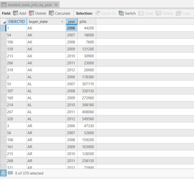
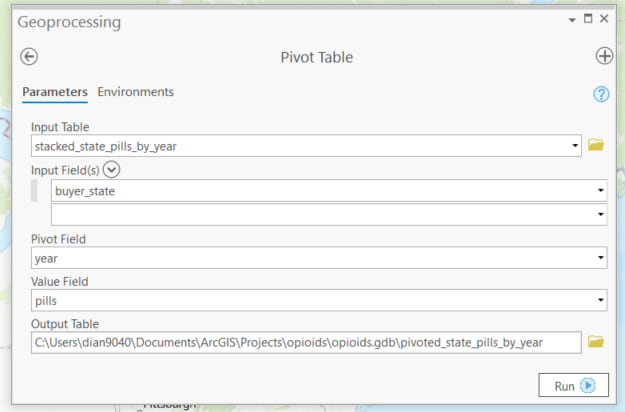
I want to pivot the rows in this table to columns so that each year becomes an attribute field. The dialog box for this tool asks for five parameters:
- Input table
- Input field
- Pivot field
- Value field
- Output table
I’ll put in the table I’m currently working with as my input table, and the field that I want to remain as rows as my input field. The field I want to pivot is the year field, which will become new attribute fields, so I’ll put year in for the pivot field. The field I’m most interested in is the value field, in this case, the pills field:
After running this tool, I get a new table that has one row per state, one field for each year, and the value in the pills field is appropriately filled in to the cells. I no longer have a field called “pills.”
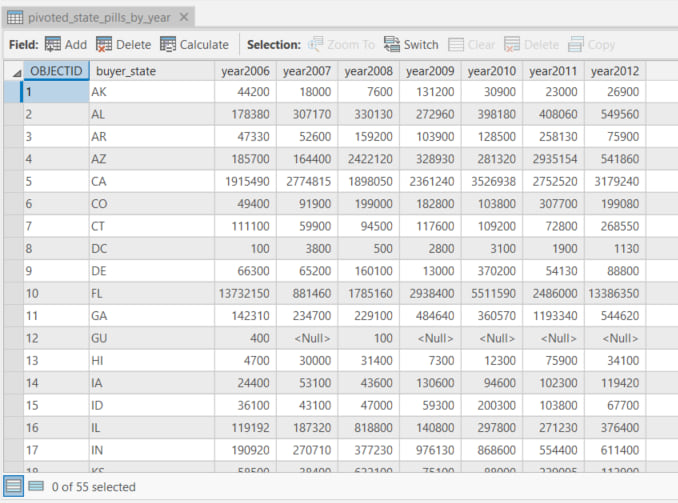
You may notice that the new table has slightly longer field names. The years (or other numbers) are now part of the field name here since year is no longer its own column. Many software programs including ArcGIS do not let you start field names with numbers, which is why the numbers need to be a suffix, e.g. “year2019” instead of “2019.” That’s okay because ArcGIS does let you enter aliases for these field names, which can begin with numbers.
Example 2: data with multiple categories
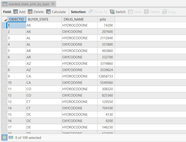
Some stacked datasets are long because they contain values for multiple categories for each geography. The Pivot Table tool works just as well for string values as it does for numeric values such as years. For example, here I have a table of the opioid pills purchased by pharmacies summarized by state, but instead of values by year, I have values by drug type (hydrocodone vs. oxycodone).
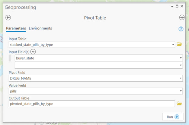
Here my pivot field is drug_name instead of year:
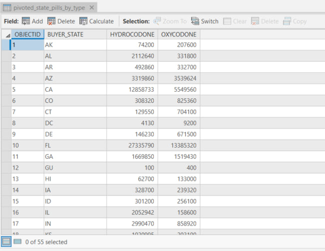
The unique strings within the pivot field then become my new attribute fields, very similar to the new year fields before:
Next steps: join, analyze, map!
Now that your table has one record for each point, line, or polygon you’d like to join to, run the Join Field tool to jump start your analysis and mapping!
Besides making your data easier to join to features, another advantage to working with data that is wide (many columns rather than many rows) is that it’s easier to calculate change over time or the difference between two categories with a simple field calculation. These new calculated fields can be mapped as well, allowing you to further explore and represent your data!
Pivot Table is available with the Advanced license of ArcGIS Pro. For more info on the Pivot Table tool, see the tool’s official help page.

Commenting is not enabled for this article.