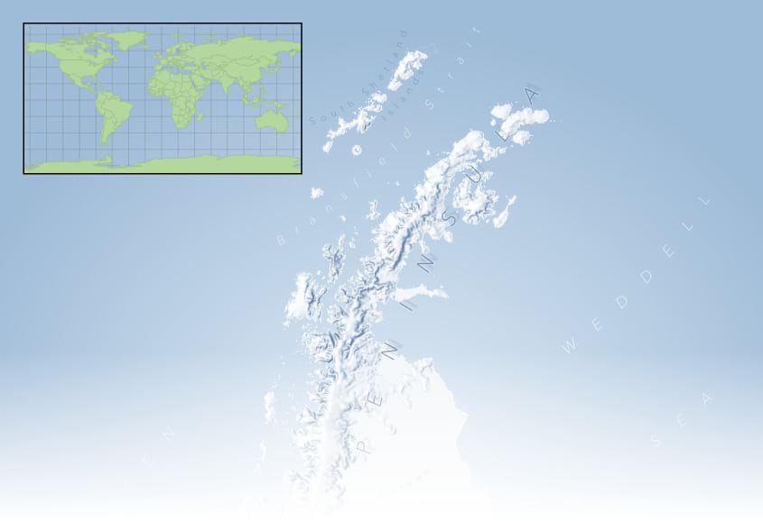
Here is a map of the Antarctic Peninsula (did you notice the achingly beautiful Antarctic hillshade? Go get it at the Living Atlas) made in ArcGIS Pro.

See that overview globe thing there in the corner? I like it. But it didn’t start out looking this way. Let’s kick this thing around, shall we? Here are five ways to upgrade a not-so-hot overview map.
1. Make It Simple
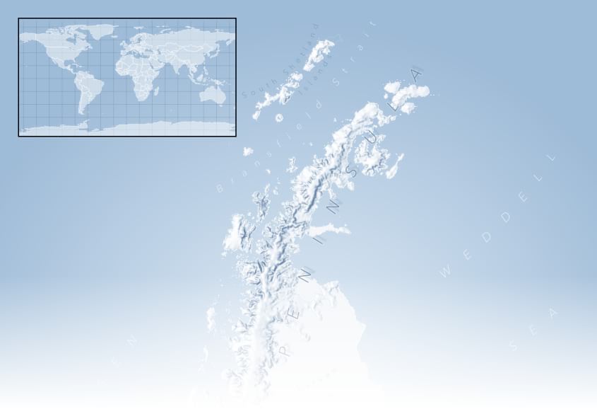
In your Pro layout, you can add any number of maps via the Insert tab. In these examples I have two maps in the layout—the main Antarctic map and the overview. Speaking of which, here is a rather sad little overview…
As much as possible, try to make your overview map monochromatic. The overview is absolutely second fiddle and just needs to be there to give a bit of context.
2. Make It a globe
If your main map area is a pretty big place, consider using a globe as your overview. It’s just nice. Plus National Geographic does it and who doesn’t want to make maps a little bit more like National Geographic?
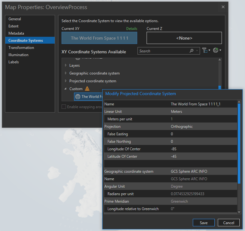
I like to use the trusty World From Space projection, then copy/modify it to center it near (but not right over) the area of interest.
Why not center the globe right over the area of interest? I feel like if the area of interest is offset a bit then it gives a nice dimensionality to the layout.
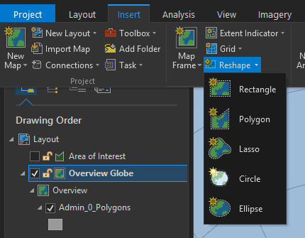
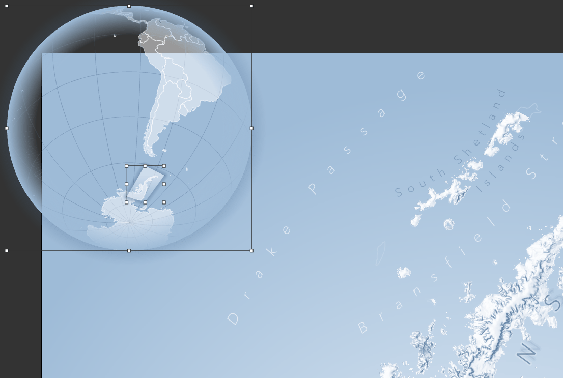
And since it’s a globe, I don’t want a square map frame containing a round map. So after I’ve inserted the map frame into the layout, I modify it to be a circular map frame (Layout > Insert > Reshape).
If your main map is a pretty local area, that’s ok, you can still give it a round frame. Edges are sharp and you don’t want to poke out an eye. Exhibit A.

3. Give It Depth
Anyway, that border along the perimeter is pretty distracting. And it’s not doing the “globe” look any favors. But you can elevate it with a simple hack. From within the layout, open up the overview Map Frame properties.
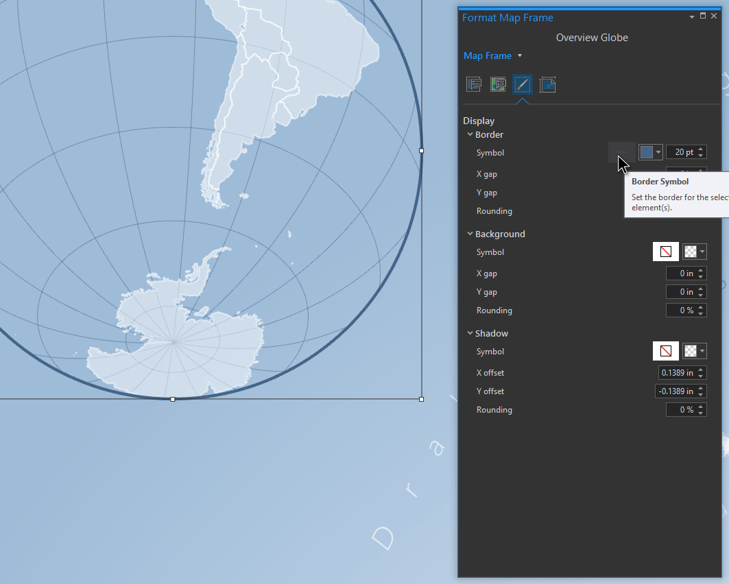
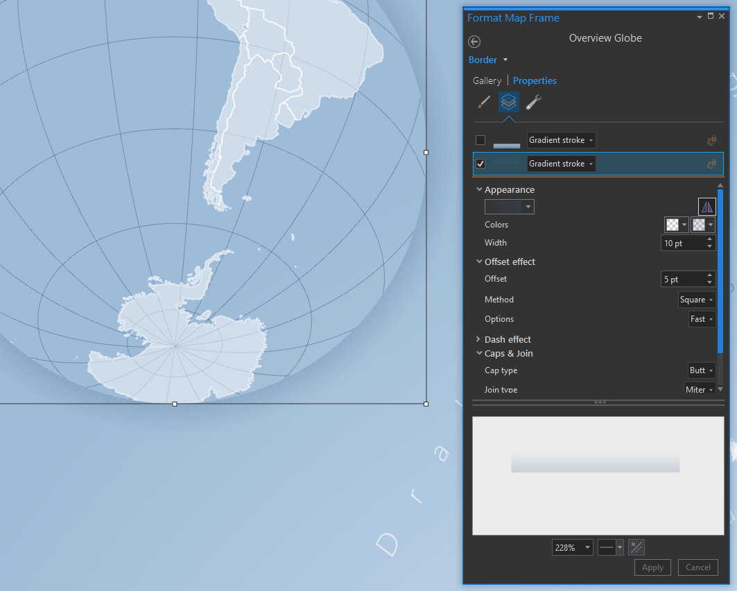
Give the map frame’s border a dark outer gradient stroke to pull it up off the main map a bit.
And sell the roundness of the globe with a subtle light inner gradient stroke.
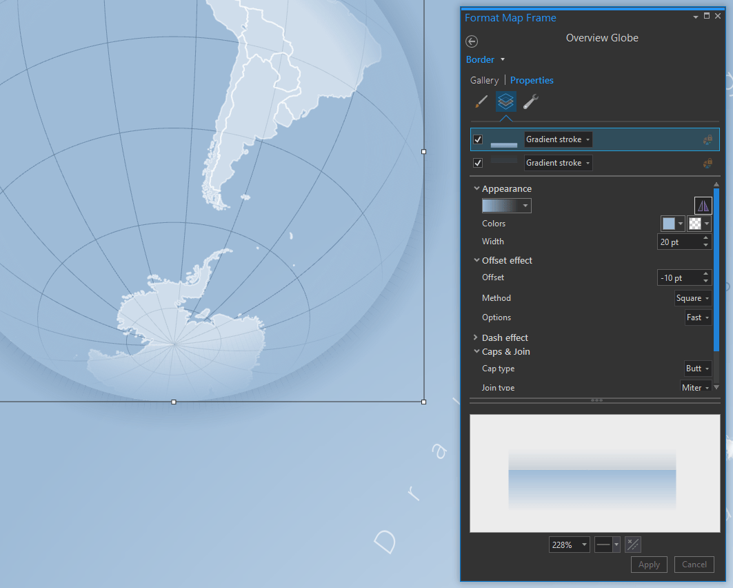
Now we’re cooking! That’s a way globier looking globe.

4. Cool Area of Interest Marker
Ok, so you have a handsome overview, but where is the interesting bit; how do you show the area of interest? You can insert a point or a star shape into the layout…

That’s cool, if your main map extent is comparably small. Or if your subject is a political area like a country or state then you can use that to mark the overview. But I like to draw (Layout > Insert > Polygon) an actual approximation box of the main map’s extent…

But while we’re at it, why not make the box look cool? You can give the shape any sort of stylistic tweaks you like. I like to make mine look like a little hovering pane of glass.
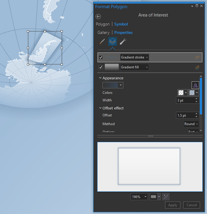
Glassy and classy!

5. Push It Over the Edge
Even though we’ve designed the overview to be pretty basic, a hovering globe can still attract a bit more attention than it deserves. Consider pushing the overview off the edge of the layout.
An overview that peeks out from the bleed margin is a simple layout trick to make your overview less prominent but at the same time gives the overall layout some dynamism. Plus you don’t see it every day. Well, you didn’t.

There it is! Five steps to consider for leveling up overview maps. To review…
- Make It Simple
- Make It a Globe
- Give It Depth
- Cool Area of Interest Marker
- Push It Over the Edge
And if you’d like, here is the ArcGIS Pro project for this map, so you can roll you sleeves up and take a look at this overview for yourself. Also, while you are in there, check out the fun curved text as labels!
Happy Overviewing! John

Commenting is not enabled for this article.