The beauty of a big map is that you can see everything at once. The problem with a big map is that you can see everything at once. They can be a bit overwhelming sometimes, don’t you think?
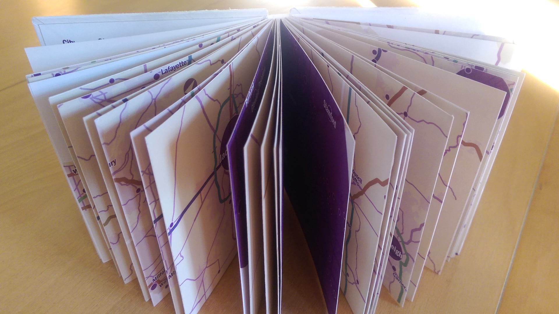
I love little maps. I love making them and I love looking at them because each little detail has a chance to shine. This is a story about making a little atlas of little maps. I started the process in ArcGIS Pro, then printed the pages and bound them together into a book. It results in a slightly different map-reading experience, one where your attention is focused on one little page at a time.
If you want to follow along or dig into any of the properties of this atlas, you can download the project package here: LittleAtlas_USPopulation
DATA
The subject of my atlas is the population of American cities. I got the data (surprise, surprise) from the U.S. Census Bureau and joined it to an existing spatial dataset. Some advice if you are trying to do the same: there are a lot of cities with the same name (not just Springfield) and a lot of duplicate records for the same city beyond that. To make sure you join the right row, you want to rely upon the codes found in the STATE, COUNTY, and PLACE fields.
PROPORTIONAL SYMBOLS
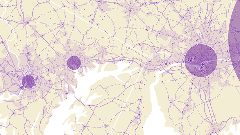
The cities are symbolized using Proportional symbols:

According to the 2010 census, the smallest town in the United States is Monowi, Nebraska, with a population of only 1. The largest city is New York, home to 8,175,133 people.
Using the properties shown above, Monowi will draw with a 4 pt symbol and New York City will draw with a 400 pt symbol. All other symbols will range in size between these values. You can tell from the single grey bar at the top of the histogram that most features will draw with smaller symbols.
It’s a nice idea to make proportional symbols transparent, so that they don’t hide one another when they overlap. And in the case of very large circles, you probably also want to see some of the geographic features underneath. Click on the symbol template to open its properties and change its color. Instead of picking a new color from the list that appears, open Color Properties instead and edit the transparency value.

Learn more about proportional symbols and other ways to symbolize by size here: ArcGIS Pro: The many ways to symbolize by size.
LABELS
Using the same label for every one of these cities is not going to give you great results:

You probably want to set up a number of label classes so that larger cities get larger labels:

Set up SQL queries so that each label class covers a different size of city:
Class 1: Population2010 is Greater Than or Equal to 1,000,000
Class 2: Population2010 is Less Than 1,000,000
And Population2010 is Greater Than or Equal to 500,000
Class 3: Population2010 Less Than 500,000
And Population2010 is Greater Than or Equal to 100,000
Class 4: Population2010 is Less than 100,000
And Population2010 is Greater Than or Equal to 20,000
Use the same label style properties for each class, but with different font sizes. You may find that you want to tweak other properties as well. For example, my label classes differ slightly in their halo sizes and line spacing.

I also styled the smallest label class differently from the rest, since it made more sense to place these labels next to their circles instead of on top.
LAYOUT
When you’re done styling your map and labels, insert a new layout and pick the largest paper size your printer or plotter can handle.
Insert a map frame and then double click on it. The Format Map Frame pane will appear where you can set the size. I made mine 4 x 4″.

Now that your map is the right size, you can copy and paste it until you have one for every page of your atlas. If you have a lot of pages (or a small printer) you’ll want to add extra layouts to accommodate them all. I made some of my maps 8 x 4″, for those urban areas large enough to merit a double page spread:

This book has 50 separate mini-maps. But they are actually acting as one larger map, broken up into pieces. For this reason it’s important that all of them are drawn at the same scale, so you can accurately compare city sizes across pages.
Activate one of your map frames. You can do this by right clicking on it:

Now when you zoom and pan, it will be on the map, not the layout. Navigate to some of the larger cities, until you’ve decided upon a scale that is the best compromise for showing all of them. I settled on 1:750,000. Now you need to make sure every one of your layouts is set to that scale. You can paste it in to the control at the bottom of the window:
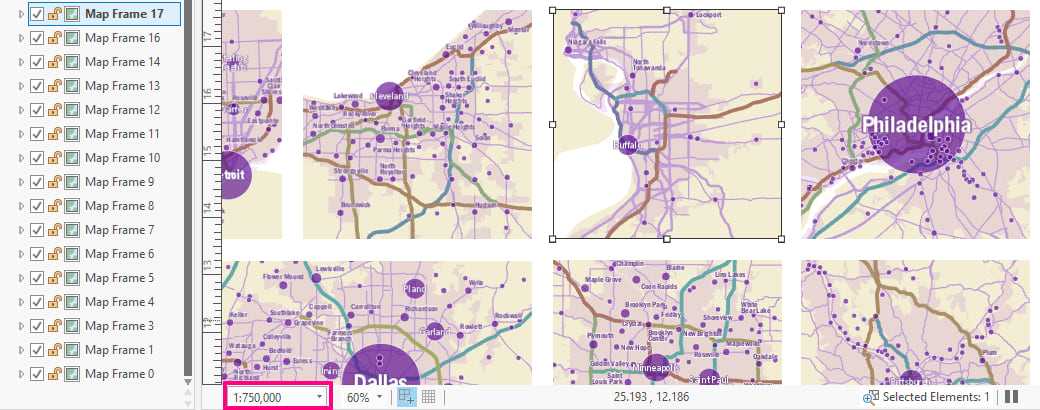
Hint: to de-activate your map frame, go to the Layout tab on the ribbon and choose Close Activation.
LEGEND
Since this is an atlas, we’ll need a few extra pages. I made a front cover, a back cover, a summary map of the United States, and a legend/credits page.

Note that the legend is not out-of-the-box. But it’s not hard to make either:
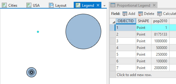
1. Make a new feature class by inserting Map notes. Using the edit tools, create two new point features somewhere out in the ocean where they won’t show up on your map.
2. Pan away from these new features and make 3-5 more. These should all be exactly on top of one another. Turn on snapping at the bottom of the window to make sure they draw in the same place:

3. Add a new numeric field. For the points that are placed exactly on top of one another, assign values to match the ones you want to see in your legend. I chose 100,000, 250,000, 500,000, 1,000,000, and 2,000,000.
4. The other two points that you made will not appear in the legend. They exist in order to set the data range. Assign one of them the lowest value from your dataset (in my case 1), and give the other point the largest value (in my case 8,175,133). In the end you should have something that looks like this:
5. Symbolize this new fake layer with proportional symbols exactly as you symbolized the real cities layer. The sizes will be accurate because you have set the layer up with the same range of values.
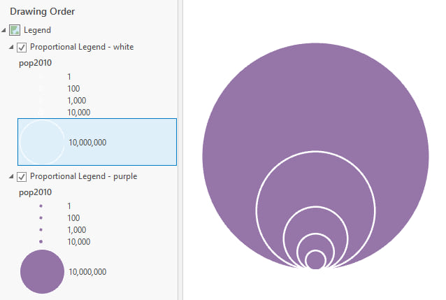
Problem: Your legend looks like a target:

Solution: Click on the template symbol to open its properties. On the Layers tab, adjust the Y Position property to -50%:

Your legend no longer looks like a target:

Problem: Because the symbol’s color is transparent, it is changing as the symbols overlap.
Solution: Make a copy of the layer. The layer that draws on top has the purple fill turned off, so only the white outlines draw. The layer that draws on the bottom has a definition query applied so only the largest legend circle draws:
6. Label the fake features on the map, or add labels manually on the layout:

BOOKBINDING
Print your maps.
Cut them out.
Sort them into the order you want them to appear in your book.

I am yet to figure out a reliable way to do double sided printing which actually aligns properly, so I went with the glue method:
Fold blank sheets of paper into groups (signatures) and glue your maps to these pages.

I like to use Japanese rice paste for gluing. Leave the pages under some heavy books to dry flat. Place a piece of wax paper between each page so they don’t stick together or bleed ink onto one another.
Sew the signatures together:

I’m not going to get into the details of how to do this. Search the internet for codex bookbinding tutorials and you will not be disappointed.
Cut out two pieces of dense cardboard for your covers (I used the backing from a book of tracing paper). These should be slightly larger than your page sizes. Glue paper over them so they look nicer.

Finally, glue the front and back pages of the book to the covers.

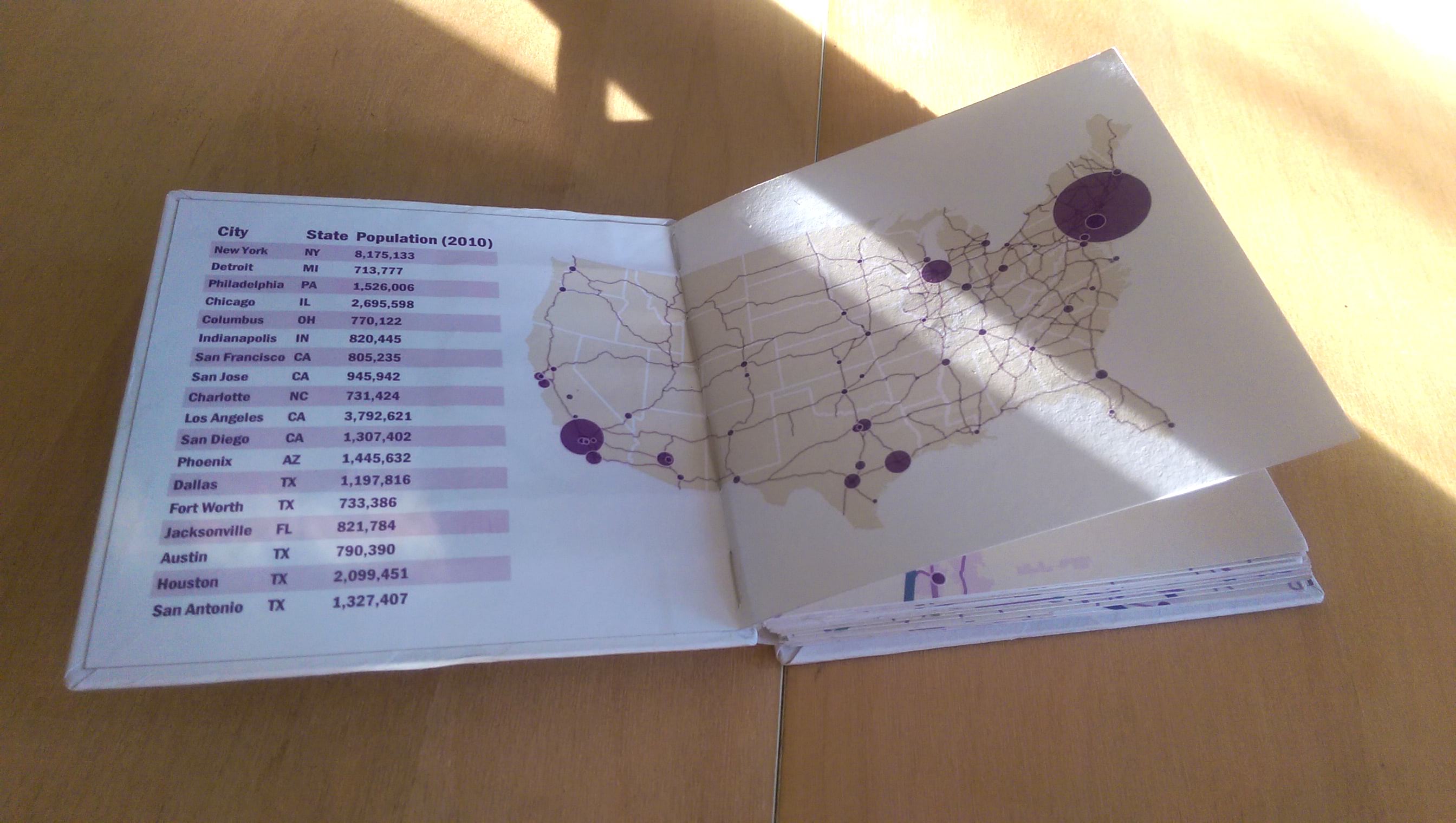
And voila…a little book of maps:


Commenting is not enabled for this article.