By Kenneth “there’s a u in colour” Field, Senior Cartographic Product Engineer
 ArcGIS Pro offers a rich new experience for making maps. Over the next few weeks we’ll be sharing many of the new and exciting features that will help you better design and share beautiful maps. Today we’ll look at how we’ve rebuilt the color palettes to provide better default options and an improved selection of color choices.
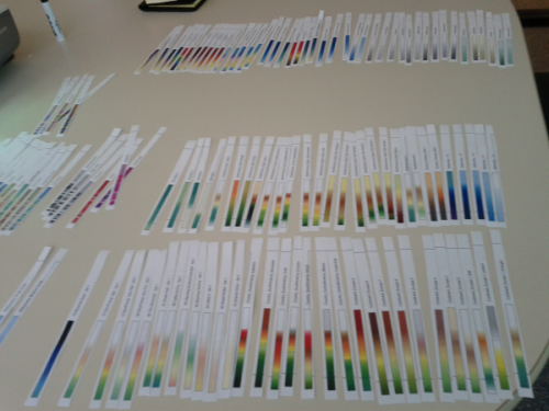
When we were designing the new ArcGIS Pro app we looked at all of the color ramps in ArcMap as well as many from a range of sources to inspire us to give our users a better experience. There’s a lot! In fact, here’s an inside snap of part of the selection process early on in the planning of our new color schemes – yes, we printed them out!
We wanted to build a fresh set of color schemes that better supported cartography and supported better cartography and we wanted to ensure we gave our users the very best possible choices that we know work well when designing great maps. Rather than try and reinvent the color wheel (pun intended!) or just regurgitate the colors in ArcMap we worked with our friend and colleague Cynthia Brewer to implement her ColorBrewer color schemes as part of ArcGIS Pro.
Developed as part of an academic project in 2002, Cindy and her co-worker Mark Harrower developed the ColorBrewer tool which has become the de facto choice for many cartographers when selecting colors. The schemes she researched and provided specifications for have been available for the last decade and are currently available via the ColorBrewer 2.0 web site which many people have used to set up their own color schemes in ArcMap. In fact, the research paper Mark and Cindy wrote in 2003 (published in The Cartographic Journal) went on to win a prestigious award for the best published paper in the journal that year and a downloadable style file of colors has been available for ArcMap for a number of years.
With such high quality research already done, it made sense to incorporate it into ArcGIS Pro rather than users having to go outside the software to find colors they wanted to work with. With Cindy’s agreement, we baked the ColorBrewer specifications into ArcGIS Pro to give map-makers access to these great color schemes as a default. Now, picking great color schemes has never been so easy. Of course, the ColorBrewer schemes which support colorblind safe palettes are also included.
Let’s take a look at some examples.
Any software has to have defaults. When you add data to a software package there has to be some default way of displaying it. In ArcMap, when you add a layer and then go to create a choropleth (Graduated Color) map for instance there’s a default behavior that classifies and symbolizes your data. The same is true for ArcGIS Pro. What most people will tell you is that this should not be the end point of making your map. It’s a starting point from which your knowledge of the data, its distribution and the type of message you want to communicate will all play a part in helping you decided how to modify the defaults.
That said, wouldn’t it be great if defaults were just that little bit better? Wouldn’t it be a step forward if there is some way the software can make more sensible choices in what it offers you as a first cut? Well with ArcGIS Pro we’ve worked hard to make the color defaults something that helps you out rather than something you immediately have to change.
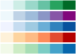
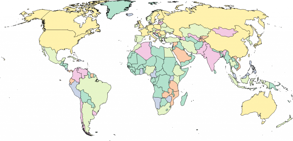
Color can be an extremely emotive topic. What works for one set of eyes and taste might not for another. If you fill a room with cartographers it’s unlikely that any two will pick the same way to color their map. That said, color choice isn’t some random decision. It follows basic rules. If we’re making a map of continuous data on a choropleth for instance, we don’t use a qualitative shading scheme (the worst type of which is applying a rainbow colored palette). It doesn’t make sense since the map is intended to show where there is more or less. Instead, we use a sequential color scheme, either a single or multi-hue, such as the map below, where lighter hues relate to lower data values and darker relate to larger data values.
In ArcGIS Pro, as a default when you make a choropleth (Graduated Color) map, the color schemes you are offered in the drop down are filtered to show only sequential schemes that vary from light to dark. It becomes harder to make a cartographic error in selecting your colors, though of course we can’t help it if you like single hue purple color schemes but your boss doesn’t – only you can decide what hues are going to work for you and your data. The following illustration shows some of the sequential color schemes.
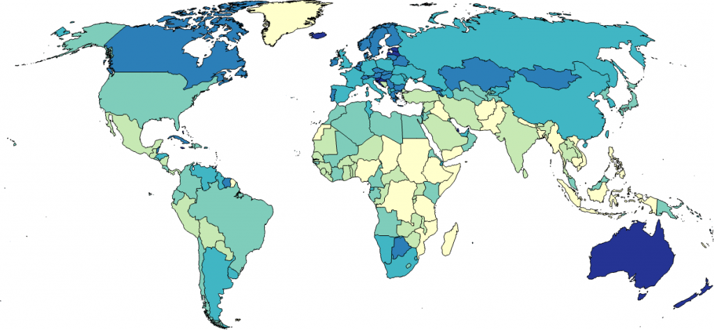
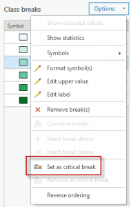
We’ve also made ArcGIS Pro a little smarter too. Perhaps your data varies around a critical break? Maybe you want to show areas that increase and decrease away from an average value? Perhaps you want to show how temperature varies (in degrees celsius) both positively and negatively away from zero. In ArcGIS Pro you can set a critical break somewhere in your data array which then populates your color scheme palette with a range of diverging color schemes appropriate for this type of map. You can set the Critical Break when working with Class Breaks.
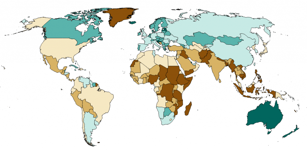
Your color pallete now shows diverging color schemes which are more appropriate for this type of data. A diverging scheme shows all classes below the critical break as a sequential scheme using one hue, and all values above the break in a sequential scheme using a different hue as the following map illustrates:
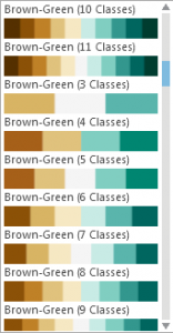
There’s preset schemes set up to accommodate up to 11 classes in your classification scheme which also creates smooth visual jumps between colors. The following illustration shows part of one set of the new diverging color schemes.
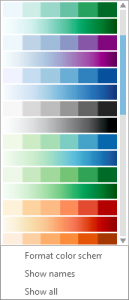
If you’re making a map that shows some sort of qualitative difference you’ll need a color palette that supports that message. This is where different hues play an important part in differentiating one area from another. Here’s a selection of the new qualitative color schemes in ArcGIS Pro.
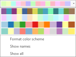
By following the ColorBrewer specification, we’ve ensured that the saturation and value of the colors is calibrated so that no one hue appears dominant. When you’re making a Unique Values map you don’t want all of the choice for sequential and diverging hues, so we present you just the options for our qualitative color schemes, all perfectly balanced with highly saturated schemes for the depiction of overlay detail on a web map or, perhaps, a set of pastels for a more subdued background map.
So the default behavior in ArcGIS Pro gives you just that little extra helping hand in selecting a color scheme that works for your data. Of course, you can see all the color schemes by checking the Show all option and you have the ability to modify any single color, develop your own color schemes and modify individual colors in a scheme.
The RGB and CYMK specifications of Cindy’s ColorBrewer palettes are included and the Color Editor supports RGB, HSV, HSL, Lab, Grayscale and CYMK color models to give you flexibility in the design process. Naturally, once you’ve created you perfect scheme you can save them out to a style which will give you rapid access to any custom styles you create for your own maps.
Defaults are part of the design of software. As we said at the start, they are the beginning of your map design process. What we have tried to support with ArcGIS Pro is a better set of defaults for color that gets you a little further down the path to making a great map than before.
In the next in the series of blog posts on the new map design capabilities in ArcGIS Pro we’ll take a look at transparency and how it’s now a core part of the way in which you can style symbols and layers.

Commenting is not enabled for this article.