One of the first things I do after adding a scale bar to a layout in ArcGIS Pro is change it. There is always something I want to adjust, like the unit of measurement, the number of lines on the bar, or the total distance shown. So how is that done? How do you go from a crowded default scale bar like this:

To a clearer and cleaner scale bar like this:

Well, there are lots of ways to go about it, but I like to take a 4-step approach:
- Pick the distance unit
- Set the length and divisions
- Simplify the numbers
- Style everything!
Sounds simple enough. But how do you actually do all that? Let me explain in more detail by going from the default scale bar to the final scale bar shown above:
Step 1: Pick the distance unit
Before I make any other changes, I want my scale bar to be in the correct units. Do I want to show meters? Miles? Smoots? The default scale bars are only in miles or kilometers, so if I want to set another unit I must do it manually.
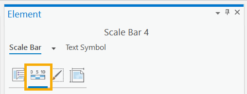
To do this right-click on the scale bar in the Contents Pane and choose Properties from the menu. This opens the Element Pane, where you can change all the scale bar properties.
Note: A subset of common scale bar properties are available on the Scale Bar Design ribbon, but I like to use the pane because it has all the properties.
Under the Map Units group, you can set the distance units for your scale bar. If you don’t see the unit you want in the Map Units drop-down list (like smoots or nautical miles) you can add it as a distance unit to your project. You can also change the label text and the label position for the scale bar.
In this case, I think the word kilometers is too long, and I want to abbreviate it to Km, so I’ve updated my Label Text. I also changed the Label Position to “After bar” so my label draws after the scale bar instead of after the numbers.
Now my scale bar looks like this:

Better, but I’m not done yet.
Step 2: Set the length and divisions
The next thing I like to tackle is how long my scale bar should be and how it should be divided up. This can be tricky if you haven’t finalized your map scale yet, or if you have a map series where the scale may change from page to page. In this case, the resize behavior for the scale bar becomes important because it changes how the scale bar adjusts as the map scale changes.
Personally, I’ve never found a scale bar showing 7.5 km or 213 feet particularly useful. I prefer values that end in 5 or 10. I also don’t like too many dividing lines. Going back to the Element Pane I can change my scale bar to reflect my length and division preferences by adjusting the values under the Division group. Here I can set the division value, resize behavior, number of divisions, and number of subdivisions.
I want my scale bar to show 10 km and have 1 km subdivisions. To do this I set my Resize Behavior to “Adjust width”, meaning my scale bar grows or shrinks to match the division value and number of divisions I set. Then I changed the Division Value to 5 and set my number of Divisions to 2 (2 divisions of 5 km each makes a 10 km scale bar). Finally, I adjusted my number of Subdivisions to 5, so there is a subdivision at each 1 km interval, making my scale bar look like this:

This looks good, but why is the number 2.5 showing if the marks are 1km apart? For the answer, and how to fix it, see step 3.
3. Simplify the numbers
Now that my scale bar is the proper length, it’s time to look at the numbers. Currently I’m seeing the number 2.5 on my scale bar, which is the first midpoint. I don’t need that number, I’d prefer only the 0, 5, and 10 be shown.
To make changes to the numbers I need to go deeper into the scale bar properties by switching to the Properties tab in the Element Pane.

Here, under the Numbers group I can change the amount of numbers shown (Frequency), where they are displayed in relation to the scale bar (Position), the rounding for decimal values (Rounding), and make changes to the formatting (Use fractional characters, Show thousands separators, Pad with zeros).
For the default scale bar I used, the Frequency is set to Divisions and first midpoint. Since there isn’t a midpoint line shown on my scale bar, that value is unnecessary and confusing. I updated my Frequency to Divisions. I don’t have any decimals or large values, so I don’t have to worry about the other settings, but they are often useful as well.
The current state of the scale bar:

4. Style everything!
The last thing I like to do before declaring a scale bar finished is add some style. After staring at the scale bar while making all the other adjustments, I usually realize some stylistic changes are needed. Maybe my text should be bigger, or smaller, or a different font. Maybe I realized that a black scale bar on a dark gray basemap isn’t easy to read, and I want to change the color. One of the best things about scale bars in ArcGIS Pro is how many ways they can be styled.
I can apply different symbology to the numbers, the division and subdivision marks, the scale bar line itself, the distance unit label. I can also change the height and offset for various scale bar pieces to get a custom look. Under each group in the Element Pane (Map Units, Divisions, Numbers, Marks, and Bar) there are one or more symbol buttons, allowing you to set up your custom symbology for that scale bar piece. So have fun! Make dramatic and cool changes! Or just update the fonts to match the rest of the layout, whatever works for you.
For my scale bar, I shrunk the number font size, made the type bold, and reduced the offset to 1. Under the Marks group I changed the Division Length to 8 and the Subdivision Length to 4, making my division dividers more prominent.
My final scale bar looks like this:

And there you have it, your scale bar just went from default to delightful. If you like what you’ve done don’t forget to save it to style to save yourself some time on your next mapping project.


Thanks for the article Aubri. How do you handle the scale bar in a map series where you have a range of scales from 1:5000 to 1:2000000? I would like to automate both the distance unit, length and divisions.