I don’t know a single cartographer who isn’t prone to a bit of exaggeration. But this isn’t a bad thing. Exaggerations appear all over maps, and particularly at smaller scales where there’s less space to fit everything onto your map. That nicely cased road symbol? Exaggerated in width so you can actually see it on the map. That estuary mouth? An exaggerated opening so it doesn’t look like a coastal lagoon. Those building symbols? Bigger than they need to be to show iconic landmarks.
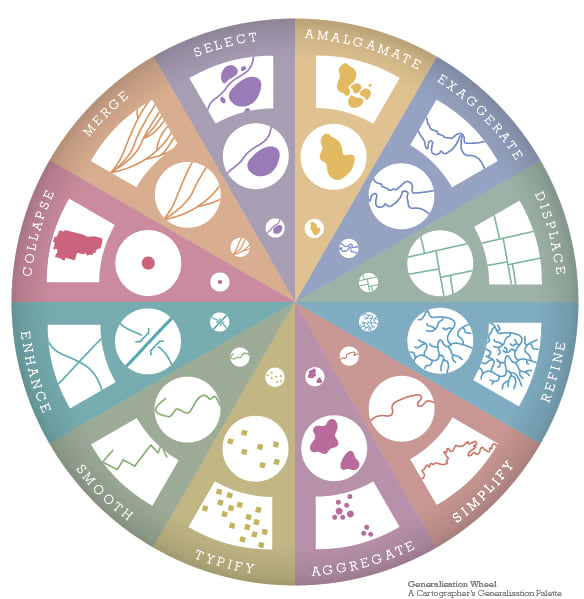
If cartographers didn’t exaggerate you’d often struggle to see features, assess their relative importance across other map detail, or see clarity in their relationship with other features. Exaggeration is a fundamental part of the map-makers generalization toolkit even though you may never really notice it when you look at a map. Here’s the generalization wheel that my colleague Wes Jones made (published in Cartography. by Esri Press) that shows how exaggeration fits into the wider toolkit.
Another great use of exaggeration is when we apply it to elevation data. Frankly, this planet we live on is actually quite flat. That might seem an absurd thing to say given Mt Everest is nearly 9,000m above sea level (over 29,000ft) and the Mariana trench is about 11,000m deep (36,000ft). Those are pretty big numbers but when you scale them back and think of how they would appear on, say, a standard desk globe with a diameter of about 30cm (12″) you might be surprised. Mt Everest would appear as a small crinkle of no more than about 0.2mm (less than 1/100″). That equates to the thickness of a piece of paper folded twice over. The Mariana trench would be a scratch of about the same dimension.
So when you look at a physical desk globe you often find that it has exaggerated relief so you can see and feel mountain ranges, or exaggerated bathymetry so you can see the topography of the sea floor. It helps to clarify the differences between truly flat expanses of land and where Earth’s mountain ranges and ocean trenches are. So if we’re creating virtual globes for the interwebs we might also want to use a little bit of exaggeration too.
I recently made a couple of virtual globes, one of Earth and one of Mars. The Earth globe was used to show thematic layers describing the risk from sea level rise on our coastlines and landmasses. The Mars globe was to show the physical features of the surface of the red planet – chasms, trenches, craters and mountains. When working in GIS there’s often a focus on accuracy and precision. We deal in the certainty of position and location and so, I could simply have published my virtual globes using elevation models scaled to reality. Except when you launch the virtual globe in your browser you’d see a really flat surface. The crinkles and scratches are imperceptible and that leads to a pretty boring looking map. So how do you exaggerate your elevation in ArcGIS? There’s two ways and they support different needs.
You’ll be working in ArcGIS Pro right? (if you aren’t…give it a whirl, your maps and virtual globes will thank you). You’ll have opened a Global Scene and be working with your data draped over the default elevation for Earth. Here’s a view of the Global Scene with the basic datasets I used for making the Sea Level Rise virtual globe. I’m using the Esri World Ocean Basemap because that makes sense for this map. I also have a layer of land mass polygons so I can drape them to mask out land detail from the basemap. I just wanted them grey. And on top, the coastline and sea level monitoring site data that I’d eventually use for creating the thematic content.
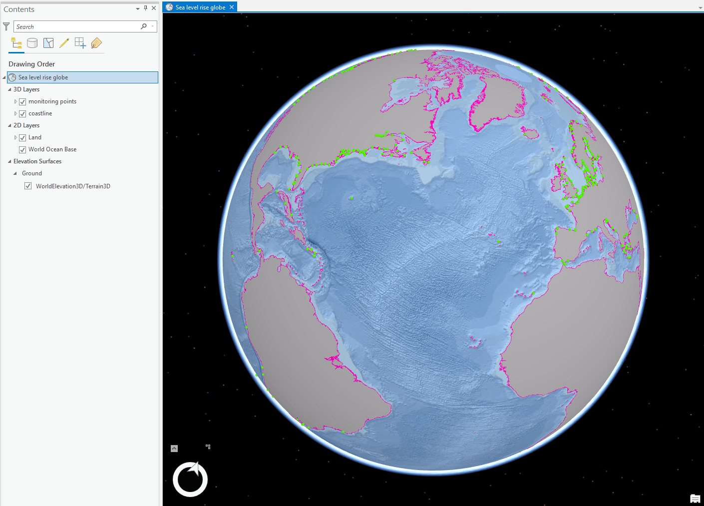
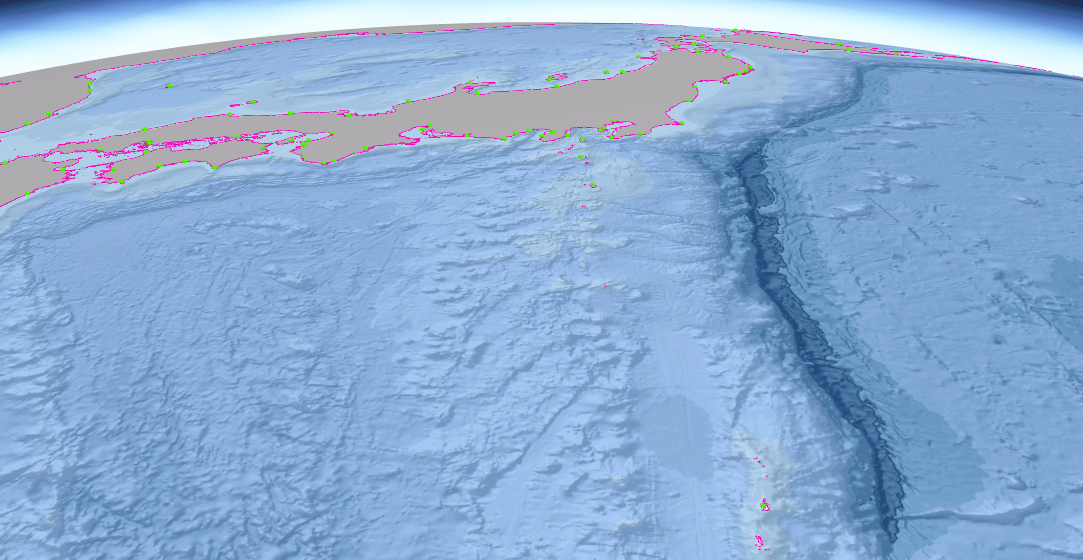
But look how flat everything is. It almost doesn’t matter what I do to the thematic content because the globe is so flat and uninteresting. The issue becomes more prominent when we zoom in to an area we know has significant variation. So here’s a closer view of the Mariana Trench off the coast of Japan.
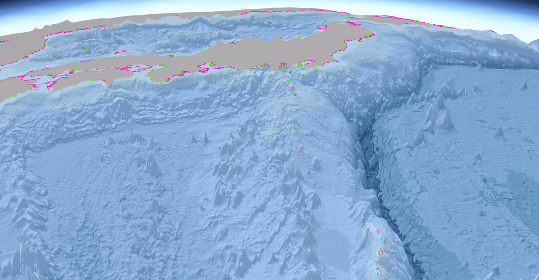
It needs exaggerating! I’m interested in the bathymetry for this map so the first job is to use an elevation surface that deals with bathymetry. The default World Elevation Terrain 3D data only covers above ground. But you can simply add the TopoBathy3D elevation surface from the Living Atlas and use that as your elevation surface instead. And the simplest way to create exaggerated relief is to change the Vertical Exaggeration settings on the Elevation Surface Appearance tab. It’s a question of experimenting. For what I want to do I used an exaggeration of x20. Now look at it…far more visually appealing.
And that’s all there is to it if you’re just going to keep your work in ArcGIS Pro. But you don’t do you? You want to share this glorious globe with the rest of the world and for that you’ll publish it as a Web Scene to ArcGIS Online.
This is where you need to do a little bit of work to enable exaggerated custom elevation surfaces to function in ArcGIS Online. While the x20 on-the-fly setting in the Elevation Surface Appearance works fine in ArcGIS Pro, you need to bake in the vertical exaggeration to your elevation data itself to use an exaggerated custom elevation surface in ArcGIS Online. It’s not difficult.
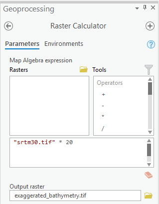
First step is to acquire the raw Digital Elevation Model you want to use as an elevation surface. For this map, it’s the SRTM 30m bathymetric DEM. It’s just a raster grid, with each cell representing elevation (or, in this case bathymetry). To create an exaggerated version fire up the Raster Calculator, use your raw DEM data as input and specify your vertical exaggeration as a multiplication of the values in the raw data – here “srtm30.tif” * 20.
You’ll generate a new raster with updated elevation values and you then simply set that as an elevation surface for your map. When you then publish your Global Scene From ArcGIS Pro to ArcGIS Online, your custom elevation surface will travel with it and be used in the Web Scene.
And here’s the finished product in an ArcGIS Online Web Scene, published using the Web Appbuilder to give me a nice unencumbered UI and all the usual useful widgets to set layer controls, information panels, share buttons, pan and zoom etc (go to full screen to get the full effect).
And as with anything in cartography, if you figure out a neat trick, use it again! The surface of Mars has some phenomenal structures. Olympus Mons, for instance, is around 5 times the height of Mt Everest. So for this virtual globe I used exactly the same approach to creating a new elevation surface with a vertically exaggerated DEM that multiplied the raw elevation values by a factor of x10. Sufficient enough to create visual interest but not too much to create a bizarre spiky ball hanging out in space (again, use your whole screen!).
Next time you make a map, try a bit of exaggeration. It can make a world of difference. Happy mapping!
Thanks to Nathan Shephard for his invaluable advice in all matters 3D. I also asked John Nelson a quick question to help with this blog and he obliged. Thanks.

Commenting is not enabled for this article.