Grid lines are handy for lots of reasons. They provide a local indication of direction, which is usually more accurate than a single north arrow, they provide a convenient means of visual tracking along shared ordinates, and they can help make your map look super sweet.
Before we get too far, are you sure you wouldn’t rather read this as a Cascade story map, with huge images? Ok…
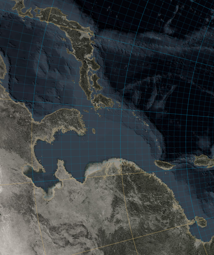
Here is a map that makes pretty heavy use of grid lines…
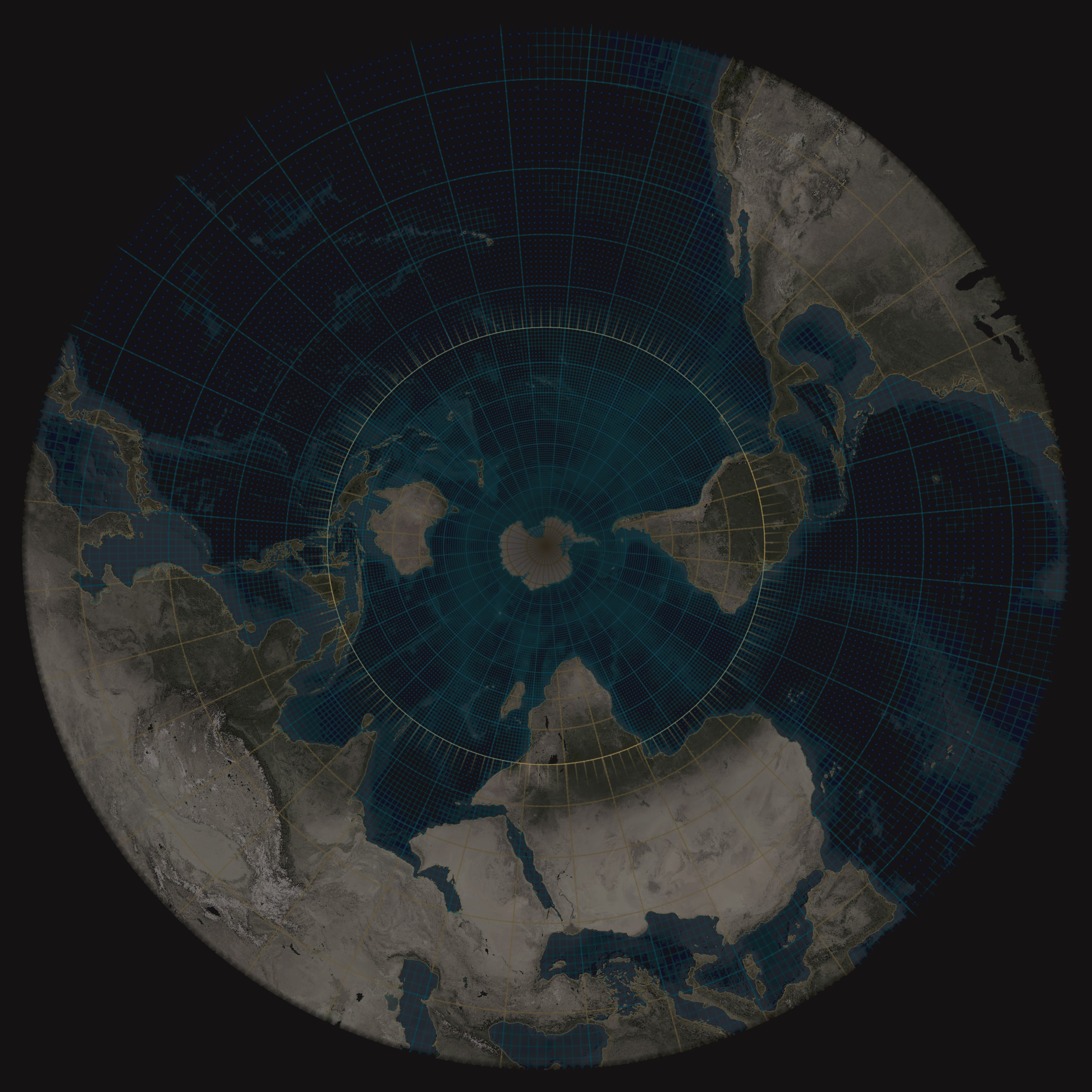
It’s based on the Firefly Hurricanes map, which you can find here. But this version has some amped up lines of Latitude and Longitude for fun and example. I’ll go over three tricks played on these grid lines…
- Land and water division
- Hierarchy
- Sunburst effect
Land and water division
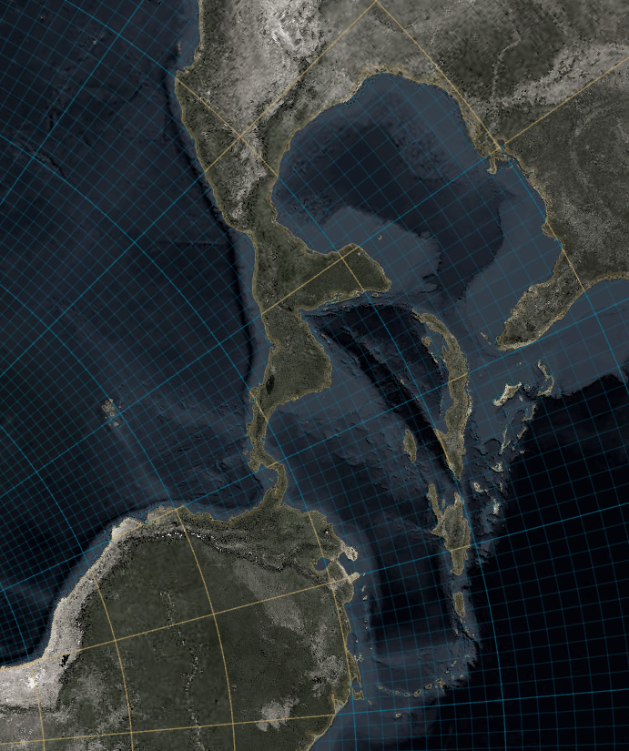
You might notice that the grid lines over oceans look different than the grid lines over land. The oceanic lines are blue, and have a finer mesh, and the land lines are gold.
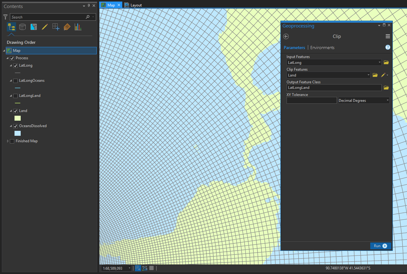
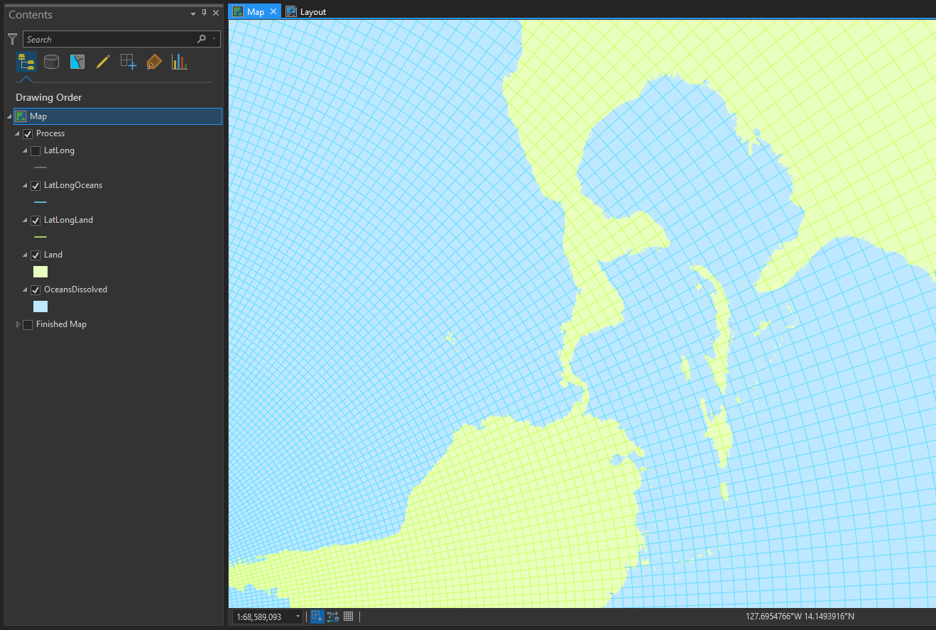
Long ago, I created a couple handy layers called Land and OceansDissolved. I use them all the time. I used the ArcGIS Pro clipping tool to cookie-cutter out separate Lat Long layers coinciding with land and with ocean. I’ve also uploaded these land-only and ocean-only lines as a feature service to ArcGIS Online, so please partake.
I actually first did this to create the ocean-only graticule component of the Firefly basemap (Bern Szukalski‘s favorite quality of the basemap, I’m pretty sure).
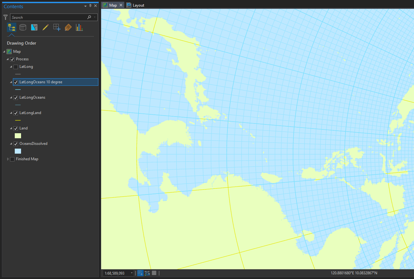
With two separate layers for grid lines over land and grid lines over oceans, you can style them independently.
And that is how I got different grid line styles over land/ocean. And so can you!
Hierarchy
You may also have noticed that the water grid lines in my finished map are more plentiful, appearing every 1 degree with a bolder grid line every 10 degrees. And the land only shows grid lines at the 10 degree interval. Aside from looking pretty neat, I did this to add more visual interest to the, pretty spartan, oceans of the imagery.
This adds some visual dimension to the grid lines. And there’s just a raw sci-fi appeal to hierarchical grid lines. How to get there? You just use a definition query to filter out the features you don’t want to show, based on attributes in the layer’s attribute table. It’s an intimidating name, but super easy to use.
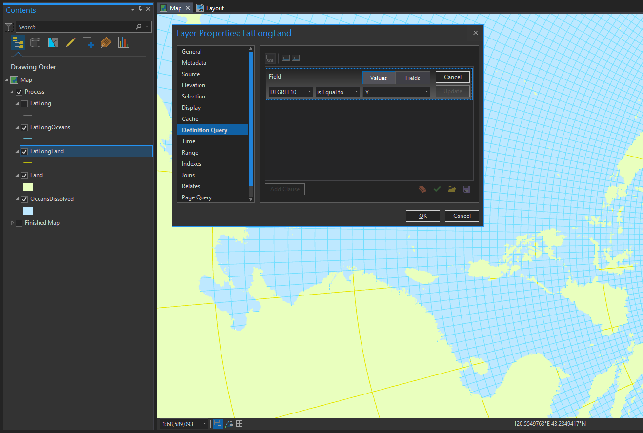
My grid line layer has a convenient attribute called “DEGREE10” which I use to hide all the rest. The result is a land grid line layer with pared back features. Then I did the same thing to a copy of the ocean grid lines, and gave them a bolder line weight.
Ah, there’s just something right about a hierarchical grid. Smells like freshly sharpened #2 pencils.
Sunburst effect
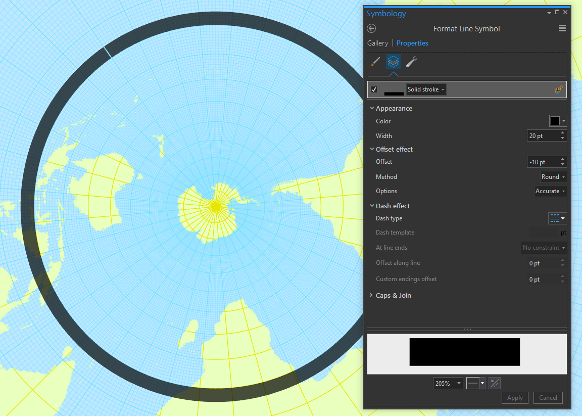
The previous two steps are common map-making tricks. But I wouldn’t call them hacks. This sunburst effect at the equator is absolutely a hack. Buckle up!
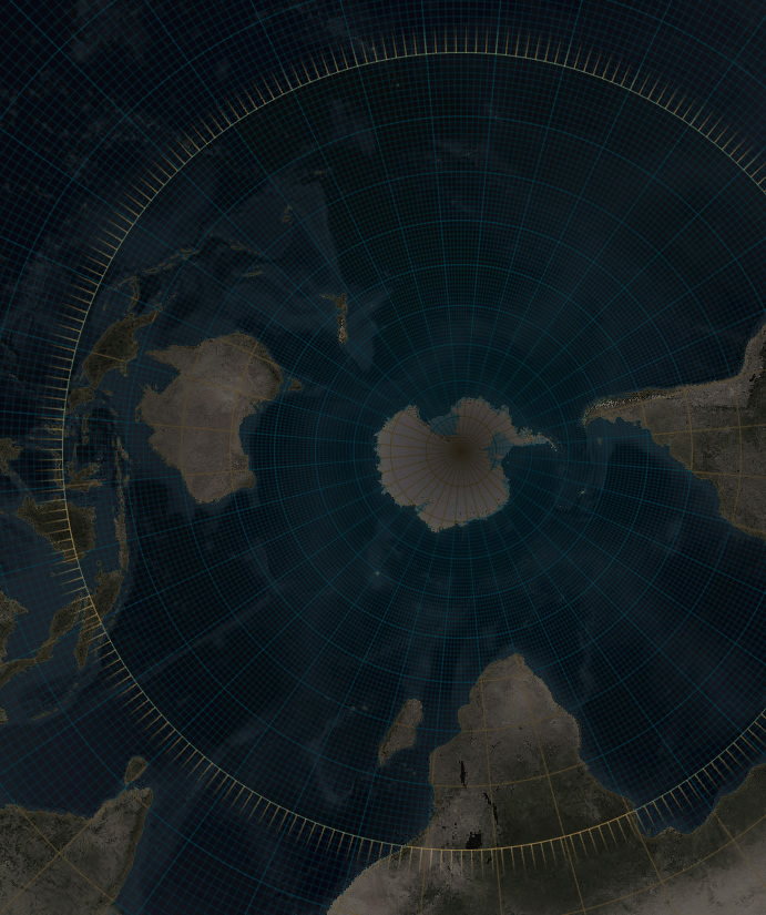
Here is the equator, drawn as a super-thick 20 pixels. I’ve offset it by half it’s thickness so rather than drawing centered over the equator, the thickness draws out from the equator.
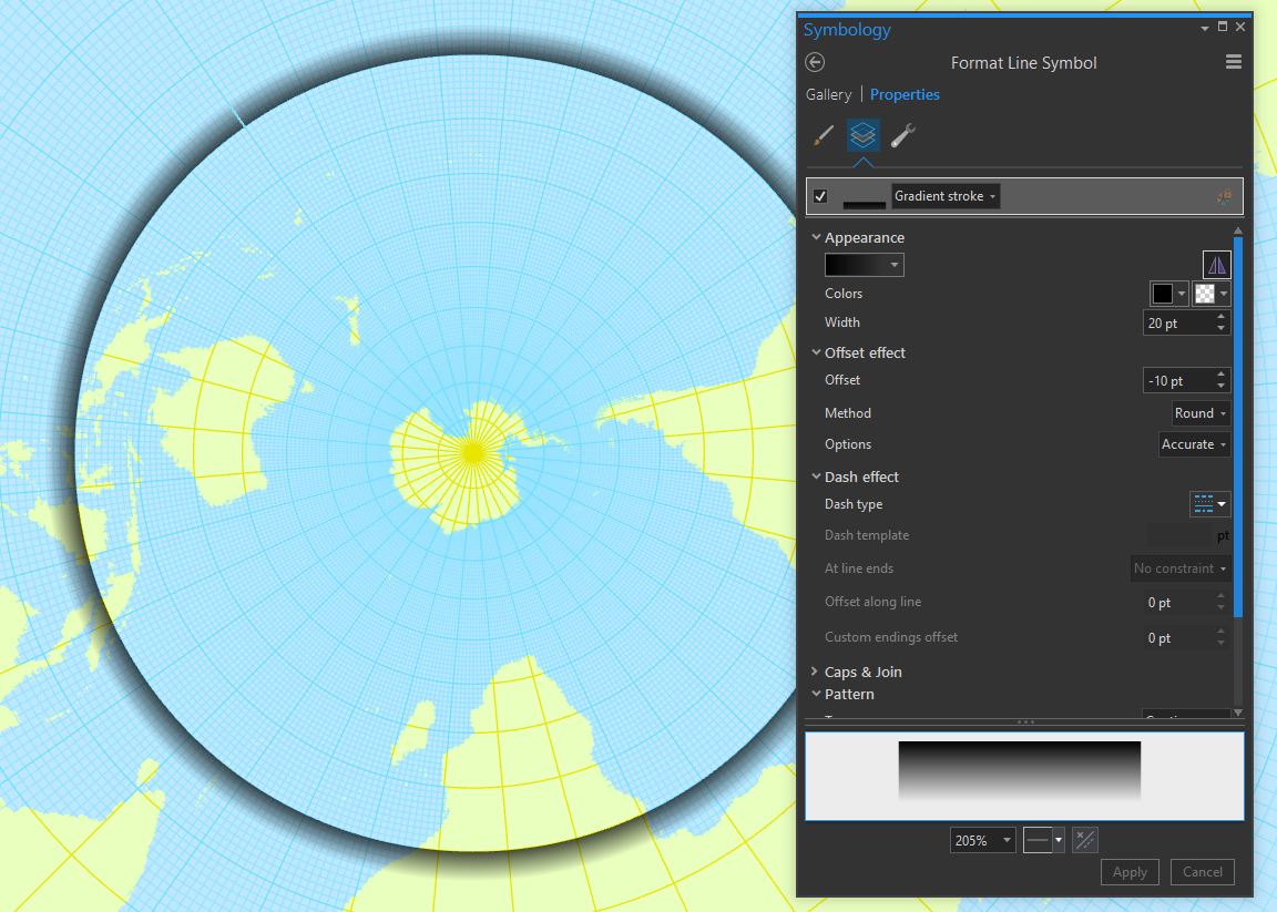
But we aren’t stuck with a boring solid line. Here is that same line drawn as a “Gradient Stroke” transitioning from more opaque to less opaque. By the way, you can use this effect for creating inset dropshadows, or to add a shaded effect to boundaries and stuff. Have fun with it.
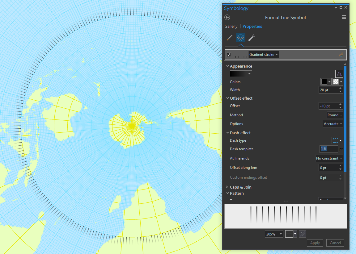
Lastly, by making this line a dashed line, you can totally hack a sunburst effect. The “Dash template” lets you set the spacing of the dashed line. Think of it like holding a pen and putting the pen tip down to draw then lifting it up to not draw. The first number is how far to move with the pen on paper and the second number (spaces between numbers) is how far to move the pen when it’s picked up. I set my dash template to “1 6” so it draws for 1pt and then skips 6pts. Ensure the “cap type” is set to “butt” so the line honors the fineness of the dash (otherwise it’s all bloby).
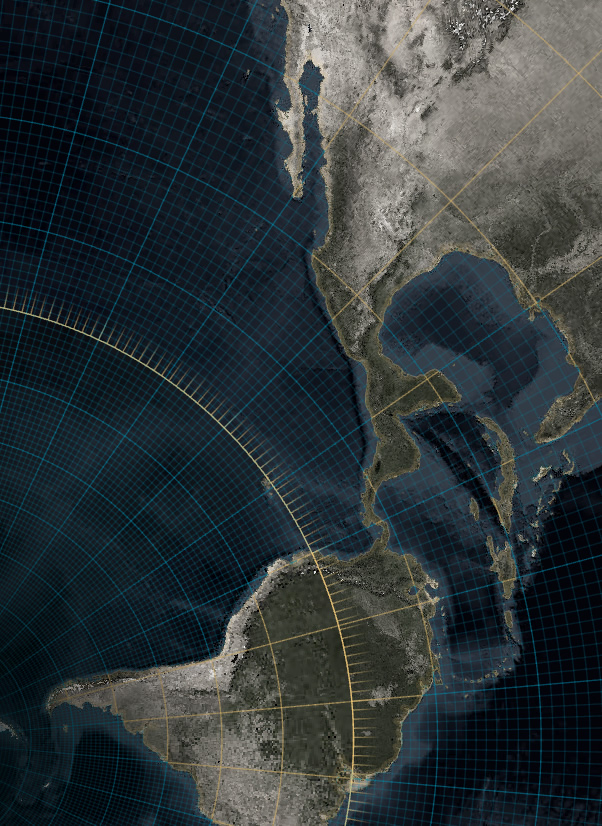
There. A sunburst! In this example it sort of looks like the equator is wearing mascara, but you get the idea. (Side note, you can stack up random dash strokes of varying thickness to replicate a chalky hand-drawn line.)
So that’s it. Fun, right? Who knew grid lines could be such a blast. Who’s got it better than us?
Happy Grid Line Mapping! John

Commenting is not enabled for this article.