Nearly three years ago I was captivated by an NPR story about a Boy Scout who built a nesting pedestal for relocated ospreys near Detroit, Michigan. A bird that hatched from that nest made a successful migration to Venezuela, which is pretty great, considering the massive mortality rate of young raptors and their only recent return to Michigan after being wiped out decades earlier by a now-banned pesticide. She was fitted with a GPS tracker while still in the nest. So, these years later, I downloaded that GPS tracking data to see what became of her.
If you are interested in how it all turned out, you’ll have to check out the story map. In the meantime, here is how I made the maps that show Julie’s long migration path.
Data
I downloaded Julie’s GPS tracking points from a free online database of animal tracking coordinates called Movebank. I searched for “osprey” and found Julie’s data (she hatched in Monroe county, MI, so that’s prefixed to her name).
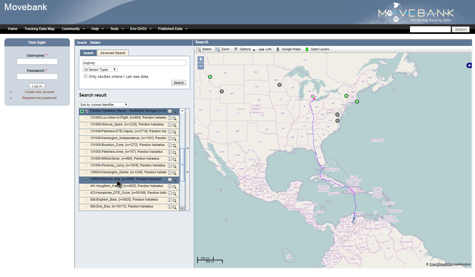
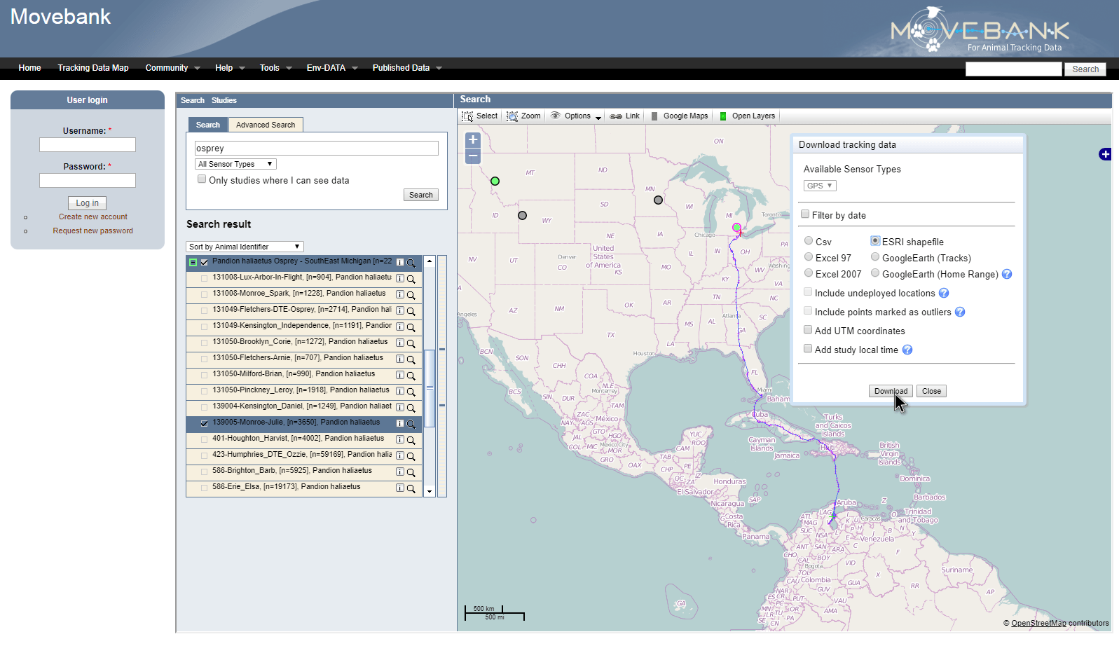
Then I downloaded her data as a shapefile, eager to get a closer look at how she’d been doing.
GIS-ifying
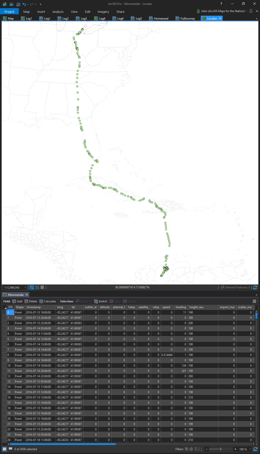
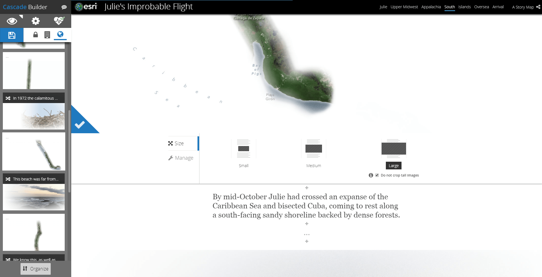
Julie’s location data was 3,600 location points, and a line layer connecting them all chronologically. I wanted to get a sense for her pacing over the migration, to see which days she flew, where, and how far. My evil plan was to string together a set of really tall maps and narrate them in a Cascade story map. Fun, right? I opened up the DBF file in excel (did you know you could do that? It’s a fun little thing if you want to do some quick table-work. Just don’t overwrite!) to jot down some migration notes to myself as I poured over the location markers in ArcGIS Pro. I knew that Julie’s migration would be too long to show in a single map so I wanted to get a sense for how I could break up the migration into a series travel maps.
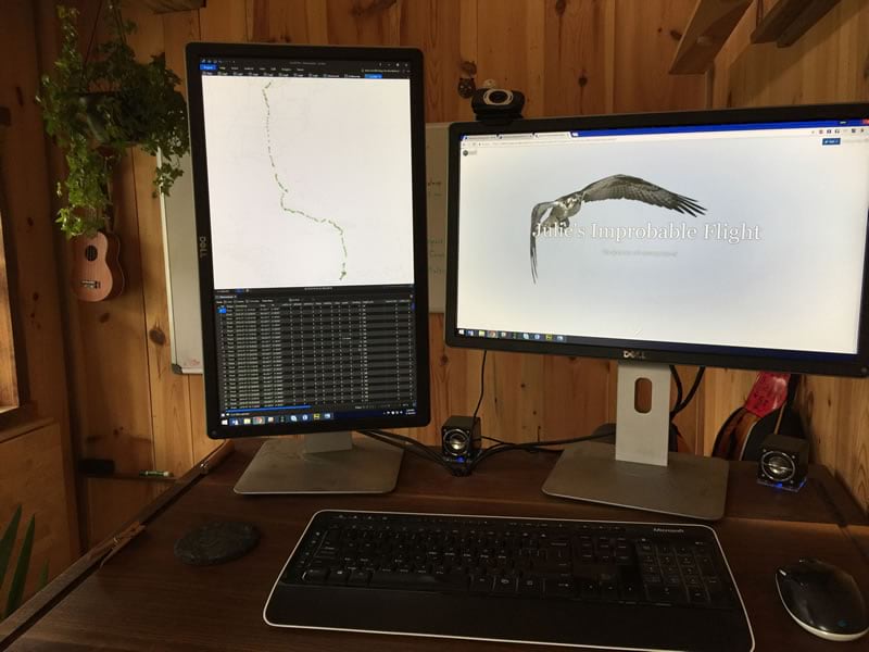
Say, did you notice the sweet vertical orientation of Pro? I have a monitor configuration with one horizontal and one vertical. It’s handy for when I have portrait orientation layouts (but mostly for email and documents). Cool, huh?
Anyway. I forgot where I was. Oh yeah…
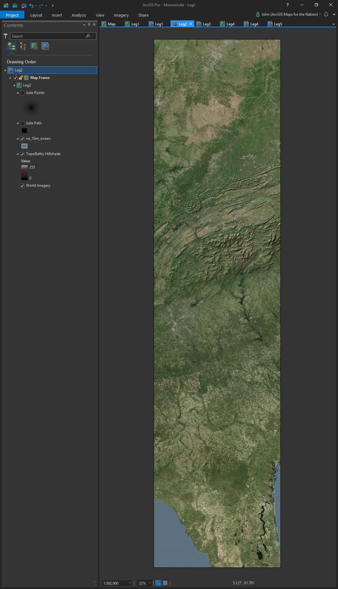
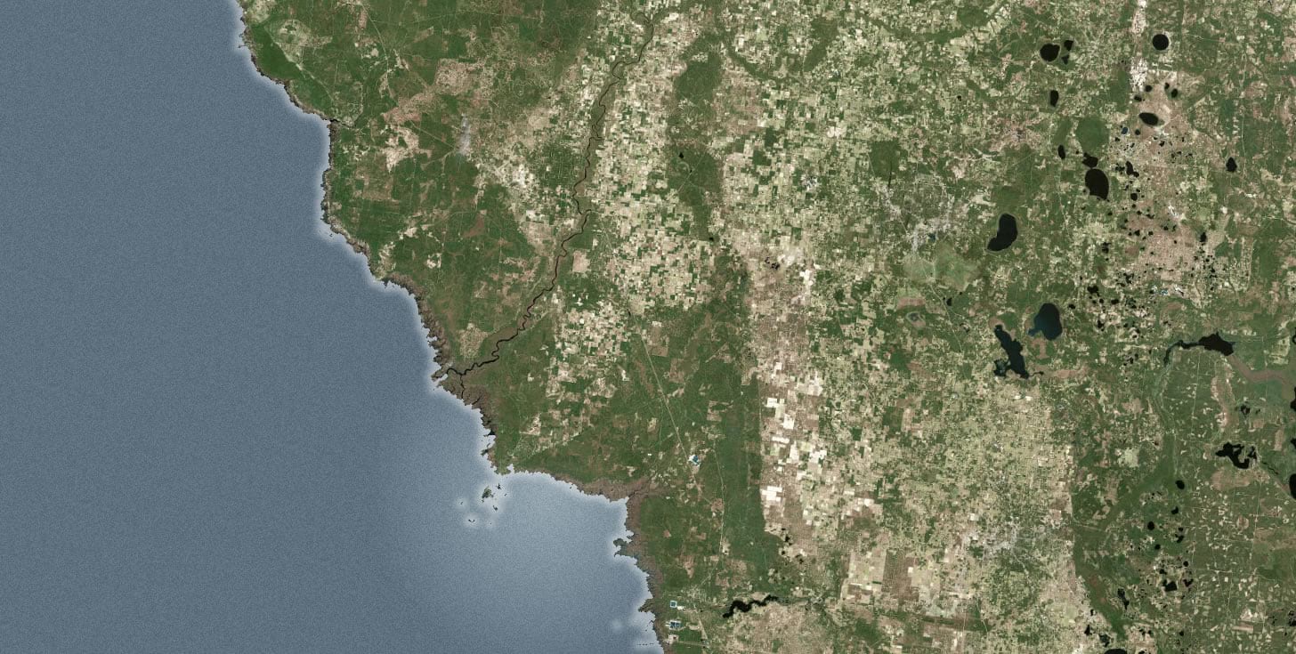
In Pro, I created a tall layout and zoomed in on one leg of the journey. I turned on the imagery basemap and then added the topobathy hillshade service from the Living Atlas. I promptly re-styled the hillshade to get rid of the grays and make it Bumpified.
Then I exported the image as a high-res PNG.
Then I turned off the basemap and gave Julie’s GPS points and lines great big gradient-looking symbols.
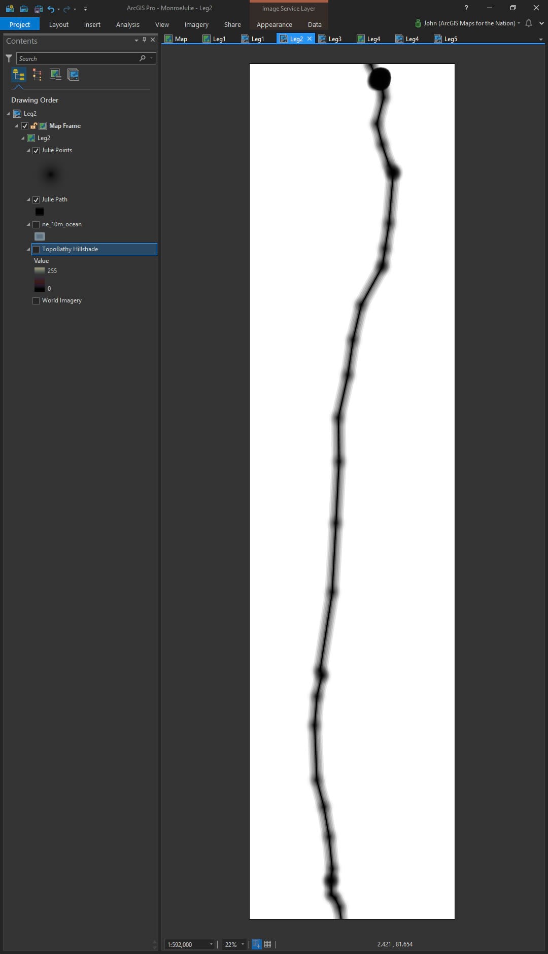
I exported this as a high-res PNG, too.
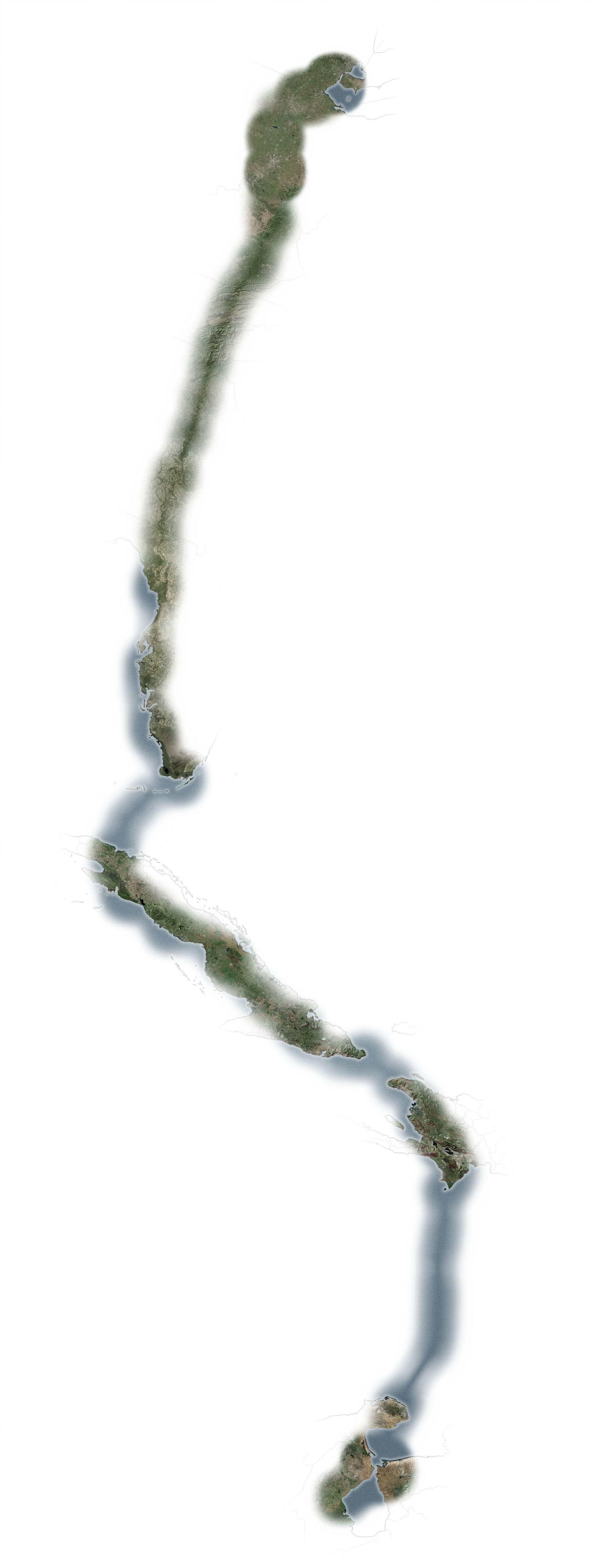
Here’s a closer look at the fuzzy symbols…
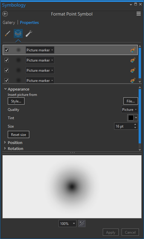
So, you might be wondering why I chose this strange symbology.
Visualization
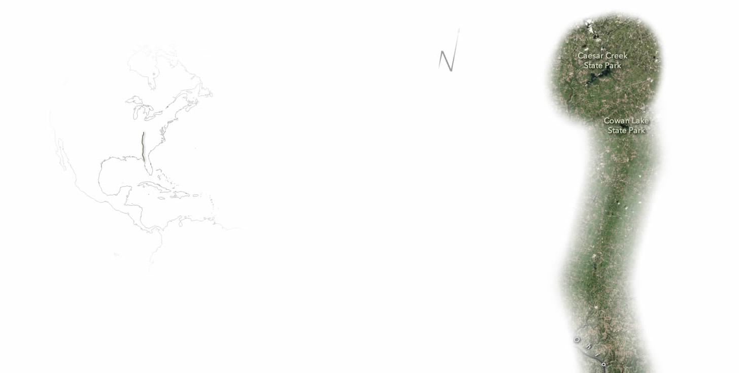
My goal for these maps was to create a bird’s eye view. The fuzzy map would be used to mask the imagery, like a reverse-heatmap. We would see only what Julie saw. I had experimented with this style some time back with this map about migration. More recently, Dylan Moriarty’s mental maps of childhood are beautiful examples of limited-view maps. For a story map like this, that plots the instinct-driven flight of a small creature who does not have the benefit of maps and satellite imagery, I felt a reverse heatmap like this, where Julie’s locations etched away at the landscape to reveal the land below, rather than occlude it, would help us empathize with her journey.
So, in Adobe, I masked the two images together like so…

Resulting in this…

Then I selectively labeled the features that Julie flew over.
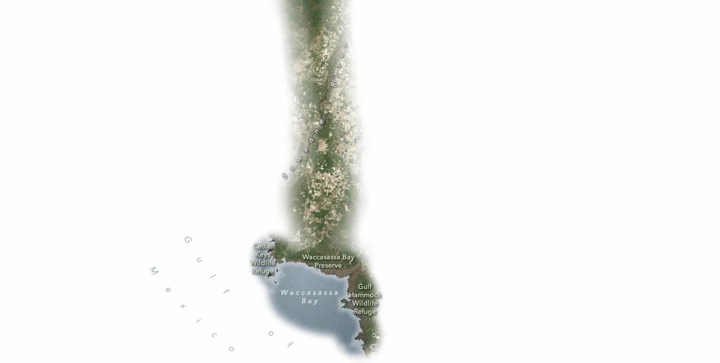
I also added a little north arrow (pretty rare for me) and a small locator map at the top, to help readers gain some context since these maps are so restrictive in what they show.
Story Map-ification
My next order of business was to marry these strip maps into a narrative. They shouted to be put into a Cascade. By choosing the “Large” option for the map sizes, their width filled the screen and the tallness became a scrolltastic adventure unfolding beneath your mouse.
Between each leg of the migration I painted in some of Julie’s backstory. Nonlinear storytelling, yo! Comic books did not rot my mind!
Why This Look?
About the tallness of the maps. I wanted to make readers feel a tiny bit of the scale that Julie covered in her migration. Yes, there’s an awful lot of scrolling in the story map, but that action reinforces a sense of distance, tricking readers into feeling a sense of scale.
The reverse heatmap style, as mentioned, provides a small glimpse into the sense of simultaneously not knowing but being compelled with confidence. How can a map make humans relate, in some small sense, to a creature so intrinsically wound with instinct? This was my go at it.
The origin of the idea actually came from working with a large municipal police force years ago who wanted to visualize the daily coverage of their patrols. A heatmap was a natural choice, but it covered up exactly the streets they were interested in revealing. So I inverted the gradient and pow!
Give it a shot.
Thoughts on Instinct and Migration
As the father of young children, I marvel and the astounding ability of animals to survive and thrive in a world that makes them no promises of security. We all feel gentle pulls of instinct and migration, but it can’t compare. Here’s how I closed the story…
The journey of one small creature in this vast dance can appear to be an impossibly minor piece of an interwoven system. These movements, synced with the very orbit of a planet around its sun, are as vast, and old, as life itself. But all systems are simply the full measure of small beings doing what they must. The migration of any creature, of Julie, driven by instinct and will, is remarkable.

Commenting is not enabled for this article.