This is a guest blog post from cartographer, Spyridon Staridas. Spyridon uses ArcGIS to create elegant and useful reference maps for his customers. Today, he shares his process for creating contour lines, and their labels, suitable for multiple scales. To follow along within Spyridon’s ArcGIS Pro project, download it here.

…
Introduction
When it comes to contour styling there are basically three words you should consider and these are: interval, interval, interval!
Contour lines, or simply contours, are used to represent elevation on a topographic map. A contour interval is the difference in elevation between two succeeding contours.
Interval is scale-dependent. In a small scale map, contours with a small interval look overly dense and cluttered and produce a noisy map. The interval must be adjusted according to the map scale and to the topographic relief about to be depicted.
I wouldn’t say there is a golden rule for the interval, but from my experience mapping the relief of Greece I have come up with a few standards:
- Map at scale 1:50,000
- Primary contours interval: 250m
- Secondary contours interval: 50m
- Map at scale 1:100,000
- Primary contours interval: 500m
- Secondary contours interval: 100m
- Map at scale 1:200,000
- Primary contours interval: 1000m
- Secondary contours interval: 200m
From the above classification you may see that for each scale we need one interval for the primary contours (those that will have a thicker stroke and the elevation label) and one for the secondary contours (those that will have a thinner stroke with no label) and these two numbers are related in terms that the latter divides the former 5 times (e.g. 250 / 50 = 5 or 500 / 100 = 5 etc).
Establishing these simple rules, and with a little help from SQL and Arcade, we may quite easily produce some really nice looking contours on our maps in ArcGIS Pro.
Basic styling
It starts with basic styling. In ArcGIS Pro I load my contour lines on a map and I open their attribute table (pic. 1). In the attribute table I can see that there is a field named “ELEV” which stores the elevation values for each line. With an ascending order sorting on that field I can see that the values begin from 50 meters and increase with an interval of 50 (100m, 150m, 200m etc).

For that layer I open the symbology pane and I select unique values for the Primary symbology (pic. 2). Then, instead of selecting just one field at the Field 1 option, I click on the green expression button to open the Expression Builder (pic. 2).

As shown in picture 2, in the Expression Builder I select Arcade as the coding language and at the Expression field I type:
var elevation = $feature.ELEV;
When(
elevation % 250 == 0, ‘250m’,
elevation % 50 == 0, ’50m’,
null
);
This is a simple script where I declare a variable named “elevation” which holds the values from the “ELEV” field of my feature layer. Then I use the When() logical function from Arcade to create two classes with the Modulus operator (the % sign). This script is saying: every time you see a line with elevation interval 250m assign it to the class named “250m”, then every time you see a line with elevation interval 50m assign it to the class named “50m”, then for all other values just ignore them (null).
When I click OK to close the Expression Builder, the two classes are being added to the Classes section of the Symbology pane, where I can style each class individually.
For the primary contours (those with the class “250m”) I give an 80% gray color and a width of 0.6 pt, while for the secondary contours (those with the class “50m”) I also give an 80% gray color but with a width of 0.3 pt (pic. 3).

Excellent! I now styled the contours for a map of 1:50,000 scale. What’s next is labeling them! So, I open the Label pane where at the Label expression I simply write the field “ELEV” (pic. 4).
As I can see the labels are being placed everywhere with no logical structure which is hard to read. Topographic maps normally have labels only on the primary contours, so in order to achieve this I have to write an SQL expression.
At the Label pane I click on the SQL query tab to open the SQL expression builder (pic 5). In the expression builder I write:
MOD(ELEV + 250, 250) = 0


This SQL statement selects every nth record in a table or feature class, which in my case selects every record in a 250 meters interval. As you may see in picture 5, now only the contours every 250 meters (the primary contours) are being labeled.
Finally, I style the labels with the options of the Label pane, including selecting contours placement from the Position tab and adding a halo with the same color of the map background to achieve a quick masking effect (pic 6).

Diving into Scales
As said before, this styling is suitable for a map of 1:50,000 but if I zoom out, going to a smaller scale, the contours start to appear dense and not that appealing.
For a map of scale 1:100,000 I have to repeat the aforementioned process but with a different interval.
So, I make a duplicate of the existing contours layer in the Layers pane, which I rename to “Contours 1:100,000” and I regenerate its classes at the unique values symbology to adjust to 100m intervals. As shown in picture 7, now the expression is:
var elevation = $feature.ELEV;
When(
elevation % 500 == 0, ‘500m’,
elevation % 100 == 0, ‘100m’,
null
);
What I am now saying to Pro is: every time you see a line with an elevation of 500 meters assign it to the class named “500m”, then every time you see a line with an elevation of 100 meters assign it to the class named “100m”, then for all other values just ignore them (null).
When I click OK the new classes appear on the Symbology pane and this contours layer is being styled accordingly on the map (pic 7).

Now, I also have to adjust the interval for the labels, since now the primary contours are no longer 250 meters, but 500 meters. I will use again the same SQL expression but with an interval of 500 meters, like this:
MOD(ELEV + 500, 500) = 0
This SQL statement selects contours every 500 meters, so, as you may see in picture 8, now only the contours of 500 meters (the primary contours at that scale) are being labeled.

I follow exactly the same process but for a scale of 1:200,000, where primary contours now have an interval of 1000 meters, while the secondary contours have an interval of 200 meters, as shown in picture 9.

The Arcade expression now used to create the classes of the unique values is:
var elevation = $feature.ELEV;
When(
elevation % 1000 == 0, ‘1000m’,
elevation % 200 == 0, ‘200m’,
null
);
What I am now saying to Pro is: every time you see a line with an elevation of 1000 meters assign it to the class named “1000m”, then every time you see a line with elevation of 200 meters assign it to the class named “200m”, then for all other values just ignore them (null).
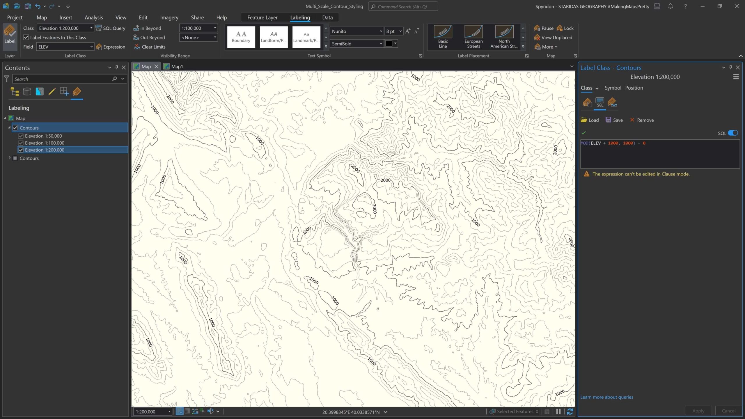
Same goes for labels. I change the interval at the SQL query to match the 1000 meters interval of the contours, as seen in picture 10.

The SQL is
MOD(ELEV + 1000, 1000) = 0
…which selects contours every 1000 meters, so, as you may see in picture 10, now only the contours of 1000 meters (the primary contours at that scale) are being labeled.
Multi-scaling
I have successfully created three contour layers, one for each scale. In order to make them work together I have to display layers at certain scales. For the layer “Contours 1:50,000” at the Visibility Range group at the Feature Layer contextual tab I select 1:50,000 for the “Out Beyond” scale (pic 11).
Eventually, for the layer “Contours 1:100,000” I select 1:50,000 for the “In Beyond” scale and 1:100,000 for the “Out Beyond” scale at the Visibility Range group at the Feature Layer contextual tab (pic 12).


Finally, for the layer “Contours 1:200,000” I select 1:100,000 for the “In Beyond” scale at the Visibility Range group at the Feature Layer contextual tab (pic 13).

Final touch, I group these three layers in one group layer. Now every time I zoom in or out the map, the contour layers will be visible or non-visible according to their visibility ranges set. And just like that I created a multi-scale contour map.
Simplifying Layers, Complicating Pro
The approach described so far is completely correct and acceptable for authoring a multi-scale map. However, in ArcGIS Pro the same result can be achieved in a slightly different way—a little more complicated, but results in a more simplified structure in the Layers panel. After all, why use Pro if you don’t take advantage of all its capabilities?
This means, instead of creating three different contour layers and assigning to each one of them a different interval and different visibility range, create just one contour layer with the same functionality.
So, in Pro, I add again the same contour layer, only this time at the unique values I write all three Arcade expressions described above, combined in one (pic 14).

The Arcade expression goes like this:
var elevation = $feature.ELEV;
When(
elevation % 1000 == 0, ‘1000m’,
elevation % 500 == 0, ‘500m’,
elevation % 250 == 0, ‘250m’,
elevation % 200 == 0, ‘200m’,
elevation % 100 == 0, ‘100m’,
elevation % 50 == 0, ’50m’,
null
);
This expression with the help of the When() function and the Modulus (%) operator creates six classes. The first three classes (1000m, 500m, 250m) are for the primary contours, while the last three classes (2000m, 100m, 50m) are for the secondary contours.
When I click OK, all six classes will be added on the Classes section of the Symbology pane and on the layer’s symbology (pic 15).

I style each class individually. For the primary contours (those with the classes “1000m”, “500m” and “250m”) I give an 80% gray color and a width of 0.6 pt, while for the secondary contours (those with the classes “200m”, “100m” and “50m”) I give an 80% gray color but with a width of 0.3 pt (pic. 15).
For the magic to happen, I will use scale-based symbol classes, but before that I must adjust the map scales and scale properties.
So in the scales list of my map I delete the default ones and I enter only the ones I am about to use, which are 1:200,000, 1:100,000 and 1:50,000. These are the scales that will appear at the scale ranges of the Symbology pane.
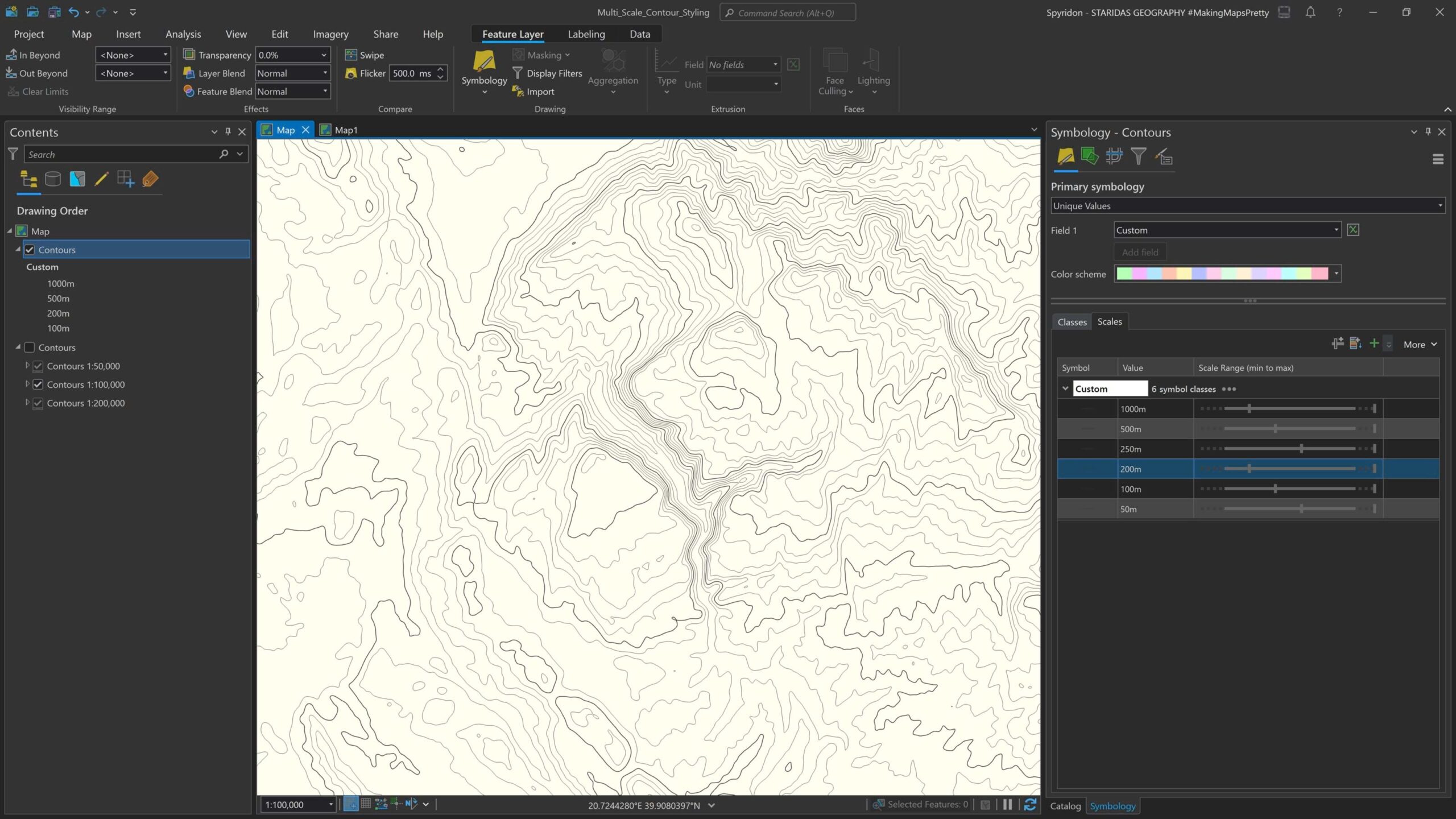
Next, at the Symbology pane I click on the Scales tab next to the Classes tab to open the scale ranges for each symbol class (pic 16).

As shown in picture 16 I have adjusted the scales for each class by horizontally scrolling the equivalent stop on their scale range bar.
For the classes “250m” and “50m” I have assigned the minimum scale to be 1:50,000 without assigning any maximum scale (they will be displayed in larger scales).
For the classes “500m” and “100m” I have assigned the minimum scale to 1:100,000 and the maximum scale to be 1:50,000, so these classes will be visible within this scale range.
Finally, for the classes “1000m” and “200m” I have assigned the maximum value to be 1:100,000 which means that these classes will be visible up to that scale. Optionally, you may also assign a minimum scale for these classes (so they will disappear in smaller scales).
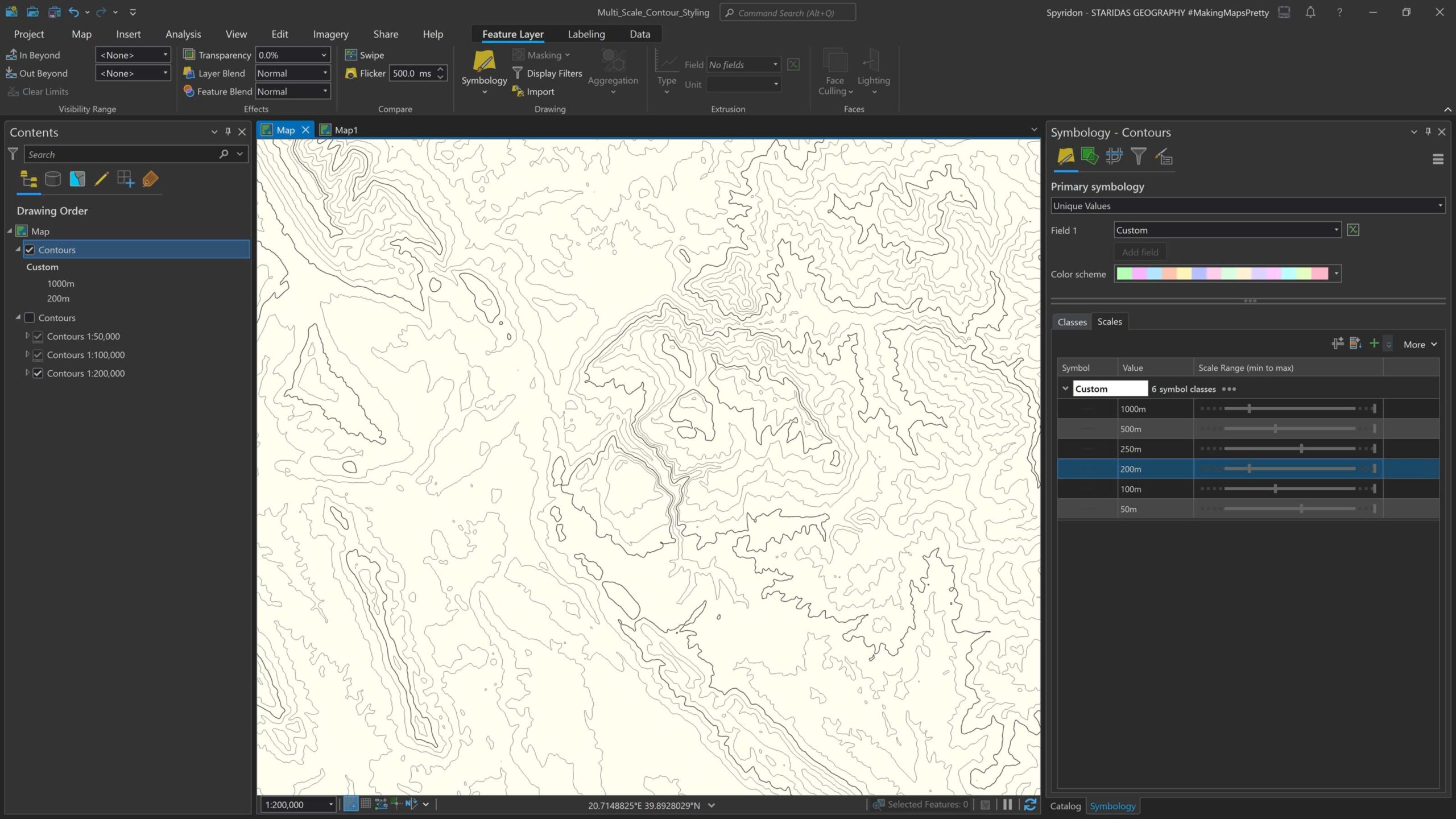
In pictures 17 and 18 you may see how the classes are being adjusted to each map scale, thus changing the correspondent contour interval.
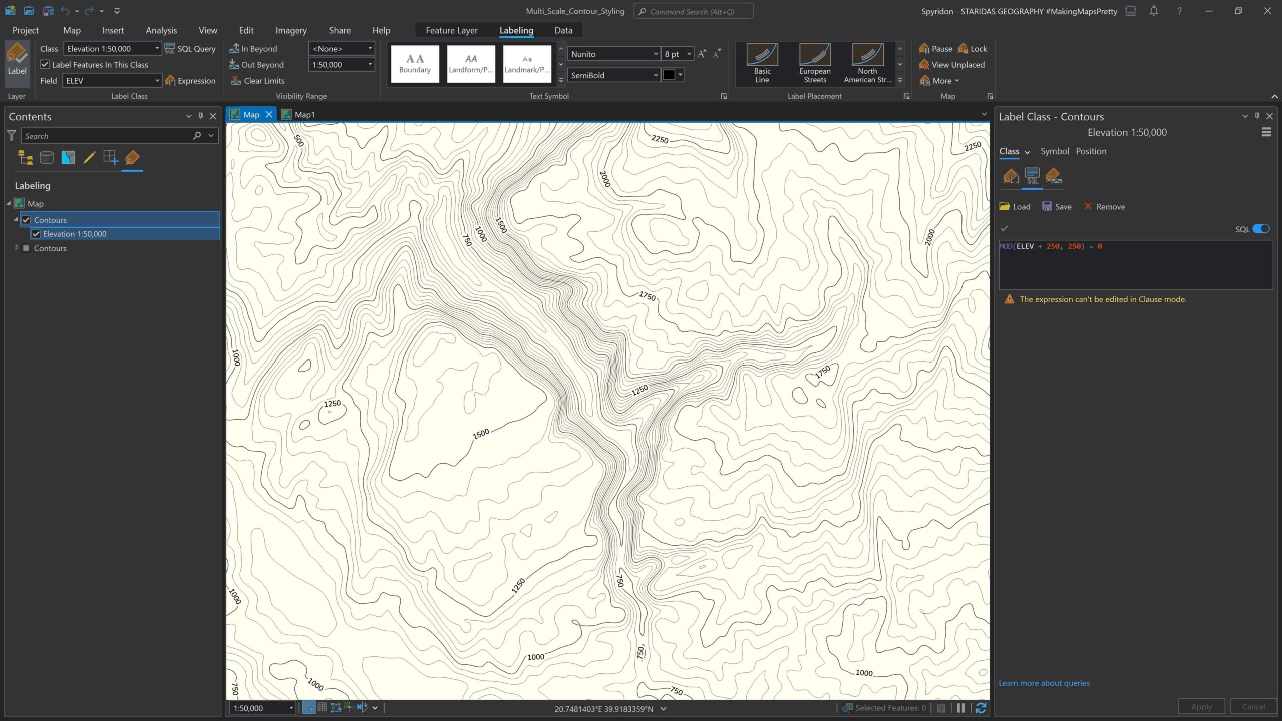
To label this layer in all scales, we need to use label classes and in particular we need to create three different classes, one for each scale.
By default the layer comes with one label class, which I rename to “Elevation 1:50,000”. For this class I select its Visibility Range from the Labeling contextual tab (pic 19) and I also write an SQL query to label only the primary contours at the given scale.
As shown in picture 19, for the minimum scale I have selected 1:50,000 and for the SQL query I have written MOD(ELEV + 250, 250) = 0.
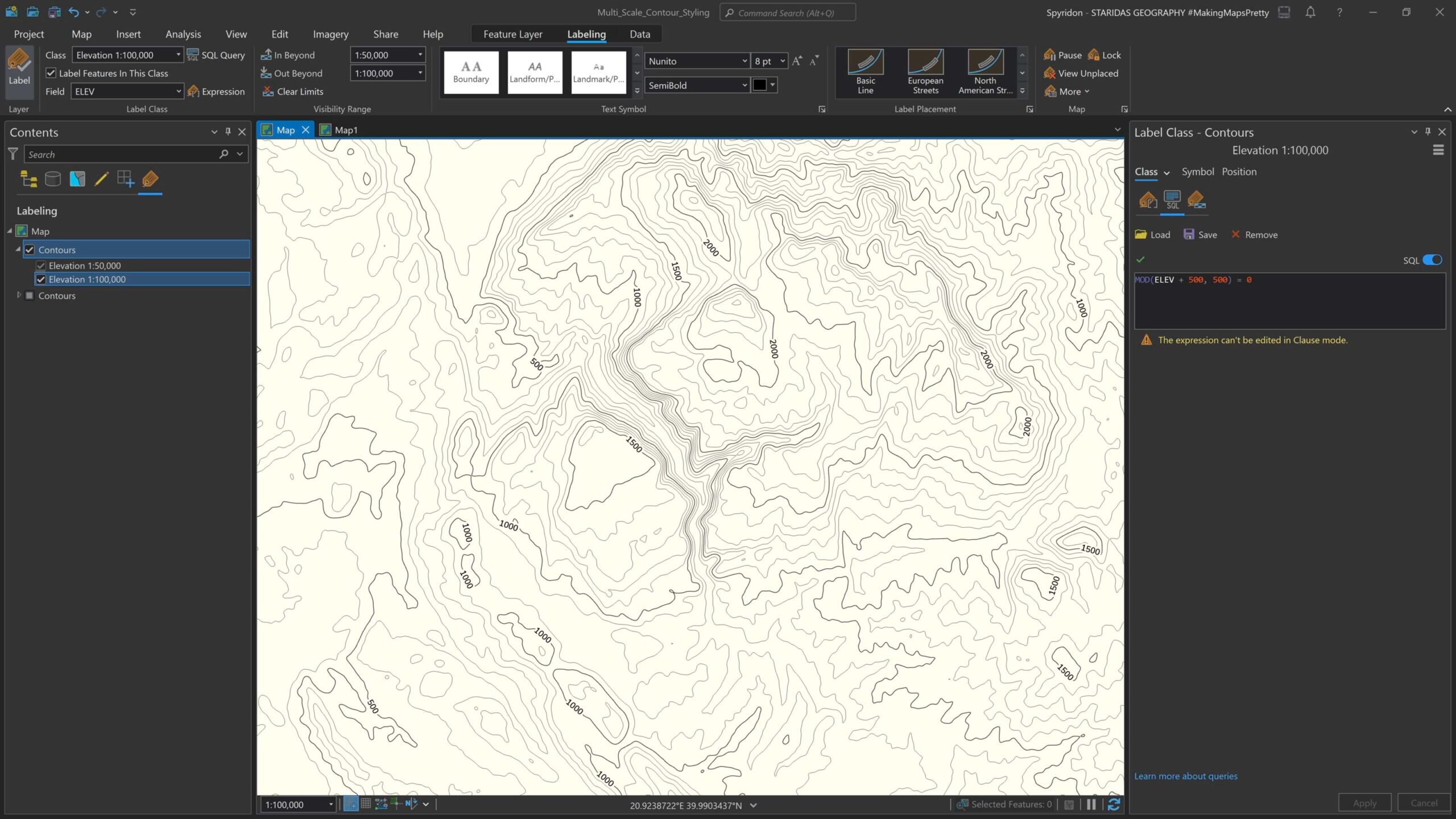
To label the contours for the other two scales I create two new label classes, named “Elevation 1:100,000” and “Elevation 1:200,000”. For each one of these two label classes I adjust their visibility range, as well as the SQL query to label only the primary contours (pictures 20 and 21).
Now when I zoom in and out the map this single contour layer adjusts its interval as well as its labeling!

Crafting contour lines, and their labels, for various scales is one of the many extra miles that a cartographer can walk to make maps as attractive and readable as possible. And, just like nearly everything in GIS, there are multiple ways to go about it. I hope these examples are a useful reference for you as you take your maps to the next interval.

Article Discussion: