Week 1 maps | Week 2 maps | Week 3 maps | Week 4 maps

Every November since 2019, cartographers and map hobbyists around the world have participated in the 30-Day Map Challenge. The Challenge asks participants to create maps based on themes Topi Tjukanov (mastermind behind the Challenge) shares for each day of November. The objective is to create and post maps on social media for as many of the Challenge days/themes as you wish.

This year, the ArcGIS Pro Team decided to join in on the fun. Members from all across the Team volunteered to make a map for every day of the Challenge.

Week 1 Maps
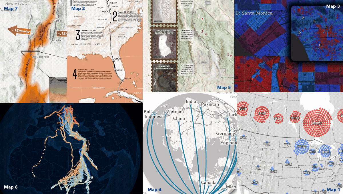
Day 1: Points “Active NHL Players by Birthplace”
Curious to know where this year’s NHL players originate from? Using Arcade in ArcGIS Pro, Peter Atwood developed a clustered points map to show just that!
Day 2: Lines “Drawn by Flight”
Follow the journey of Julie the Osprey from Detroit, Michigan to Maracaibo, Venezuela! Warren Davison, mapped the migration using GPS tracks as lines in ArcGIS Pro to tell a story of endurance and instinct.
Day 3: Polygons “Emergency Response Risk Index in Los Angeles”
Arcade + Census = socioeconomic mapping magic. Lisa Berry highlights areas in LA at risk during emergencies. She created an index-calculated map in ArcGIS Pro using polygons based on five factors like access to internet and vehicles.
Day 4: Data – My Data “Made In”
Using ArcGIS Pro, Aubri Otis mapped the “Made In” labels from items in her house, creating a visual representation of her home’s global connections for the “My Data” theme.
Day 5: Earth “Patterns of Geology”
Inspired by her love of geology and collecting national park postcards, Iza Ogilive created this Earth themed map using John Nelson’s Postcard style and Sentinel-2 satellite imagery in ArcGIS Pro!
Day 6: Dimesnions “Black Stork Migration”
These animations showcase one of the greatest dimensions of all – time! Using Black Stork observations from GBIF in ArcGIS Pro, Craig McCabe compressed 17 years of GPS tracks into 1, to amplify this epic migration.
Day 7: Accessibility “The Rio Grande Rift”
Map accessibility conversations often stop at contrast ratios and text sizes. Jakob Ruffner created this Rio Grande Rift map to demonstrate that the key to achieving accessibility in map design is to consider every aspect of the map design process.
To see the full maps and get extra behind-the-scene insights from the map creators, explore the 30-Day Map Challenge gallery.
Week 2 Maps
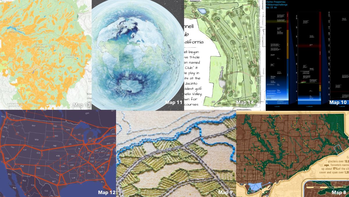
Day 8: Urban “The World’s Largest Urban Ravine System”
Using ArcGIS Pro, Caitlyn North mapped the urban sanctuary that many Torontonians use to escape the hustle and bustle of the city. ArcGIS Living Atlas data and custom symbology brought Toronto’s 1,200 km ravine system to life.
Day 9: Analog “Montreal 1815”
Inspired by 19th-century cartography, Edie Punt swapped out engraved hachures symbology for a beautiful, Montreal embroider map.
Day 10: Air “A ‘Map’ of the Known Atmosphere”
Where does the atmosphere end and space begin? Charles Preppernau explored this question for the “Air” themed day of the Challenge. Using ArcGIS Pro, he mapped the entire measurable extent of our atmosphere.
Day 11: Minimal “Oxygen in the Ocean”
Minimal aesthetic, compelling visuals! Nick Bauch’s map showcases oxygen levels 5m below the ocean’s surface in ArcGIS Pro using data from NOAA’s World Ocean Atlas, Azimuthal Equidistant projection, and Adobe Paper Texture.
Day 12: 2125 “NortAm Rail”
The “2125” theme is about dreaming of the future. Jesse Wickizer wanted to imagine what a high-speed rail network might look like in 100 years. Using ArcGIS Pro, he proposed a cool new way to connect North Americans.
Day 13: 10 Minute Map “Soil Types of Yosemite National Park”
Grace Anderson mapped Yosemite National Park’s soil types in under 10 minutes using ArcGIS Pro and ArcGIS Living Atlas data. New tools like Spatial Definition Query and Search for Colors made for quicker mapping. Come back for day 23 to see the process!
Day 14: OpenStreetData “The O’Donnell Golf Club”
A “Draft Sketch” of a map?! Craig Williams edits a golf course map on “OpenStreetMap”, inspired by working at a course during his teenage years. For this Challenge, he mapped The O’Donnell Golf Club in Palm Springs using ArcGIS Pro.
To see the full maps and get extra behind-the-scene insights from the map creators, explore the 30-Day Map Challenge gallery.
Week 3 Maps
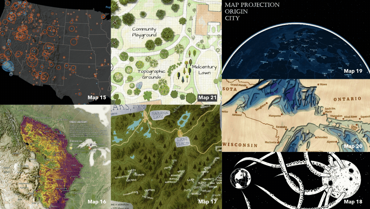
Day 15: Fire “2025 CONUS US Wildfires”
For the “Fire” themed day of the Challenge, Peter Atwood used ArcGIS Pro to map 2025 wildfires in the Continental United States, measured by both the area burned and the number of people living within 2 miles.
Day 16: Cell “Little Hero on the Prairie”
For the “Cell” themed day of the Challenge, prairie dogs take center stage! Warren Davison explores grassland risk and showcases the keystone role these burrowers play in shaping North America’s prairie ecosystems.
Day 17: A new tool “The Adirondack High Peaks, NY”
For the “A new tool” themed day of the Challenge, Anna Hartig pushes creative boundaries by integrating Adobe Fresco into her ArcGIS Pro mapping workflow for the first time, bringing the Adirondack High Peaks to life.
Day 18: Out of this world “Planet Eater”
Watch out Earth, the Moon is a tentacled Planet Eater! For the “Out of this World” theme, Wesley Jones used ArcGIS Pro & the Vector Tile Style Editor to create a dramatic map with black water, white land, and bold lines.
Day 19: Projections “Projecting Projections”
What if you project a projection? Created in ArcGIS Pro using picture markers and a creative twist on the View Dome tool, Nathan Shepard’s animation “pushes” each map projection out from the place it was invented.
Day 20: Water “The Great Lakes”
Wooden lake maps are a classic Midwest cabin decor, often showing bathymetry in thin layers of wood. Noel Peterson crafted 2D &3D digital representations of these in ArcGIS Pro!
Day 21: Icons “Basemap Tree Icons”
From forests to trees, features are uniquely visualized across the different Esri basemaps. Using ArcGIS Pro, Cindy Prostak mapped ways trees are symbolized. Take a “walk” and marvel at the distinctive foliage.
To see the full maps and get extra behind-the-scene insights from the map creators, explore the 30-Day Map Challenge gallery.
Week 4 Maps
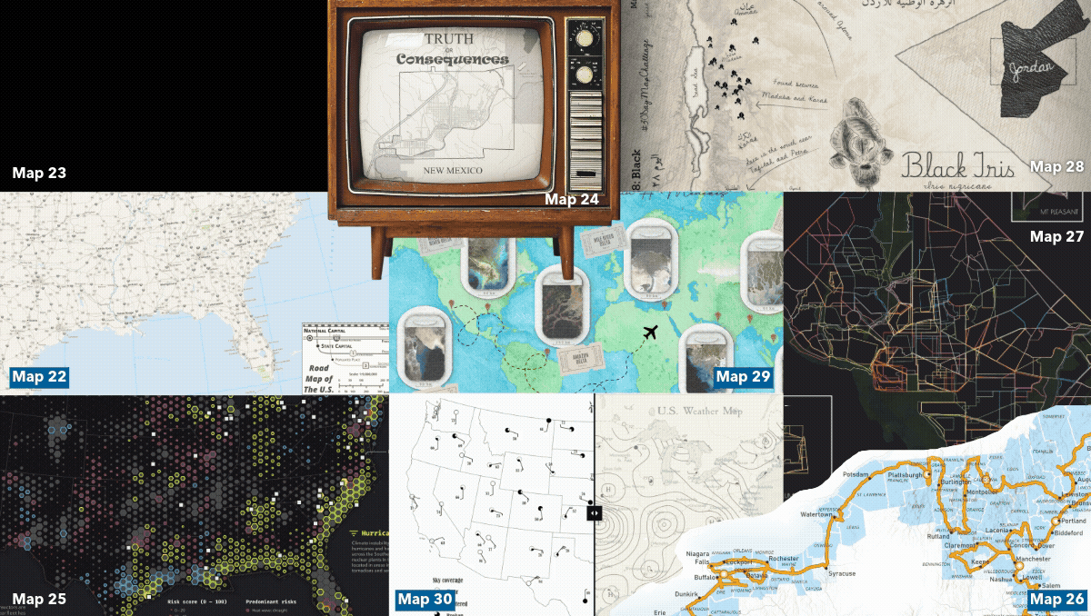
Day 22: Data Challenge – Natural Earth “Natural Earth Map“
Tommy Fauvell built a road map of the U.S. AND a reusable ArcGIS Pro project to help you fully leverage the Natural Earth public domain map dataset. Explore it for yourself today!
Day 23: Process “Making the Soil Types of Yosemite National Park in Ten Minutes”
To prove her day 13 map was built using ArcGIS Pro in under 10 minutes, Grace Anderson created a real-time tutorial video showing the entire process behind her soil types in Yosemite National Park map.
Day 24: Places and their name “Truth or Consequences”
For the “Places and their name” themed day of the Challenge, Aubri Otis used ArcGIS Pro to map Truth or Consequences, New Mexico, a town that boldly changed its name in 1950 for a TV game show deal.
Day 25: Hexagons “America’s Nuclear Fleet Faces Intensifying Climate Threats”
For the “Hexagons” themed day of the Challenge, Cooper Thomas used ArcGIS Pro to examine three critical environmental risks threatening U.S. nuclear power plants and their vulnerability to climate hazards.
Day 26: Transport “A County Collecting Summer Voyage”
For the “Transport” themed day of the Challenge, Greg Lehner used ArcGIS Pro to map his 2025 summer county collecting journey, tracking visits towards his goal of collecting all 3,144 U.S. counties!
Day 27: Boundaries “Washington D.C. Neighborhoods”
We all have mental maps informed by our favorite spots. Valeria Chavez spent time before the Challenge gathering local interpretations of neighborhood boundaries in Washington, D.C., and this map is the culmination!
Day 28: Black “Black Iris”
Five years in Jordan left Jared Kohler fascinated with its rare national flower, the Black Iris. Incorporating ArcGIS Living Atlas iNaturalist + GBIF data in ArcGIS Pro, he mapped recorded sightings across the country.
Day 29: Raster “Where Rivers Meet the Sea”
Flying Delta Air, Elizabeth Menezes thought, “It’d be funny to map Deltas on Delta using the plane’s map console.” Inspired, she brought the idea to life in ArcGIS Pro!
Day 30: Makeover “U.S. Weather Map”
A few summers ago, at the Esri UC, Zihan Song presented the process of making a wind map, mainly showcasing function over aesthetics. So, the “makeover” theme was the perfect opportunity to use ArcGIS Pro to tell a more compelling story.
To see the full maps and get extra behind-the-scene insights from the map creators, explore the 30-Day Map Challenge gallery.

Commenting is not enabled for this article.