Every map has an inherent Area of Interest; it’s the part you want people to look at, to focus their attention. Sometimes maps benefit from a bit of visual assistance in marking out just where it is the map is about. There are lots of cartographic techniques that help us draw the eye to just the geographic areas in question. Helpers. Visual aids. Look-here-nevermind-there. I’ll call them AOIs, for brevity. See Greg Fiske’s Instagram feed for some particularly artful examples (just not right now!). In the meantime, let’s take a stroll down AOI lane in ArcGIS Pro. Where helpful, I’ve included a screenshot of the symbology settings for the AOI and/or Non-AOI layers so you can get a look behind the curtain…
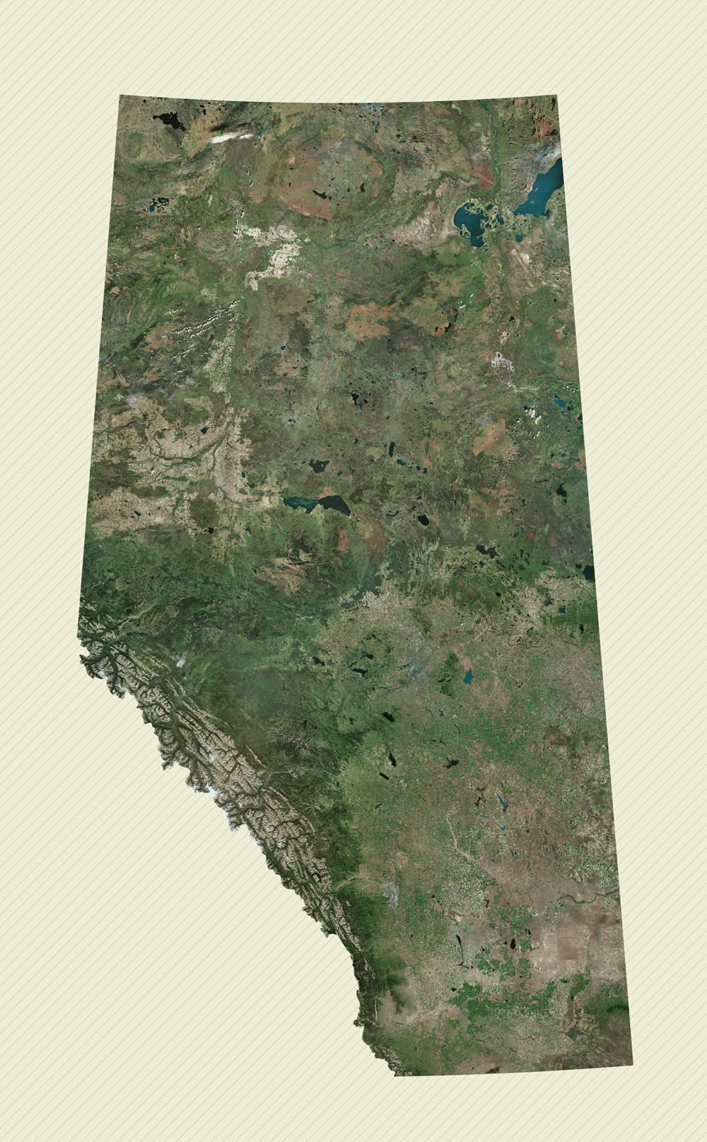
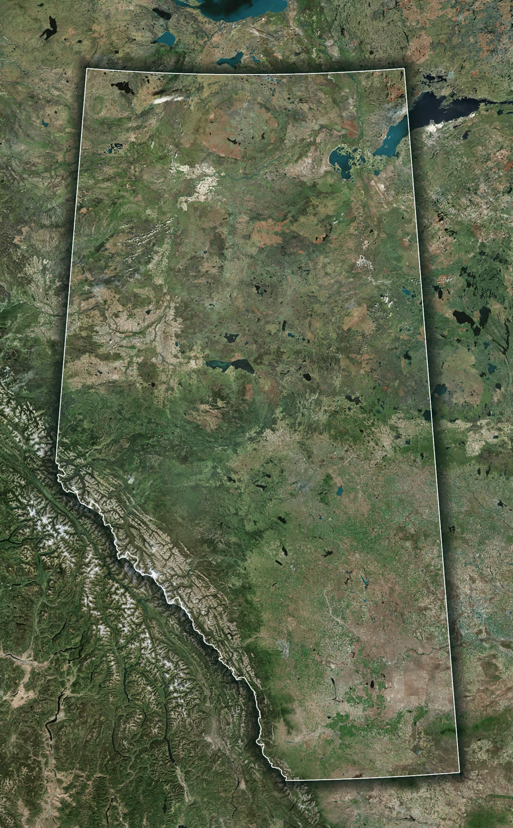
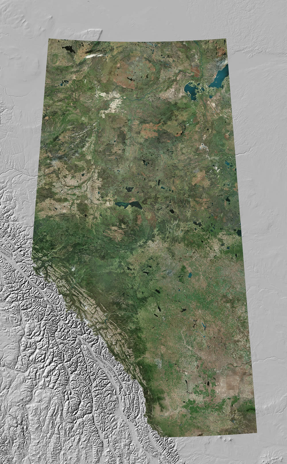
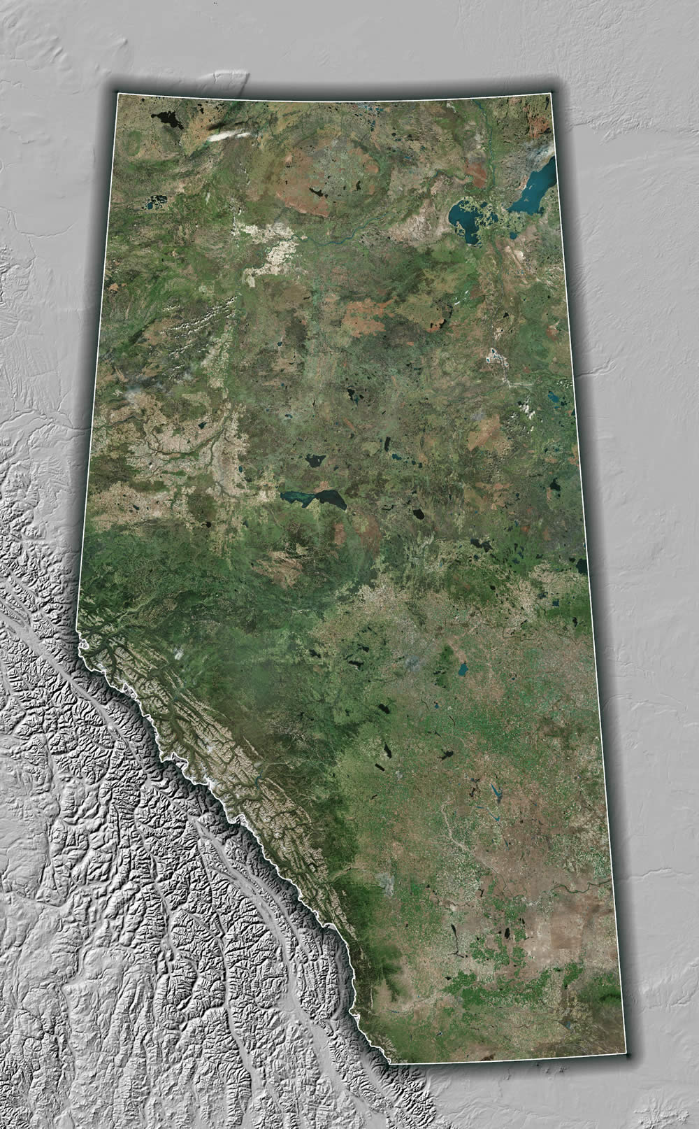
Here is the beautiful Canadian province of Alberta.
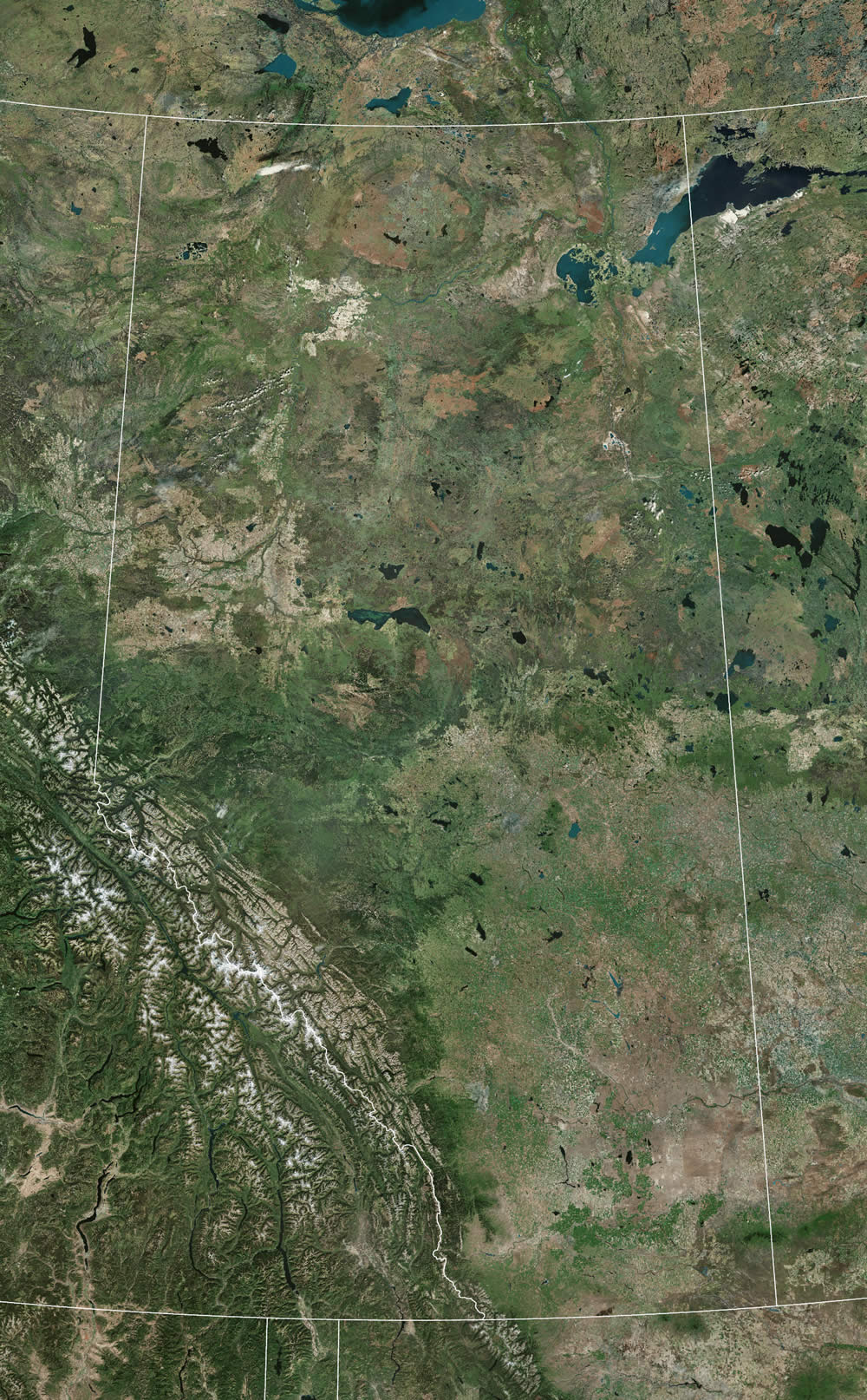
It’s the one there in the middle. Let’s see, how can we make this more obvious? How about we give the non-Albertan provinces a solid fill (you can hide Alberta with a “definition query”).
Opaque Overlay


There is now no question regarding what part of the map at which we should be looking. (That was a grammar jab. Sometimes avoiding ending a sentence with a preposition is just ridiculous.)
Anyway, there is a pretty abrupt transition of deep texture to solid fill. Maybe we can make the cartographic choice to break up that transition with some faint hatching?
Opaque Overlay with Hatched Fill
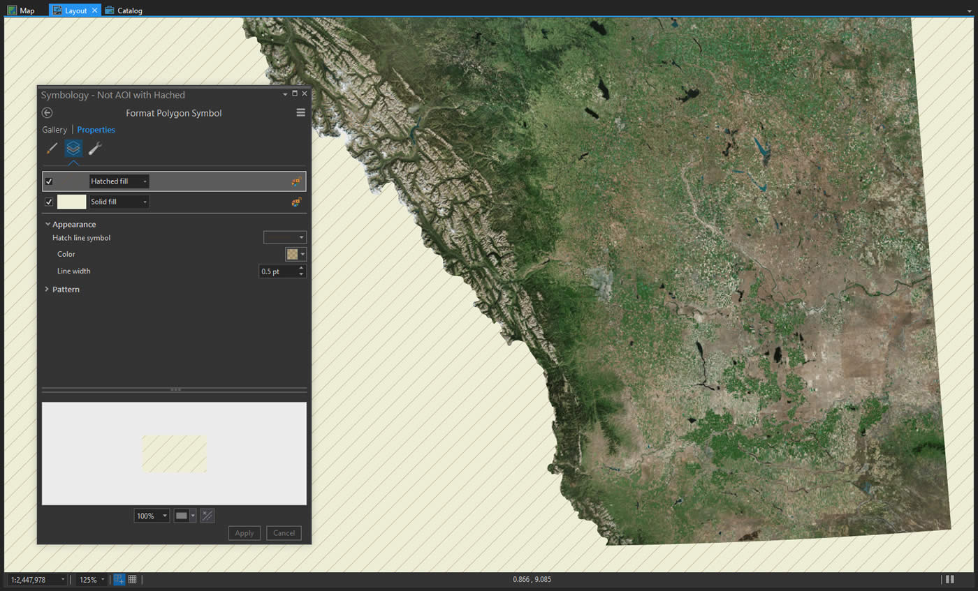
Not bad. Depends on your taste, really. In cartography there is never just one right way to do things. Maps can take on all sorts of forms and styles and be equally valid.
So I’m looking at this and I admit that I have removed all locational context for Alberta. Sometimes that’s ok, but sometimes you want to show a bit of the area around the Area of Interest. I mean, Alberta could be an island for all we know. It’s not. What if we make the non-Albertan provinces semi-transparent, so we can peek through them a bit?
Semitransparent Overlay
![]()
![]()
The focus of the map is still clearly Alberta, but now we get a sense for its neighboring topography and boundaries. This is a common method used by journalists. They tend to use light colors for washing out non-AOI content, because of the context of their digital style sheet, and because dark is harder to print. But if you don’t have those restrictions then it’s worth trying out painting the non-AOIs with a dark tone.
Semitransparent Dark Overlay
![]()
![]()
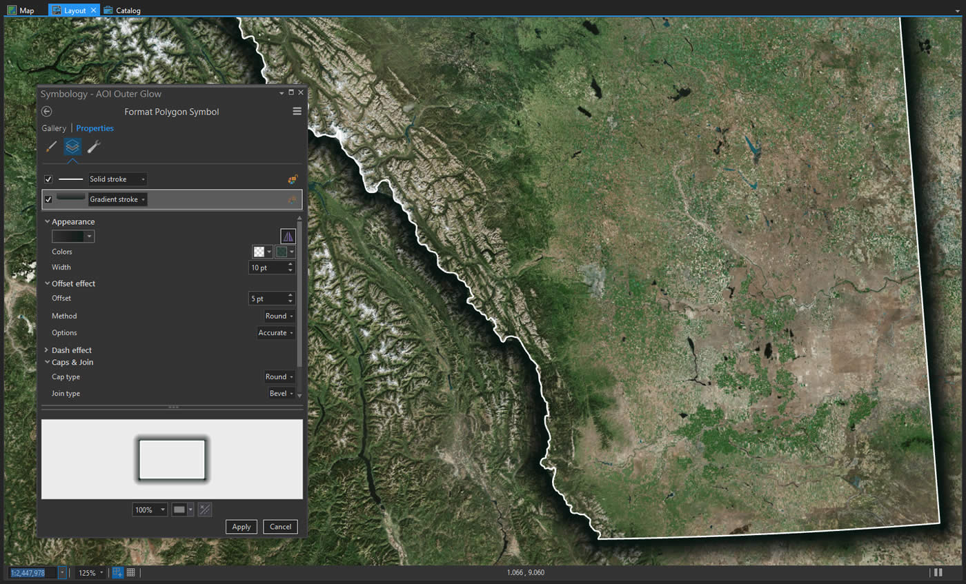
That looks pretty good, too. Whether dark or light or given to some hue, sometimes the content within your AOI appears to blend into the non-AOI areas. So you could consider adding a thick stroke around your AOI, to make its visual primacy extra zingy. Here’s an example using a ribbon-like semitransparent yellow stroke…
Outer Ribbon with Semitransparent Overlay
![]()
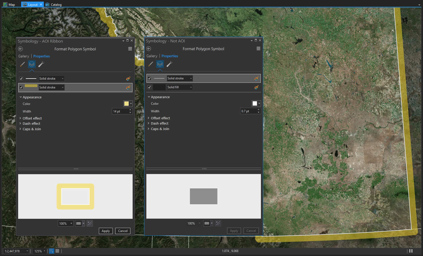
Because this semitransparent outline is so wide, I gave it an offset equal to half its thickness. This ensures that it renders outside of the boundary, drawing visual priority to, but not covering, the AOI. I also gave the AOI a thin white stroke to clearly define the border.
So when I look at this thick yellow ribbon I wonder if I can make it look more like a shadow. Instead of a “solid stroke”, you can make it a “gradient stroke” where it starts more opaque then fades out to fully transparent, like a shadow or dark glow.
Outer Gradient with Semitransparent Overlay
![]()
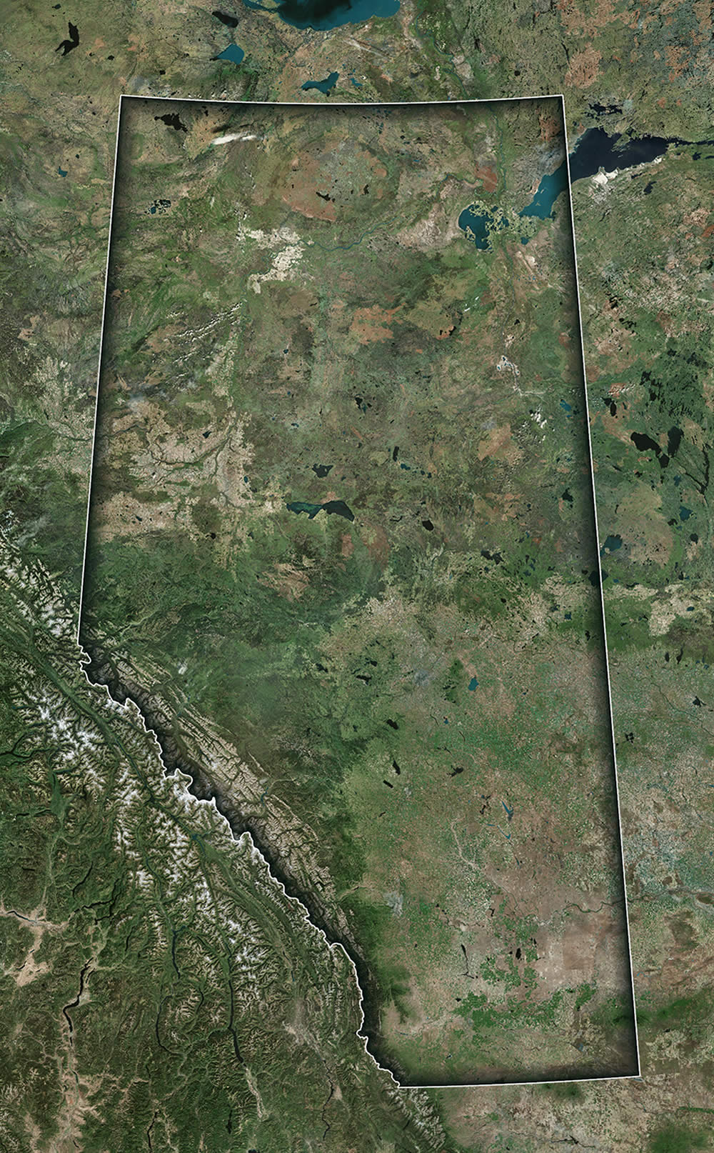
One of the primary jobs of a map is to establish a visual fore/ground hierarchy of content. What’s most important? How to layer the content naturally? The outer gradient is a literal cue for making your AOI elevate from the background. And it looks pretty cool. Is it enough to establish the AOI on its own, without the semitransparent overlay?
Outer Gradient
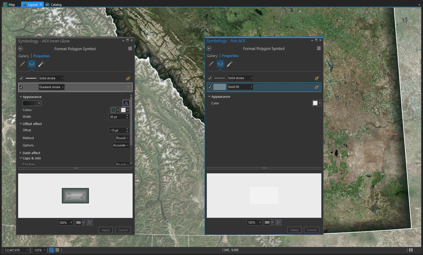
Sure, that works too. Though you do allow in all the visual complexity of nonAOIs. Up to you. Say, what if we lived dangerously and reversed the gradient so that it drew into the AIO rather than outside of it?
Inner Gradient
That’s actually sort of interesting! It breaks the fore/ground rule, though, since it appears that your AOI is getting tamped down below your non-AOI. But I think if we bring back a semitransparent overlay, we can mitigate some of that…
Inner Gradient with Semitransparent Overlay
![]()
That’s fun. The important thing is that we’re playing with options, combining different techniques, and seeing for ourselves what works. That’s mostly what mapping is, and where lots of the adventure lives.
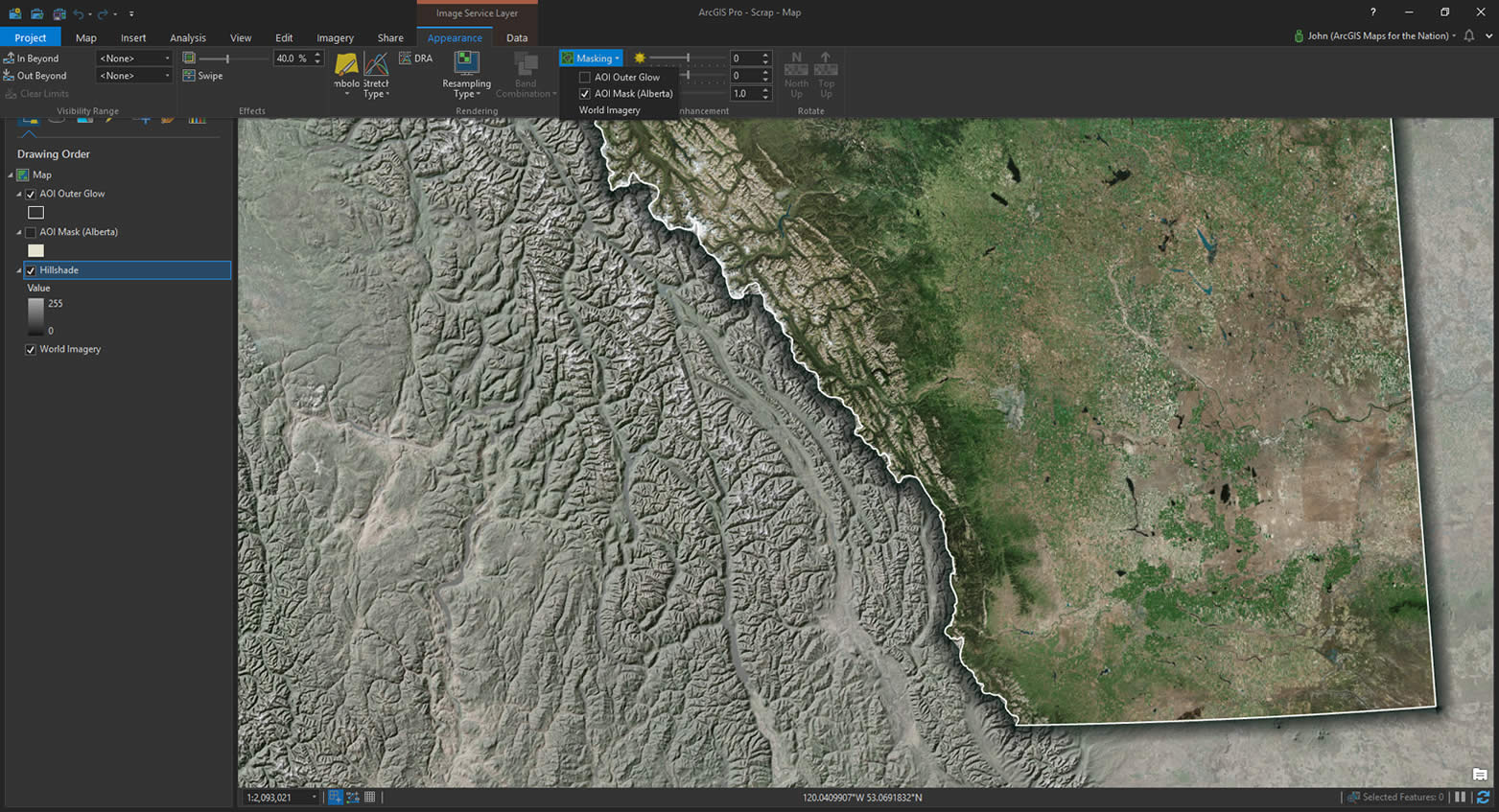
Let’s try something else entirely. In the map below we’ve got two layers: A hillshade layer and an imagery layer. I’ve masked the shape of Alberta out of the hillshade layer so that you can see through to the imagery beneath…
Masking
Hmmmmm cool! We get the topographic context of the surrounding areas without overpowering the AOI with competing imagery detail. What if we brought back the dropshadow effect?
Outer Gradient with Masking
I like that better. It just gives more of a sense of primacy to the AOI. The hillshade layer can be pretty stark. What if we made that masked hillshade layer semitransparent, so you could see a bit of the underlying imagery texture but still visually distinct?
Outer Gradient with Semitransparent Masking
![]()
Here’s a look at how you can mask layers in Pro. Select the layer to be masked, in the “Appearance” tab, choose the polygon layer you want to be the mask. Then the layer below will show through. You can adjust the masked layer’s transparency in the Appearnce tab, too.
Shoot, look at that. That’s not bad either. We still get a sense of the landcover but the semitransparent grayscale hillshade pushes back the colors and paints in a bit of topographic interest. Alberta is still clearly the subject of this map, but there is still helpful contextual information about the surrounding areas.
So many options. But the good news is that you and I get to make maps all the time and we’re always learning cool new ways to let them communicate all the good stuff they have to tell us. This was a whirlwind tour of a handful of ways to make your map’s Area of Interest visually distinct but there are loads others that I didn’t think of. Feel free to point me at (Twitter, Instagram) other examples, or if you try any of these out also let me know. I’d love to see them.
Happy Area of Interest Mapping! John Nelson

Commenting is not enabled for this article.