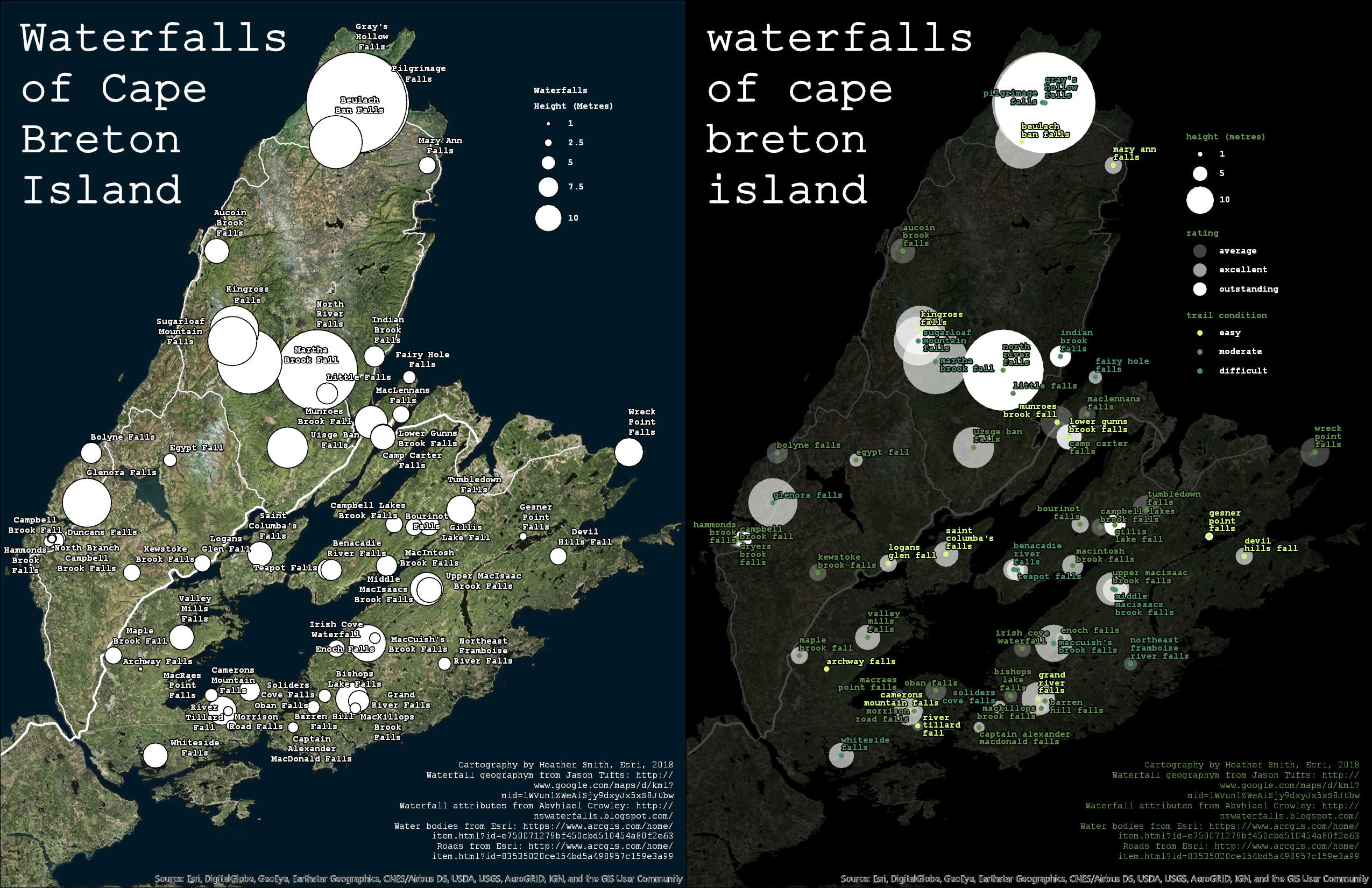
In Part One of this tutorial, we used ArcGIS Pro to transform this map of Waterfalls on Cape Breton Island in Nova Scotia, Canada:
In Part Two we will push the cartography even further:
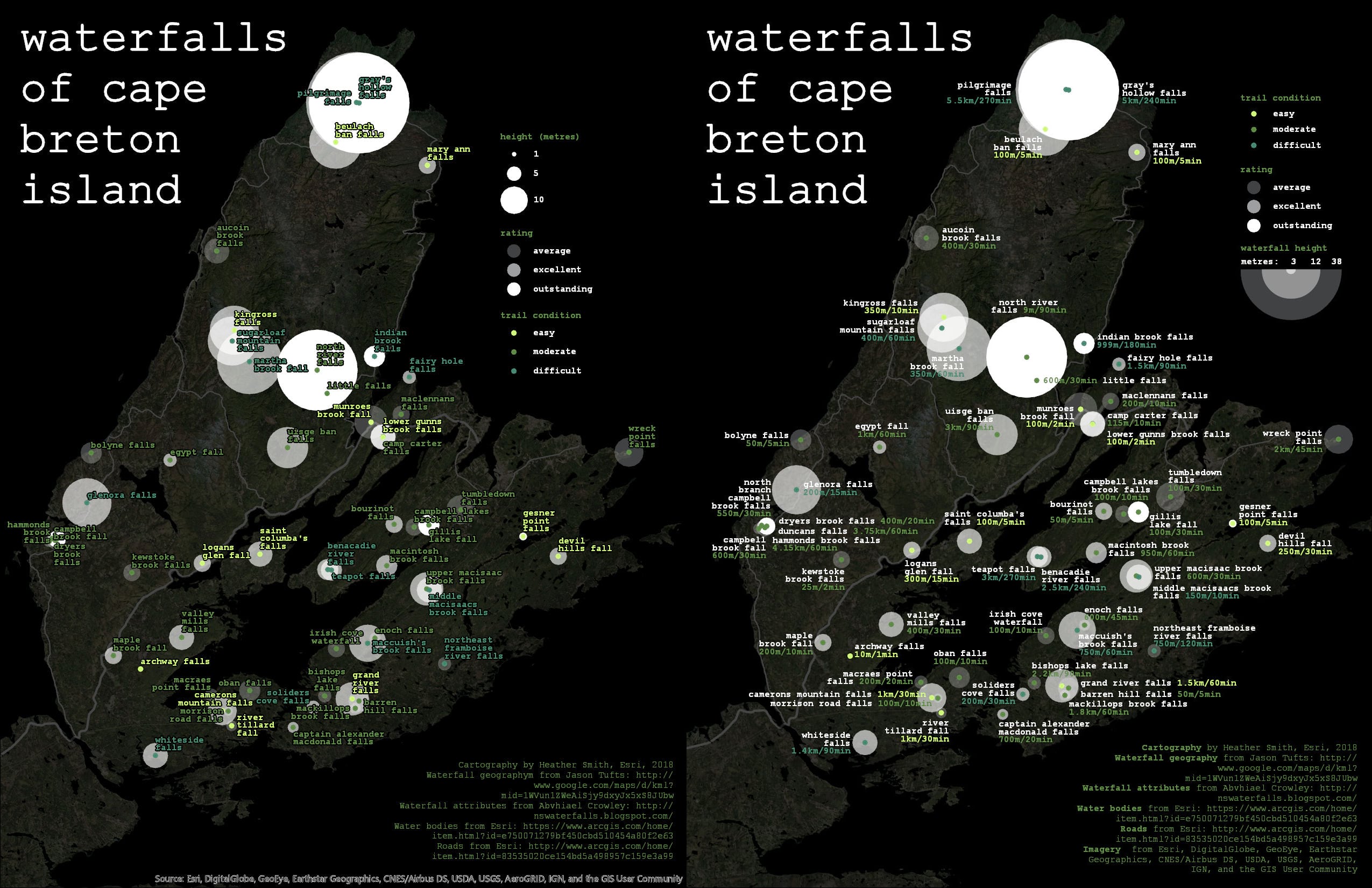
Part two is for the map maker who has the extra time to make their map extra nice.
WHY???
- Because you love making maps.
- Because you’re kind of a perfectionist.
HOW???
- Show more information in the labels by building label expressions.
- Control text placement by converting labels into annotation.
- Create a custom legend using graphics.
- Control the appearance of the credits text.
You can use Map 2 and Layout 2 from this project package as your starting point. You can refer to Map 3 and Layout 3 for the finished product. (Closed maps and layouts can be found on the Catalog pane > Project tab)
1. LABEL EXPRESSIONS
Ok first things first: I don’t like those black outlines on the labels. I just pretended to like them for the last tutorial, but really they were just a compromise. I also decided to show even more information about the waterfalls in the labels. I wanted to list the trail distance and hiking times. In order to accomplish these things and still have legible labels, you need to do two things:
- Write label expressions to make the different parts of the labels distinguishable from one another.
- Convert the labels into annotation so you can control the position of each piece of text.
On the Contents pane, switch to the List by Labeling view to see the three Waterfall label classes.
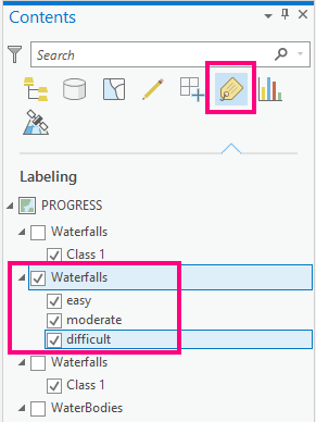
On the Labeling ribbon you can see that all three classes are using the Name field. Click the label expression button.
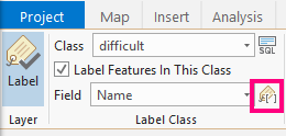
This will launch the Label Class pane to the Label Expression view. If it is not already, set the language to Arcade. The current expression is $feature.Name. Replace it with this fancy expression:
if ($feature.Distance_metres >=1000) {
"<CLR red='255' green='255' blue='255'>" +
$feature.Name + "</CLR>" + " " +
$feature.Distance_metres/1000 + "km/" +
$feature.HikingTime_minutes + "min"
}
else {
"<CLR red='255' green='255' blue='255'>" +
$feature.Name + "</CLR>" + " " +
$feature.Distance_metres + "m/" +
$feature.HikingTime_minutes + "min"
}
This will make the name of the waterfall white, and add the distance and hiking time for each in green. It is an if statement because some distances are labeled in meters and others in kilometers.
Learn more about writing label expressions here: Specify text for labels.
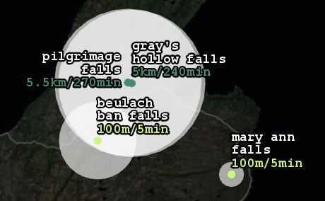
Now get rid of those black halos. You can do this on the Symbol tab of the Label Class pane.
2. ANNOTATION
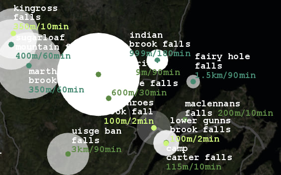
Perhaps you have noticed that you can’t read the while text on top of the white circles, and the labels are far too crowded.
Convert Labels to Annotation, using the button on the Map Ribbon.
Set the conversion scale to 1:700,000 (to match the map’s referance scale) and choose the Waterfalls.gdb as your output geodatabase so the new annotation feature class will be stored in the same place as all the other data. Set Extent to Default to make sure it converts labels from the entire map.
A new group layer called GroupAnno will be added to the map, and labeling is turned off for the Waterfalls layer. The appearance of your map will not change, but now you can now edit the labels as if they are graphics!
Open the Edit ribbon, and select a piece of text on the map to edit it:
• Use the Move tool to rearrange the labels.
• Launch the Attributes pane from the Edit ribbon to adjust stacking and alignment.
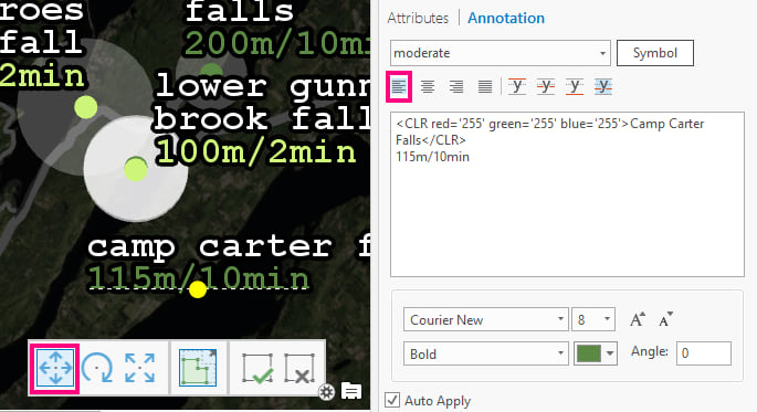
Do this for as many labels as you need to in order to make the map legible. Or do it for all of them if you enjoy editing annotation. Don’t be afraid to deviate from your pattern in places where the features are particularly dense.

3. LEGEND
Open Layout 2. The legend for waterfall height can be improved. For one thing, the largest waterfall on the map is 38 meters tall, not 10. Remove the first Waterfalls item from the Legend in the Contents pane.
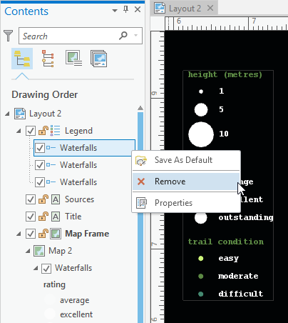
From the Insert ribbon, add a Point graphic.
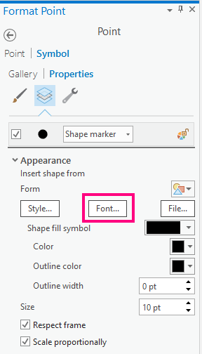
Double click on the Point in the Contents pane to open the Format Point pane. From here you can symbolize it the same way you would symbolize a feature on your map.
Navigate to the Font… button:
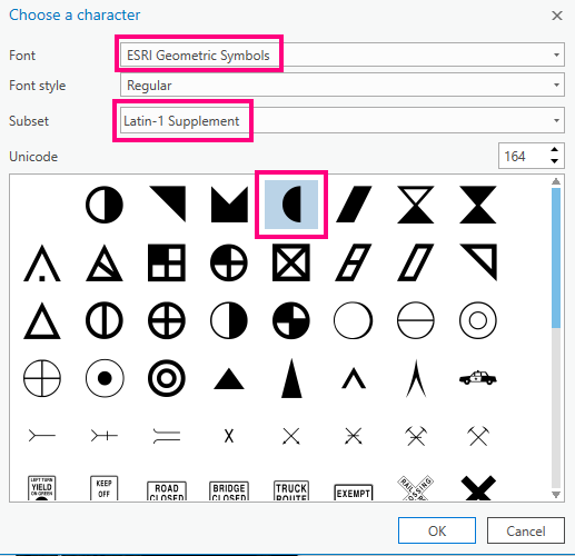
And find this half-moon shape:
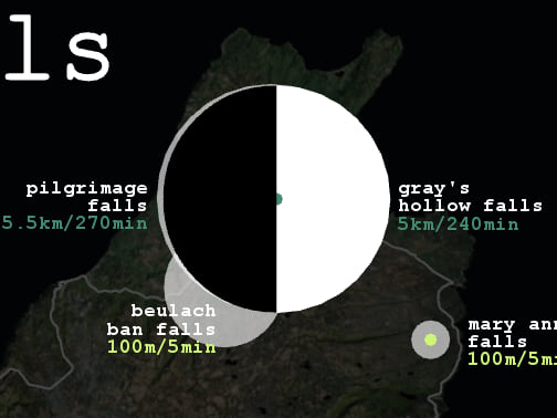
Find the largest symbol on your map (Gray’s Hollow Falls or Pilgrimage Falls). Drag the half-moon graphic on top and scale it until it matches the waterfall symbol in size.
Make two copies of this half moon graphic and scale the other two to match a small and medium sized waterfall from the map. Take note of which waterfalls you used as reference so you can look up their heights!
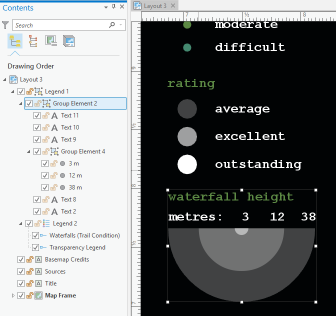
Change the color of all three graphics to 50% transparent white, and the rotation to 90°. Position them on top of one another and add graphic text to complete your custom proportional-symbols legend:
4. CREDITS
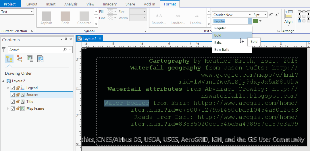
Select the credits text on the layout. Highlight select parts of the text and change them to bold on the Text Format ribbon.
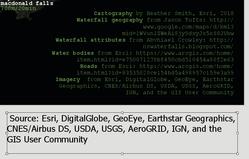
On the Insert Ribbon select Dynamic Text and choose Service Layer Credits.
Now that white text at the bottom of your layout is dynamic. Move it off of your map and add that information to the rest of your credits text. This way you are still giving credit where credit is due, but not disrupting the visual style of your map.
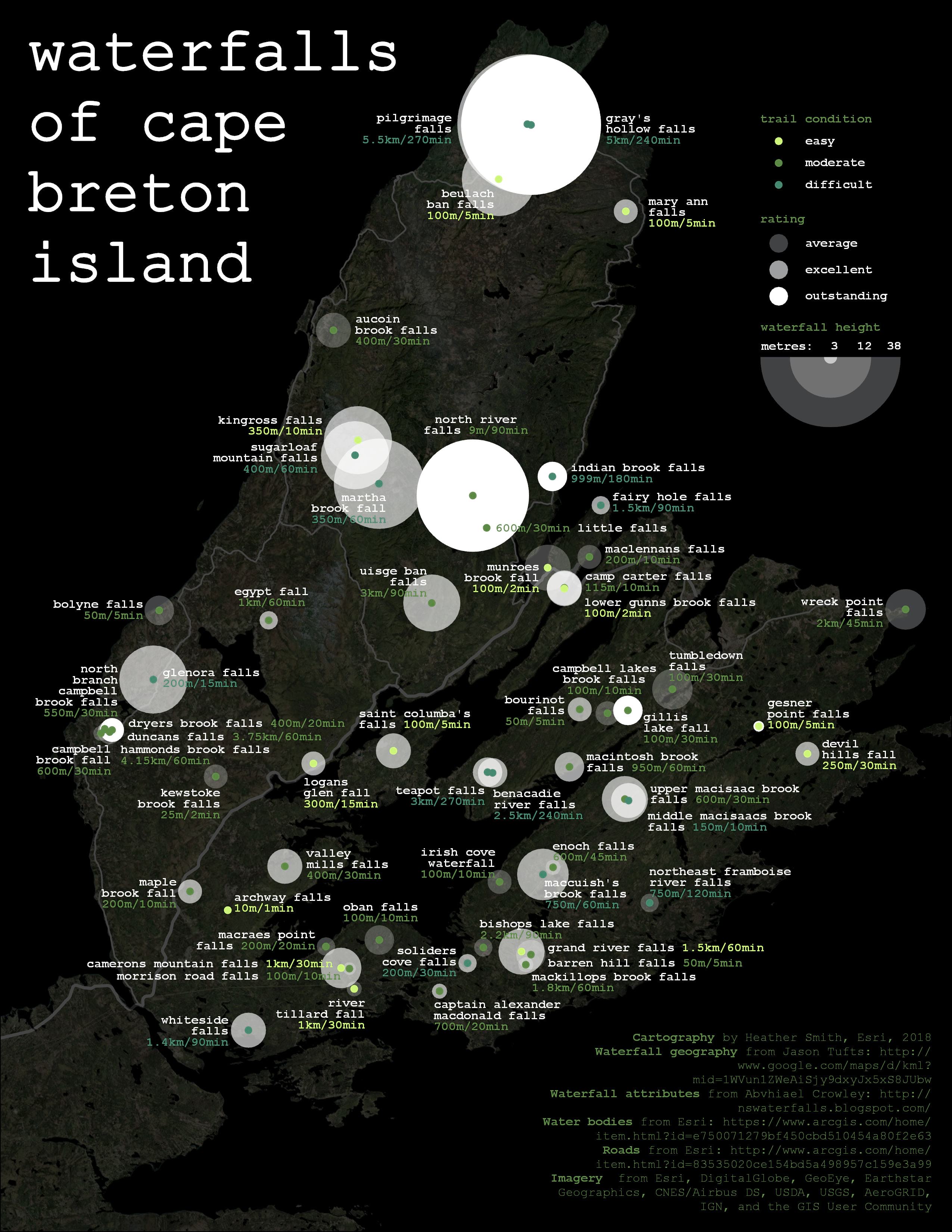
The finished map looks like this:
And here’s a review of how we got there:
- Make multicolor, multi-attribute labels using Arcade label expressions.
- Convert labels into Annotation for precise placement control.
- Create a stacked proportional symbols legend using layout graphics.
- Customize the credits text.
Could you do even more? Sure! Some other things I always consider adding when making a polished map include:
- An inset/key/locator map to tell the map reader just where in the world they are looking at.
- Descriptive text to highlight and describe the most interesting features or patterns.
- Illustrations.
But I think this waterfall map is full enough as it is. We’ll leave those fun extras for another project.

Commenting is not enabled for this article.