Hillshading is a gloriously delicious endeavor for any map nerd. But, as is the case with any digital pursuit, it’s in the pushing aside of the defaults that the real devious stuff can happen. In this post we will slide down the rainbow and look for an interesting optical/chromatic effect for our crafty hillshading shenanigans in Pro using only one source layer from the Living Atlas and the hillshade Raster Function.
Spoiler Alert: I’ll make three hillshade layers, each with an offset sunlight angle and given an offset (you know, like on the color wheel) color.
Data
Ready? Ok, in ArcGIS Pro, I’ve added the “terrain” image service from the Living Atlas. It’s a digital elevation model (DEM) that scales with you as you zoom and navigate. And the Living Atlas team is always working to add more and better data over time, which rules. It’s a great resource and I use it all the time. You can add Living Atlas content right from the “Add Data” browser in Pro.

Looks like this. I’ve zoomed into the Great Glen Fault in Scotland, which I would like to see IRL someday.

If you’d rather work with a local file that you’ve downloaded, you can wield your GIS on these dutiful SRTM elevation images.
Hillshade
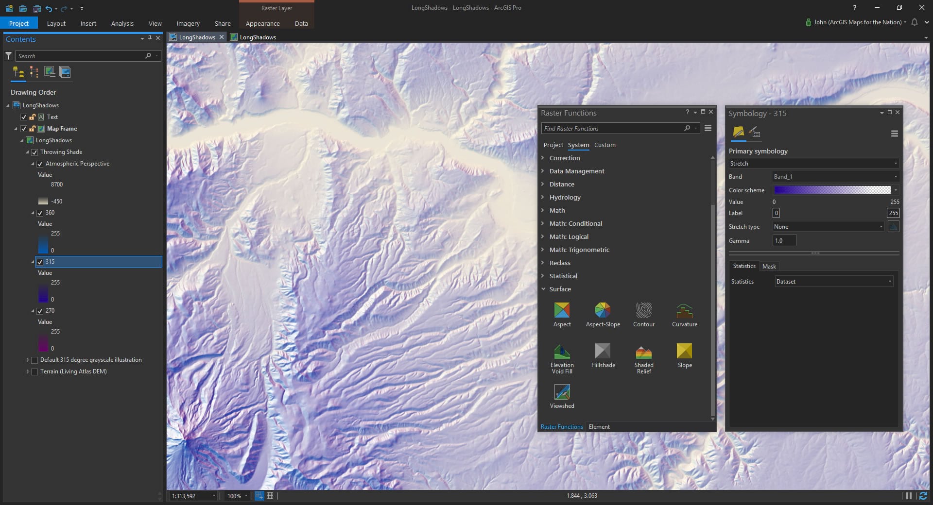
Next I’ll run the traditional hillshade tool from the Raster Functions. It’s a shockingly fast renderer that calculates the virtual hillshade on the DEM image service and shows it to you in Pro (without having to save a new layer).
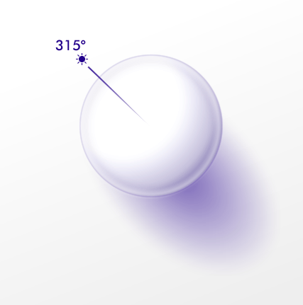
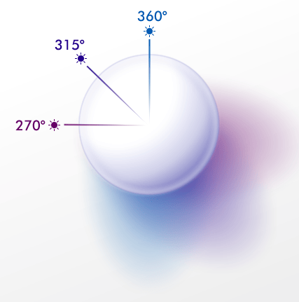
So here is an illustration of a traditional single light source hillshade. Trusty old 315° (northwest) light source and grayscale color scheme.
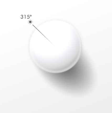
Which looks like this when applied to the elevation image service…

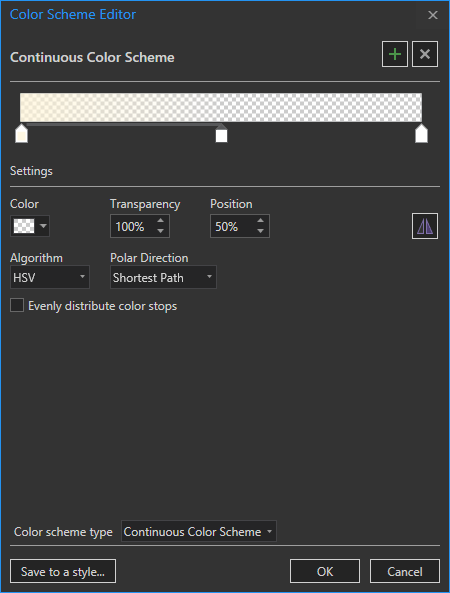
That’s cool and all (grayscale is actually a great default), but in real life shadows just aren’t perfectly black and light isn’t perfectly white. And light doesn’t come from an impossibly precise single direction. Defaults are not the boss of us. In this case I’ll go with a cool royal blue of #23008C (shorter wavelengths are more prone to scatter) that transitions into full transparency at a position of 85% (since I’ll be stacking up a couple more hillshade layers so I want to give the “sunlit” areas a bit of breathing room).
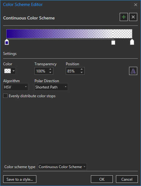
If we go back to our handy little hillshade illustration graphic, you can see the shadows now have that royal blueish color.
Oh my goodness, what a cute little illustration graphic. This really helps illustrate hillshading orientation and color. Oh, thank you! That’s very kind of you to say.
Looks like this…

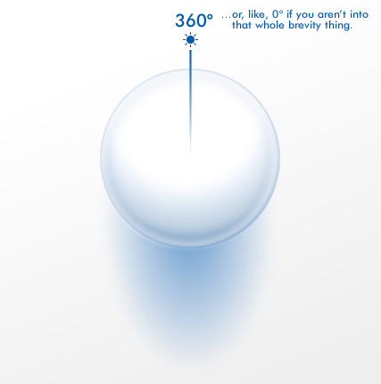
Next I run the same hillshade raster function, but this time I give it a light source from straight north. And I give the hillshade a more bluish green color (#0059B2). When you do this sort of manual layered hillshading, it works best if you use colors next to each other on the color wheel, which echoes the way that you choose neighboring angles for your hillshade layers.

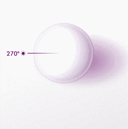
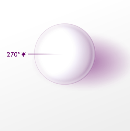
Next I’ll create a third hillshade layer, this one with a light source straight from the west.

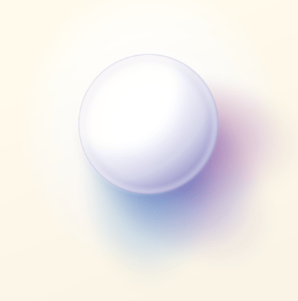
And since all these hillshades have a lot of transparency, just go ahead and turn them all on at once! The result is a sort of nuanced little dance of merging colors and light angles. A little more like how real life works.

Atmospheric Perspective
Lastly, we’ll just drag the original Living Atlas Terrain DEM layer up to the top and give it a new color scheme. We want to replicate the effect of atmospheric perspective, where things in the distance are less visually distinct because we’re looking through more air to see them. I’ve chosen a khaki color (#FFF5D7) that is opposite the hillshade hues on the color wheel and given the stops a lot of transparency.
This warmness helps to balance the coolness of the hillshade colors and the chromatic contrast helps differentiate it from shadow, pulling high elevation areas up and pushing low elevation areas down.

And that’s it! Instead of a rather sterile impossibly precise hillshade you have a landscape of varied hues. The variation actually gives the brain another cognitive dimension (hue) to process the illusion of surface topography.
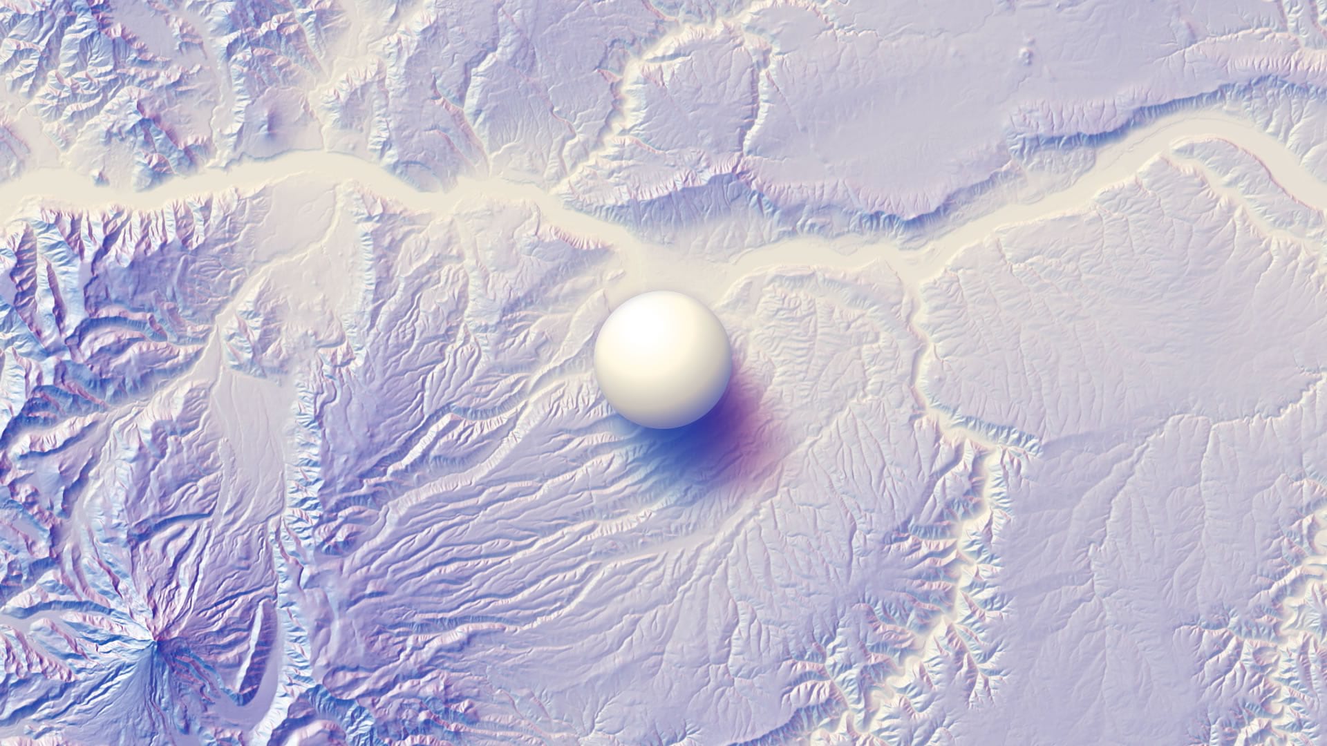
And here is the Columbia River Valley overlain with that adorable little PhotoShoppy doodad illustration cue ball thing…
Can you use different colors? Sure! Just try to choose a series of colors that are consecutive on the color wheel (and an analogous color for the mist). For example, here is a version using spring greens and amber hillshades with a chilly violet mist…

If you are thirsty for more, then check out this gallery of more examples I’ve made of different parts of the world with different hillshade hue combinations. Get ready to live.
Multidirectional Hillshading
So all of this is the basis of the “multidirectional” hillshading option available in the Raster Function’s hillshade menu. And it uses way more directions, which is cool. Though because the resulting multidirectional values are flattened into a single band color scheme, we lose the variation in directional done that the hack I’ve described here gives. You can apply a multi-colored color scheme to a multidirectional output, but it will look different than this.
Parting Thoughts
Thank you, first of all, for spending a bit of your allotted time on this earth with me as we goof around with making interesting pseudo-realistic hillshade techniques. I really do appreciate that, and hope you share your results if you choose to give it a go. Mostly, though, I hope you give defaults a strong critical look. I like to say that the people who determine software defaults are the most powerful people in the world. As one who participates in making maps, there is tremendous joy in contributing active choices for each element of our map design. Taking a moment to invest in your skills and creative urges will make you a better and more engaged map maker, and more connected to things you didn’t suspect had anything to do with maps. Whether or not your initial pursuits make it directly into a production map design is less important.
Happy Adventuring! John

Commenting is not enabled for this article.