Here is a ridiculous walking distance map of Seattle. The geography of areas accessible via a 1, 2, and 3 hour stroll are warped into concentric rings. While it looks like an ice cream cone on a hot day, its actually a pretty practical map -if you’re a pedestrian.

What’s Real?
If our reality is walking, which it often is, then this is the most realistic look at Seattle going. It’s a reminder to me that all maps are a compromise between literal spatial reality, our practical spatial perceptions, and the map reader’s goals. Maps are just little communication devices, and I need to ask myself all the time, what is the most important purpose of this map? It’s always a tightrope between a sense of precision and the message that a map carries to its reader. It can be easy to fixate on the former at the expense of the latter. I like this time warp map because it’s an especially inflated example of that. Like Gallagher and a watermelon.
Where Did It Come From?
In 2011, in a brightly lit little office in the Geography building of Michigan State University, Kirk Goldsberry showed me a yellowed old draft manuscript of Waldo Tobler’s (covered in his hand-written notes; it was awesome) in which he’d diagrammed a map of Seattle this way. I always wanted to try it but wasn’t sure about how.
At some point it occurred to me that I could hijack the georeferencing feature to warp, like a rubber sheet, totally unsuspecting isochrons into these rings. I don’t know how other people do it, but this could work for a guy like me.
How To?
Like many things I make, this is the result of an absurd use of a perfectly well-meaning tool. Wait, is that true? Is that what I’m doing?
Deep breath Nelson. Push that existential crisis down to your feet. Ok. Ok, we’re good.
Ah-hem. Pardon me. Here’s how it goes:
- Create Walk-time service areas in ArcGIS Pro.
- Export 2 mega-huge images of the Seattle area (one with the service areas baked-in and one without).
- Create equal-distance rings roughly overtop the service areas (multiple ring buffer, matching the number of service areas).
- Add the image with the service areas as a layer.
- Using the georeference tools, warp the service areas to the equal-distance rings via a kajillion control points (spline method).
- Save the control point table and apply them to the image of Seattle without baked-in service areas. And save it as a new, time-warped image!
As always, I find that pictures help…
Here are three walking “service areas” from a dot I dropped downtown, created using the Generate Service Areas tool.
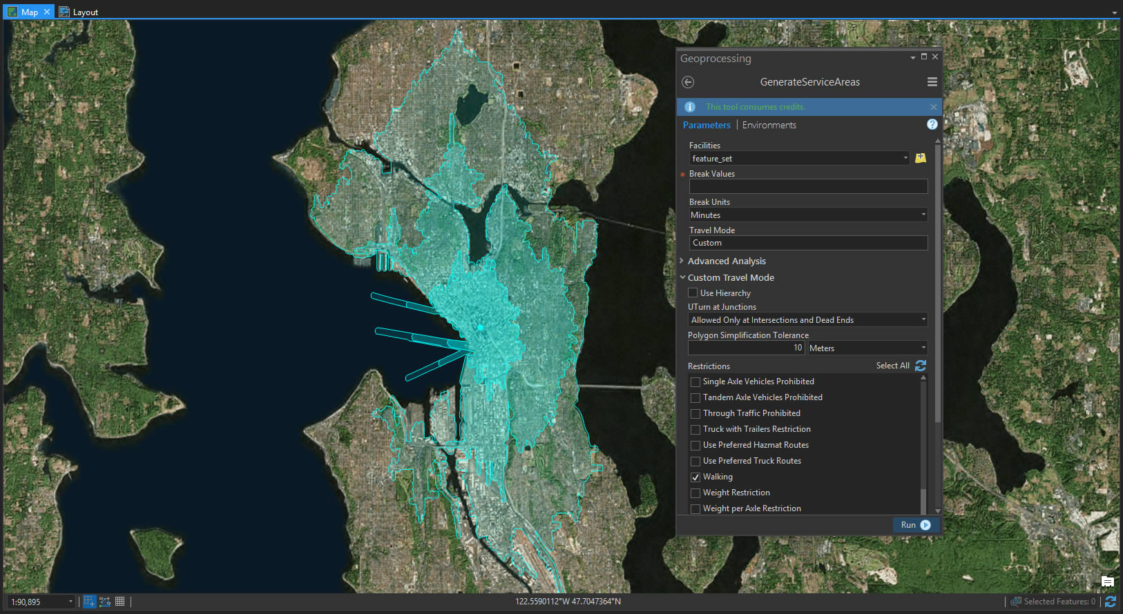
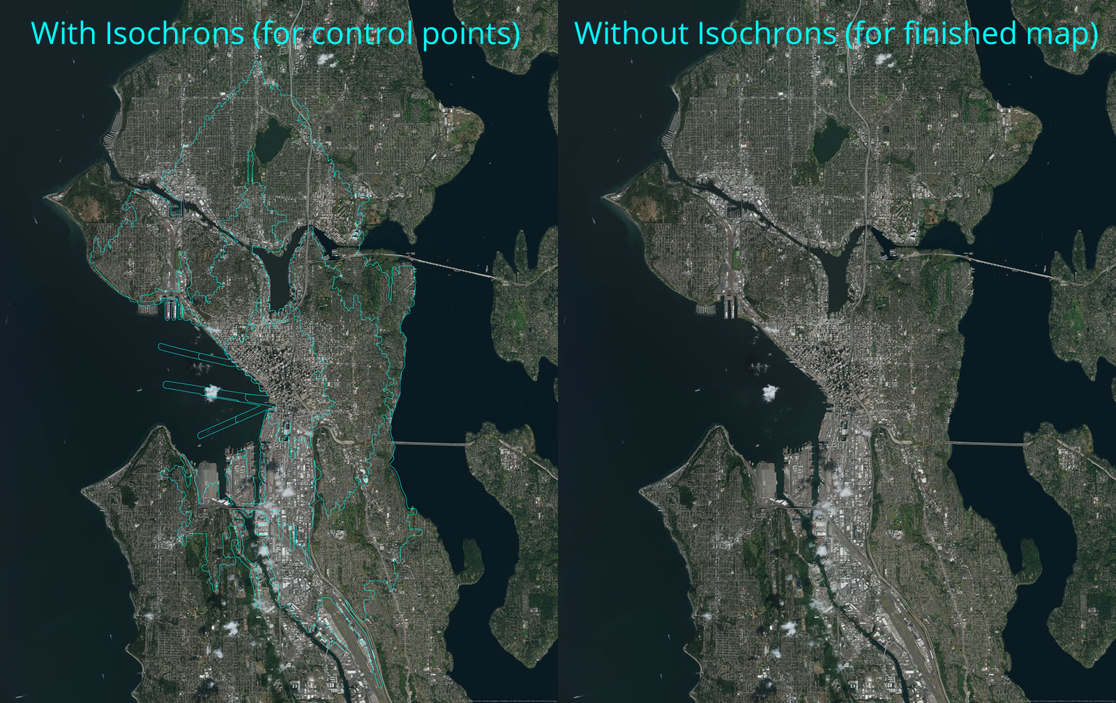
In a really big layout, I export two high-res images. One image has these service areas baked into it (I’ll use it as a reference to create control points) and the other is just sweet sweet imagery (I’ll use this as the image that I ultimately georeference).
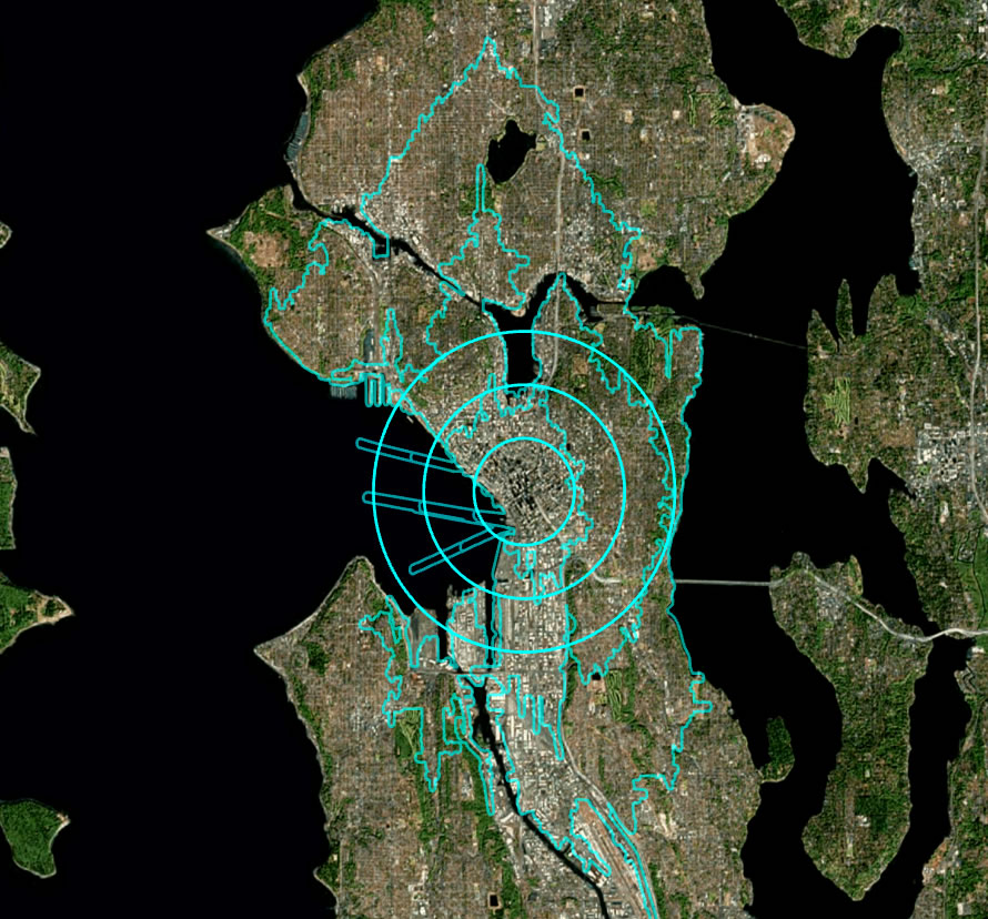
Next I created three rings or equal distance around the walk origin point using the Multi-ring Buffer tool. The distance was somewhat arbitrary, so long as they are all equal.
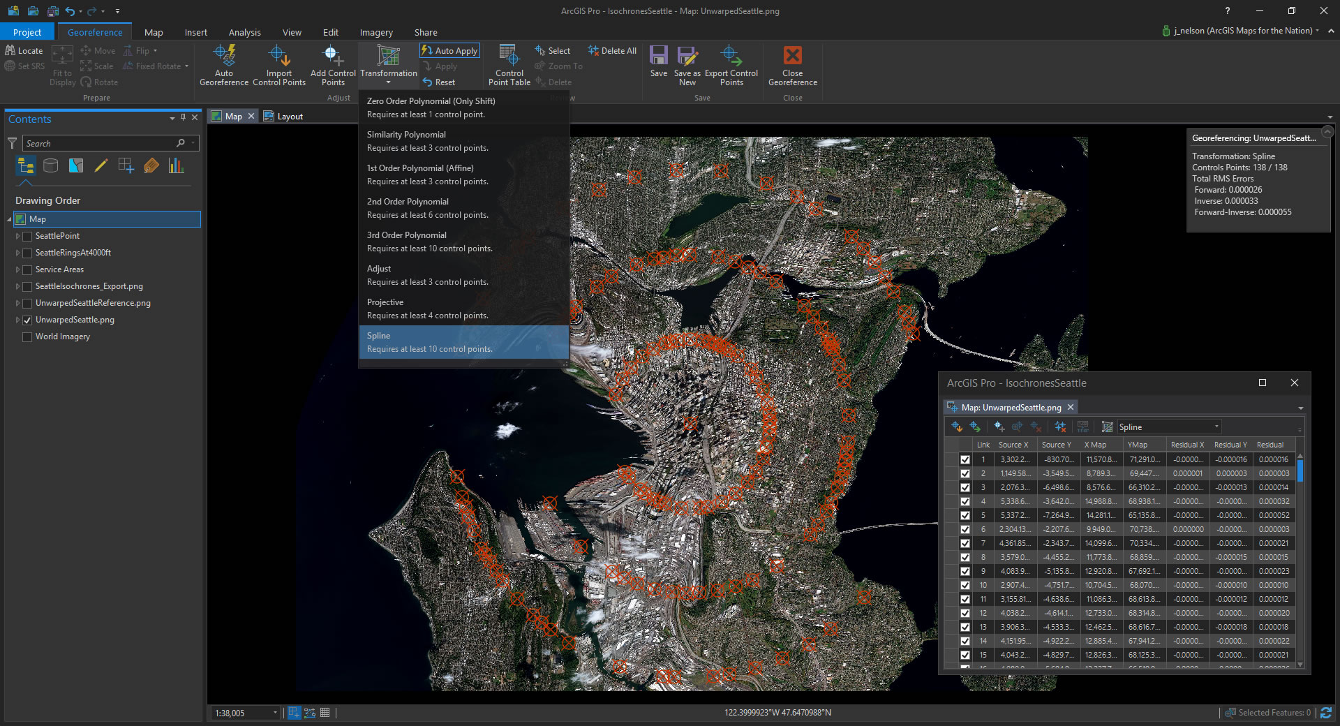
Then I add the exported image with the service areas baked into it back into the project as a dumb, non-geographic image. Time to get warping!
The Georeferencing toolset in ArcGIS Pro rules. You just set a bunch of control points connecting a pixel on the image to a real-world coordinate. Click/clack, click/clack, click/clack. I chose the Spline warping method. Spline gives you an absolute pinning of control points, but you need at least 10. No problem; I ended up with like 150 control points. Click here to see a fun animation of the warping.
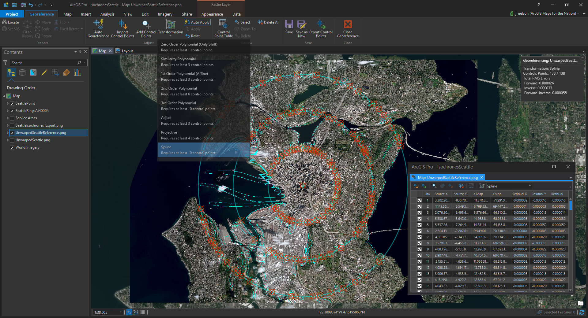
When my service area polygons were sufficiently warped to my rings, I exported the control points table (it saves it as a .txt file with all the origin pixel coordinates and destination geographic coordinates). I don’t actually need to save a warped version with the service area lines. I want to have a warped image without those reference lines.
So, I cancelled that geoprocessing session (since I had saved my control points table), and added in the big high res image without the service area lines. And that’s the image I ended up applying the control points to. Bait and switch. Thank you for your service, service areas –we’ll take it from here.
I saved the image, all time-warped up, and took it into a new Layout for decoration. And that is that.
Happy Warped Mapping! John


Article Discussion: