As authors, we want to reach our audience, keep them engaged, and help them understand the ideas we’re sharing. What follows is a look at four of the recent winners of the 2020 Story Map competition, highlighting some of the really clever and effective things these authors did to achieve these goals. You don’t need to do each of these things in every story, but having these techniques in your toolkit will help elevate your work. Let’s dig into why these are stories we love.
Great news: While this post looks at what and why these techniques make for good storytelling, here is a series of companion ArcGIS Learn Lessons that will be a deep dive on how to replicate these winning approaches, step by step.
1. Creating a visual hierarchy
We know we consume content in millisecond bursts, often skimming quickly over the page looking for “hooks”—maybe a provocative photo or a colorful map—that give cues to what we’re looking at and whether we want to spend more time here. Few of us simply read from the first word to the last in a mechanical and linear way. Rather, we graze for information.
A clear visual hierarchy is critical for helping readers do that successfully.
Visual hierarchy controls the delivery of the experience. If you have a hard time figuring out where to look on a page, it’s more than likely that its layout is missing a clear visual hierarchy.
Our brains decide what’s “important” and “where to jump to next” unconsciously, using visual cues like size, weight, color, and position. Crafting visual hierarchy is how we direct the attention of our readers. To do that well we need to know what the most important information is, what makes sense to notice after that, and so on. Sometimes this is as simple as using clear headings and subheadings throughout the story. But as we see below, it goes far beyond that.
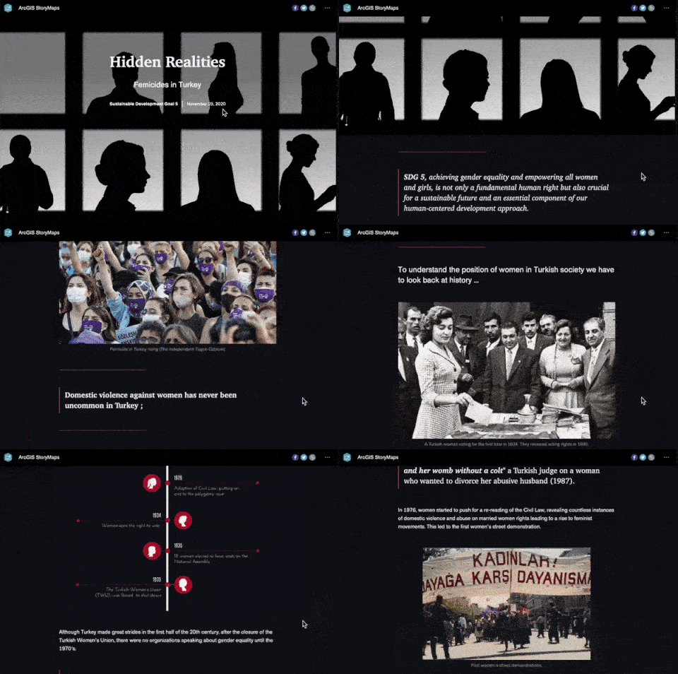
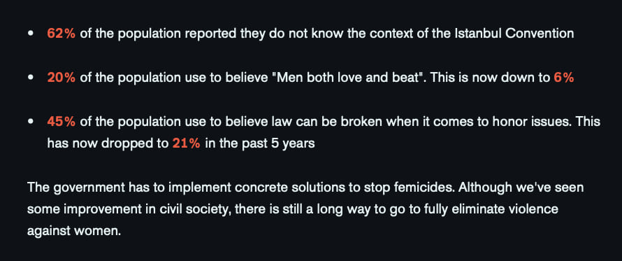
Hidden Realities, Femicides in Turkey uses a single stark red accent color throughout the story to draw the eye to information such as the statics below. The color is both evocative and helps flag important content.
2. Setting the right visual tone
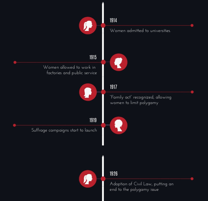
Tone is different from visual hierarchy in that it sets the graphic style for the story through the coordinated use of colors, fonts, photos and other graphic design elements. Hierarchy controls what our readers see first, second and so on; tone sets the overall graphic style which conveys the emotion of the story.
ArcGIS StoryMaps uses themes to set the overall graphic look and feel of your story. The choices you make in your themes can say as much about the story as the content itself. They can even influence readers’ ideas about whether a story is truthful, sympathetic, inspiring, or any of dozens of other inferences. In other words, themes are much more than just “making the story look pretty.” When done correctly, themes work in concert with the content and amplify it.
Our team has written lots on this topic before—here, here, and here—so let’s jump into the examples.
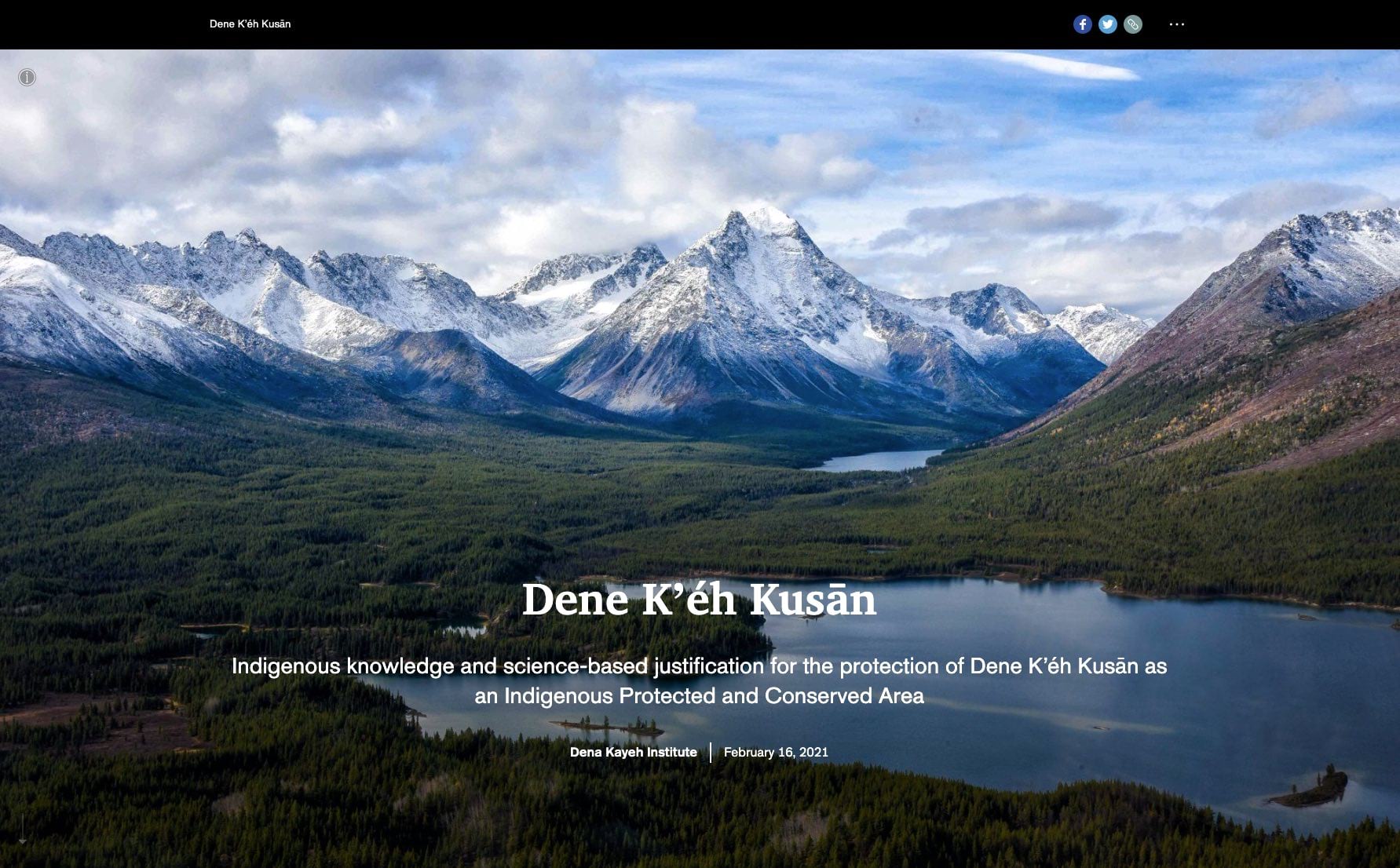
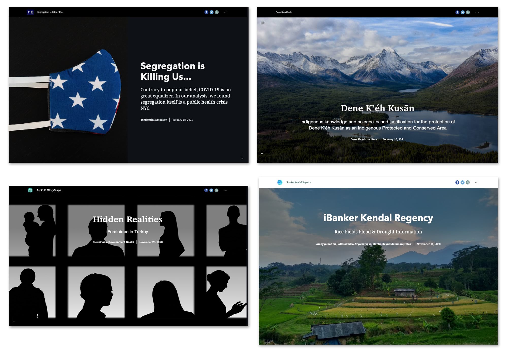
Dene Kʼéh Kusān opens with a strong establishing shot to quickly convey a feeling of northern landscapes and conservation. Learn more about establishing shots and other photo techniques in this wonderful post by my colleague Hannah Wilber.
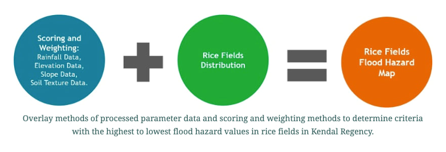
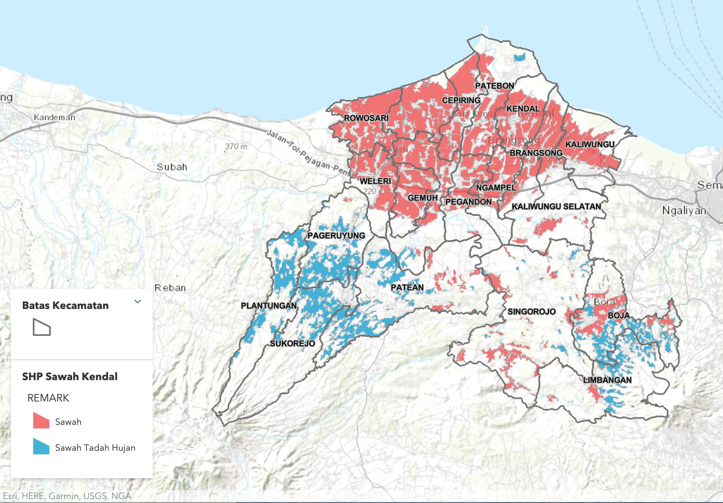
iBanker Kendal Regency opts for a bright, crisp theme and friendly saturated colors, perfect for a story about tropical agriculture. I love the clever use of big, bold graphics to help explain their GIS analysis. Simple graphics like this help broaden the audience of a story.
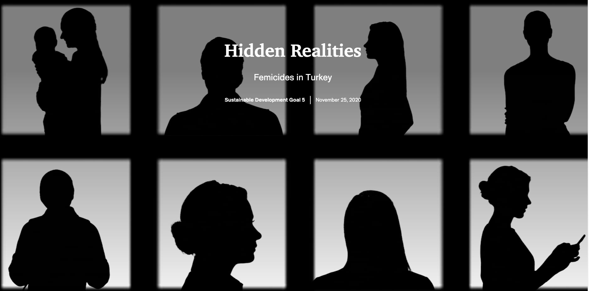
By comparison, Hidden Realities, Femicides in Turkey brilliantly uses a stark black cover page video of moving silhouettes of women (tip: videos can make great cover media). More than that, the silhouettes’ anonymity silently reinforces the title of the story: a hidden reality.
3. Picking the right form for your data
One of the wonderful-yet-challenging things about digital storytelling is how open-ended the medium is: You can incorporate videos, text, photos, illustrations, quote blocks, maps of all kinds, charts, dashboards, and on and on. Every story we write on the StoryMaps team prompts questions like “How should we present these data? What will be the easiest for our readers to understand? What will be the most powerful? How hard will it be to make this?” For example, we could present a set of simple statistics as numbers in the body of the text, or as a chart, or as a map: Which one to use?
Some general advice:
- Variety is good, it keeps readers engaged, but pointless changes in form draw unwanted attention.
- Try to avoid showcasing your technical skills if they don’t serve the story. Deploy that new skill or favorite 3D map in the right story, not just the next.
- Carefully pick your “wow” moments in the story. They’re expensive to craft and lose their impact if surrounded by a sea of competing media.
- Sketch ideas out quickly to check if an idea is going to work.
When those of us on the ArcGIS StoryMaps team start a new story, we usually have an idea that some data presentation (like a scatterplot or a choropleth map) will be the perfect way to make a point. But sometimes, when we actually see it, we realize that the original hunch is wrong and the graphic is just not working. In that case we might find that something simpler and more direct is better. Here’s just such an example from Segregation is killing us.

While I am a professional cartographer and adore thematic maps, I’m the first to admit not all data work well as a map; charts, stats, and tables can often work better for a given dataset or for your audience. It is worth experimenting with a few options to find the best one.
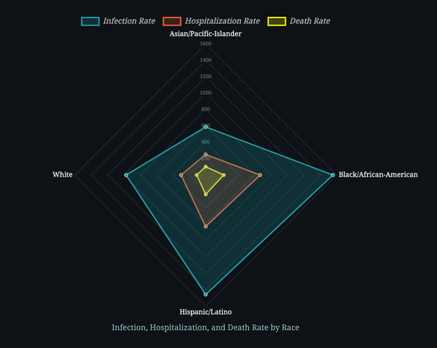
Early in the Segregation is killing us story we see a relatively rare radar chart to introduce us to the data. Its novelty pulled me in. But it’s more than novelty. It’s a compact and elegant way to show three measures of COVID-19, all broken down by race. This allows us to make direct comparisons at a glance. That’s a winning approach.
4. Using map actions
The maps in Segregation is killing us are both varied and gorgeous. The authors also incorporated map actions into their story as a way to reward the curiosity of the reader. The buttons beside the maps make it easy to see different slices of the data.
Map actions give readers agency over what they see next so they are not just a passive audience member. A map action can zoom and pan the map to a location or, as done here, turn different map layers on and off. The simplicity of the button means these actions work easily even on a small phone screen.
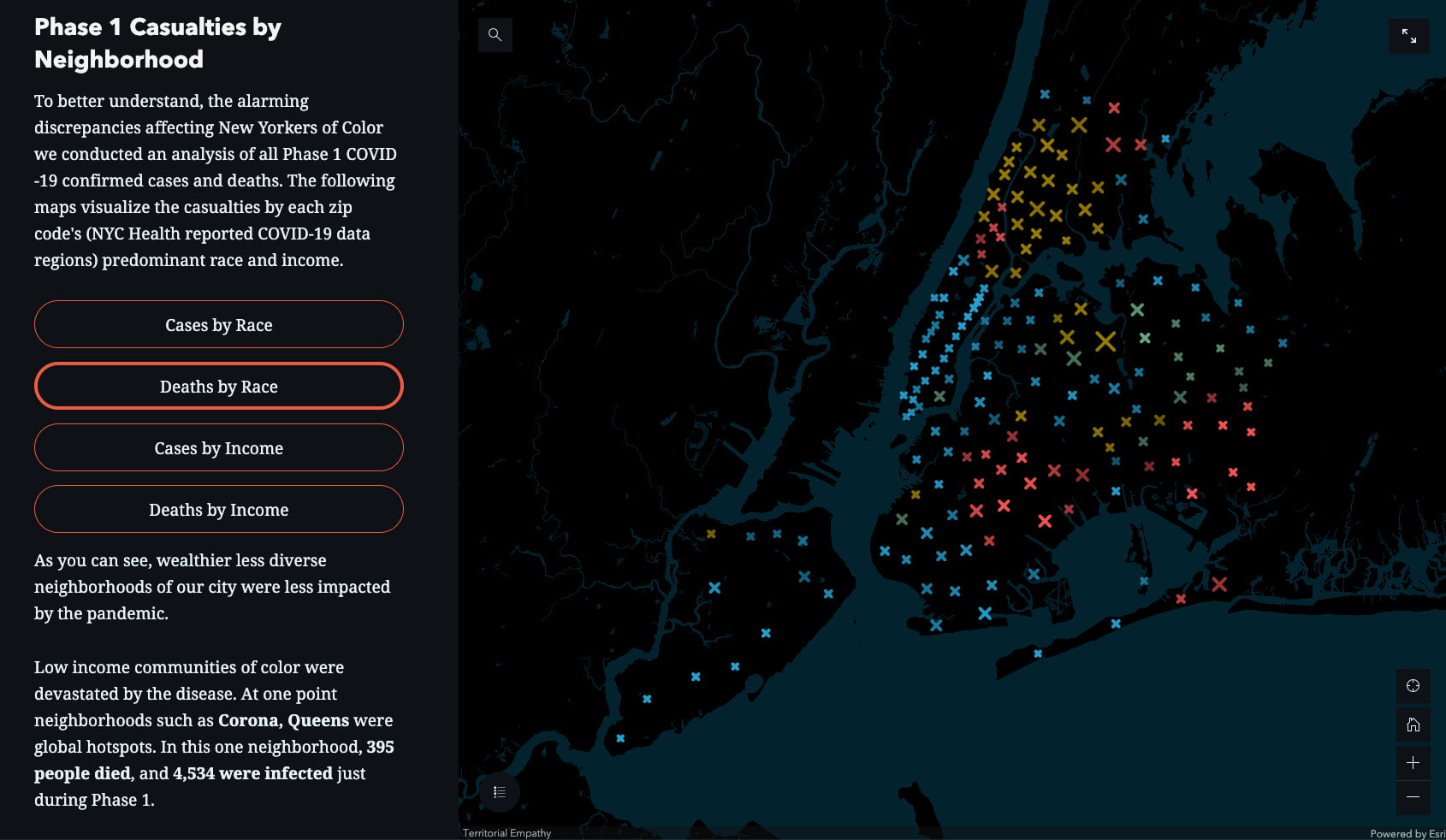
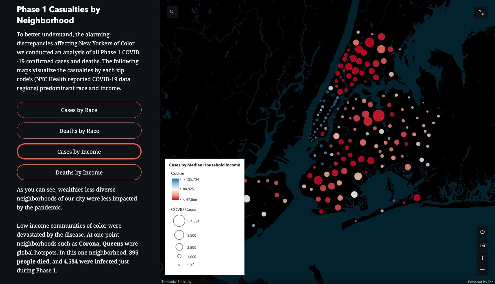
These multivariate maps tell us two things at once: The colors show either race or income while the size of the symbol shows prevalence of COVD-19 deaths or cases. The use of a proportional X for deaths and circles for cases helps to distinguish them quickly. The bright colors on a minimalist (label-free) dark basemap make the symbols pop and become “figure.” These small design choices add up to a winning story.
5. Using a progressive reveal
Showing all of your content at once to the reader only works when the story is very simple. The rest of the time we need to construct narratives that reveal content as the reader scrolls. Maps come into focus, charts grow and update, immersive slideshows and text captions advance, and so on. The best stories progressively build up the layers of the story allowing us to gradually absorb and use what we’ve just learned.
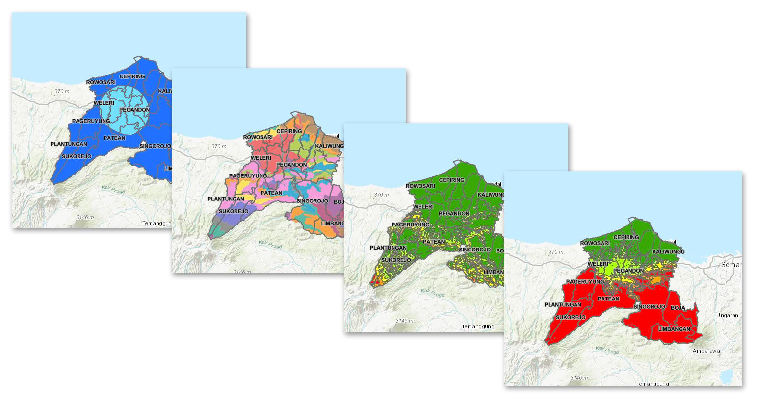
iBanker Kendal Regency does a good job of walking the reader through complicated geographic data and analysis in immersive sections. They do a progressive reveal of their geographic data and analysis and provide just enough explanatory text to help us understand what we’re looking at and what it means. Beginning with things we all understand intuitively (rainfall amounts, elevation), the maps grow increasingly complex and show the outputs from GIS modeling. Starting at the end of the analysis would have been overwhelming without that introduction.
Two additional things these authors do well:
- All of the maps use the same scale and centering so they are easy to compare.
- They only use a small number of data classes to keep the maps easily understood. This is a winning formula when creating a map for a wide audience of non-experts who may not be familiar with the region.
6. Using an overview map to establish context
Overview maps are often underutilized in stories, but they are critical to introducing your readers to the location. Since all stories happen somewhere, including a simple locator map early helps orient your readers especially when they don’t know the location well.
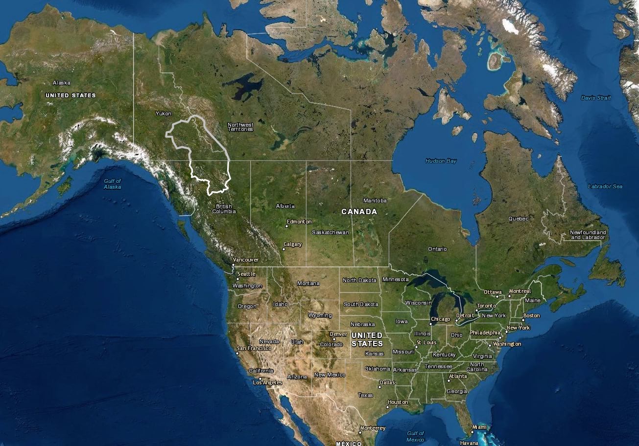
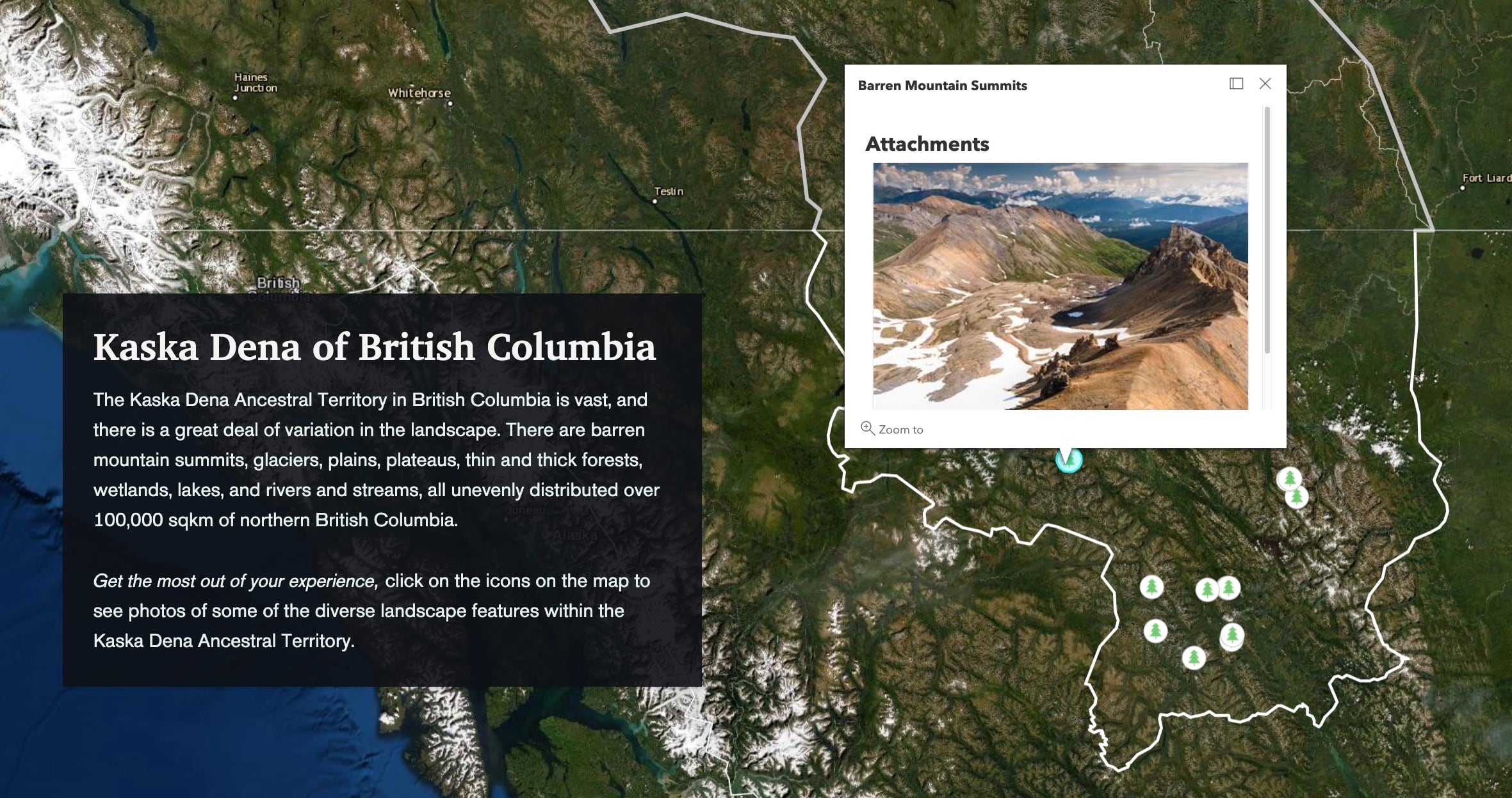
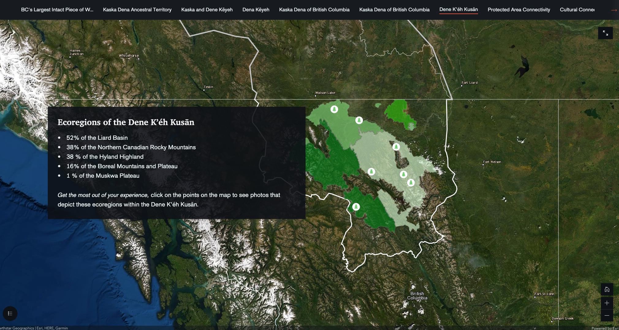
The Dene Kʼéh Kusān story takes the locator map to the next level. When it first loads, the map is zoomed way out to show North America with just a white and grey line to demarcate the territories within the provinces of British Columbia and Yukon, respectively. As we scroll into the story, the simple locator map zooms in, then adds additional details, then becomes interactive. As we move through the story and photos are interspersed, the map morphs and adds new data, helping to keep us oriented.
The choice of the satellite imagery basemap is also very effective in getting us to think about this place beyond the (overused) road map basemap. It also highlights how diverse the landscapes of this region are. And lastly, this basemap choice also reminders us that this traditional Dene territory is huge, much larger than most U.S. states.
7. Owning the authorship
All stories are written by people who created them for a reason and have a particular voice and perspective. Acknowledging that there are humans on the other side of the screen may feel weird to those of us trained in classical science (which is supposed to be neutral). But adding the humanity back to our stories—acknowledging that these stories are about people and written by people—doesn’t make the work any less serious or rigorous. Instead, it makes it easier for us as readers to connect with the creators, to align with them, and for these authors to own their voice.
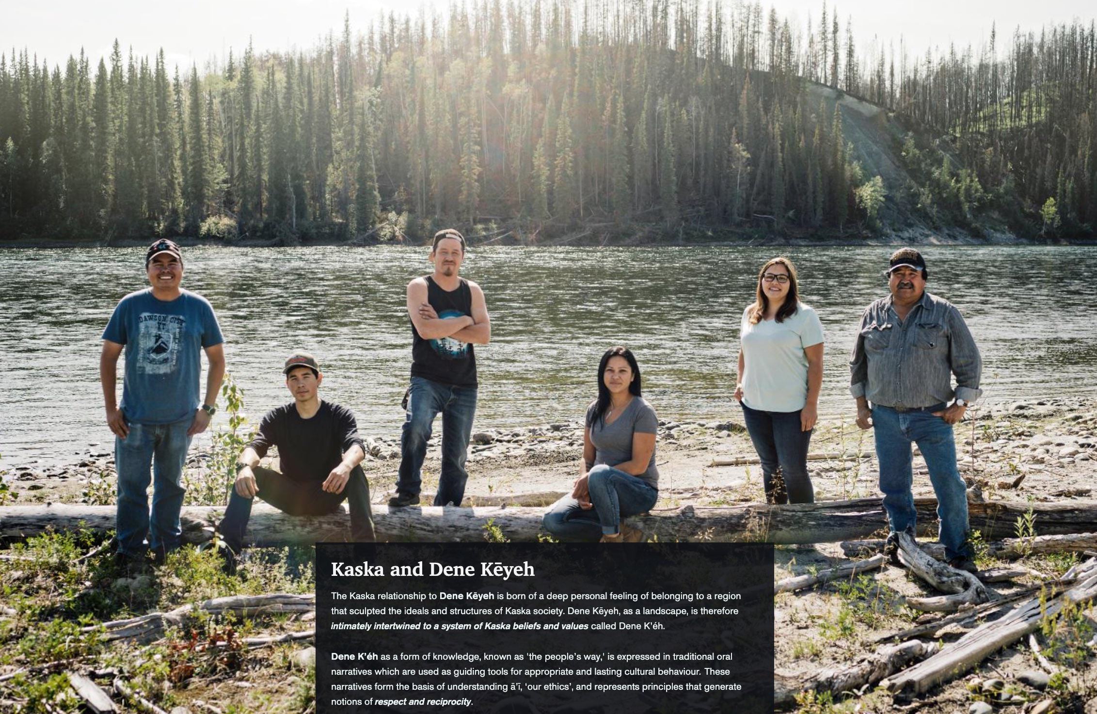
The Dene Kʼéh Kusān story does a beautiful job of introducing us to the Dene people who call this land home and have for thousands of years.
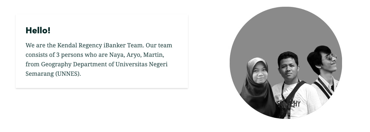
At the end of the iBanker Kendal Regency story we are introduced to the three student authors behind the work. Seeing folks around the world using the latest tech to solve local problems, especially at the university level, is inspiring.
If you haven’t already, go and read each of the winning stories and read these companion Learn Lessons to help make your own stories shine. One of the best ways to improve your own work is to read lots of other stories!

Article Discussion: