Many businesses grade their activities or an opportunity using a 5 Star rating. It’s common on product review sites and is a popular widget in executive dashboards. Creating one in the Business Analyst Web App (BA Web) is much easier than many imagine.
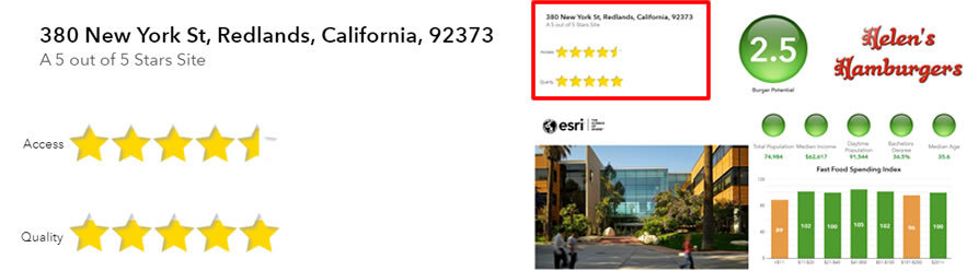
The example above shows a common usage. A developer is assessing and scoring a property’s potential for a burger bar. The scoring system combines different demographic and site attributes which are shown in the infographic using color coded symbols. The overall score is summarized using a 5-star rating. The site at 380 New York Street, Redlands has an overall rating of 5. Other attributes such as access and building quality are also rated using a star quality method.
I built this interaction using 5 individual components:
1) A Standard horizontal bar chart element containing
Custom chart attributes calculated by combining demographic variables, and
Site attributes captured using the BA mobile app or added during a site inspection
2) Text elements in a floating panel overlaid on top of the chart, and
3) Custom images superimposed on each bar in the chart
This blog explains how each of those parts can be combined to create the final 5-star rating system.
Horizontal Bar Chart
The chart is the most important component. It sits behind the masking images and text box and contains the attributes which will be rated. Once the chart is configured I add floating panels to the areas highlighted with red rectangles to create the final effect shown as a thumbnail in the image below.
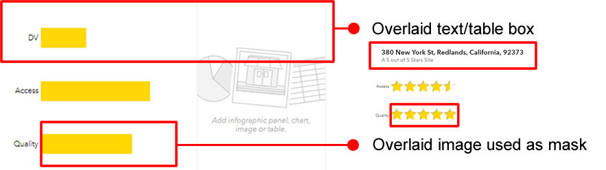
The chart itself contains 3 variables which are arranged in a specific order.
1) DV: A dummy variable, which is always at the top of the chart and is always set to 5. This guarantees the maximum bar length and ensures I can accurately place the other elements on top of the chart.
2) Access: A user entered assessment of the site’s road access with range 0 to 5, and
3) Quality: A score calculated using demographic attributes with range 0 to 5.
I ensure that no attribute in the chart exceeds a maximum value of 5. This means that the length and width of each bar in the chart is therefore defined by the size (width and height) of the element the chart is placed in. Resizing the element will cause the chart and bars to be resized as a result.
The bar chart color will determine the color of the stars. I normally use gold and minimize chart decoration. Removing the title and horizontal axis increases the vertical size of each bar and I maximize the thickness to minimize the gaps between bars. Finally, I remove the vertical chart axis and tick marks. This creates a minimalist fixed sized bar chart with only the attribute labels and bars shown on the left-hand side of the example image above.
Text Overlay Box
The next layer in construction is a customized text box that is added as a floating panel. This overlays the dummy attribute (DV) which is always the top bar in the chart. Using a solid white fill background color (the same as my infographic background) means that any part of the chart below the box is hidden, so there only appears to be 2 variables in the chart (access and quality) not 3.
You can put any information into the text box, but I like to use it to summarize the site address and star quality, as shown in the example below.
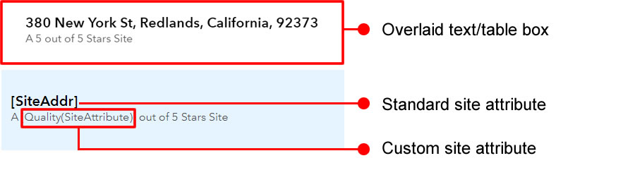
The box contains 2 lines of text with different styling. The first line contains only the site address which is a standard BA Web attribute field called SiteAddr. For the second line I combine the custom attribute Quality(SiteAttribute) with the rest of the sentence “out of 4 Stars Site”. When the infographic is run on a location the attribute labels are replaced with the unique site address, (380 New York Street) and site score (5) in the text box.
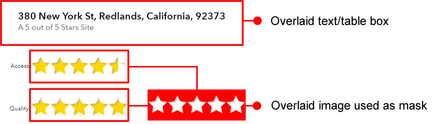
Custom Image Overlay
The final layer contains custom images which mask the two visible bars. I use a partially transparent custom gif (shown in red in the image below) that acts as a mask. This gif has 5 star-shaped holes punched through it and a drop shadow to give the 3D effect when combined with the bar chart. The bars can be seen through the star-shaped holes. If the site scores 4.5, it will appear as a partial star like in the “Access” rating in this example.
Bringing It All Together
By carefully arranging floating panels and images that act as masks, I have created the illusion of a single chart component. Using the infographic background color for the text box and image mask hides the complexity of its layered construction.
With some creative thinking and clever design work floating panels, masks and images can be used to turn ordinary infographics into compelling visualizations. The possibilities and opportunities are truly endless.

You can download the transparent mask image used in this example here.


Article Discussion: