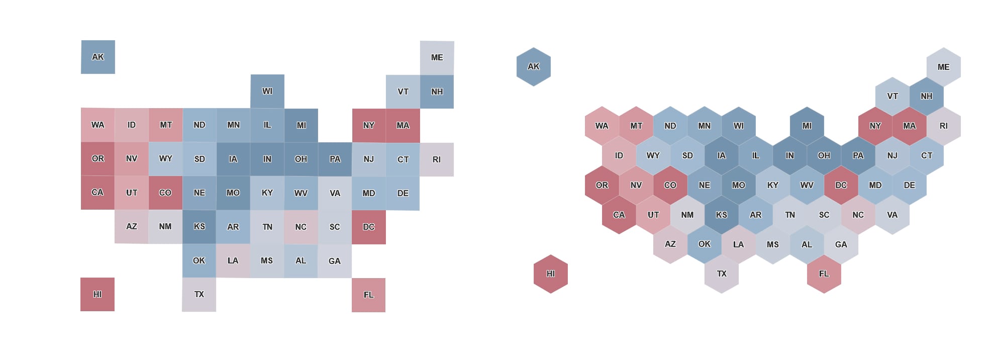
A cartogram is a map on which statistical information is shown in diagrammatic form. The geometry is often extremely distorted to show a variable using the polygon’s area. One of my favorite cartogram styles is equal area. It’s most commonly used to show data for all 50 US States and DC where each state has the same size and shape – either a square or hexagon.

Size Matters
The major advantage of this cartogram is that it maintains geographic relationship in how the states are distributed while removing the most common problem in choropleth maps – big areas prevent us from seeing the detail in small areas. When we map the US at a national scale, we are much more likely to focus on Texas, California and Montana than what’s being communicated about Rhode Island, DC or Connecticut. This is simply because of size difference.
An equal area cartogram removes those issues and allows us to focus on the patterns and data distributions. It focuses us on the difference between data attributes between states not the differences in size. The square and hexagonal cartogram examples shown below, allow the user to focus on communicating the variation in the mapped variable and let the reader explore the patterns.
Using ArcGIS Maps for Office to Build a Cartogram
The standard location types that are built into ArcGIS Maps for Office can be extended using a feature service hosted on ArcGIS Online. In the carousel window, click the Location Type drop-down menu and click More. From there click the “My Locations” tab, then “Add location type” to add a new location type to the list of available choices.

I have created a hosted service for each of the cartogram styles shown above. These are called “USA_Hex_Cartogram” and “USA_Grid_Cartogram”. Use either of these names to search ArcGIS Online (not your organization or groups) and then click the desired hosted service, both of which are shown above.
Both services contain full state names and 2-character state abbreviations. Check either state name or abbreviation using the box next to the appropriate column. This column will be used to match your spreadsheet data to the features in the hosted service. Provide a unique name for the location type and click “Add location” type and the new location type will be available for use on the “My Locations” tab.

Because the services contain both state name and abbreviation you can create two different services to match the type of state name values you have in your spreadsheets. In the example above, I have created 4 different location types which allow me to use abbreviations or names and create either a grid or hexagonal cartogram.
Using the hexagonal location file and a table of income data with state names I was quickly able to produce this cartogram.

Using ArcGIS Online to Build a Cartogram
Building a cartogram in ArcGIS Online is even easier. Just join your spreadsheet hosted as a table to one of the cartogram map layers! Here’s how:
First, add the spreadsheet as a table using the Add Item option as a table. This will copy the spreadsheet to ArcGIS Online and create a hosted table, which you can add to a map as shown below.

Then, search ArcGIS Online to add a new layer, using the keywords “USA Cartogram owner:helent_biz”. This will find 3 services; the hexagon and grid cartogram templates and a mask layer. In the example below, I added the USA_Cartogram_Mask service first, to hide the basemap layer, and then added the grid cartogram on top.

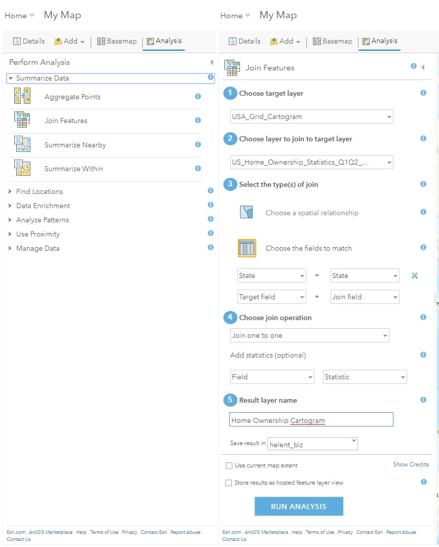
We now want to join the cartogram template map to the table which contains state names (or abbreviations) using the Analysis tool, Summarize Data, Join Features option, as shown on the left in the screenshot below. Because both the map and table share state names or abbreviations we can use the “Choose Fields to Match” option to link state outlines to rows in the table. Select the matching state name fields and add an appropriate name for the new layer, in my example, Home Ownership Cartogram as shown on the right-hand side.
You can now remove both the table and cartogram layers (if appropriate) and symbolize and style the cartogram using the newly joined attributes. In the example below, I symbolized the states using the smart mapping “Above and Below” style using a graded red to blue symbology to show high and low values with a thick 7 pt grey outline.
The 3D embossed, paint box like, effect was achieved by duplicating the cartogram layer and symbolizing it with a 1 pt white line and fully transparent polygon fill. Finally, I added the state abbreviations as a label with a white 1 pt halo, to make the names stand out.

Try It for Yourself
An equal area cartogram is a fantastic way to let the data tell its own story and let your reader explore the variations and patterns of geographic association and connectivity. I encourage you to try this for yourself and we’d love to see what you can produce.


Commenting is not enabled for this article.