Regression analysis in ArcGIS Insights allows you to create a regression model using relationships between a dependant variable and one or more explanatory variables, then use that model to predict values. The regression analysis method that Insights uses is called Ordinary Least Squares (OLS), which is a linear regression method.
One notable thing about linear regression is that it is designed specifically for normally distributed data. There are distinct rules and guidelines that should be followed to create a solid regression model; your variables should be normally distributed, there should be a linear relationship between your dependant and explanatory variables but no collinearity, you want an R2 value close to one, little to zero skewness, the excess kurtosis close to 0, etc. However, as you know it can be challenging to meet such specific requirements when working with your real-world data. Data is rarely perfect, like in the case we are about to go through, so here you will look at one example of how you can work with imperfect data.
This blog will use data information collected from buoys on the Great Lakes of North America. It will go through step by step how to explore and choose appropriate variables, create and evaluate a regression model, and use that model to predict variables in related datasets.
Step 1: Open Insights and add data
In this first section you will retrieve your data, import it into Insights and prepare it for your regression analysis. If you are more familiar with ArcGIS Insights and this process, you can skip ahead to Step 2.
- Navigate to https://www.glahf.org/data/.
- Scroll to Mechanical Energy section and click download buoy locations & summaries.
- Open ArcGIS Insights Desktop.You can also use your Insights in ArcGIS Online or Insights in ArcGIS Enterprise.
If necessary, accept the Activation complete message and skip the Welcome to Insights window.
- Navigate to the Datasets tab on the home page.
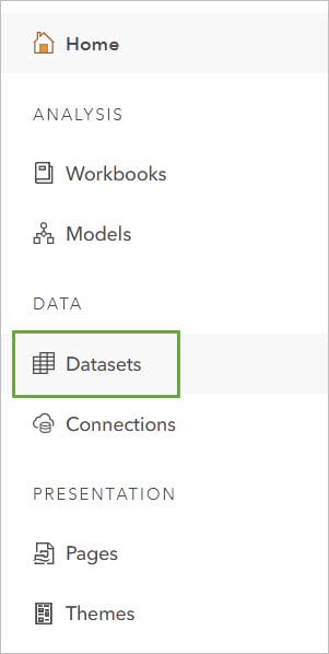
- Click New dataset and select the downloaded buoy_data.gdp.
Note: if using Insights in ArcGIS Online or ArcGIS Enterprise, you will need to update the Type to File geodatabase before adding.
- Download the workbook package.
- In ArcGIS Insights go to the Workbooks tab and click Import.
- Import the attached workbook and open it.
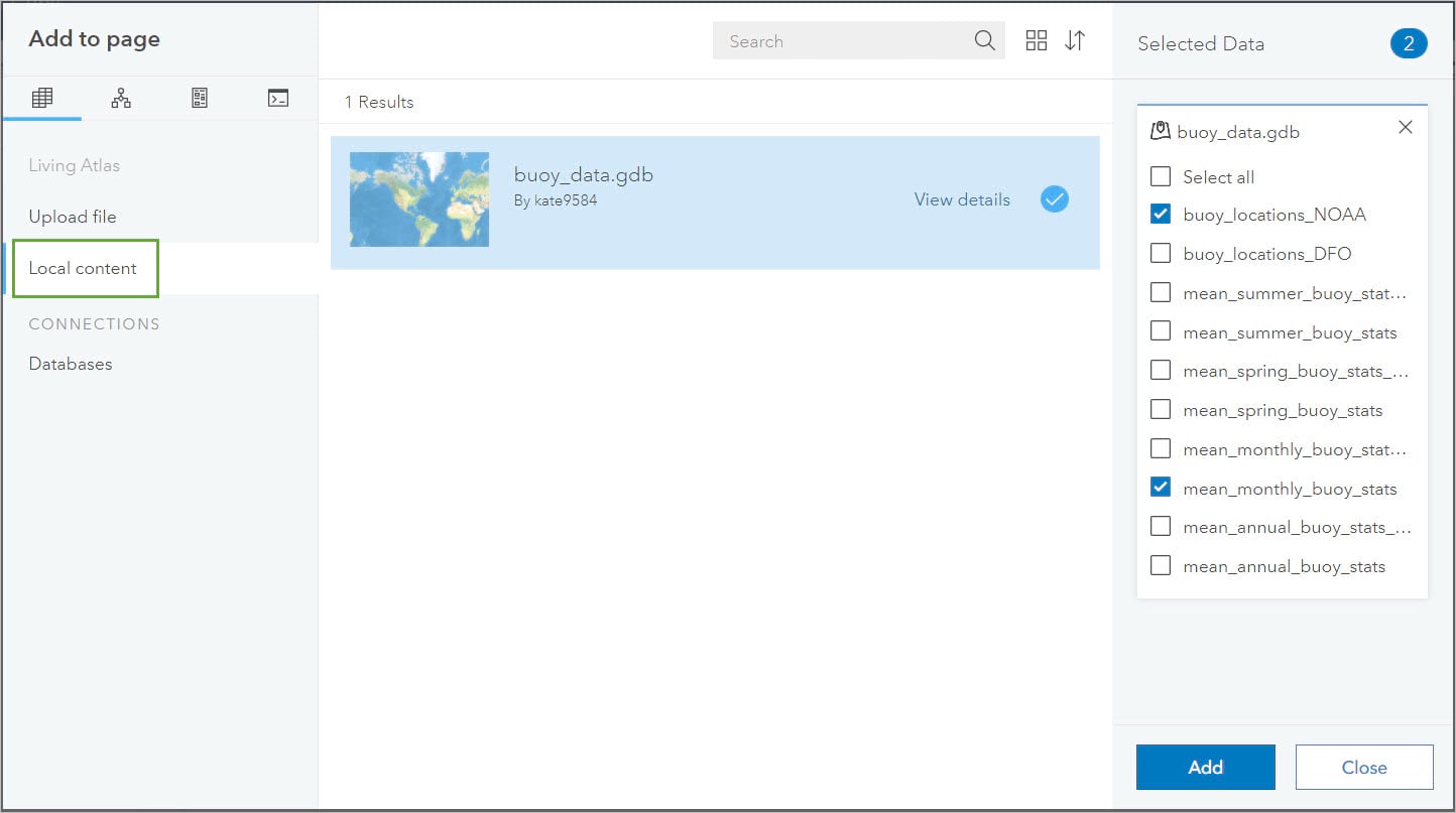
The Add to page dialogue should open automatically.
- Go to the Local content tab and select buoy_data.gdb
- Add buoy_locations_NOAA and mean_monthly_buoy_stats from bouy_data.gdb.
- Delete the map from the page.
- Click the Dataset options button on mean_monthly_buoy_stats_noaa.
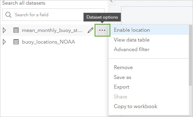
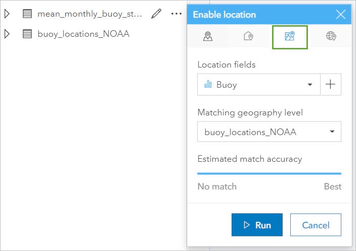
- Click Enable location, switch to the Geography tab, and click Run.
Many of the numeric variables are imported as strings. These fields can be converted to numbers in the data table. The data originally retrieved from NOAA (National Oceanic and Atmospheric) uses 9999 as a no data replacement. As you convert the data from a string to a number field you can also remove the 9999 field to just convert the values you want
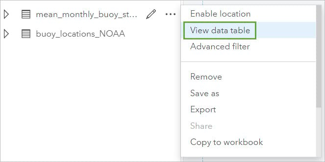
- Click the Dataset options button then choose View data table from the menu.
- Add a new field and enter the expression IF(AirTemp_mean <> ‘9999’, VALUE(AirTemp_mean)). Click Run.
- Rename your new field to AirTemp.
- Repeat step 15 for WtrTemp_Mean and AtmoPress_Mean.
- Rename your fields to WaterTemp and AtmoPressure.
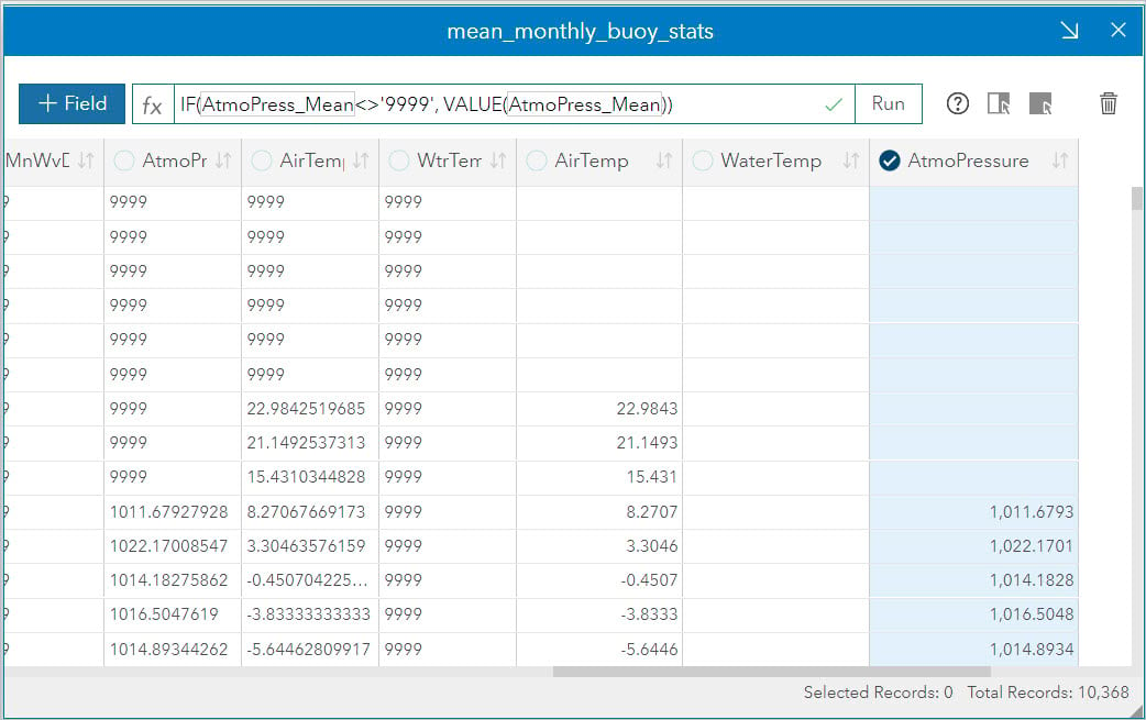
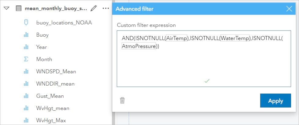
Now that the data is converted to the correct type, while there are no “9999” values there are now many rows with no data. You can use an advanced filter to filter out the null data.
- Close the data table.
- In the data pane next to mean_monthly_buoy_stats.table click the Dataset options button then choose Advanced filter from the menu.
- Enter the expression AND(ISNOTNULL (AirTemp), ISNOTNULL( WaterTemp), ISNOTNULL(AtmoPressure)).
- Click Apply.
Step 2: Explore variables
Now that you have your data, the next step is to explore that data and determine which variables will be used for your regression model. If you skipped section one, please download this workbook, import it into your ArcGIS Insights Workbooks tab and open it to begin with section 2.
- Expand the mean_monthly_buoy_stats data set.
For the regression model you are going to need a dependant variable and one or more explanatory variables. The dependant variable will be the field you want to explain with your model and the explanatory variables will be used to explain that variable. The goal is to make a model to help predict water temperatures, so you know WaterTemp will be our dependent variable. To help determine the explanatory variables you can use scatter plots and histograms.
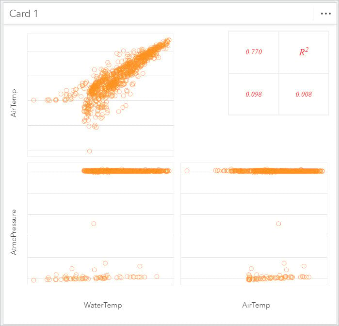
- Select your newly created numeric fields WaterTemp, AirTemp, and AtmoPressure and drag them to the scatter plot matrix drop zone.
There must be a linear relationship between our dependant variable and our explanatory variable. For the relationship to be linear when one variable changes the other must change in the same proportion. However, you do not want collinearity, meaning a linear relationship between explanatory variables.
On the scatter plot matrix, you can visually analyze if there is a linear relationship and look at the R2 values. Visually a linear relationship will create a straight line when graphed. When examining your scatter plot it is also important to check for outliers. Outliers will stand apart from the predominant pattern of the graph and could be erroneous measures or a once in a lifetime event that would skew your results. Sometimes removing these outliers prior to continuing can show a higher linearity and produce a better model.
The R2 value measures the strength of the relationship. You want the R2 value to be close to 1, indicating a stronger relationship the closer it is to 1.
Looking at the scatter plot matrix created, you can immediately see that there is a linear relationship between Water Temp and Air Temp and confirm the relationship is strong from the high R2 value. In this case there only seems to be one suitable explanatory variable; however, if there were more than one, you would want to ensure there was not a linear relationship between explanatory variables.
Another factor to consider is that you want the variables to have a normal distribution. You can evaluate the distribution using a histogram.
- Select the AirTemp field, drag it to the Chart drop zone, and drop it on Histogram.
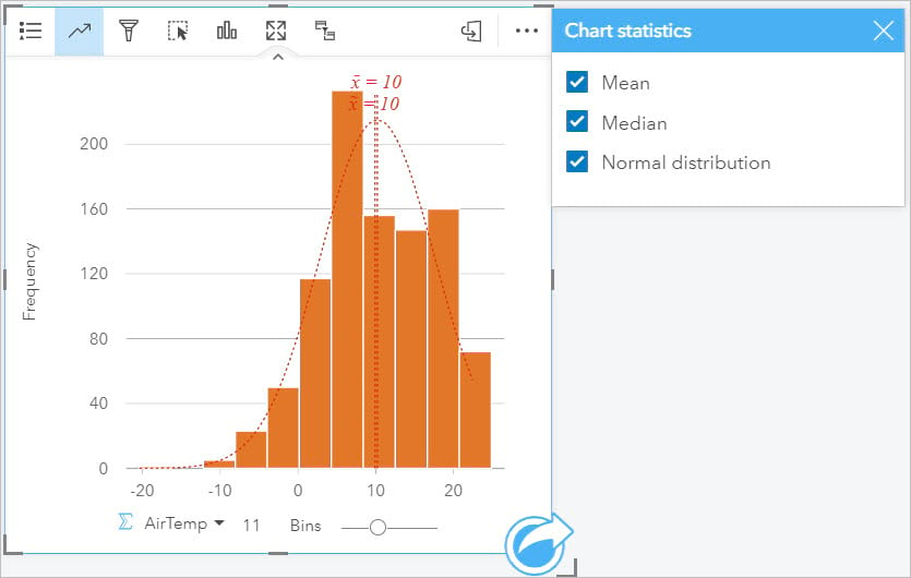
You can see off the bat this variable is not perfectly normal. To further confirm this, you can add the normal distribution curve to the histogram.
- Click on the chart to activate it. Click the Chart statistics button then check the box next to Normal distribution.
You can also evaluate how skewed the variable is – we can do this by looking at the mean and median values automatically placed on the chart. In this case the mean and median are equal, meaning the data has low skew.
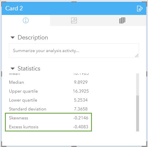
Another place we can look for statistics is on the back of the card.
- Click the Flip card button.
Here there are several statistics, including Skewness and Excess kurtosis. We want the skewness to be close to zero and the excess kurtosis to be close to 0.
Looking at this variable we can see it is not perfectly normally distributed. We can try calculating the log of the variable to see if it creates a better normal distribution.
- Flip the card back over.
- Click the Dataset options button and choose View data table.
- Click +Field.
- Enter the function log(AirTemp) and click Run.
- Rename the field to Log AirTemp.
- Close the data table.
- From the data pane select the Log AirTemp field and create a histogram.
In this case the log transformation actually makes the distribution worse. Having done this, you can now make the decision – while the AirTemp variable is not perfect it is not skewed and will be suitable enough to try creating a regression model.
Step 3: Create and evaluate models
Now that you have evaluated the variables you want to use in the regression model, this next stage will guide you through creating, evaluating, and comparing your regression models.
- Select the mean_monthly_buoy_stats dataset and drag it to the Model Creation page.
- Expand the dataset and select the WaterTemp numeric field and drag it to a map drop zone.
- Click on the map to activate it and click the Action button.
- Go to the Find Answers tab and choose How is it related?
- Select Regression Model.
- For Choose a dependant variable, select WaterTemp.
- For Choose explanatory variables, check AirTemp and click Select.
Note: you can click the Visualize button and a scatter plot will be created – you have already evaluated the scatter plot in the previous step so will skip this for now.
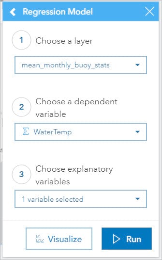
- Click Run.
A couple of things will happen when you run your model; a new layer Avg Standardized Residual will be added to your map, a new dataset Predicted WaterTemp 1 will be added to the data pane and a Regression Model will be added to the data pane
- Click on the layer symbol for the Sum of WaterTemp layer to hide this field from the map.
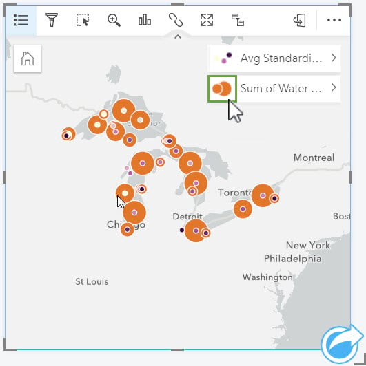
- Expand the Predicted WaterTemp 1 dataset. This dataset has all the same variables as your original but with 3 new ones: Estimated, Residual, and Standardized Residual.
Note: You want the residuals to be normally distributed with a mean of zero. If this is not the case, then the coefficients’ p-values are unreliable. You can check this in the same way we checked the normal distribution of our explanatory variable in Section 2, steps 3-5.
- Collapse the dataset.
- Expand Regression Model 1.
Here the details of your model can be seen, and you can evaluate the results of your model to examine how good of a model it is. Looking at the adjusted R2 you can see its close to one at 0.77. The Durban-Watson Test value which describes model autocorrelation is a little low, you want this value to be between 1.5 and 2.5, and the p-value of the model is 0 which is ideal.
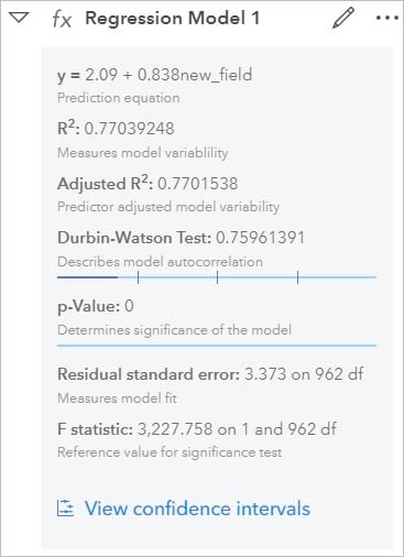
The last component is the options to view confidence intervals.
- Click on View confidence intervals.
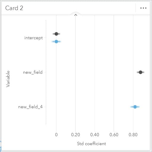
This chart shows the level of confidence you have in the model – this is a point chart which automatically sets up confidence interval bars showing both the upper and lower 90, 95, and 99 percent standardized confidence intervals. This is especially valuable when comparing models. Now create a second regression model and compare.
- Click the Action button on the map and reopen Regression Model (under Find answers and How is it related?).
- For Choose a dependant variable, select WaterTemp.
This time you will use the log air temp variable as the explanatory variable.
- For Choose explanatory variables, select Log AirTemp and click Select. Click Run to create the model.
- In the data pane, expand Regression Model 2
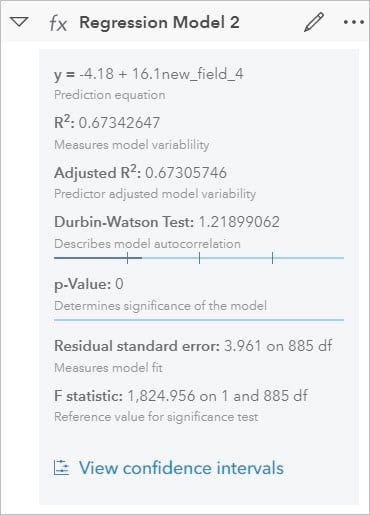
Looking at the R2 it is a little lower, but the Durban Watson is more in the range you would want it. Another way we can compare the models is to compare the confidence intervals on the same point chart.
- Select Regression Model 2 in the data pane and drag it to the existing point chart.
You should see a second set added to the chart. The confidence interval bars of the new model are slightly longer – meaning you have less confidence in the output of that model. This leads me to decide the first model is more accurate and therefore the one you will want to use going forward!
Step 4: Predict variables
In this stage you will use the Regression model that was created in the previous step to predict variables in another dataset where data is missing.
- Drag Regression Model 1 to the Predict Variables page tab.
This page should now have Regression Model 1 and BuoyData 2017 in the data pane and a map on the page.
The 2017 buoy data here has a variety of information from buoys in the great lakes but no water temperature data. You are going to use the model you just created to try and predict the water temperatures!
- Click on the Regression Model 1 and drag it onto the map and drop it in the Predict Variable drop zone.
The Predict Variable dialog should open next to the map.
- For Choose a layer, verify that BuoyData 2017 is selected.
- For Choose the regression model layer, verify that Regression Model 1 is selected. The details of the model should appear below the parameter.
- Scroll down in the dialog and update the map variables. Select air temp as the Replacement field.
- Click Run.
Now you have a new Predicted Variable 1 dataset which has our Estimated water temperature value! The map has also been updated to show the average estimated water temperature. You can also use the estimated variable in other charts or tables to get a closer look at the variables.
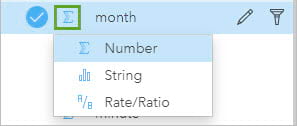
- Change the month field in the Predicted Variable 1 dataset from a number to a string by clicking on the icon to the left of the field name.
- From the Predicted Variable 1 dataset select station_code, month, and Estimated, drag them to the Table drop zone, and drop on Summary Table.
- Change the summary statistic on the Estimated field to AVG.
- Resize and re-style as desired!
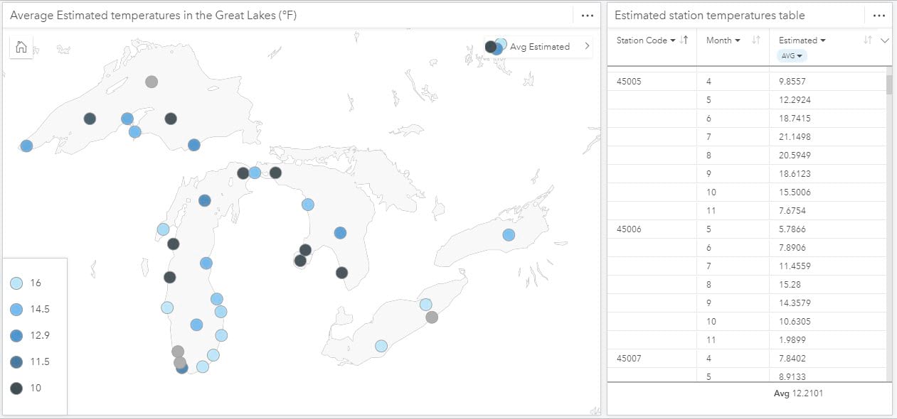
And there you have it, you have successfully created a regression model and predicted variables. It is important to remember that while we all strive for perfection our data will fight us along the way and there are ways to overcome that. Hopefully, this blog has provided you with some new tools to help you make decisions towards creating the best possible regression model in ArcGIS Insights!




Article Discussion: