Did you know that the first Census in the US was conducted on August 2, 1790, included 6 questions, and involved an estimated 650 enumerators? New York City was the most populated urban area (as it was in 2020) and total US population was 3.9 million. The US Census Bureau has continually gathered various data sets since, providing valuable information to governments and citizens.1 ArcGIS Insights is the perfect companion for US Census data, turning this information into knowledge!
Developed after the 2000 Census, the US Census Bureau’s American Community Survey (ACS) is a nationwide survey of over 3.5 million households that collects and produces information on social, economic, housing, and demographic characteristics about our nation. The ACS provides communities with reliable and timely social, economic, housing, and demographic data every year2.
For those of us interested in using data to bring meaningful change to the places we live, work, and play, it is simply, a national treasure. Today, we’ll look at how to use ArcGIS Insights to leverage the benefits of this resource.
ACS Data
One dataset the ACS provides involves yearly migration flows, detailed at state, county, and metro geographies. We’re going to look at Metro-to-Metro migration flows to get a sense of domestic metro migration characteristics. The table we’re looking for can be located at Metro Area-to-Metro Area Migration Flows: 2015-2019 –> Metro Area-to-Metro Area In-, Out-, Net, and Gross Migration.
Note: Data downloaded from US Census Bureau may have a defined cell range applied. If so, make sure range includes all data rows and header row. See more here.
The dataset includes two locations (Geography A and Geography B) along with flow, counterflow, net migration and gross migration (and margin of errors for each variable). We’re primarily interested in net migration between different areas so you can remove the other fields and cleanup the data a bit. You can also download a refined version of the data here.
Net Migration
Since we’re going to want to see this data on a map, let’s grab the spatial data as well. The 2019 metro area boundaries can be downloaded through the Census Tigerline site. However, the migration dataset includes a catch-all geography (areas within the US but not in a metro), so I modified the census boundaries to include a placeholder for this. You can download the updated metro boundaries here.
You’re now ready to import into ArcGIS Insights.
The first thing you’ll want to do is filter out null records. For the migration dataset, this occurs because the Census records international in-migration but does not count international out-migration. You’ll instead focus on domestic migration patterns.
1) Open a new workbook and add MetroNetMigration_2015to2019.xlsx and CoreBasedStatisticalAreas_2019.zip.
- Rename MetroNetMigration_15to19.Table1 to
Net Migration (2015-2019). - Rename Core_Based_Statistical_Areas_(2019) to
CBSA (2019).
2) Apply a dataset filter on Net Migration (2015-2019).
- Click the Dataset options button and choose Advanced filter from the menu. Enter the expression
ISNOTNULL(NETMIGRATION)and click Apply.

Since ArcGIS Insights was built with spatial capabilities as part of its DNA, adding location data to your table and creating a map is simple.
3) Enable location on Net Migration (2015-2019) using the metro areas in CBSA (2019).
- From the Dataset options menu, choose Enable location, then click the Geography tab.
- Location fields:
DESTINATION_METRO_CODE - Matching geography level:
CBSA (2019) - Rename the generated CBSA (2019) field to
Destination Metro.
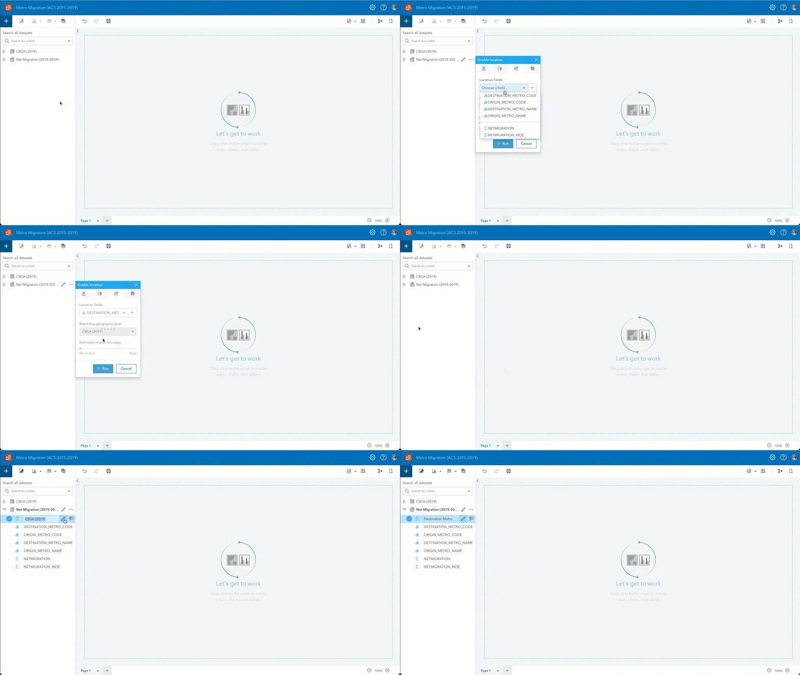
You’ll want to separate each metro area by whether it had a net migration gain or loss.
4) Create a map of positive net migration.
- Drag the Destination Metro and NETMIGRATION to the page and drop it on Map.
- Rename the result dataset to
Net Migration (Positive). - For Sum of NETMIGRATION, click the Dataset filter button and change the lower limit of the filter to
1. - Rename Sum of NETMIGRATION to
Migration Gain.
5) Style the map.
- Number of classes:
4 - Break values:
12,500/25,000/50,000 - Size:
5px-30px - Fill color:
#267300, 35% Transparent - Outline color:
#267300
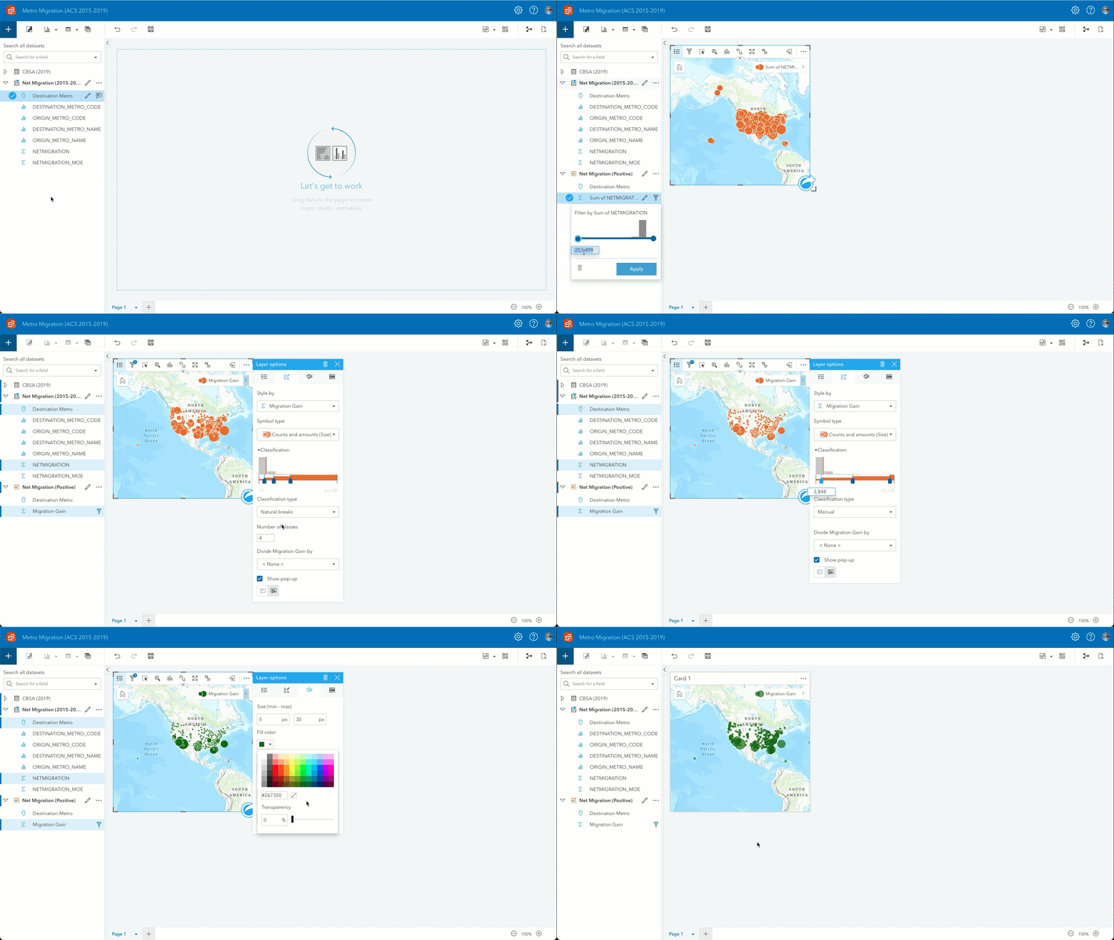
6) Create another layer on same map of negative net migration.
- Drag Destination Metro and NETMIGRATION to the map and drop them on Add new layer.
- Rename the result dataset to
Net Migration (Negative). - For Sum of NETMIGRATION, click the Dataset filter button and change the upper limit of the filter to
-1.
7) Create new field showing migration loss in absolute terms.
- From the Dataset options menu, choose View data table, then click +Field.
- fx:
ABS(Sum of NETMIGRATION) - Field alias:
Migration Loss
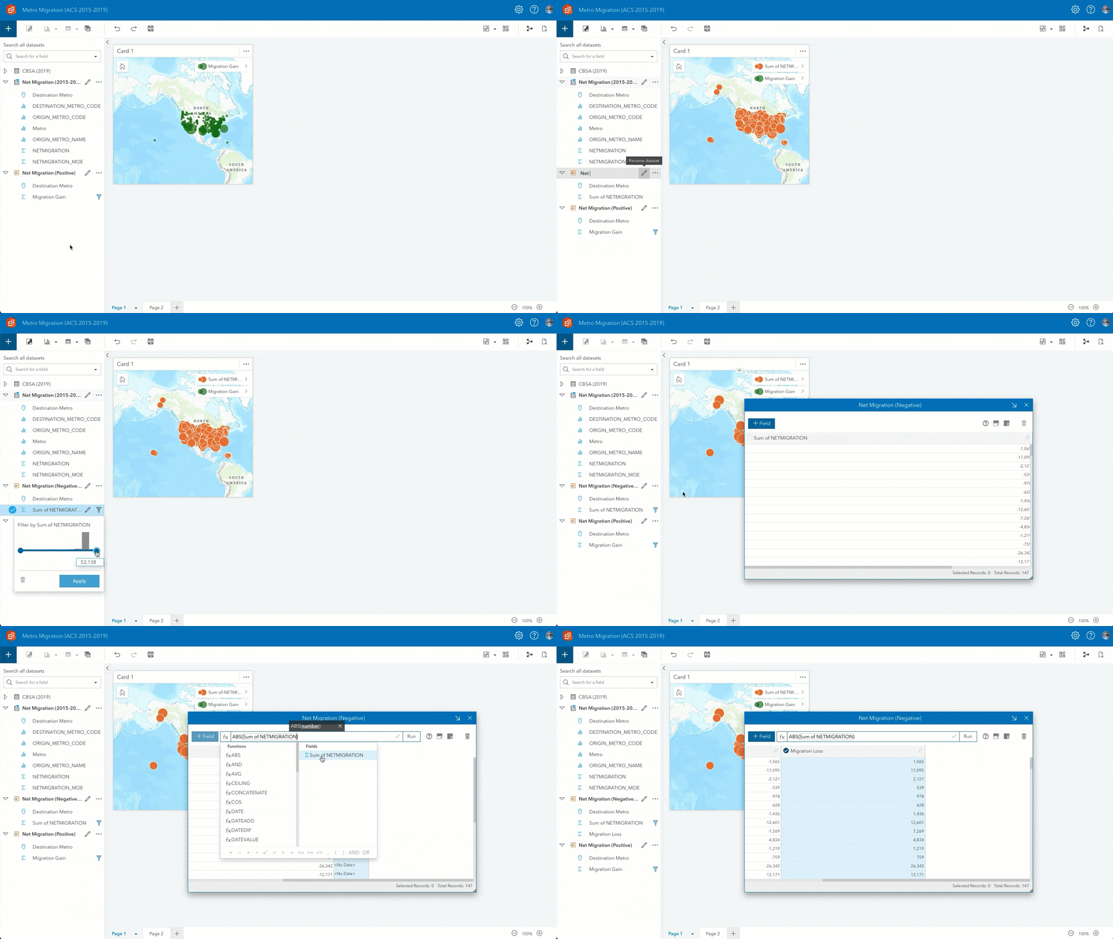
8) Style the layer.
- Break values:
12,500/25,000/50,000/100,000 - Size:
5px-40px - Fill Color:
#730000, 35% Transparent - Outline Color:
#730000
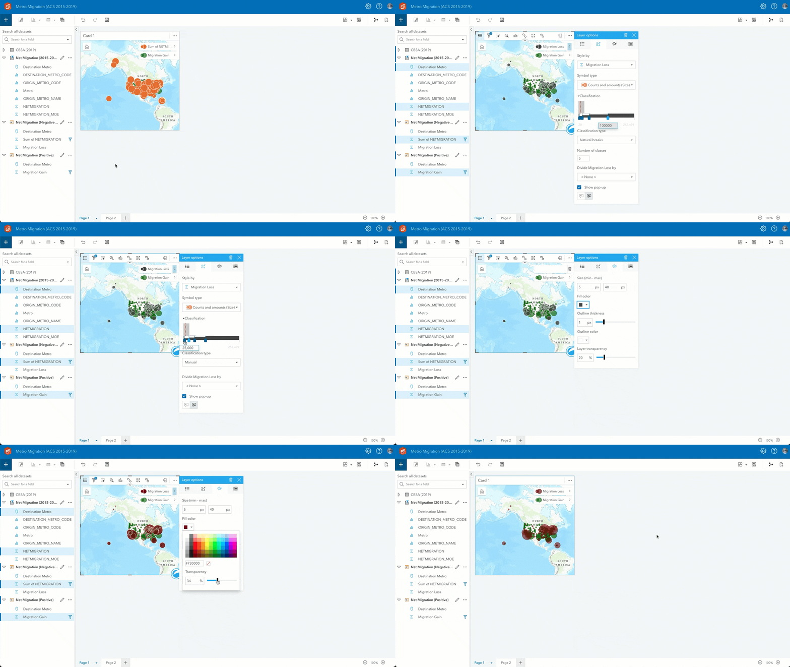
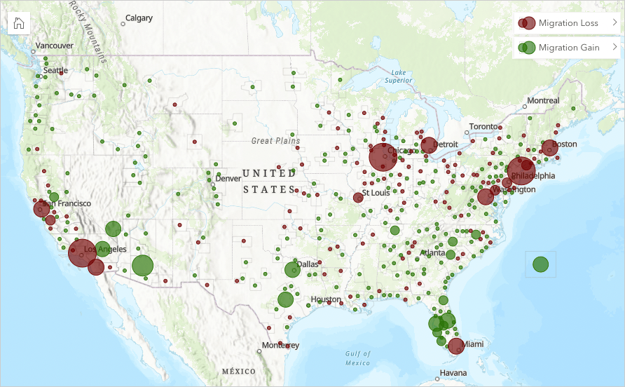
What can you see from the map?
- Large metros nationwide are experiencing net migration loss though the effects are somewhat mixed in the Southeast and Pacific Northwest.
- Sunbelt metros (such as Dallas, Houston, and Phoenix) continue to grow via net migration gains.
- More people migrate from metro areas than to metro areas (this is depicted by the data point off the eastern coast).
Our analysis so far is good for interpreting macro trends but what about specific metro areas? Where are the losses and gains the largest? You can use a summary table to dive deeper.
9) Create a summary table of metro areas and their net migration.
- Drag DESTINATION_METRO_NAME and NETMIGRATION to Table and drop them on Summary Table.
- Rename the result dataset to
Net Migration (Summary). - Rename DESTINATION_METRO_NAME to
Metroon Net Migration (2015-2019). - Rename NETMIGRATION to
Net Migrationon Net Migration (2015-2019). - Enable cross filters on the summary table (this enables more interaction between the table and map).
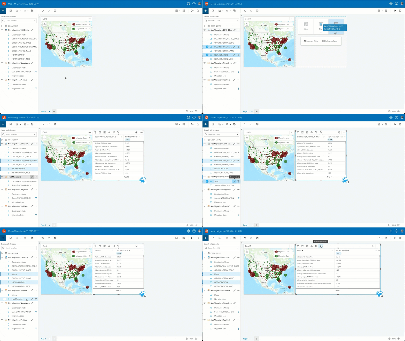
10) Save the workbook.
Now you can easily sort and filter the summary table. Notice that the New York City metro experienced the largest population outflow at more than 250,000 people a year. Phoenix, on the other hand, experienced the largest inflow at just over 50,000 people a year.
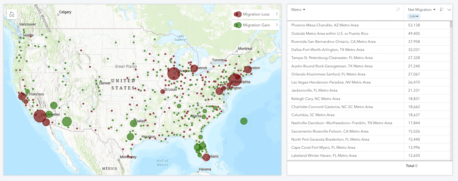
You could stop here and share this analysis while adding additional text to shape your narrative. But ArcGIS Insights is capable of much more than that.
Let’s see what patterns exist with migration between metro areas.
Migration Flow
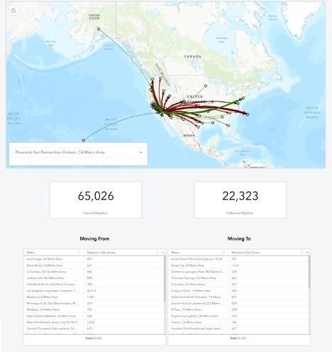
Within ArcGIS Insights, datasets with spatially descriptive attributes can be given multiple spatial fields and analyzed in a link map. As with the Net Migration analysis, you’ll separate metros with migration gains and losses. You’ll also limit flow patterns to those greater than 250 (gain or loss) to eliminate data clutter.
1) Create a new page and add MetroNetMigration_2015to2019.xlsx and CoreBasedStatisticalAreas_2019.zip.
- This time, rename NetMigration_15to19.Table1 to
Migration Flow (2015-2019). - Rename Core_Based_Statistical_Areas_(2019) to
CBSA (2019).
2) Apply a dataset filter on Net Migration (2015-2019).
- Click the Dataset options button and choose Advanced filter from the menu. Enter the expression
Net Migration<=-250 OR Net Migration>=250and click Apply.
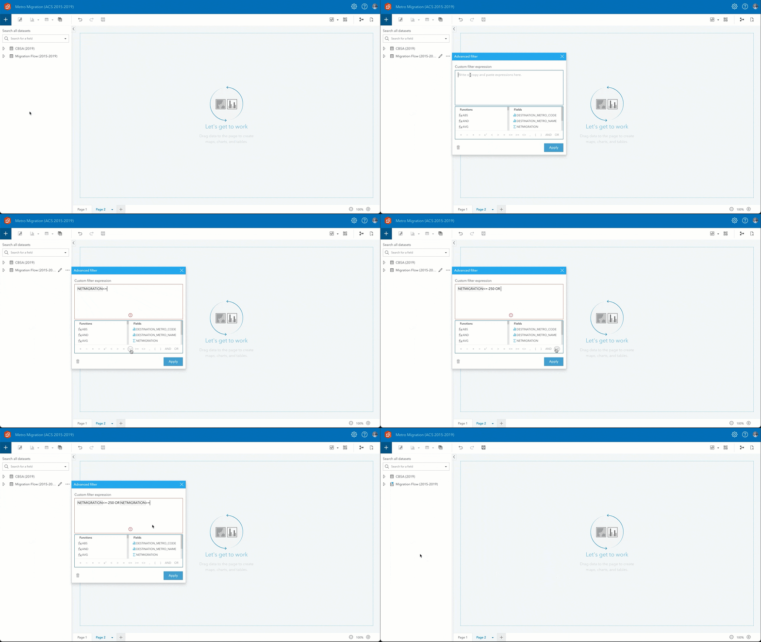
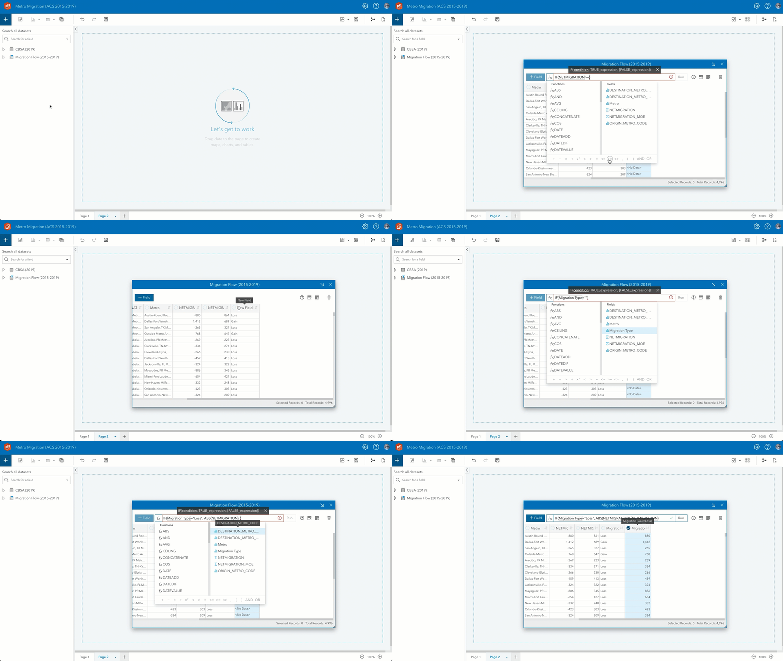
3) Create new fields for migration types and values.
- From the Dataset options menu, choose View data table, then click +Field.
- fx:
IF(NETMIGRATION>=250, "Gain", "Loss") - Field alias:
Migration Type
4) Create new field with the absolute value of net migration.
- Create another field using +Field.
- fx:
IF(Migration Type="Loss", ABS(NETMIGRATION), NETMIGRATION) - Field alias:
Migration (Gain/Loss)
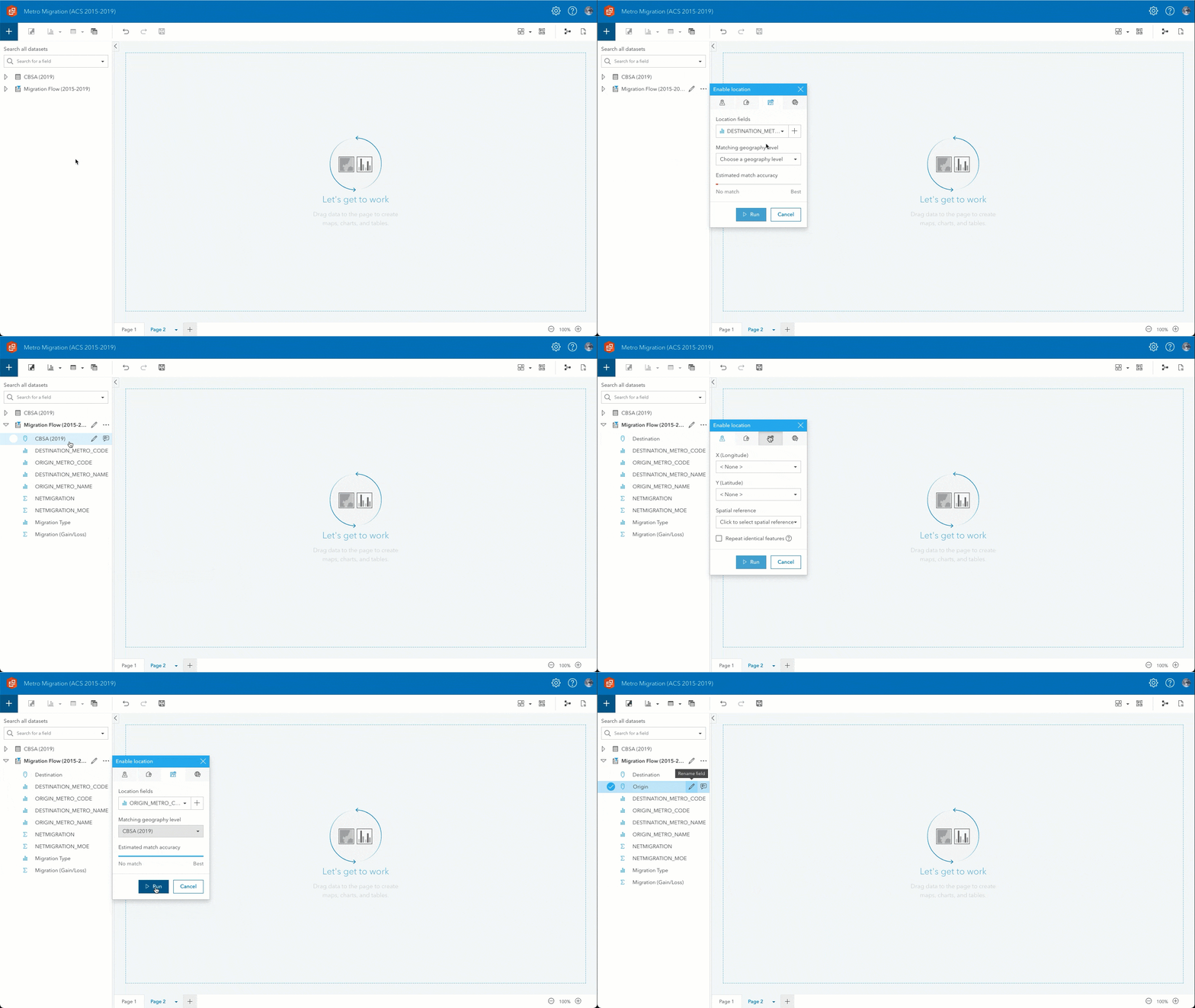
5) Enable two locations on Migration Flow (2015-2019) using the metro areas in CBSA (2019).
- From the Dataset options menu, choose Enable location, then click the Geography tab.
- Location fields:
DESTINATION_METRO_CODE - Matching geography level :
CBSA (2019) - Rename the generated CBSA (2019) field to
Destination. - From the Dataset options menu, choose Enable location again, then click the Geography tab.
- Location fields:
ORIGIN_METRO_CODE - Matching geography level :
CBSA (2019) - Rename the generated CBSA (2019) field to
Origin.
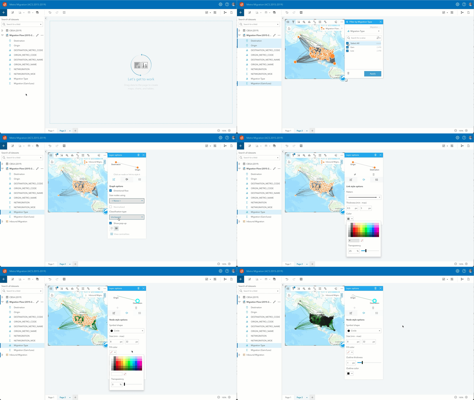
6) Create a link map of inbound migration.
- Drag Origin, Destination, and Migration (Gain/Loss) to Map.
- Click Card filter, select the Migration Type field and filter to
Gain. - Rename the result dataset to
Inbound Migration.
7) Style the layer.
- Directional flow:
Checked, Origin to Destination - Size nodes using:
None - Classification type:
Natural breaks - Show pop-up:
Without statistics - Line color:
#267300 - Node fill:
No Fill - Node outline:
#1A1A1A
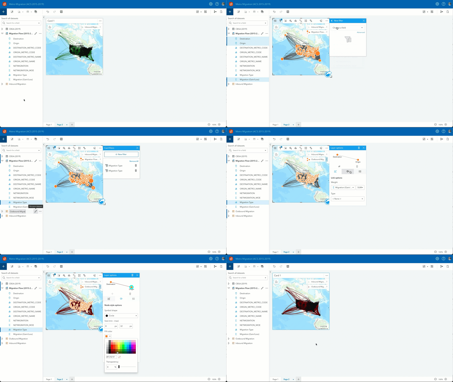
8) Create a link map of outbound migration.
- Drag Destination, Origin, and Migration (Gain/Loss) to the same map and drop them on Add new layer.
- Click Card filter, select the Migration Type field and filter to
Loss. - Rename the result dataset to
Outbound Migration.
9) Style the layer.
- Directional Flow:
Checked, Destination to Origin - Size nodes using:
None - Classification type:
Natural breaks - Show pop-up:
Without statistics - Line Color:
#730000 - Node Fill:
No Fill - Node Outline:
#1A1A1A
10) Enable cross-filters on the map.
You have your Migration Flow analysis set but due to the amount of data, it’s difficult to gain any well…insights. So, you can add a filter and create additional data visuals to provide context.
11) Add a filter for metro areas.
- Add a Predefined filter to the page.
- Under Migration Flow (2015-2019), choose
DESTINATION_METRO_NAME. - Add the filter By value.
- Change the Selection type to Drop-down.
- Resize the filter and place it at the bottom left corner of the map.
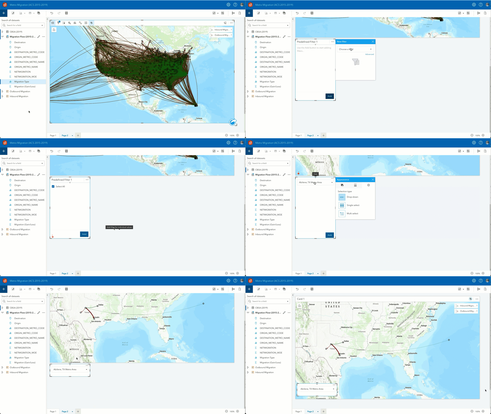
Now you can use the filter to select an individual metro and get detailed migration flow patterns. Adding KPI cards and a summary table allows us to detail the full picture of each flow pattern.
12) Add a KPI card for inbound migration.
- Drag Migration (Gain/Loss) from Migration Flow (2015-2019) to Chart and drop them on KPI.
- Click Card filter, select the Migration Type field and filter to
Gain. - Change the label to
Inbound Migration. - Rename the result dataset to
Inbound Migration KPI.
13) Add a second KPI card for outbound migration.
- Copy (ctrl+C or cmd+C) and paste (ctrl+V or cmd+V) the
Inbound Migration KPI. - Click Card filter, select the Migration Type field and filter to
Loss. - Change the label to
Outbound Migration. - Rename the result dataset to
Outbound Migration KPI.
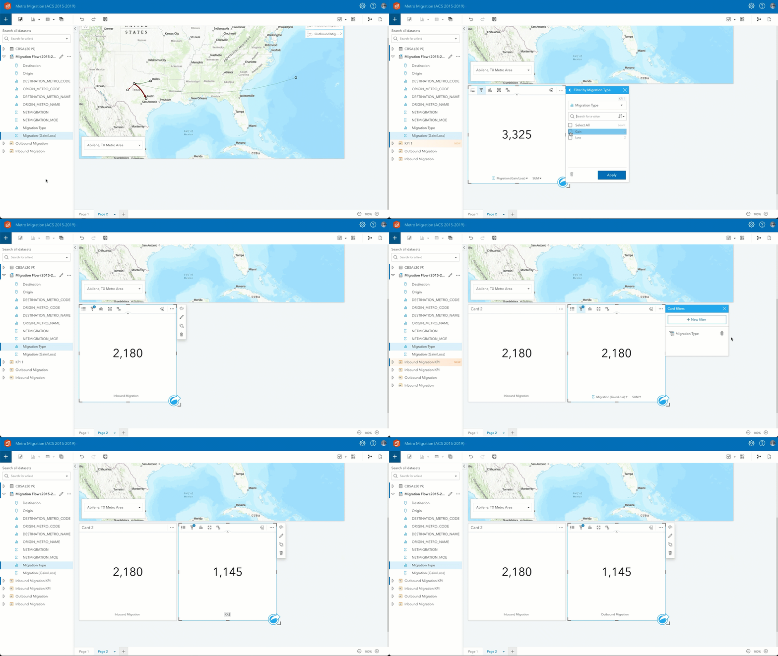
14) Add summary table for inbound migration.
- Drag ORIGIN_METRO_NAME and Migration (Gain/Loss) to Table and drop them on Summary Table.
- Click Card filter, select the Migration Type field and filter to
Gain. - Rename the ORIGIN_METRO_NAME field to
Metro. - Rename the result dataset to
Inbound Migration Summary Table.
15) Enable cross-filters on the table.
16) Add summary table for outbound migration.
- Copy (ctrl+C or cmd+C) and paste (ctrl+V or cmd+V) the Inbound Migration Summary Table card.
- Click Card filter, select the Migration Type field and filter to
Loss. - Rename the result dataset to
Outbound Migration Summary Table.
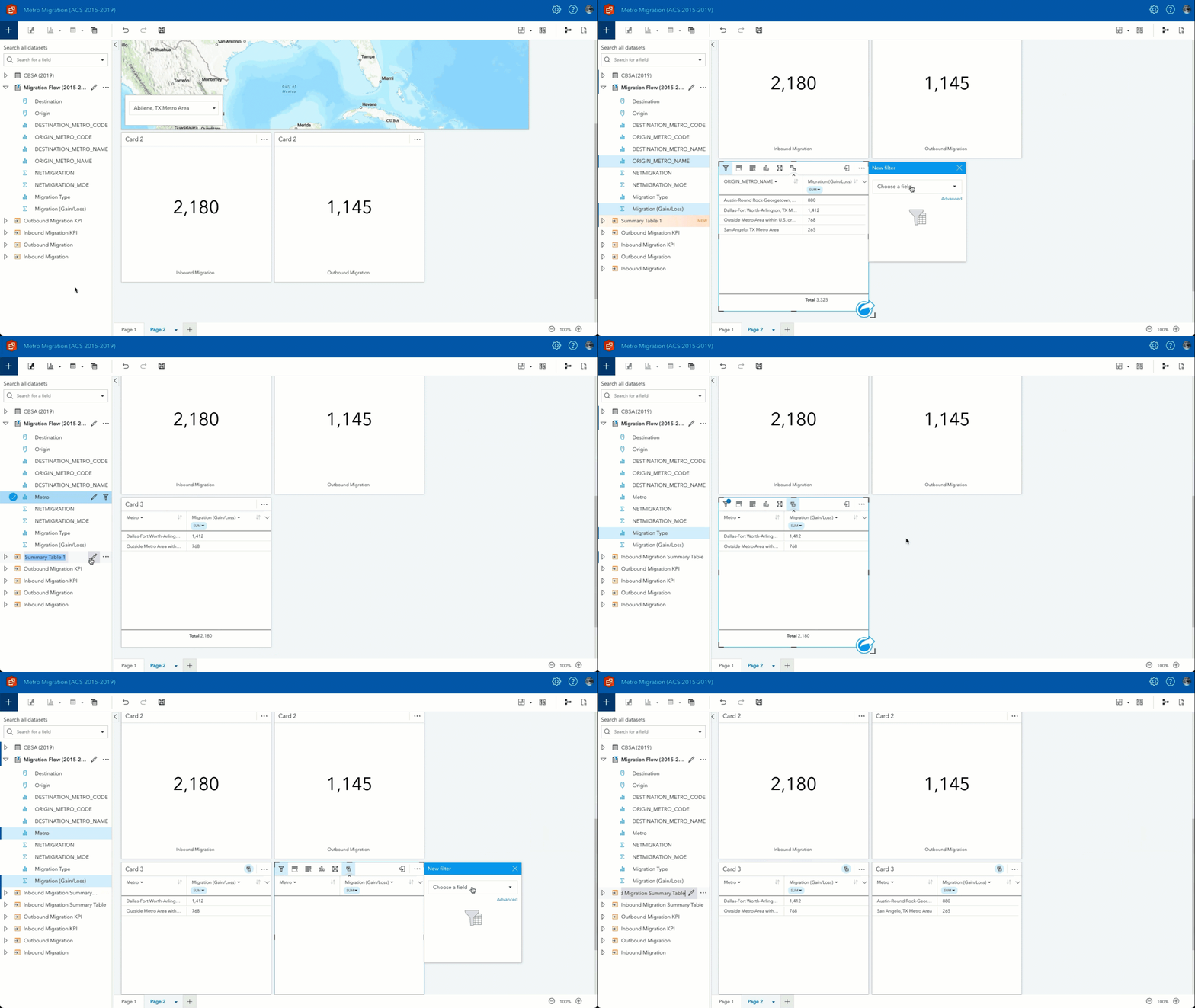
17) Add text labels for each table.
- Add a Text and media card, type
Moving Fromin the text box. - Change the font to
20, Bold, Centered. - Remove the card background and border.
- Copy (ctrl+C or cmd+C) and paste (ctrl+V or cmd+V) the card you just created.
- Change Moving From to
Moving To.
18) Arrange the cards.
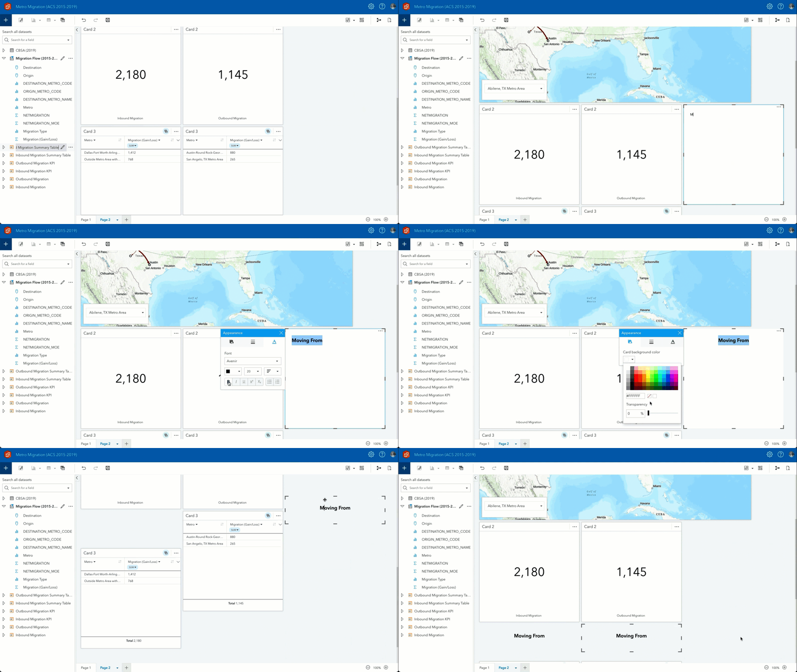
19) Save the workbook.
And there it is. You’ve created data and visuals to analyze net migration and migration flow for metro areas within the US. From here you can experiment with generating reports, embedding visuals, and creating a narrative to tell a complete story.
One last thing
Another powerful feature within ArcGIS Insights is that all of your analytic ingenuity was tracked and can be saved as a model. This allows us to rerun the analysis using ACS data from a different time period. For example, you can quickly update your visualizations and analysis using the 2016-2020 ACS data recently released from the US Census Bureau.
Please leave a comment below or on the ArcGIS Insights community page and let us know how you’re using ArcGIS Insights to turn information into knowledge.



Article Discussion: