Insights 3.3 is now available! We’re pleased to share significant new features that have been asked for.
Insights extends the reach of GIS to the entire organization by delivering self-service location analytics. It empowers all analysts to perform location analytics through a familiar, non-disruptive user experience. Users, novice to expert, can directly connect to enterprise databases and ArcGIS, and perform drag-and-drop spatial analysis.
Some main highlights with this release include: pie and bar charts in your map, unlimited fields in the summary table, percentile statistics, the ability to embed a Python or R script within your Insights model, and Insights running local on Windows and Mac (in beta).
Maps with pie and column chart symbols
Pie and column charts are an intuitive way to represent and understand different categories of your data. Maps also frequently need to communicate data with categories.
So, we’ve married the two – maps with pie and column charts. The result is a interactive visual within one Insights card, combined. Your map symbology now communicates the categorical values, and each slice of the pie (or column chart) is interactive, driving other card selections and filters. This lets you progressively disclose more information to uncover finer granularity. Of course, you can create this new map visual with either polygon, line, or point data.
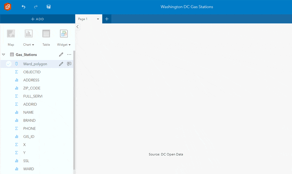
The below Insights page explains the distribution of gas station brands within Washington DC. Notice that when a bar on the column chart is selected, the other cards honor that selection. This animation shows selections across cards, but filters (cross filters) can also be applied across cards. Data acquired from Open Data DC.
Summary table with unlimited fields
A summary table (unlike a full data table) allows you to extract the significance from a large detailed dataset. It lets you pivot and summarize with statistics, giving your data a new interpretable form and value. Analysts are no longer limited to only using 2 string fields within the summary table – now use as many string fields as you like. Also, an individual numeric field can now be used an unlimited number of times. This means that your summary tables can be larger and contain more detail and statistics, allowing you to summarize your tabular data fully.
Percentile and median statistics
A percentile is useful for understanding how much data falls below a given value. It’s an indicator for how your data is distributed, specific to a given number. Within Insights, the percentile is configurable – meaning that you can define a value (say 90th percentile), and visualize the distribution of records that fall above and below that 90%. Percentile (and median) statistics are now available within the summary table, bar chart, column chart, and line graph cards.
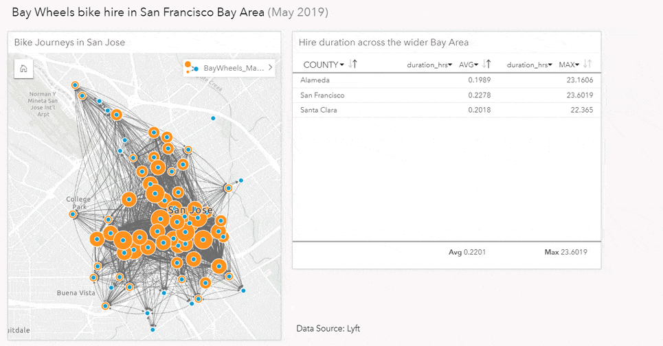
The below Insights page communicates not only where scooter rentals occur (with a line connecting origins and destinations), but also how long each ride is. The summary table lists the counties and a 90th percentile value for each, describing that 90% of rides are “x” hours or less. This helps to reduce the noise of outlier data. The 90th percentile of ride times are also communicated through the bar chart, so we can see that the San Francisco County has longer rides. Data acquired from Bay Wheels.
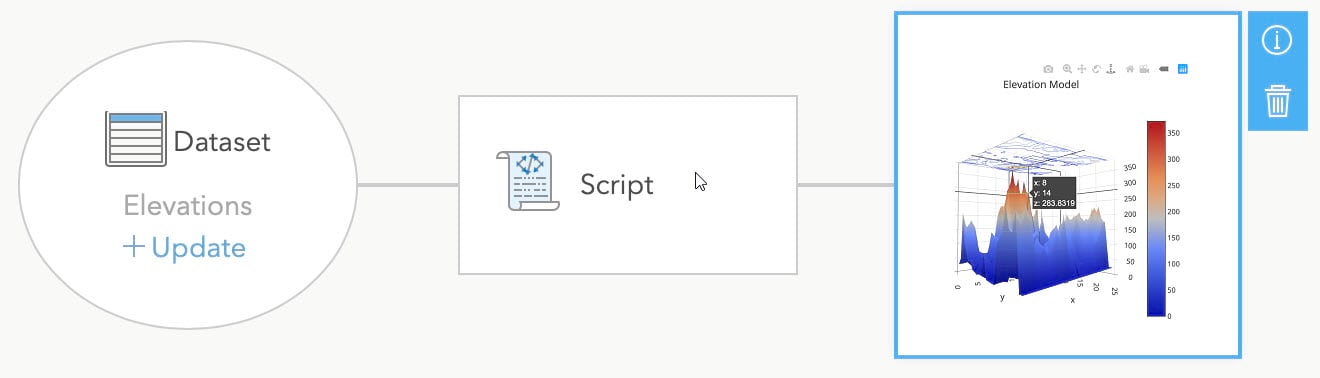
Add a Python or R script to an Insights model
You can now embed a Python or R script within your Insights model, allowing you to seamlessly integrate scripts as part of your Insights workflow. These scripts can perform data cleanup, analysis, and create new data visualizations – opening up the possibilities of open data science to you within Insights. Once embedded, the script looks and feels just like a standard Insights analysis tool, and is automatically rerun when your model is refreshed.
This capability also means that anyone can use a Python or R script now, you don’t have to be a developer. Collaborate with someone to create the script, and then use it within your own Insights model. Let’s say you have a data set you need to format fields with, and re-run analysis on a monthly basis – create the script once, embed it, and then repeatedly use within your analysis every time you get new data.
Insights Local on Windows and Mac (beta)
Insights Local on Windows and Mac is now in beta, and available through the early adopter community. Anyone with a current Insights license (in ArcGIS Enterprise in ArcGIS Online) has access, and we invite you to experience it for yourself. All ArcGIS organizational administrators have been emailed instructions to access this program.
As an analyst, this gives you the option to use Insights in a web browser, or Insights installed natively on Windows and Mac. Insights Local looks and feels the same as the web browser version. However, Insights Local can work disconnected from the web, it leverages local CPU power, and connects directly to enterprise business databases. When connected to the ArcGIS Online or Enterprise, Insights Local can do even more, including sharing and consumption of location-based (LBS) services.
This initial beta release is just the beginning, and more is coming for Insights Local!
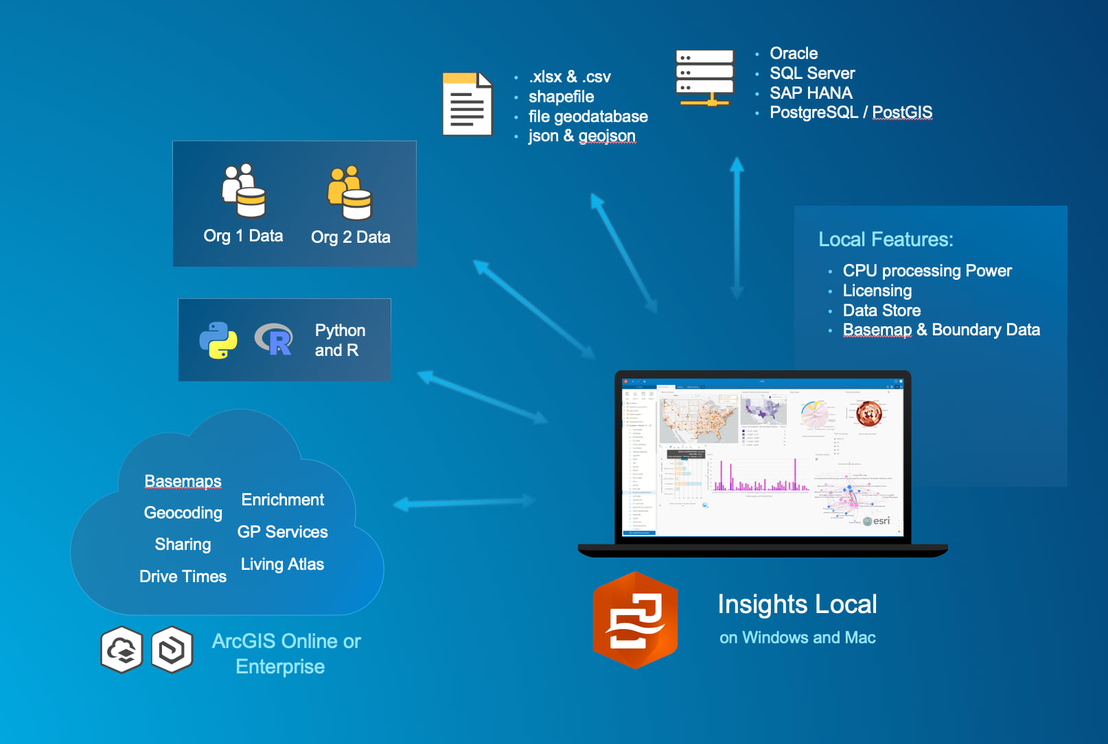
The below diagram describes some of the data Insights Local can connect to, including connections to multiple ArcGIS Organizations.
…and more!
- Now you can immediately access insights by going to insights.arcgis.com – this is the well-known location for accessing the app. Bookmark it!
- Anyone in your ArcGIS Online or ArcGIS Enterprise organization with viewer access can use the Insights home page, to see pages and workbooks shared with them. Viewers can read these pages and workbooks in view mode only. So, the Insights home page now serves as a portal for viewers across your organization.
- Working with shapefiles became easier. When adding data to a workbook, you can now directly add a shapefile, and from the Insights home page you can now export data to shapefile and csv file format.
- We’ve improved support for dealing with null and no data values. The map legend and charts cards now show null data as a unique value. This allows you to more easily separate these null and no data records, and work with them.
- Python and R scripting (now in beta 2) has added several enhancements. This includes the ability to edit previous cells and export scripting history to the data pane. For Python, there is no longer any limitation on the size of data that can be exported from the Python kernel to Insights. Also for Python, spatial fields are honored in the scripting environment, and can even be exported into Insights as a spatial dataset.
- For even more detail on what’s new with Insights 3.3, check out the help documentation.
Please note: if your organization has deployed Insights in ArcGIS Enterprise 10.7.1 or 10.7, be sure to install Insights 3.3.1. If you are running ArcGIS Enterprise 10.6.1, download Insights 3.3. If you’re working with ArcGIS Online, just log in now to check it out now!
What are you waiting for? Give these new capabilities a try, log in to Insights. Don’t have Insights yet? Sign up for a 21-day free trial today.


Commenting is not enabled for this article.