For data analysis, sharing is caring. Or more precisely, sharing your high-quality analysis in a way that meets the needs of your intended audience…is caring. The report designer feature in ArcGIS Insights allows authors to create custom design layouts for one or more device types and publish a report that changes to an appropriate layout based on the viewer’s device—commonly referred to as adaptive web design.
But how does adaptive design work and how can you get the most out of it? Grab some coffee and let’s walk through it!
How does it work?
Users can design one or more layouts that are specific to a device category (desktop/tablet/phone) and, if needed, set custom breakpoints for each category.
Fundamentally, it’s easiest to think of different device categories with regards to their viewports. The breakpoints in the report designer are used to define which layout is displayed given a certain viewport.
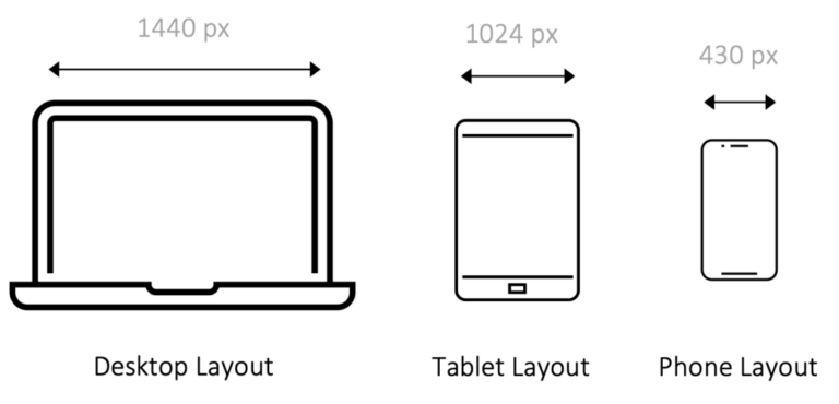
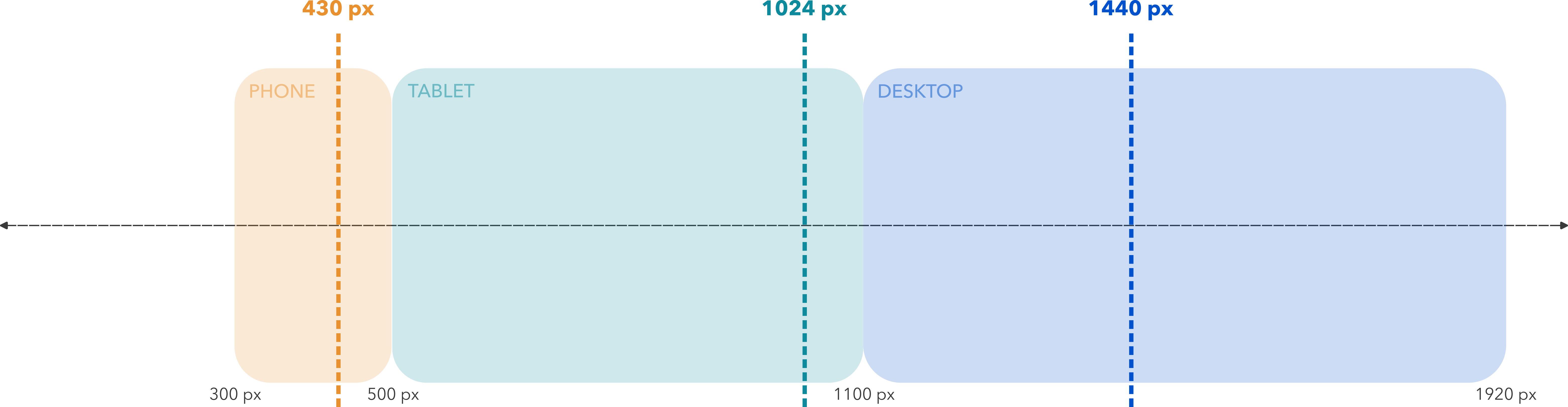
In the example above, devices with a viewport of 431px – 1024px will display Tablet Layout. Once a viewport drops to 430px though, it will display Phone Layout. Note that this is independent of the actual device. Actions such as changing the orientation of your phone or significantly reducing the size of your web browser will modify the viewport dimensions and may trigger a different layout.

As device sizes—and therefore viewport sizes—are in constant flux, the report designer allows you to modify the exact breakpoints (within set ranges).
OK, but how does it work best?
That covers the basics, but if you’ve made it this far, you’re likely interested in how to achieve the best results. With a little bit of knowledge of your intended audience and some initial planning, you can create interactive reports that will look great for any use case.
First, let’s acknowledge that it’s highly unlikely to cover each possible screen scenario. Instead, the goal should be to provide the best possible experience while providing reasonable access to the highest number of users. Here are a few handy tips to get started:
- Define your core audience: This is often the most difficult task but to the degree you can establish which devices the majority of your content will be consumed on, the easier your design task becomes. Will your report mostly be viewed on laptops and large screen monitors? Will it be a mix of phones and laptops? Maybe only on tablets in the field? Whatever the answer is, this should drive your design efforts
- Avoid horizontal scrolling: For a multitude of reasons, web interactions are generally vertical in nature. Users are more likely to scroll from top to bottom (vertical) than left to right (horizontal). As a result, horizontal scrolling should only be used for specific and significant design decisions.
- Design by order of importance: While it’s true that you may create three distinct layouts, this should not mean three times the work. Often, a design will be created for one device category and then adapted to fit the others. Start with whatever design is most important. If you would prefer that your content be consumed on a desktop, design for desktops first and then adapt as needed for tablet and phone. This makes sure that you’re not limiting your design simply because you started at the wrong place.
Example
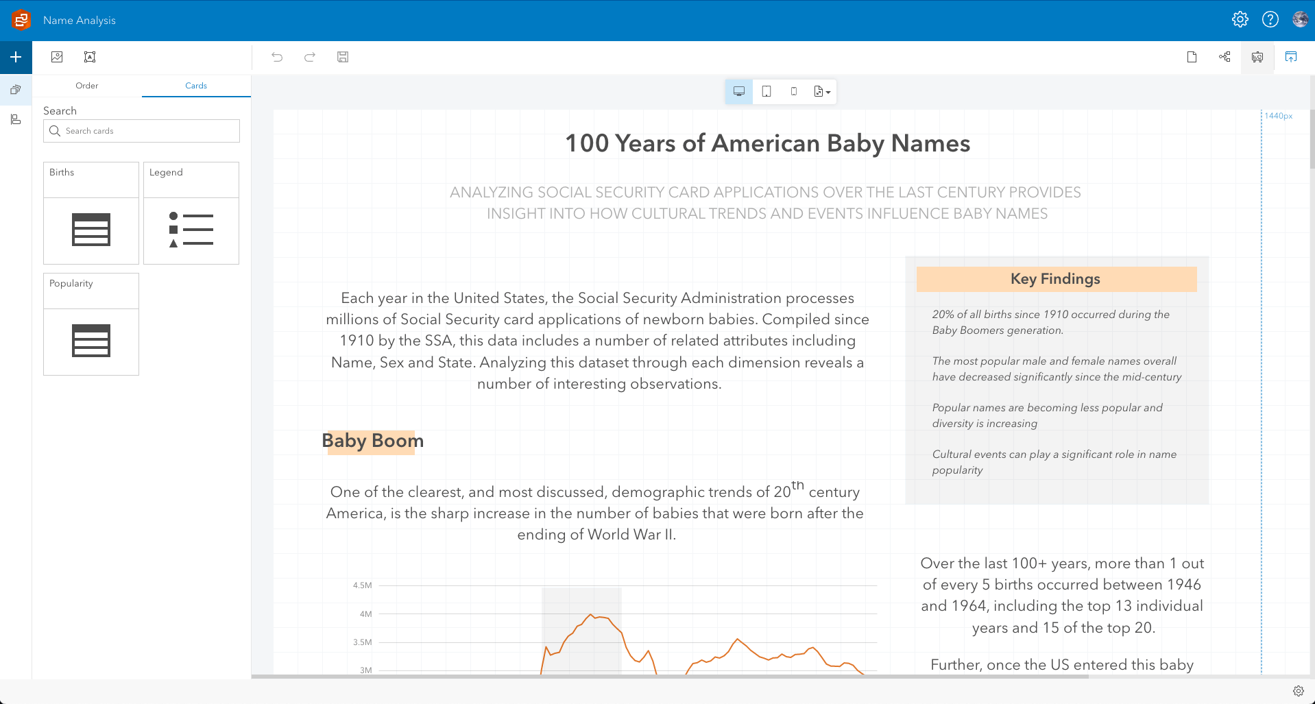
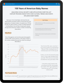
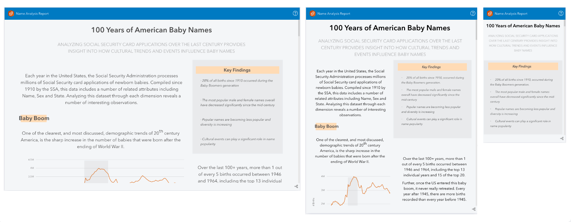
Let’s dive into a specific example. In ArcGIS Insights, I’ve completed an analysis of 100 plus years of baby names using United States Social Security. My goal is to create an executive summary report that highlights notable trends and interesting patterns. I believe this content is best consumed on a desktop, but I also realize that the report is going to be shared publicly, so it should work across all device categories.
Starting with desktop and using the report designer tools I’m able to arrange my content and add design elements to create a full data story.
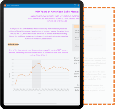
As I switch to the tablet layout I can modify the breakpoint, if needed. At this point, it’s important to remember that the breakpoint controls which layout is displayed but it doesn’t necessarily represent the edge of the visual canvas. The canvas will always be the width of my content. If I add a reference table to the layout and stretch it horizontally to 1200px wide, my canvas will default to 1200px wide. The same table stretched to 500px would create a 500px wide canvas, and so on.
Let’s see that concept in action. In the example below, the content has been changed—the font is purple—but the arrangement is the same as my desktop layout. My canvas in this scenario is then 1440px wide for both desktops and tablets. The tablet breakpoint ensures that users with viewports less than 1025px will see this new purple font layout, but it’s not optimized for the device category and requires horizontal scrolling to view all of the content.
Rearranging the content to fit ensures a much better experience for users.
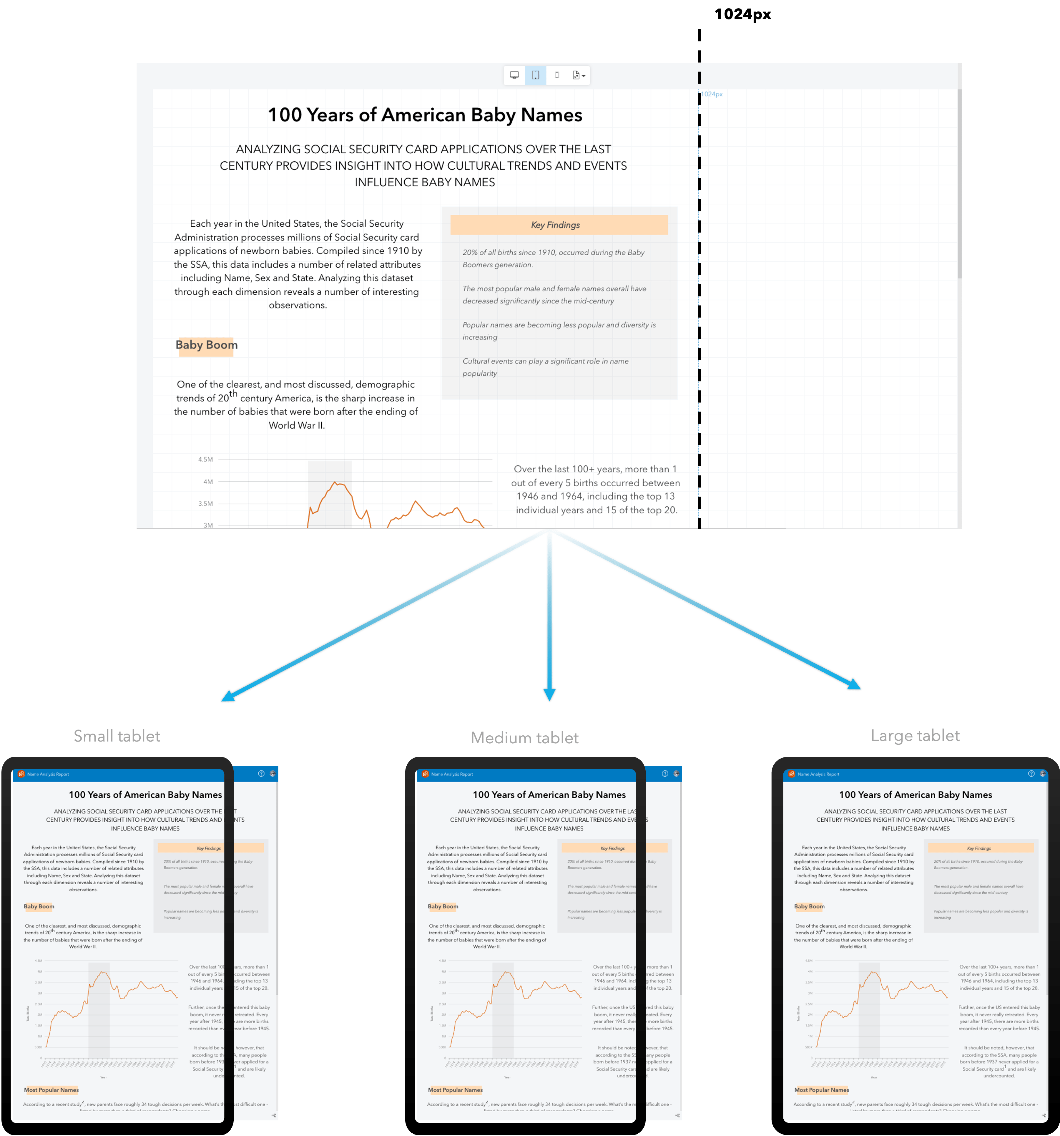
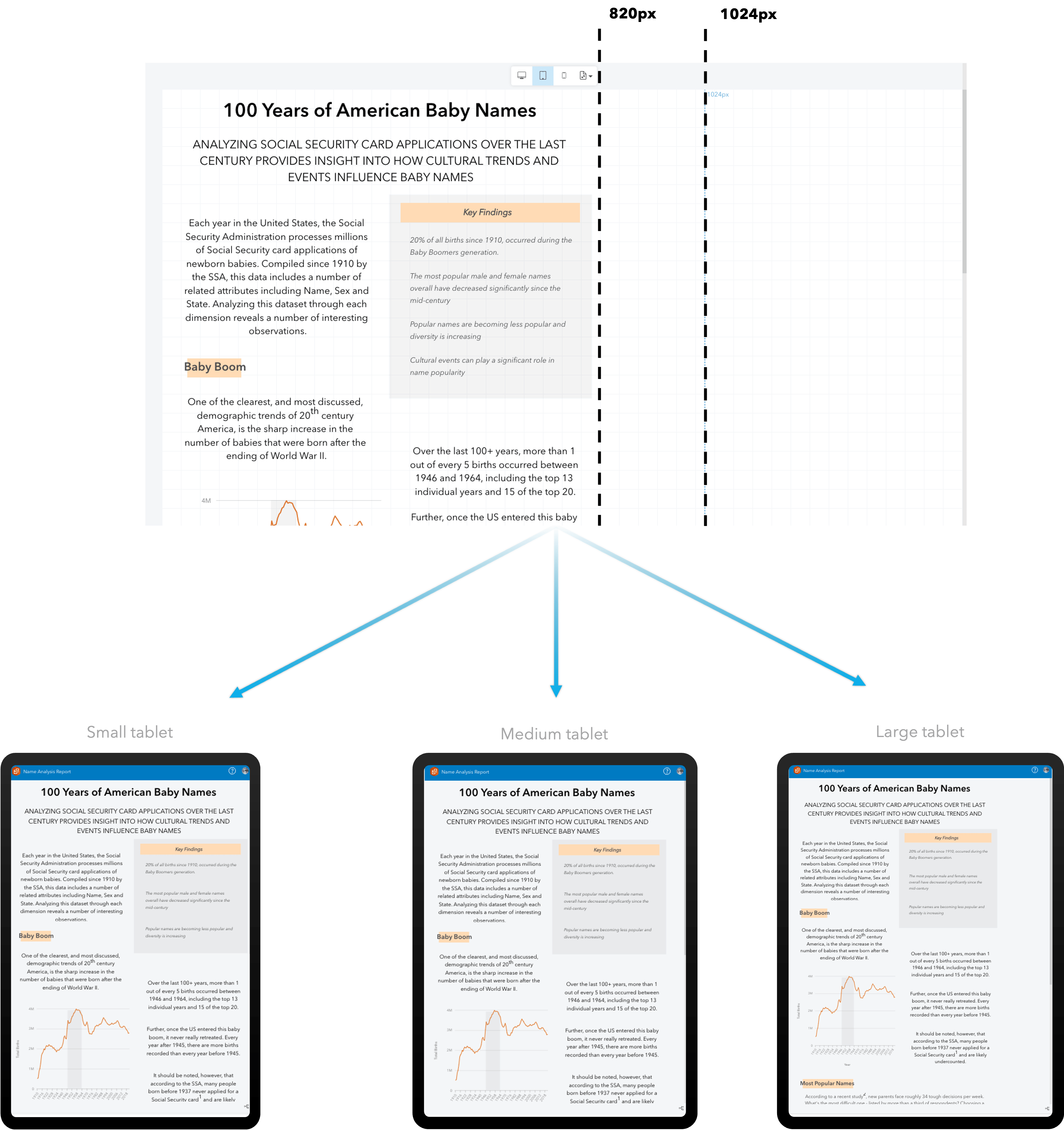
This concept becomes particularly important when designing for multiple devices within the same category. Below is a table of current generation tablets and their viewport in portrait mode.
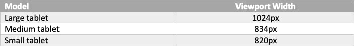
The differences between the viewports of each model are small enough that they should probably all be using the same layout but large enough that a design on the largest isn’t going to work well on the smallest. For scenarios like this, start with the smallest device needed within the category. This ensures that content will be seen on each one without the need for horizontal scrolling.
In the example below, I’ve arranged my content so that my canvas is 1024px. All three devices above will see the same layout, but users will have to scroll horizontally on the two smaller models.
However, if I arrange my content so that my canvas is 820px, horizontal scrolling is removed for all devices and the extra white space that is present on the two larger models is a reasonable trade-off.
The same concept can be applied for the desktop and phone size categories as well.
Conclusion
That’s it! With a bit of forethought and applied creativity it is possible to create high quality reports for all types of users. The possibilities for reporting are vast and we’re excited to see where the Insights community takes this new capability.
We also want to hear from you! Comment below or head over to the Insights Community page and let us know what you think.


Article Discussion: