A new study by Harvard and Esri researchers has determined that air quality has generally improved across the US since 2000. But it has not improved equally for everyone – namely Black, Asian, Latinx, and low-income populations.
Led by Dr. Francesca Dominici and her colleagues at the Harvard Data Science Initiative, in collaboration with Esri’s spatial statistics team members, Xiaodan Zhou, Jie Liu, and Ting Lee, the study highlights racial disparities in air quality using visualizations made with the ArcGIS API for JavaScript, a mapping tool for 2D and 3D visualizations. The study compares levels of PM2.5 – air particles smaller than 2.5 micrometers wide and thus dangerous for human health- for demographics like race and income to discover if air quality disparities fall on racial or financial lines. In total, the team analyzed over 32,000 ZIP codes across the United States.
The results show that diminished air quality is standard in low-income and ethnically diverse ZIP codes suggesting environmental injustice could be a key reason for air quality disparities. Areas where people have fewer tools and money to fight injustice result in a lack of enforcement, regulation, and remediation.
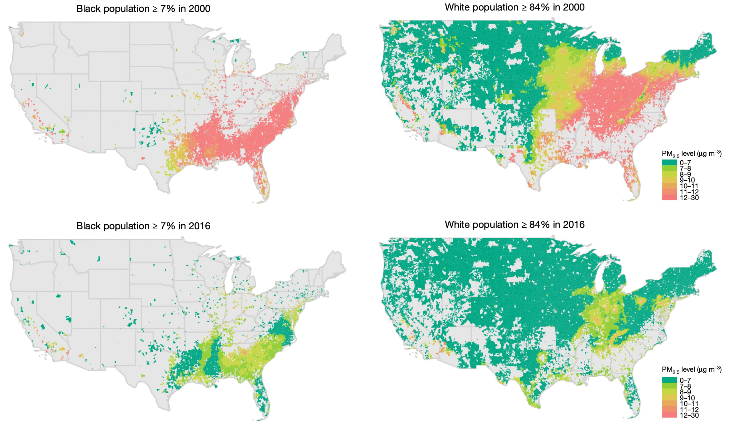
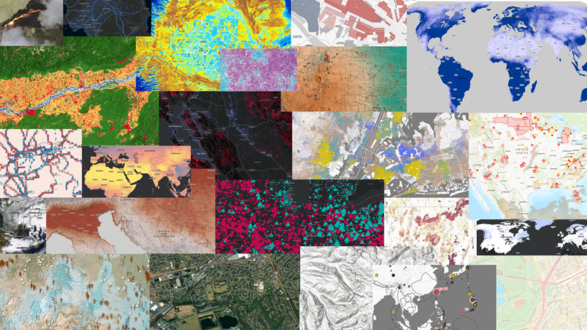
Above, maps from the study show air quality levels for primarily Black ZIP codes (left) and predominantly white ZIP codes (right). The top two maps display PM2.5 levels for 2000, while the bottom two show PM2.5 levels for 2016. Notice how, between 2000 and 2016, majority-Black ZIP codes saw air quality improve from less healthy red levels to acceptable lime green levels. Meanwhile, majority-white ZIP codes saw air quality improve from red levels to the optimal dark green levels, marking the most significant air quality improvement. In 2016, the average PM2.5 concentration for the Black population in the US was 13.7% higher than that of the white population. These maps demonstrate how the racial makeup of an area influences air quality disparity trends. They also suggest that race plays a factor in the speed at which air quality remediation happens.
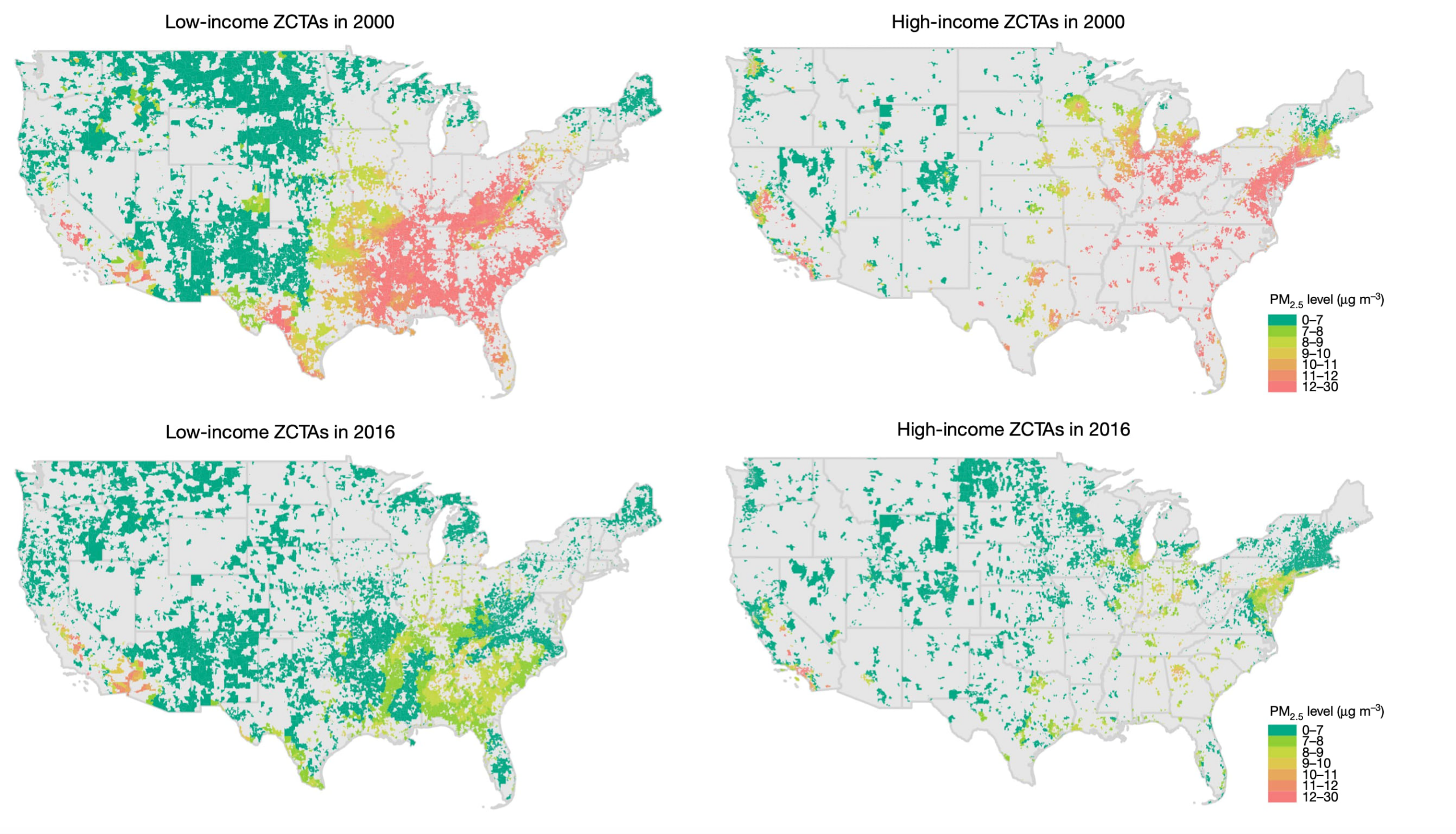
Similar disparities were observed when comparing income-level. Notice that, between 2000 and 2016, air quality in low-income communities improved from being in the dangerous red range to the acceptable lime green range. Meanwhile, air quality in high-income communities improved from the red range to the optimal dark green range, again, marking a more drastic air quality improvement. These maps attest that income also plays a significant role in the air-quality remediation of a region.

Even as air quality is improving, it is not improving equally for all people.
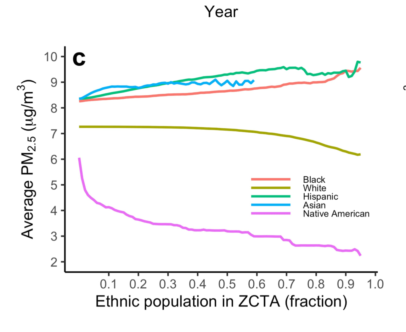
Most importantly, the results show that as a ZIP code’s racial makeup changed, so did its air quality. For example, as the Black population increased within a ZIP code, the amount of PM 2.5 particles also increased, diminishing the air quality. This was especially true in ZIP codes where more than 85 percent of the population was Black. A similar trend was observed for Latinx populations. Strikingly, the opposite trend was seen in ZIP codes where the white population was increasing. As more white residents moved into the community, the air quality improved. These results suggest that the racial makeup of a community strongly influences the remediation and enforcement of emission regulations.
Maps that Empower Communities
Now that the results are published and the disparity trends can be clearly viewed on maps, the team hopes community members utilize the maps to push for targeted air quality remediation in their region. The study was purposefully designed to create maps and graphs that are easy to understand.
“The more accessible we make our results, the higher the impact they’re going to have. It’s not about pointing fingers or agreeing and disagreeing. It’s about being able to visualize and see. Look at the data!” Dominici exclaimed.
Dominici said seeing the disparities on maps was key to helping readers of the study understand the dire situation, pointing to the partnership with Esri as being particularly helpful.
“By working with Esri, not only have we kept this paper at a very high level of scientific rigor, which is important, but we have also taken many steps forward by being able to communicate and visualize our results,” she said.
The team harnessed a variety of Esri tools in the study. ArcGIS Pro was used to explore the disparities in the data. The ArcGIS Pro “project” feature allowed the team to handle missing data, resolve spatially misaligned data, and conduct exploratory mapping. The team also utilized ArcGIS Online to share data for cross-team collaboration. Lastly, ArcGIS API for JavaScript was used to create the maps in an informative and aesthetically pleasing way that was computer memory efficient.
“The visualizations shine a light on relative disparities in a very intuitive and straightforward way,” said Zhou. “Anyone can capture the disparity pattern easily from our maps and animations. We did these with ArcGIS API for JavaScript which is a powerful tool for building stunning 2D and 3D visualizations.”

Anyone can capture the disparity pattern easily from our maps and animations.
Dominici urges people with a GIS and statistics background to download the data and look at the code, which will allow them to see step-by-step what was done and potentially apply the team’s methodology to other situations, “not only in the context of air pollution but also in the context of weather, pesticides, climate change, and more.” In addition to open access to the team’s code, supplemental videos are available that show how the team created each map. The study’s code and data can be found here.
Overall Dominici sums up the study’s purpose like this, “People that live in both clean-air areas and dirty-air areas, now have the visualization of maps combined with a peer-reviewed paper in Nature to advocate for change,” said Dominici. The data can also be downloaded, and individuals can look up their ZIP code to see the disparities in their own community. “It’s really about mobilizing the entire community to advocate for change,” said Dominici.
To learn more about ArcGIS for air quality analysis explore air quality layers in the ArcGIS Living Atlas of the World, access stories, and discover resources.


Article Discussion: