At the March 2017 Esri Developer Summit, Dave Bayer and I gave a presentation on how to use Arcade expressions in web apps built on the ArcGIS platform. In that presentation I demonstrated a succinct way to create a predominance visualization using Arcade.
Visualizing predominance involves coloring a layer’s features based on which attribute among a set of competing numeric attributes wins or beats the others in total count. Common applications of this include visualizing election results, survey results, and demographic majorities.
Arcade is a good solution for predominance visualizations because it allows you to avoid creating new fields in a service for storing the predominant category and the margin of victory. With Arcade, you write the expression and it will return the values at runtime, allowing you to drive the color of the visualization based on the predominant category.
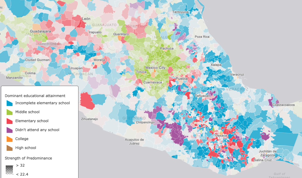
In our Dev Summit presentation I shared this webmap, which depicts the predominant educational attainment achieved by people in Mexico on the municipal level.
The expression used to create the visualization looks like this:
// Calculate values based on attribute fields
var primary = $feature.EDUC04_CY + $feature.EDUC07_CY;
var secondary = $feature.EDUC06_CY + $feature.EDUC08_CY;
var highSchool = $feature.EDUC09_CY + $feature.EDUC11_CY;
var college = $feature.EDUC10_CY + $feature.EDUC12_CY
              + $feature.EDUC13_CY+$feature.EDUC14_CY
              + $feature.EDUC15_CY;

// pass all values to an array
var fields = [ $feature.EDUC01_CY, $feature.EDUC02_CY,
               $feature.EDUC03_CY, $feature.EDUC05_CY,
                primary, secondary,highSchool,college ];

// get the max or winner
var winner = Max(fields);

// return the string describing the winning value
return Decode(winner,
  $feature.EDUC01_CY, "Didn't attend any school",
  $feature.EDUC02_CY, "Preschool",
  $feature.EDUC03_CY, "Incomplete elementary school",
  primary, "Elementary school",
  $feature.EDUC05_CY, "Incomplete middle school",
  secondary, "Middle school",
  highSchool, "High school",
  college, "College", "Other");
Once you understand Arcade’s syntax and what the Decode() function is doing, the expression is pretty straightforward to read. Decode is an Arcade function that matches a value (usually feature attribute) to another value among a set of potential matches. Each of the potential matches is paired with other values (usually a string) that describes it. In essence, it matches a value with a meaningful description. In this case, the input value to match is the maximum value of those field values/expressions in the provided array. All values in the array are passed to the Decode function along with matching strings describing what the value represents. So the string matching the max will always be returned. It’s slick, compact, and simple to use with any dataset.
An alternate approach
However, one user at our presentation asked a great question: “What if there’s a tie for the top category?” The answer we gave is that Decode will return the first match in the case of duplicate winners. While ties are relatively common in the datasets I’ve looked at, very few of them involved the max value. Nevertheless, the Decode approach is flawed and doesn’t address the real question: “How do we visualize ties for the top category?”
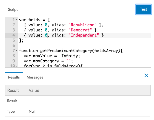
The solution I eventually came up takes advantage of Arcade’s ability to write custom functions. After testing the revised expression with several datasets, I found it easier to work with and the solution for dealing with tied max values satisfactory:
var primary = $feature.EDUC04_CY + $feature.EDUC07_CY;
var secondary = $feature.EDUC06_CY + $feature.EDUC08_CY;
var highSchool = $feature.EDUC09_CY + $feature.EDUC11_CY;
var college = $feature.EDUC10_CY + $feature.EDUC12_CY
              + $feature.EDUC13_CY+$feature.EDUC14_CY
              + $feature.EDUC15_CY;

// The fields from which to calculate predominance
// The expression will return the alias of the predominant field

var fields = [
  { value: $feature.EDUC01_CY, alias: "Didn't attend any school" },
  { value: $feature.EDUC02_CY, alias: "Preschool" },
  { value: $feature.EDUC03_CY, alias: "Incomplete elementary school" },
  { value: primary, alias: "Elementary school" },
  { value: $feature.EDUC05_CY, alias: "Incomplete middle school" },
  { value: secondary, alias: "Middle school" },
  { value: highSchool, alias: "High school" },
  { value: college, alias: "College" }
];

// Returns the predominant category as the alias
// defined in the fields array. If there is a tie,
// then both names are concatenated and used to
// indicate the tie

function getPredominantCategory(fieldsArray){
  var maxValue = -Infinity;
  var maxCategory = "";
  for(var k in fieldsArray){
    if(fieldsArray[k].value > maxValue){
      maxValue = fieldsArray[k].value;
      maxCategory = fieldsArray[k].alias;
    } else if (fieldsArray[k].value == maxValue){
      maxCategory = maxCategory + "/" + fieldsArray[k].alias;
    }
  }
  return IIF(maxValue <= 0, null, maxCategory);
}

getPredominantCategory(fields);
The getPredominantCategory() function returns the alias of the max category as defined in the fieldsArray. Notice that if a tie value is encountered for the max value, then the aliases of all fields involved with the tie are concatenated and returned.
The results
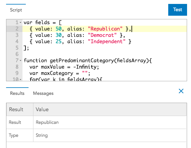
Let’s take a look at how well this approach works using the Arcade playground. I entered dummy field values representing the number of votes cast for three political parties in a fictitious feature and ran the expression. It correctly returned the maximum value.
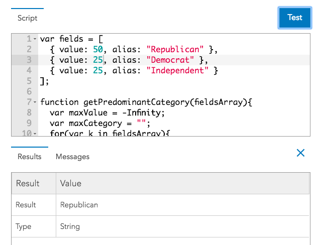
If the two lower values were tied, the same result was correctly returned since they don’t involve the maximum value.
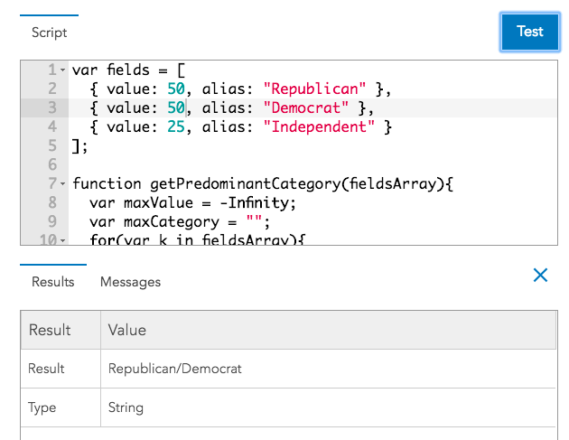
If two values were tied for first place, both aliases were returned as a concatenated string.
In the unlikely event of a three-way tie, the expression even works in that scenario.

And what if if all fields have the value of zero? It doesn’t seem right to visualize a tie since no votes were cast within the given feature. So the expression returns null, which will indicate to the layer’s renderer to not bother with visualizing the feature.
But how does this approach change the visualization of the educational attainment dataset in Mexico? As a whole, the visualization didn’t change much. If we open up the “change style” options in the ArcGIS Online map viewer, we can compare the categories and their total counts between each method used.
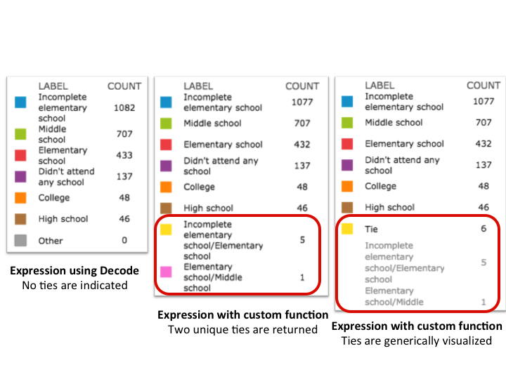
Two unique tie situations were found among six municipalities where ties existed for the max value of the fields. Notice that the map viewer allows you to group values. So if you have a bunch of unique tie scenarios, you can group them into the “Other” category and rename it to “tie” so they are visualized with the same symbol.

If building the visualization in a custom app with the ArcGIS API for JavaScript, you would use a UniqueValueRenderer and just set the defaultSymbol and defaultLabel to this generic value. Then you won’t need to specify each tie scenario in the uniqueValueInfos of the renderer.
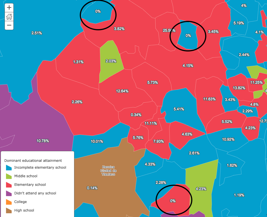
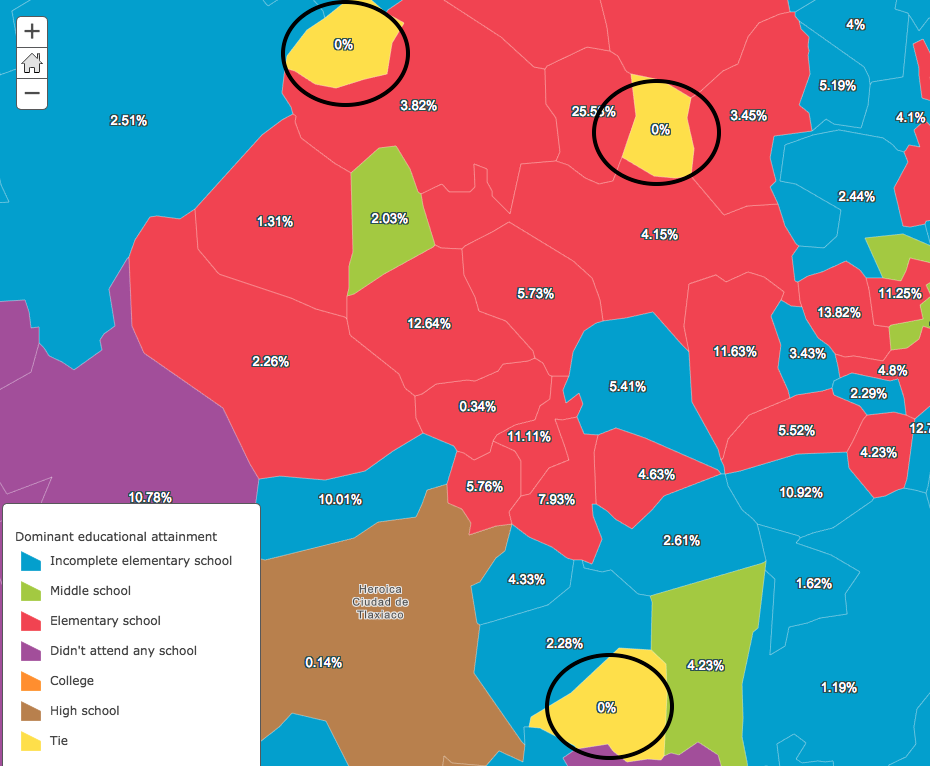
Interestingly, three of the six ties occurred in the same region. We’ll zoom to northwestern Oaxaca to get a better look at comparing the different visualizations for each method. The labels on each feature indicate the % gap or margin between the top two competing fields. I’ve circled the features in black where the gap is 0% (or where a tie exists).
Decode methodology – no ties indicated
Notice that the features with ties incorrectly indicate a clear winner.
Custom function methodology – unique ties indicated
Unique ties are visualized with different colors.
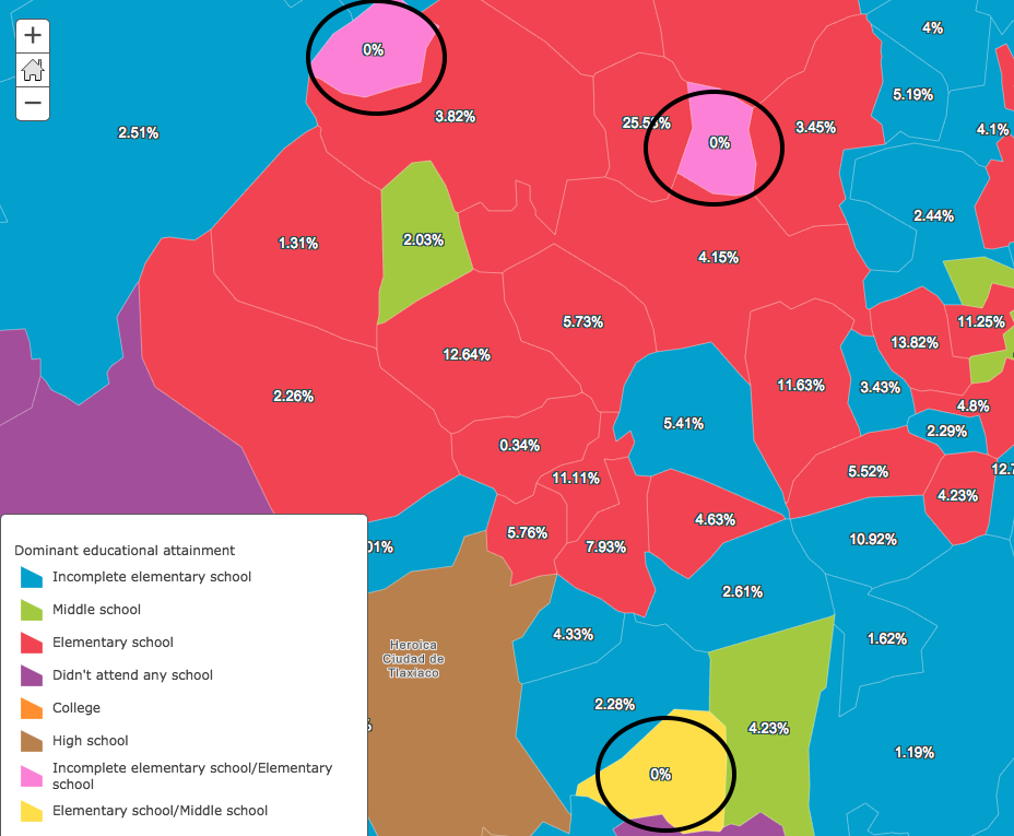
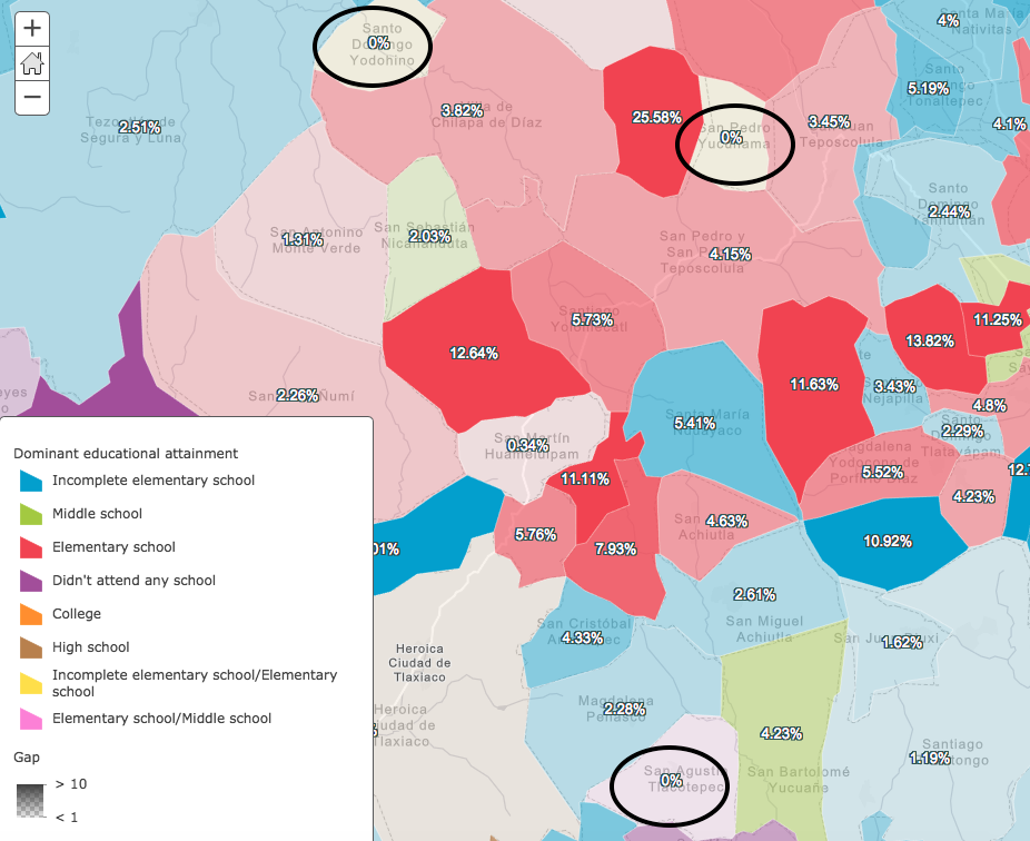
Custom function methodology – all ties generically indicated
All ties are visualized with the same color after grouping them together.
Methods for indicating strength of predominance
I’ve used two different methods for visualizing the strength of the predominant value, or the overall dominance of the winner. They’re explained in more depth in the session video so I won’t go into too much depth describing the logic of the Arcade syntax used.
The concept is that we’ll change the opacity value of each feature based on how convincing the win was between the competing values. This tells another side of the story, especially in the case of elections and survey results.
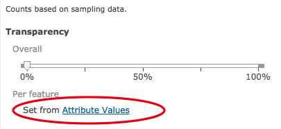
Opacity can be driven by field values or Arcade expressions by clicking the “Attribute Values” link in the “Change style” options of ArcGIS Online.
Strength
The first method I simply call “strength of predominance”. It compares the value of the winner to all other values and returns its strength as a percentage:
var primary = $feature.EDUC04_CY + $feature.EDUC07_CY;
var secondary = $feature.EDUC06_CY + $feature.EDUC08_CY;
var highSchool = $feature.EDUC09_CY + $feature.EDUC11_CY;
var college = $feature.EDUC10_CY + $feature.EDUC12_CY+$feature.EDUC13_CY
              +$feature.EDUC14_CY+$feature.EDUC15_CY;

var fields = [ $feature.EDUC01_CY, $feature.EDUC02_CY,
               $feature.EDUC03_CY, $feature.EDUC05_CY,
                primary, secondary, highSchool, college ];
var winner = Max(fields);
var total = Sum(fields);
return (winner/total)*100;
The percentage is then used to drive the opacity of each feature. The Smart mapping API will provide good default breakpoints for the opacity values.
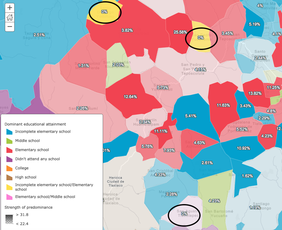
Notice that features where ties exist can have varying levels of strength. In the image above, the northern-most circled feature has two attributes with high values that are tied. The competing field values might look something like this: [40, 40, 10, 4, 2, 1, 1, 0]. The strength expression would return 40%. The max of this feature is likely higher than the max in most other features; thus the feature is more opaque even though a tie exists.
The southern-most circled feature may have the following values for its competing categories: [20, 20, 19, 19, 10, 8, 3, 1]. The strength expression would return 20%. The max is relatively low compared to the max value of other features, thus resulting in the vary transparent color.
Gap
The “Gap” methodology only compares the max value with the second highest value. The resulting value indicates how much the winning feature won by, also know as the “margin of victory”.
var primary = $feature.EDUC04_CY + $feature.EDUC07_CY;
var secondary = $feature.EDUC06_CY + $feature.EDUC08_CY;
var highSchool = $feature.EDUC09_CY + $feature.EDUC11_CY;
var college = $feature.EDUC10_CY+$feature.EDUC12_CY
             + $feature.EDUC13_CY + $feature.EDUC14_CY
             + $feature.EDUC15_CY;

var fields = [ $feature.EDUC01_CY, $feature.EDUC02_CY,
              $feature.EDUC03_CY, $feature.EDUC05_CY,
              primary, secondary,highSchool,college ];

var order = Reverse(Sort(fields));
var winner = order[0];
var secondPlace = order[1];
var total = Sum(fields);
return Round(((winner - secondPlace) / total) * 100, 2);
In this scenario, the tied features will always have a transparent fill.
Summary
Arcade can be a powerful vehicle for exploring predominance visualizations among competing attributes. I mentioned a couple of expressions you can use when creating predominance visualizations. Just remember the limitations of each:
- The Decode approach is fine if no ties are present or if you plan on driving opacity with a gap expression since gap will wash out the color anyway.
- The custom function works well in the case of ties. However, if many unique types of ties exist, you may want to visualize them grouped in a generic “tie” category to avoid confusion.
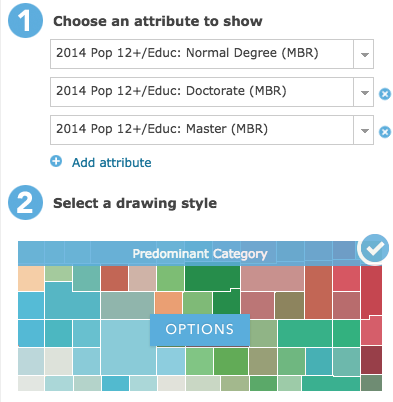
Also note that you can leverage the Smart Mapping tools for this workflow. By simply selecting two or more fields in the map viewer, you can select the “Predominant category” style option to allow the map viewer to do all the work for you.
Be sure to check out this story map explaining how to visualize predominance in ArcGIS Online. However, you cannot use Arcade expressions for each value in this workflow. In the examples above, some values like “college degree” were the sum of multiple fields (e.g. bachelor + master + doctorate degree). The Arcade expressions shared above in this post allow you to perform additional calculations prior to generating the predominance visualization.

Commenting is not enabled for this article.