At the 4.22 release of the ArcGIS API for JavaScript, we added a sub-chapter of the Visualization guide that teaches you how to visualize high density data in meaningful ways.

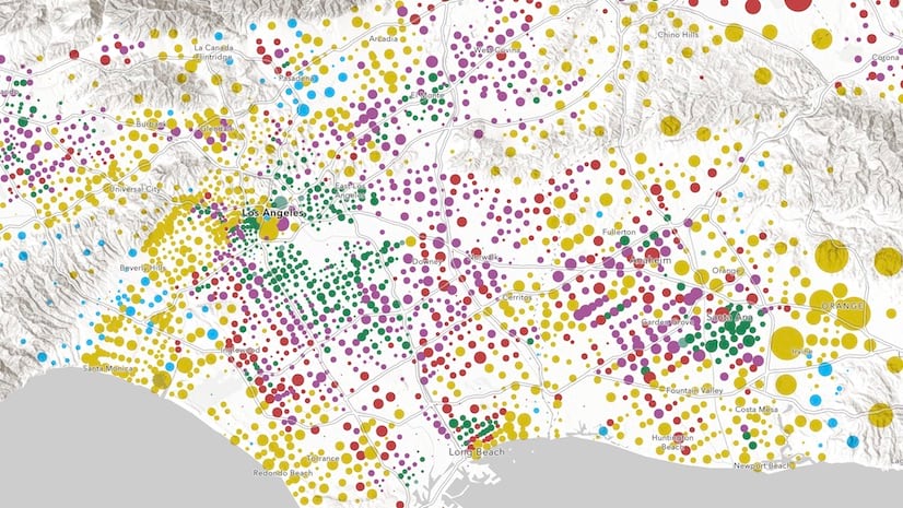
Large, dense datasets are difficult to visualize well. These datasets typically involve overlapping features, which make it difficult or even impossible to see spatial patterns in raw data.
Thanks to major performance improvements over the last few years, the JS API can now render hundreds of thousands (even millions) of features with fast performance. These improvements prompted the need to highlight appropriate and effective ways to make sense of large, dense datasets.
The High density data visualization guide outlines seven approaches for visualizing large amounts of data. These topics are grouped by client-side and server-side approaches.
Each page provides a brief definition of the technique, describes why and when you should use it, and steps through two or more live examples that demonstrate how to practically use the technique.
 and provides examples about how to use it in the ArcGIS API for JavaScript.")
The following is a brief overview of each new topic:
Clustering | Heatmap | Opacity | Bloom | Aggregation | Thinning | Visible scale range
Clustering
Clustering is a method of reducing points by grouping them into clusters based on their spatial proximity to one another. Typically, clusters are proportionally sized based on the number of features within each cluster.
Large point layers can be deceptive. What appears to be just a few points can in reality be several thousand. Clustering allows you to visually represent large numbers of points in relatively small areas, making this an effective way to show areas where many points stack on top of one another.

Heatmap
A Heatmap renders point features as a raster surface, emphasizing areas with a higher density of points along a continuous color ramp.
Heatmaps can be used as an alternative to clustering, opacity, and bloom to visualize overlapping point features. Unlike these alternative techniques for visualizing density, you can use a heatmap to weight the density of points based on a data value. This may reveal a different pattern than density calculated using location alone.

Opacity
Clustering and heatmap are only available for point layers. However, when polygons overlap, you can use per feature opacity to visualize their density.
Any layer with lots of overlapping features can be effectively visualized by setting a highly transparent symbol on all features (at least 90-99 percent transparency works best). This is particularly effective for showing areas where many polygons and polylines stack on top of one another.

Bloom
Bloom is a visual effect that brightens symbols representing a layer’s features, making them appear to glow. This has an additive effect so areas where more features overlap will have a brighter and more intense glow. This makes bloom an effective way for visualizing dense datasets, especially against dark backgrounds.

Aggregation
Aggregation allows you to summarize (or aggregate) large datasets with many features to layers with fewer features. This is typically done by summarizing points within polygons where each polygon visualizes the number of points contained in the polygon.
There are a couple of scenarios where this technique can be more effective than others:
1. The point dataset is too large to cluster client-side. Some point datasets are so large they cannot reasonably be loaded to the browser and visualized with good performance. Aggregating points to a polygon layer allows you to represent the data in a performant way.
2. Data can be summarized within irregular polygon boundaries. You may be required to summarize point data to meaningful, predefined polygon boundaries, such as counties, congressional districts, school districts, or police precincts. Clustering is always handled in screen space without regard for geopolitical boundaries. There are scenarios where summarizing by predefined irregular polygons is required for policy makers.


Thinning
Thinning is a method of decluttering the view by removing features that overlap one another. This is helpful when many features overlap and you want to display uncluttered data, but don’t necessarily need to communicate its density.

Visible scale range
Some large datasets can’t be reasonably visualized at certain scales. For example, it doesn’t make sense to display census tracts at scales where you see the whole globe because tracts typically represent neighborhoods and small communities. Many polygons at that scale would be smaller than a pixel, making them useless to the end user.
Setting visible scale range on your layers also helps reduce the initial data download to the browser. Don’t display too much data if you don’t have to!

Conclusion
At the bottom of each page, you’ll find the following chart, which summarizes which technique you should (or can) use given geometry type (point, lines, polygons, mesh), view type (2D vs 3D), and whether the data can all be loaded to the browser (client-side), or requires server-side preprocessing.

Be sure to check out the high density data visualization guides. I’d love to hear your feedback, including additional ideas that haven’t been covered.

Article Discussion: