Wurman Dots represent values through various fill amounts within gridded circles. Richard Saul Wurman’s 1966 book Urban Atlas: 20 American Cities inspired the style. The maps in the book express density using a symbol whose inner fill is based on the population density value for that cell. More filled-in symbols represent higher values. Areas with no value are not symbolized and the basemap reveals why; rail yards, rivers, or other features help the reader understand that the statistic being measured is not experienced as a continuous surface across the land.

Over 50 years later, the style is making a comeback. The example below, created using ArcGIS Online and the ArcGIS API for JavaScript, shows the percentage of forest cover within 30km grids. The lush Appalachia stands out with its full, dark green dots while cities with less forest cover, like Springfield, Illinois and Columbus, Ohio, contain smaller green dots.


Why use Wurman Dots?
Thematic maps that use polygons of varying size (e.g., states, counties, or postal codes) suffer a significant problem with interpretation. Bigger polygons on the map get more attention simply because they are bigger. Is there a way to make the map show the subject such that any two areas could be directly comparable?
That’s the question Richard Saul Wurman asked himself 53+ years ago.
This map style is great for situations where you have lots of data across a wide area and can aggregate it into grid cells with equal area. Because all cells are equal area, you can map percents, ratios, medians, averages, and counts. The style works well when you are trying to show where your map topic is concentrated and where there are gaps.
Add a Variable
Wurman Dots shine when you add another variable. The map below illustrates the percentage of forest cover by the size of the inner dot and the population by the dot’s color. Orange dots represent highly populated areas while green dots represent areas with less population.

Notice how Connecticut and New York contain large, orange dots. This means that this is a densely populated area with lots of forest cover. Chicago also has orange dots, but the dots are much smaller because trees are sparse in that city. Atlanta, nicknamed the “City in the Forest”, has a good number of trees, but is still filled with people.

As you zoom in and out, the symbols automatically change size to maintain the gridded effect.

Wurman Dots Inspiration
In 1966, Richard Saul Wurman and Joseph R. Passonneau published “Urban Atlas: 20 American Cities. A Communication Study Notating Select Urban Data at a Scale of 1:48,000.” The book is an enormous format collection of over 80 maps sized 54 cm wide by 46 cm tall, some of which even fold out to double that size. Mr. Wurman shared this book with Esri staff years ago, and it has been an inspiration to me when working with statistical data.

The Urban Atlas transforms readers to 20 American cities mapped at an identical scale for selected topics like population density, income, religion and land use types. I’ve found the maps’ style lends itself to single topics as well as multiple topics such as population density and income, or land use and population density. See more examples in the David Rumsey collection of maps from the Urban Atlas.
The Data
To create the gridded effect of the Wurman Dots, there are 3 simple steps that can all be done using ArcGIS Online’s out-of-the-box analysis tools.
- First, run the Generate Tessellations tool for your study area. The forest map shown earlier used a 30km hexagon for the entire United States. For citywide maps, a smaller hexagon from 1 to 10km works better. Another option is to use an already generated hexbin layer from the Living Atlas.
- Second, run the Enrich Layer tool to add information about people, places, and/or businesses to the hexbins. The forest map used the “Percent of Forest (NLCD)” attribute.
- Lastly, run the Find Centroids tool to create a point layer that includes the newly enriched data.
The Design
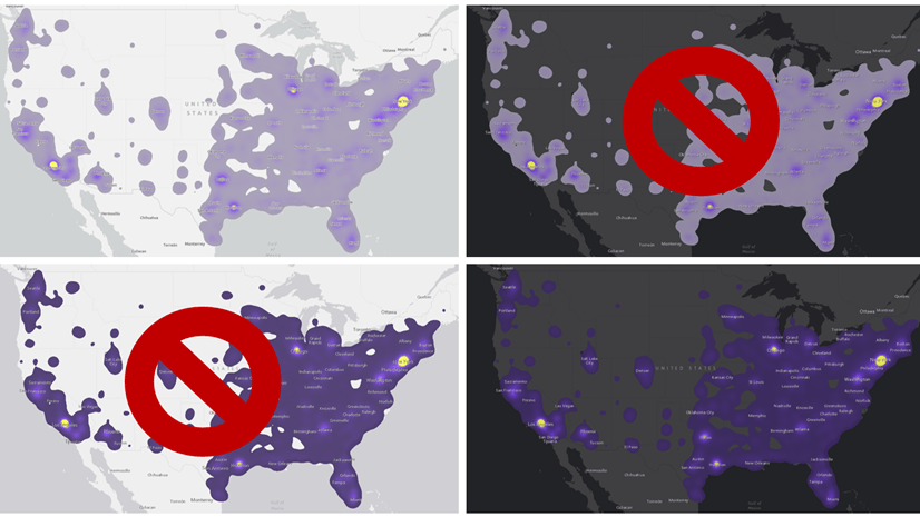
The map started with green to represent forest cover. When choosing the second color, it is important to choose ones that are colorblind-friendly. Run a colorblind simulator to help verify that the colors are distinguishable. The red and green map on the left does not pass the colorblind-safe test while the orange and green map on the right does.

A well-designed basemap helps the layer shine even more. Using the Vector Tile Style Editor and the human geography basemap as a starting point, the waterbody color went from gray to gray-green to support the layer’s colors, and the land, boundaries, and labels changed to a dark beige to pay homage to the Urban Atlas map styles.

How it Works
The ArcGIS API for JavaScript provides the power to create custom vector symbology that can be sized based on the data using simple arcade expressions.
This visualization is achieved through CIMSymbol. CIM (Cartographic Information Model) symbols are used to display multi-layer vector symbols for features and graphics.
The CIMSymbol has two symbol layers. One represents the outer circle (total area) and the other represents the inner circle (percent of forested area). The outer circle varies its size by view scale. The inner circle varies its size by view scale multiplied by the percentage of forested land.
The snippet below demonstrates how to override the inner circle’s size with an Arcade expression.

Try it Yourself!
Check out the ArcGIS API for JavaScript Sandbox for Wurman Dots. Here you can add your point layer url, edit the size of the outer circle, choose an attributes for the inner circle’s size and color, edit the popup, and update the legend.
The Wurman Dots map of forest cover and population is powered by the ArcGIS API for JavaScript, driven by data created from the Living Atlas of the World and ArcGIS Online analysis tools, and supported with a basemap designed with the Vector Tile Style Editor. Explore these tools and resources to create your own Wurman Dots map using the JavaScript API and ArcGIS Online tools.
This post includes contributions from Fang Li, Jim Herries, Kristian Ekenes, and Jeremy Bartley.


Article Discussion: