Whoa, a Firefly basemap just went live! Check it!

- Visit this ArcGIS resource page to download an ArcGIS Pro project with all of the files and styles packaged up for a firefly basemap.
- Grab this firefly imagery set for point symbology.
- And this, alternate, warm-hue, set of symbols.
Firefly?
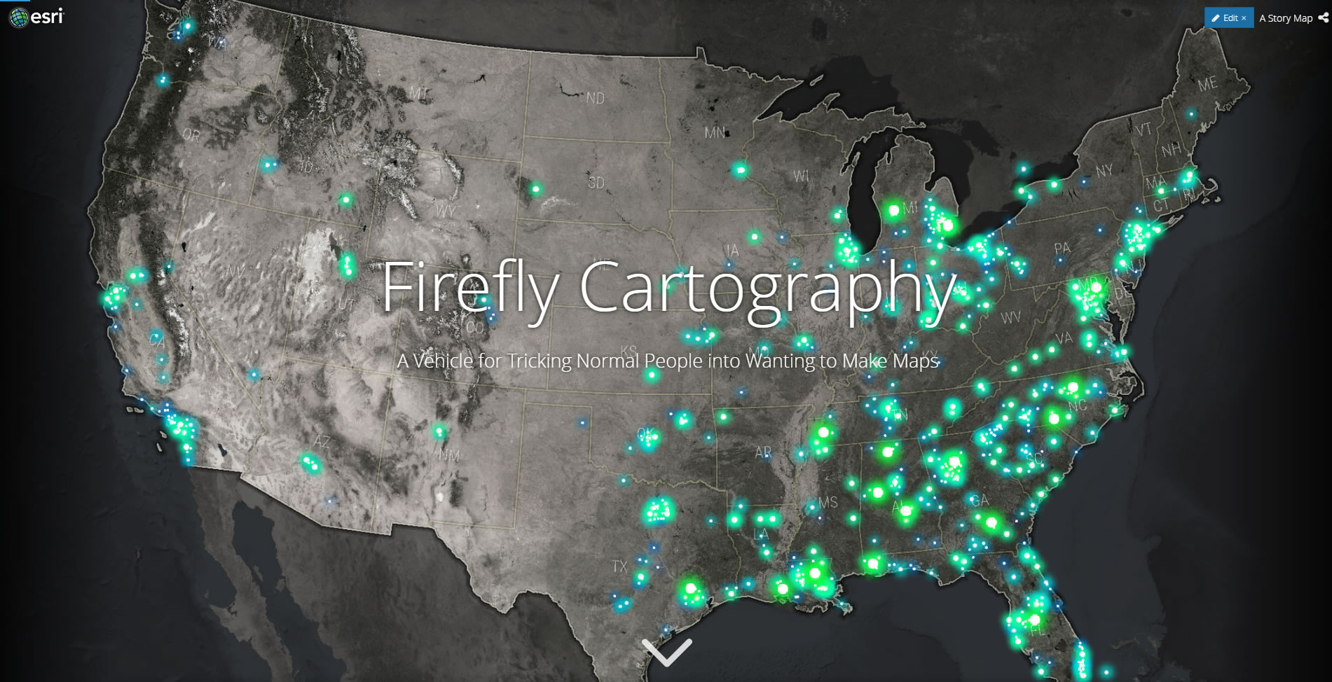
What in the world is firefly cartography?
This story map will give you the lay of the land.
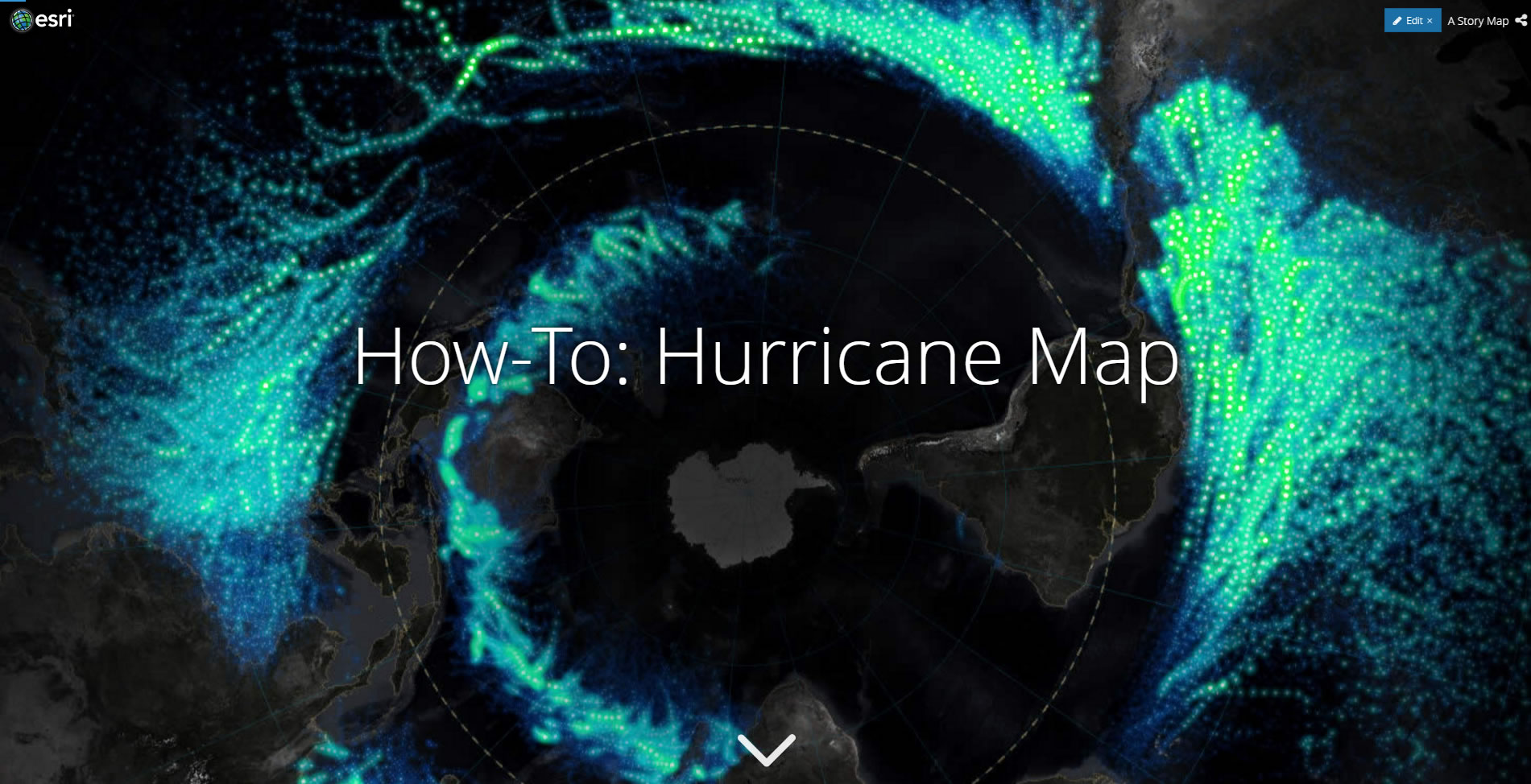
How do you do it?
Here’s how.
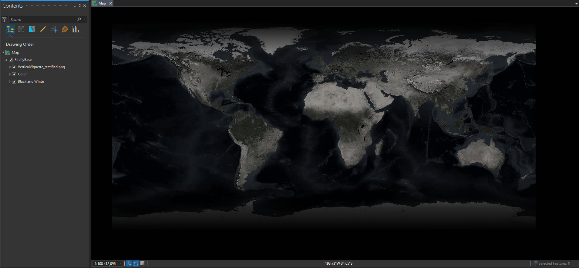
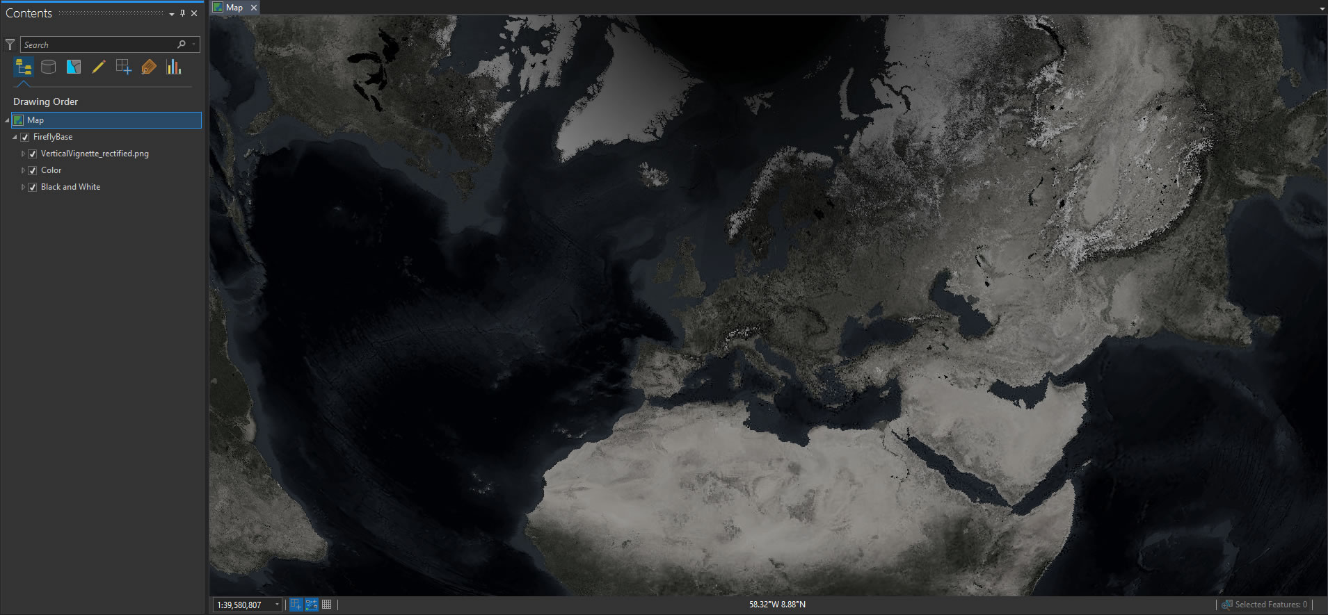
Ok, now we’ve got that all squared away, here is a resource for ArcGIS Pro users to get rolling on some firefly cartography. It is a mega-huge ArcGIS Pro project download (355MB what??) with all of the NASA imagery packaged up into it. So get the coffee maker rolling, hit download, and kick back. When you open it up, it will look like this…
Side note: If you don’t have the dark theme (cue Vader breathing) activated in ArcGIS Pro, you are missing out on some sweet sweet goodness. So much easier on the eyes. If you are designing visual products then a muted, receding, interface like this is a helpful context that promotes the priority of content over interface. Plus if you’re working on a screen all day your eyeballs will thank you.
Imagery
Ok, so what is this basemap made of? It is a set of cloud-free image mosaics from NASA’s Blue Marble. The resolution holds up to about 1:2,000,000, so it’s great for global and regional maps.
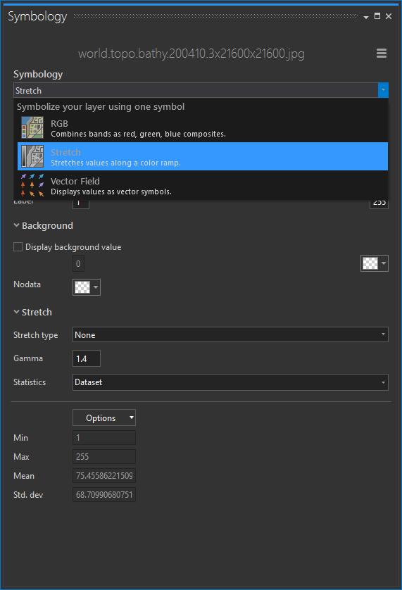
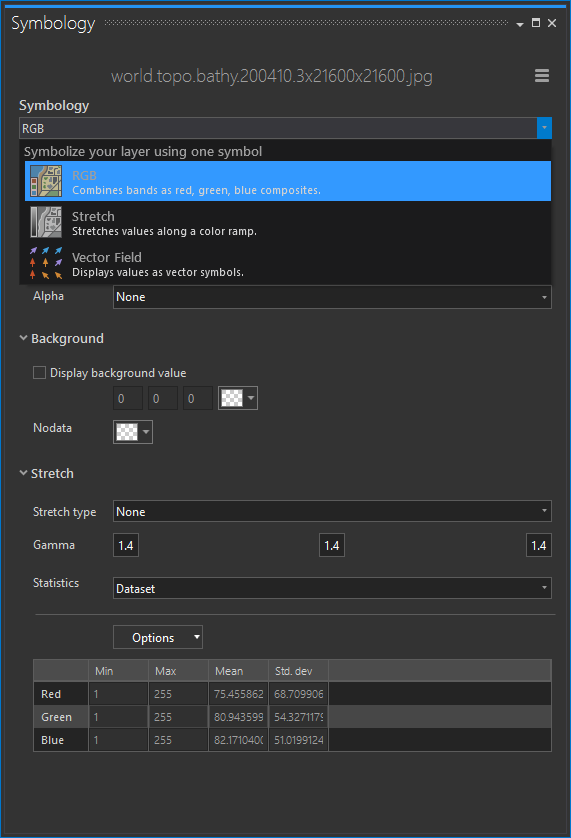
A hallmark of a firefly map is the dark, desaturated imagery basemap. The easiest, fastest, way I’ve found to do this (you could probably use a raster function, alternatively) is just make two copies of the imagery. The bottom layer is set to black and white and the top layer set to color. Here are the settings I used:
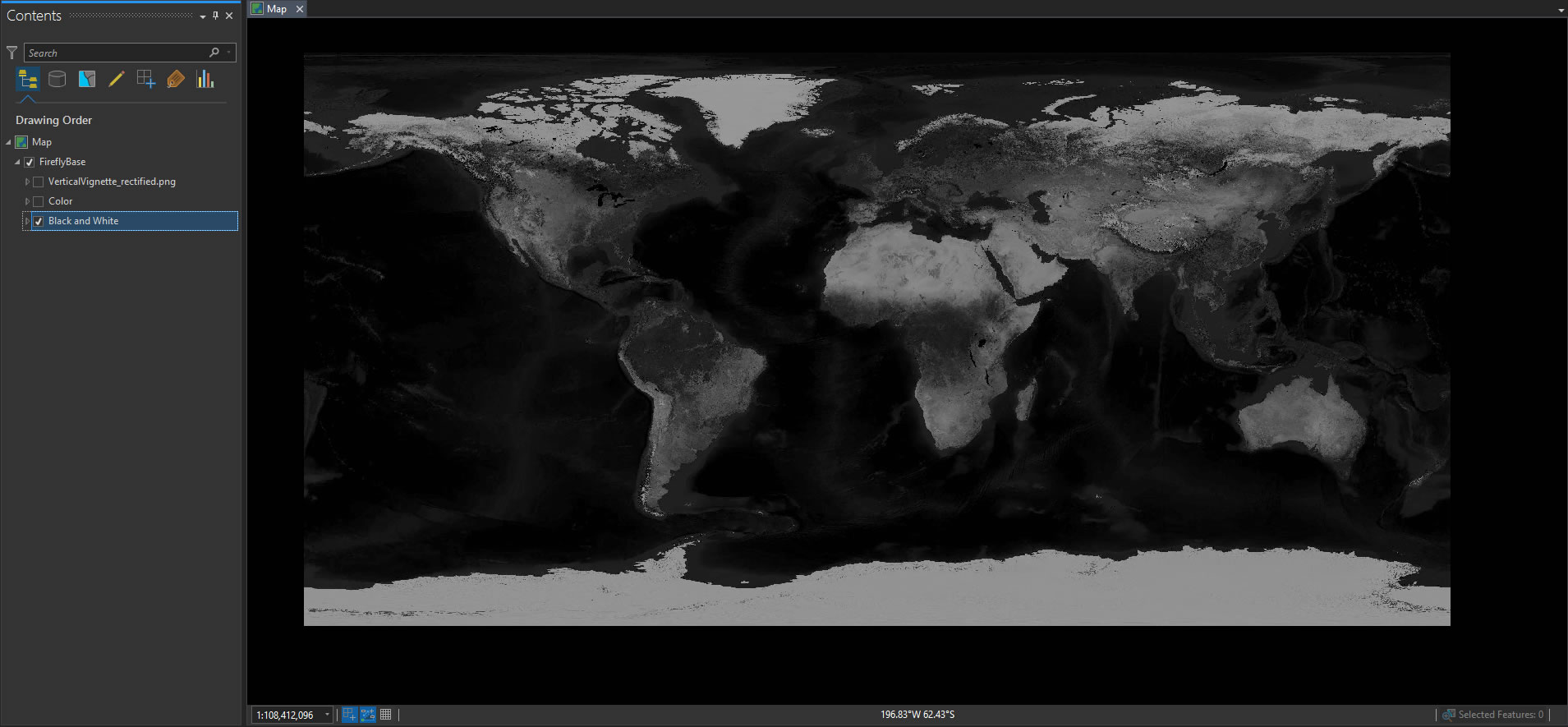
They look like this in the viewer. The group of black/white images I set to 40% transparent…
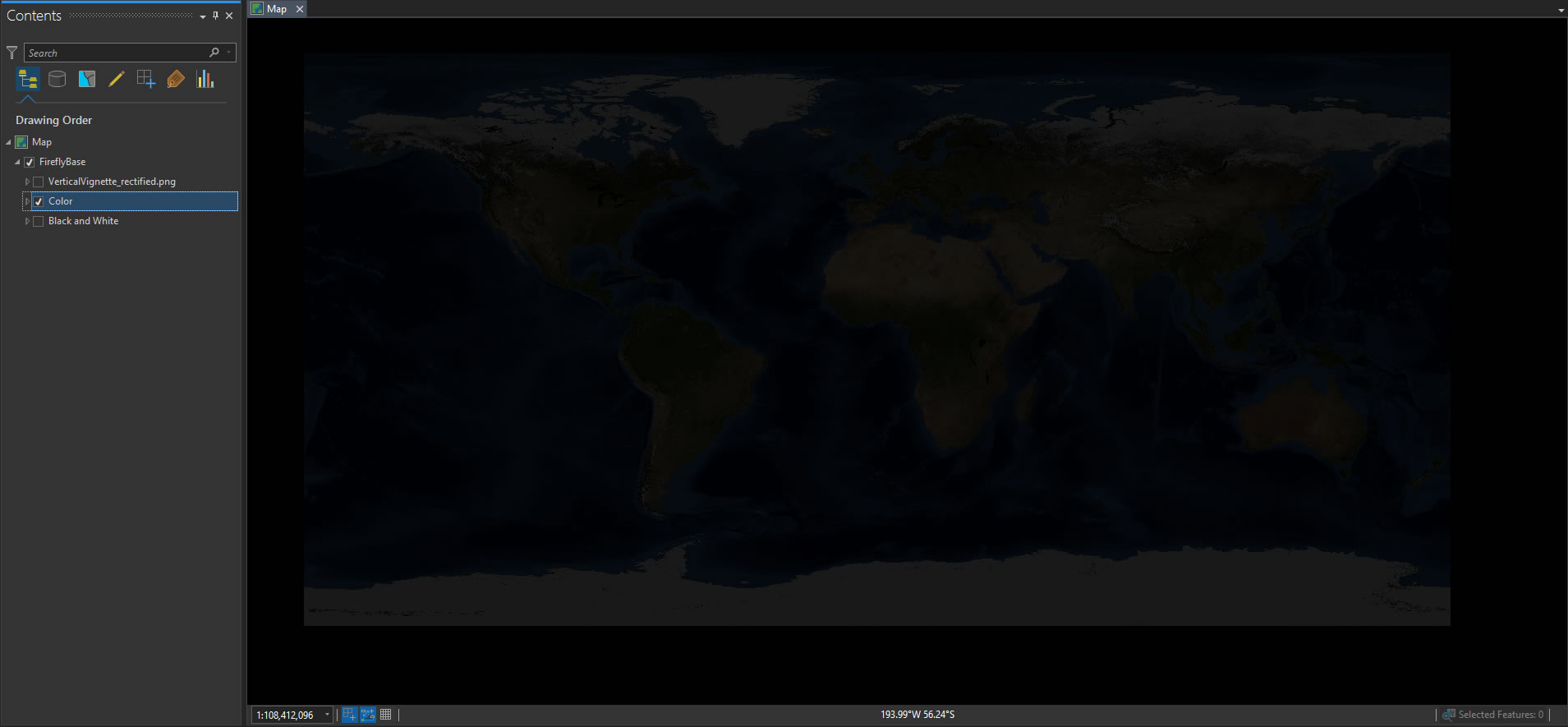
The color images have a transparency of 90%. Yeah, you can barely see them on their own, but they paint in just a bit of color for helpful (maybe dramatic) context over the gray-scale imagery.
Vignette
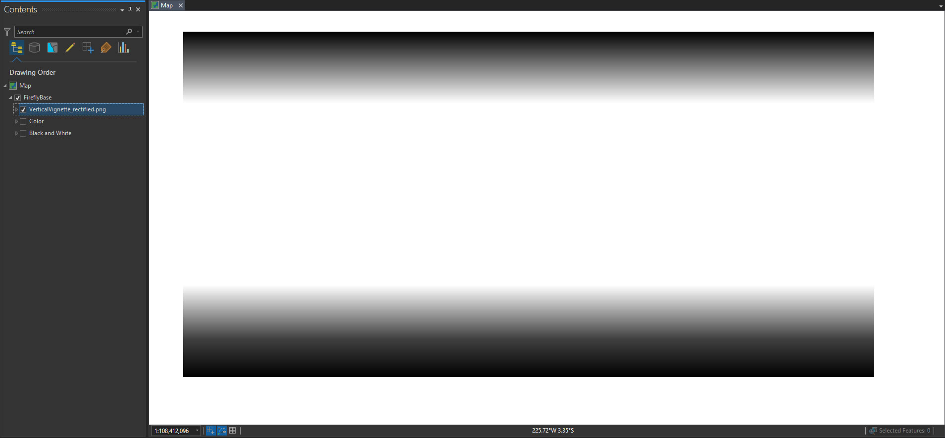
Finally, I use a vignette layer to mute the bright whites of the polar regions. This vignette helps draw the eye into the map and frames the overlain thematic content in a sizzling sort of way.
I did not include a vignette for the left/right edges of the map because that falls apart depending on the projection used. Please, oh please, do not leave your map in this default equirectangular projection. Here’s a European Lambert projection, for what it’s worth…
Bonus Track
If you’ve come this far, there is a reasonable chance you are going to download this ArcGIS Pro project and start cranking out firefly maps. In that case, you might like the head start of using these glowing green images as point symbols; or these warm-hue versions. Have fun!
Happy Firefly Mapping,
John

Article Discussion: