Ah the days of old, our field bursting with artists plying their craft, creating maps of breathtaking imagination and technique. Just window shop here for a moment to fall into the eye-watering depths of cartographic charm.
One of my favorite aspects of these maps is their lovely coastal effects. Often they are water-lines, buffered out at some magical interval, and sometimes they are stippled-in using a pointillist technique to imply varying density and distance.
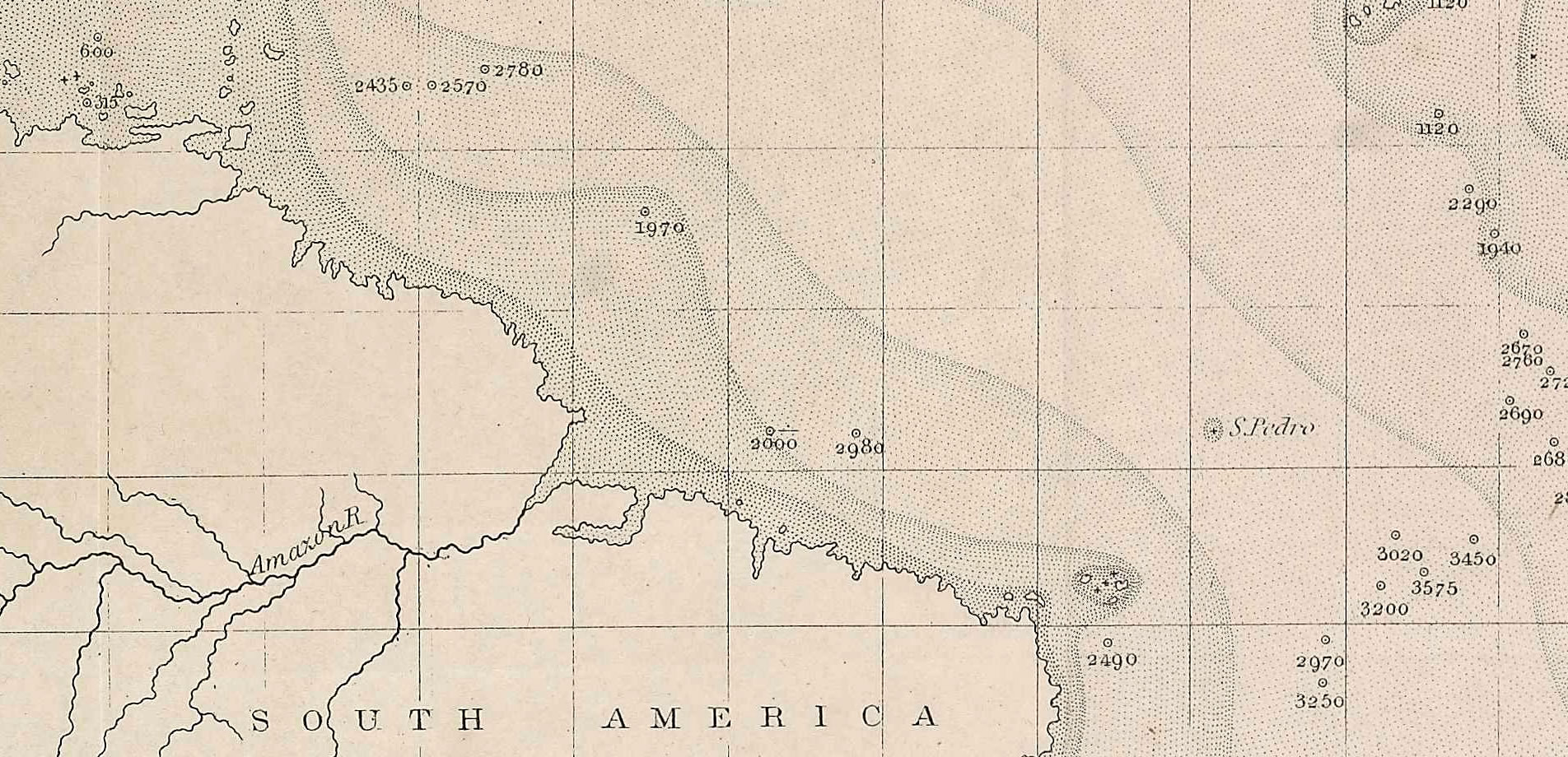
To give you an idea, here’s a map by Matthew Maury using varied stippling to denote bathymetric levels (inverted, to my mind).
HOW
ArcGIS Pro lets us dabble in a flavor of this technique, and it’s actually pretty simple (or mega-easy, depending on your favored parlance). If you are feeling dangerous, you can just download my Pro project and ignore the rest of this post.
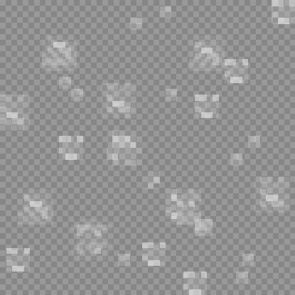
In ArcGIS Pro, I rendered up some multi-ring buffers around a global land layer. Instead of filling in each ring with a color, I just used an image fill of dots that I made. That’s it! Here’s what my stipple texture image looks like, all zoomed-in…
You can download this image here. It’s the only image I’ll use to create the coastal stipple effect.
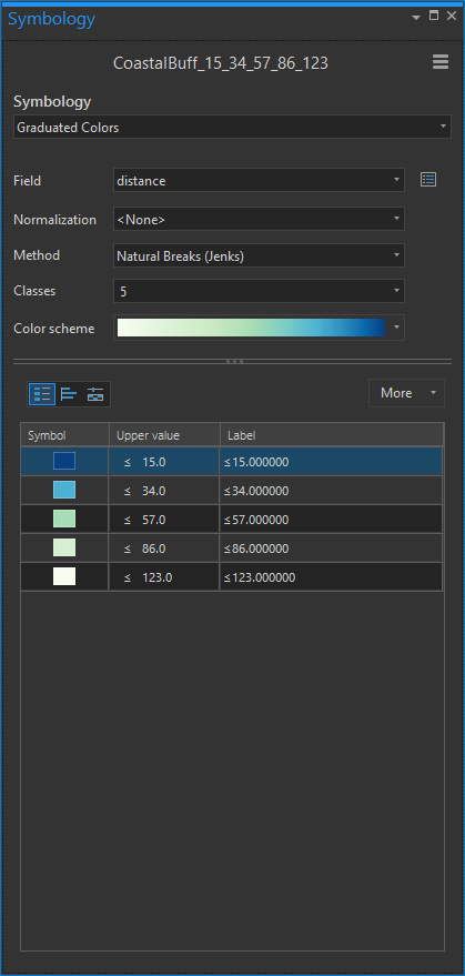
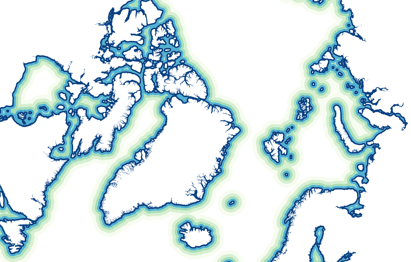
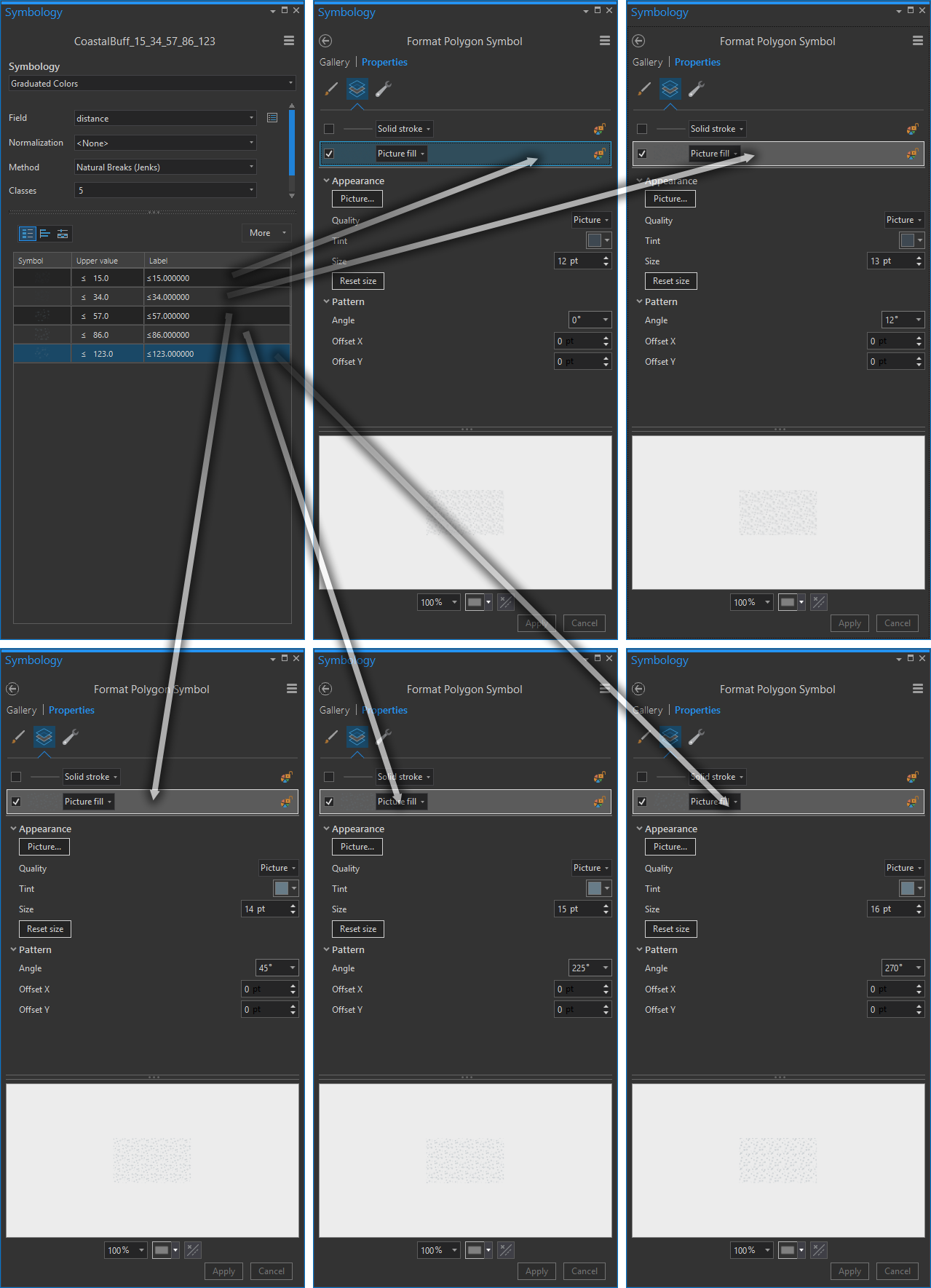
Ok, backing up, here is the layer of the buffered coastal areas. I gave it a graduated color symbology, based on the buffer distance.
Nice and standard. But let’s wind our pocket watches back to 1870 and see what some standard symbology might look like then…
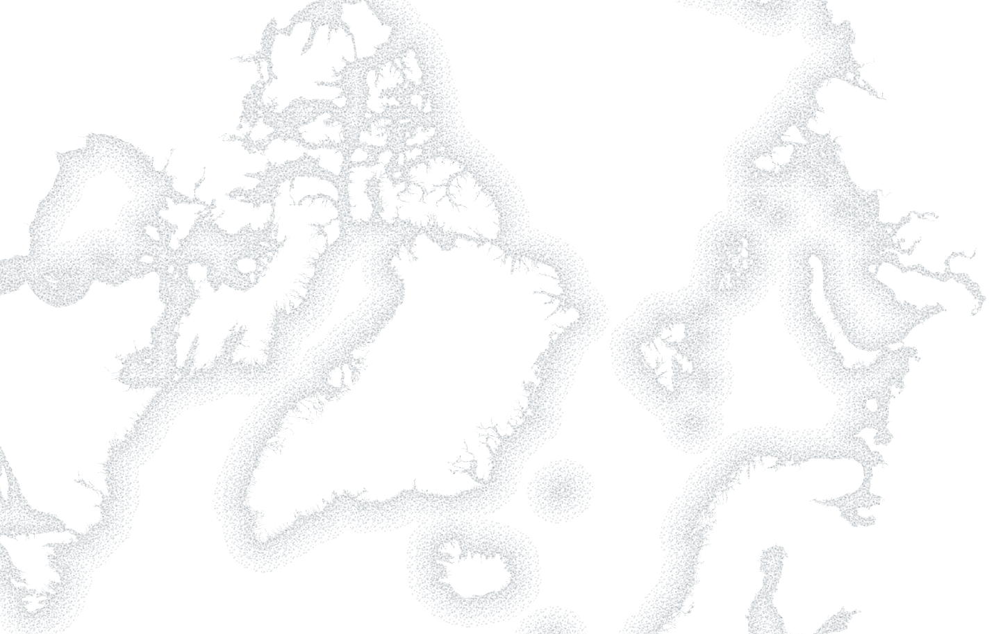
Instead of a color fill, I gave each polygon a “Picture fill”. I chose the same stipple image for each one, and made them slightly smaller and darker the closer they come to land. They stack up on each other, and the difference in stipple density gives a sweet Victorian-era drop-shadow! Here is the steampunky result…
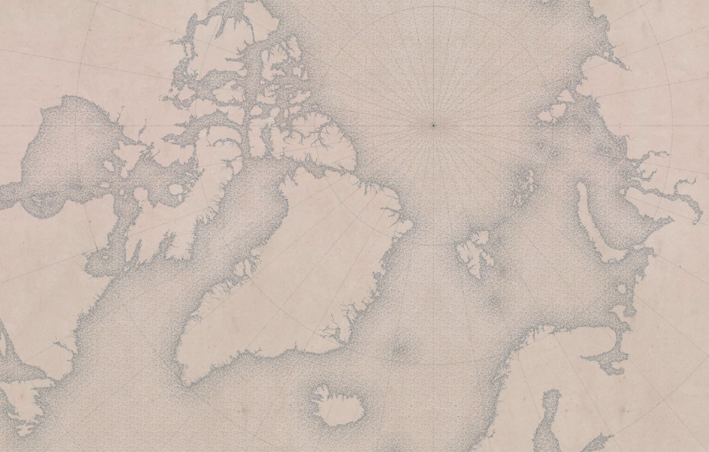
How grand. I wanted to give the background a foxed yellowed period-paper texture, so I snagged a blank page from the Statistical Atlas of the United States and dropped it in the background (and also as a picture fill for the land areas). I gave the stipple fills a blue tint that I eye-dropped from the lovely old atlas and it looks like this…
Actually, in the stipple-map era, they really had no idea what the arctic areas looked like. But we do now. So here’s to impossible throwback maps!
Happy Stipple-Mapping! John


Article Discussion: