Smart Mapping was added to the ArcGIS API for JavaScript in version 3.13 to provide web developers with an easy way to generate renderers with smart, visually pleasing defaults based on data distribution and the basemap.
This new module helps take some of the guesswork out of an otherwise complicated workflow for defining how color and size should be used to visualize attributes. In addition to the renderer generators, Smart Mapping introduced visual variables as an easy way to define color, size and opacity ramps for visualizing numeric data. These ramps can be continuous by setting minimum and maximum values, or they can be used to define class breaks using stops.
What makes visual variables particularly powerful is the ability to create visually appealing multivariate thematic maps with just a few lines of code. The following samples demonstrate how visual variables can enhance the story of your map by unearthing the power of multiple variables in a single visualization.
Visualize one variable with color
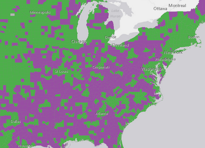
The sample below uses a UniqueValueRenderer to shade each county in the U.S. with one of two colors – green or purple. Green features are counties where the majority of adults (25 years of age or older) attended at least some college in their lifetime. Counties shaded with purple are areas where the number of adults who never attended any college outnumbers those who attended at least some college.
While spatial trends are immediately apparent, this visualization only tells part of the story of the geography of adults who attended at least some college in the United States. The only variable considered here is whether one group outnumbers the other in each county. Considerations such as population and the strength of the majority in each county are ignored, leaving the user to click on individual counties to find those statistics on their own.
For example, zoom to the Cincinnati, Ohio area. Click on several counties in the area and observe the pie chart and overall numbers. Some counties have a much higher percentage of adults who attended college and others have a much lower percentage. Some have a near-equal mix of the two. The differences between these features aren’t immediately apparent to the user with color as the lone variable.
Visualize two variables with color and opacity
To enhance this map, we’ll add a visual variable to the renderer. All that’s required is the type of visualization, the field, and a set of values from which to stretch the colors, opacity, or size between two values in the data. If a feature contains a value greater than the maximum data value, it will be assigned the highest color, size, or opacity value defined in the visual variable. Features with data values smaller than the minimum are assigned the minimum visualization values.
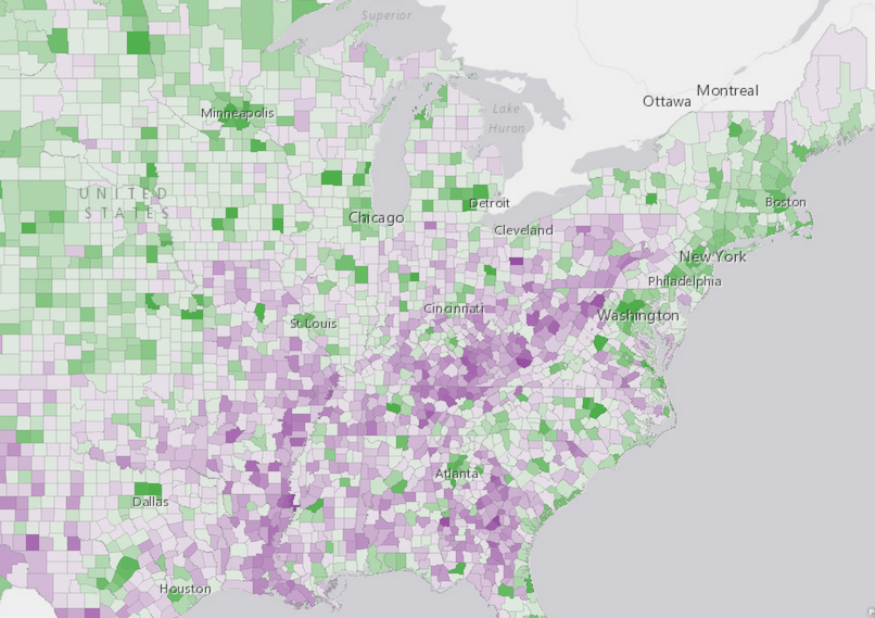
In the sample above, we already make use of color, so we’ll include an opacityInfo visual variable to add a second dimension to this visualization. Because opacity is good for depicting strength, we’ll use it to show the strength of the majority population in each county. We’ll shade features with full opacity if the majority group (either attended college or did not attend college) outnumbers the minority 3:1 or makes up at least 75% of the total adult population.
If the majority barely outnumbers the minority, we’ll make the feature very transparent. In this case if the majority makes up 51% of the total adult population, we’ll give it 10% opacity so we can still observe the color of the feature.
renderer.setVisualVariables([{
  type: "opacityInfo",
  field: "ATE_COL_DOM_PER",
  stops: [{ value: 50, opacity: 0.1}, { value: 75, opacity: 1}]
}]);
This visualization is much better. We can immediately observe a spatial pattern: the Texas – Mexico border and counties in the Appalachian region of the southern and eastern United States are areas where adults who didn’t attend college not only outnumber those who did attend, but outnumber by a wide margin.
On the other hand, it’s not immediately apparent if a similar spatial trend exists in counties where adults who attended college significantly outnumber those who didn’t.
Visualize a third variable with size
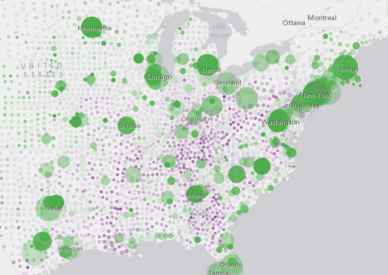
Adding opacity allows the user to gain a better understanding of how dominant the majority is among competing attributes. But we still don’t get a sense of how the overall numbers in one county compare to others nearby or in other parts of the country.
To gain additional insight into our data, we’ll add a sizeInfo visual variable to visualize the adult population in each county.
var sizeVisVar = {
  type: "sizeInfo",
  field: "EDUCBASECY", //total adult population 25 years and older
  minDataValue: 10000, //counties with < 10,000 adults will be assigned the min size
  maxDataValue: 1000000, //counties with > 1,000,000 adults will be assigned the max size
  valueUnit: "unknown",
  minSize: {
    type: "sizeInfo",
    expression: "view.scale",
    //The min size of the symbol varies depending on the map scale
    stops: [
      { value: 250000000, size: 6 },
      { value: 6000000, size: 6 }, //at a 1:6,000,000 scale, the min size is 6px
      { value: 1000000, size: 4 },
      { value: 200000, size: 2 },
      { value: 1000, size: 2 }
    ]
  },
  maxSize: {
    type: "sizeInfo",
    expression: "view.scale",
    //The max size of the symbol varies depending on the map scale
    stops: [
      { value: 250000000, size: 50 },
      { value: 6000000, size: 50 }, //at a 1:6,000,000 scale, the max size is 50px
      { value: 1000000, size: 40 },
      { value: 200000, size: 20 },
      { value: 1000, size: 10 }
    ]
  }
};
This allows us to gain a better understanding of how data in each feature compares to other features. The largest circles indicate counties with more than one million adults. With a few exceptions such as the Bronx, New York and Philadelphia, Pennsylvania the clear trend shows that urban counties are mostly populated by adults who have attended at least some college. The counties that are dominated by adults who haven’t attended college tend to be geographically rural and sparsely populated.
As evidenced by the sample applications above, visual variables provide the ability to easily create multivariate maps that can depict two or three numeric attributes using color, opacity, and size.
Stay tuned in the following weeks for a three part blog series exploring 3D visualization techniques using visual variables in a SceneView with the 4.0 beta 3 version of the API.


Commenting is not enabled for this article.