Extracting meaningful information from large or dense point datasets can be challenging. Sometimes many points aren’t visible because they’re stacked on top of one another. Some datasets contain sparse data in some locations, but very dense data in others. Visualizations of attribute data with color or size in these scenarios can be difficult to digest. Zoom out to smaller scales and all of these problems are compounded. Version 3.22 of the ArcGIS API for JavaScript introduced point clustering to help solve some of these problems. It allows you to reduce and summarize relatively large numbers of data points in the map, providing some insight to geographic patterns in the data. These clusters are scale-dependent, meaning both their size and color change appropriately as the view scale changes.
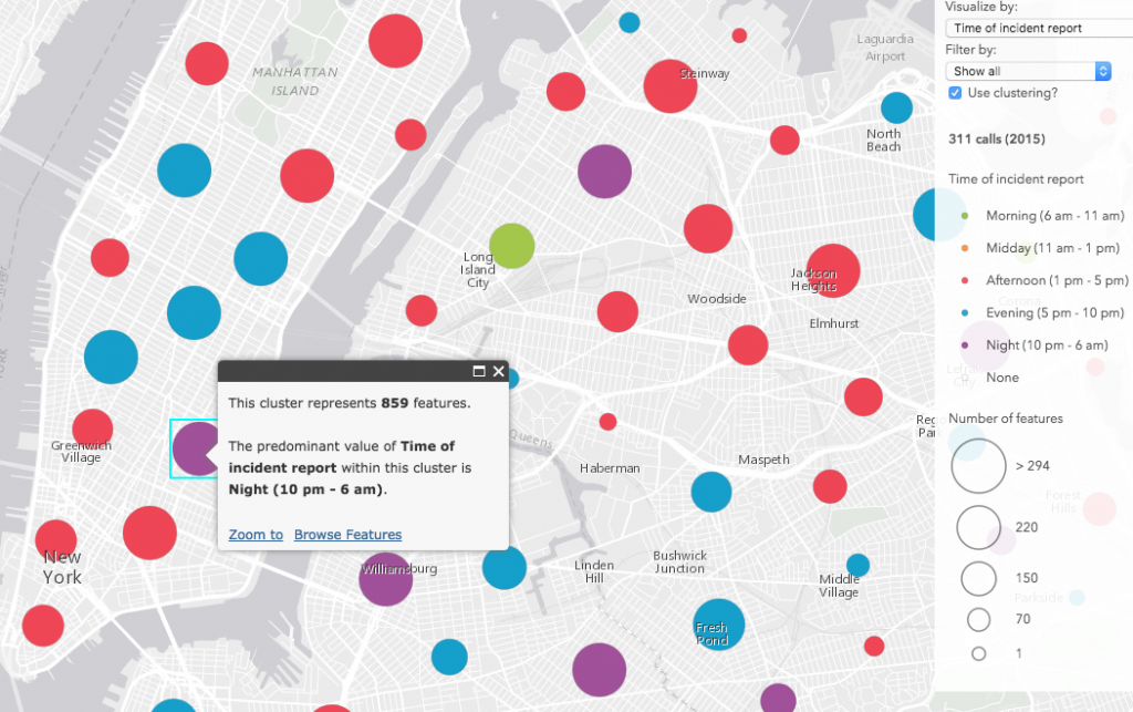
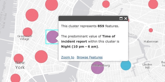
Perhaps the most compelling piece of the ArcGIS clustering implementation is its separation from the layer’s renderer. Clustering is enabled on the layer, not the renderer, which means that all rendering properties are retained by the layer when clustering is enabled. Once enabled, the popup of each cluster will summarize the attribute used to drive the visualization of each feature. The color and the size of each cluster is determined based on the average or predominant value of the features comprising the cluster. Therefore you can use clustering as a tool for summarizing potential spatial patterns in data exploration apps.
Exploring 311 calls in New York City
I downloaded 311 data from New York City’s Open Data site and created a small app for exploring the data. While glancing through the available attributes, three date fields caught my attention. They include the date each incident was created, the date it was due, and the date it closed.
Then I wrote three Arcade expressions to dynamically create three new variables of interest, answering the following questions:
Were any incident closures overdue? If so, by how long?
// Days incident closure was overdue
var closed = $feature.Closed_Date;
var due = $feature.Due_Date;
var closureDueDiff = DateDiff(closed, due, "days");
IIF(IsEmpty(closed) || IsEmpty(due), 0, closureDueDiff);
How old were the incidents when closed?
// Incident report age (days)
var closed = $feature.Closed_Date;
var created = $feature.Created_Date;
IIF(IsEmpty(closed) || IsEmpty(created), 0, DateDiff(closed, created, "days"));
At what time of day were the incidents reported?
// toEasternTime is defined in a previous function
// that converts the date from UTC to eastern time
var created = toEasternTime($feature.Created_Date);

// Time of day
var t = Hour(created);
When(
  t >= 22 || t < 6, "Night",
  t >= 6 && t < 11, "Morning",
  t >= 11 && t < 13, "Midday",
  t >= 13 && t < 17, "Afternoon",
  t >= 17 && t < 22, "Evening",
"It never happened" );
The toEasternTime() function is a custom Arcade function used to determine the hour an event occurred in the Eastern Time Zone. This assumes all data points were collected in the same time zone in the year 2015.
Then I created three renderers, each based on one of the above Arcade expressions, and added a select element to the UI to allow the user to dynamically switch visualizations on the layer. I also added a checkbox allowing the user to view the visualization with clustering enabled or disabled.
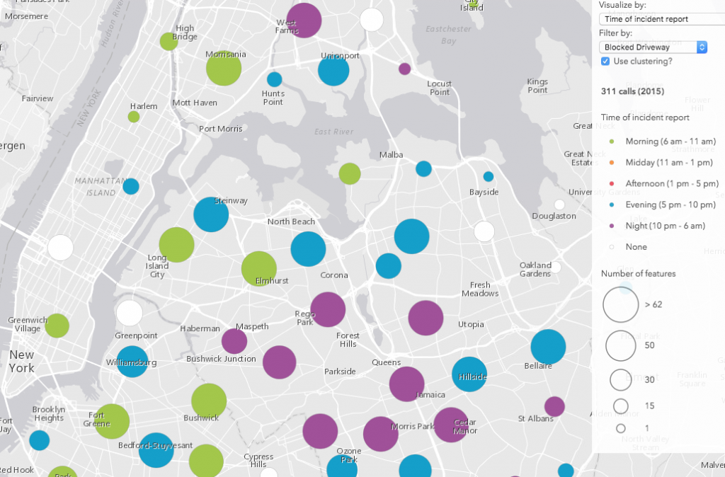
Additionally, the app allows you to visualize and filter incidents by type. This filter allows us to explore potential spatial patterns based on location, type, or any of the time variables mentioned above.
Data observations
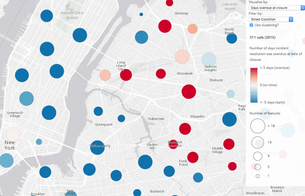
After exploring the data, it’s clear how clustering can improve the visualization of points based on a thematic attribute. Take a look at the image comparison below (click the images for a larger view). The renderer depicts the number of days each incident closure was overdue. When clustering is disabled, no obvious pattern emerges. However, once enabled, clustering helps us clearly identify areas where incident closures tend to be overdue more than others. These clustering patterns can be more or less refined as you zoom in and out or adjust the clusterRadius on the layer.
| No clustering | Clustering enabled |
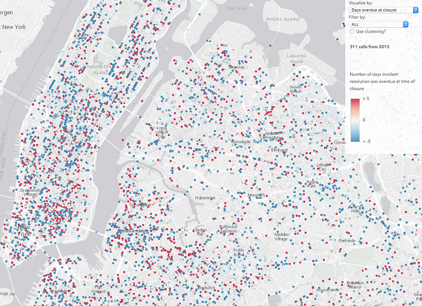 |
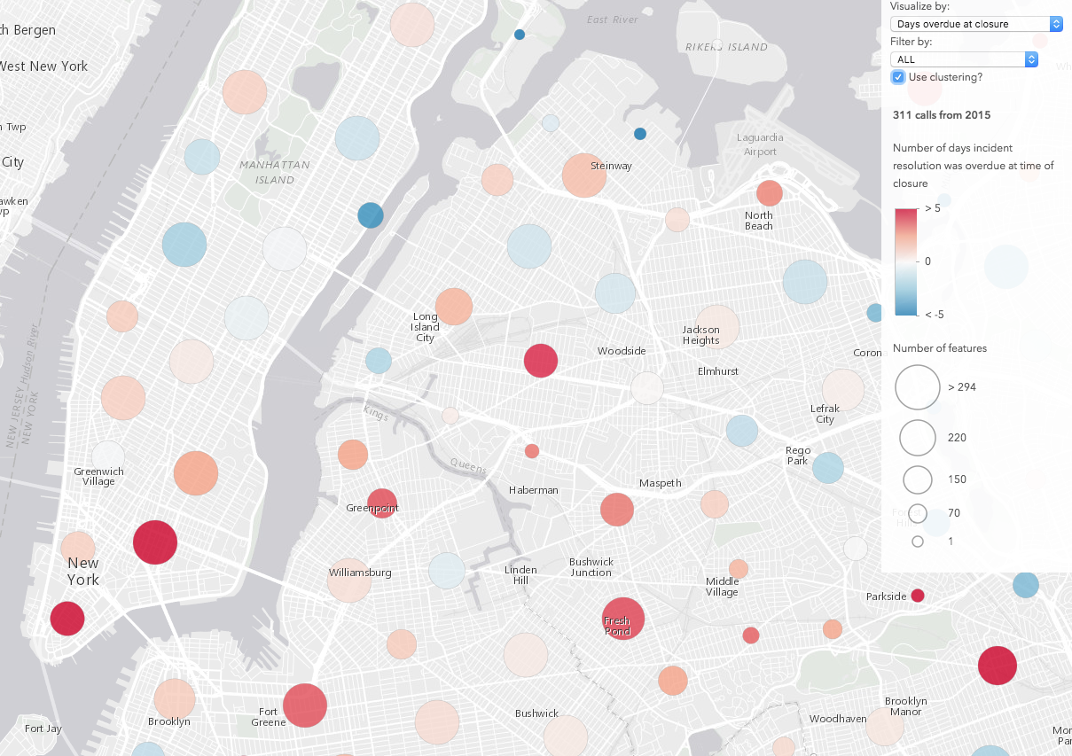 |
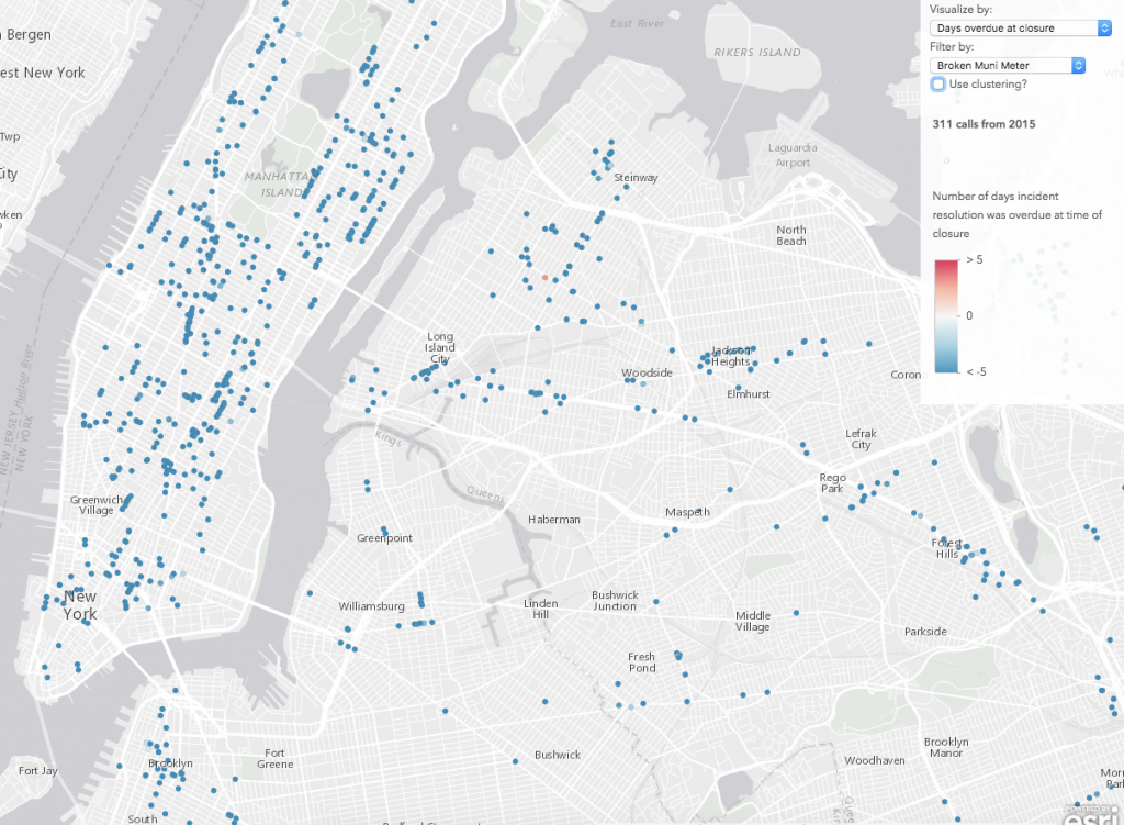
This app also demonstrates how filtering features impacts cluster patterns. As you filter by various complaint types, you will notice not only different spatial patterns emerge, but patterns in the closure times of each incident appear as well. For example, blocked driveways, illegal parking, and noise complaints usually seem to be resolved quickly and on time. Similarly, broken meter complaints tended to be resolved well ahead of schedule.
But graffiti complaints tended to close much later, often well after the assigned due date. Since “graffiti” is the most common incident type, it heavily influences the overall visualization of overdue incident closures.
On average, street condition complaints were resolved before or after the due date depending on the location of the complaint.
The time of day visualizations seemed to follow expectations when filtering by type. For example, noise complaints tended to occur at night, while blocked driveway complaints occurred more often in the morning, evening, and night (when people are more likely to be going in an out the door).
Enable clustering in your web apps
Clustering is managed with the featureReduction option in FeatureLayer and CSVLayer. You can enable it by simply setting the type to “cluster” in the layer’s constructor…
var layer = new FeatureLayer(serviceUrl, {
  featureReduction: {
    type: "cluster"
  }
});
…or with the setFeatureReduction() method:
layer.setFeatureReduction({
  type: "cluster"
});
There are several other methods and options available for managing clusters and their children features. See the 3.22 release notes for more details.
Leverage the ArcGIS platform
While the tips mentioned above may help you get started with incorporating clustering in custom data exploration apps, don’t forget to use the ArcGIS platform to your advantage when possible. You can save yourself time by enabling and configuring clustering options in a web map in ArcGIS Online, and loading it into a custom web application. Check out this blog post, which provides a nice summary of the various clustering capabilities available in ArcGIS Online.
A word of caution
Clustering is useful for summarizing and identifying potential spatial patterns in attributes visualized by a layer’s renderer. However, keep in mind that every cartographic visualization includes some level of deception and should be questioned. While the visualizations in this sample show some interesting patterns, they depend solely on my definition of “time of day” and don’t take into account the spread of features as they occur in time.
For example, the time frame for “morning” could be interpreted a number of ways. Does it start at 5 a.m., 6 a.m., or 7 a.m.? When does it end? And regarding the spread of the data, let’s assume that “morning” is defined as (6 am – 11am) and a predominant “morning” cluster contains 500 features. Suppose 250 of the incidents comprising the cluster occurred between 10:50 am – 11:00 am and 240 occurred between 11:00 and 11:10. The cluster would correctly depict the data as predominantly occurring in the morning, but it doesn’t reflect the fact that most features occurred in the late morning, much closer to “midday” than a reasonable person might otherwise assume when viewing this map. Additionally, the visualization doesn’t indicate the strength of the predominant value.
Zooming in and out at various scales and browsing the features of each cluster will help peel away at the inadvertent deception present in the summarized data.
Also note that clustering options available via featureReduction do not perform complex statistical analyses. Therefore, the clustering visualizations described above should not be interpreted as precise, statistically significant “clusters” of data. Rather, they should merely be approached as a nice summary of the data, providing you with a preview to potentially identify spatial patterns that may or may not reveal significant storylines.
If you require more sophisticated spatial analysis, such as attempting to determine statistically significant hot spots and cold spots, or identify clusters of data, then the ArcGIS platform offers several tools that allow you to accomplish this. In ArcGIS Online, these tools include Aggregate Points, Calculate Density, Find Hotspots, and Find Outliers. You can also take advantage of the cluster toolset in ArcGIS Pro for access to additional tools.
Conclusion
Because clustering is a client-side feature reduction solution, it has a number of known limitations (see the list below). Server-side clustering will be implemented in a future release, which will improve performance and allow for more features to be clustered. Clustering will be added to the 4.x series of the ArcGIS API for JavaScript sometime in the near feature. Also check out the samples new to the 3.22 documentation demonstrating various ways to implement clustering in your web apps.
Known Limitations in 3.22
- Support is limited to point data in FeatureLayer (from service or FeatureCollection) and CSVLayer.
- The map must have a spatial reference of Web Mercator or WGS84.
- If the layer contains more than 50,000 features, then only the first 50,000 will be clustered.
- A FeatureLayer created from a service URL must point to a service that supports pagination (ArcGIS Server version 10.3.1 or higher).
- When editing is initiated with the Editor widget, then feature reduction is disabled until the Editor widget is destroyed.
- Feature reduction is disabled when the layer has one of the following renderers:
HeatmapRenderer,BlendRenderer,TemporalRenderer, orScaleDependentRenderer.

Commenting is not enabled for this article.