Many datasets contain a date or time field, but showing them in the map can be a challenge. The June 2016 ArcGIS Online release has new map styles that allow you to visualize information found in date and time fields. These new time styles reveal patterns of new and old, and showcase the age of things on the map.
This new smart mapping capability allows you to view overall patterns of time by representing time in one of two ways:
Continuous Timeline
This option showcases your date values within the map by the order in which they occur. You can instantly see the chronological order of your data within the map.
Age
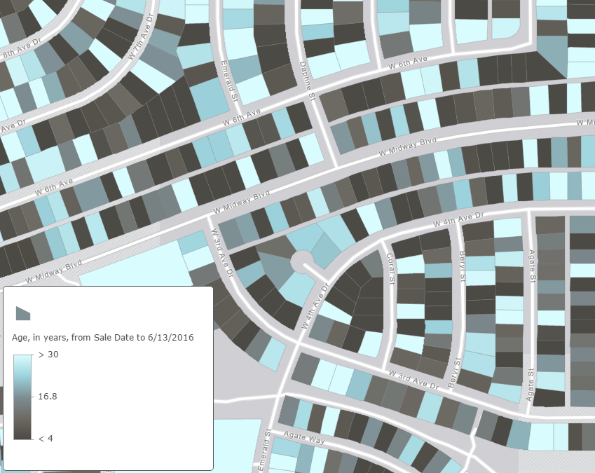
Showing the age of features within the map helps to quantify how long ago a date or time has occurred. Whether you want to show how old a building is, determine the change in time between two events, or showcase how long it has been since an event has happened, the age option uses a specific unit of time to highlight patterns in your data. In the past, this type of representation could only be done by calculating fields, but smart mapping allows you to simply choose the dates that are important to you, and quickly show them on the map.
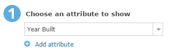
Getting started with these new options is easy: simply select a date/time attribute from your data.
Both continuous timeline and age representations can be shown using color or size. When using color, you can utilize one of two themes to help show important patterns within your map: New to Old, or Before and After.
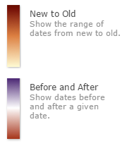
Using the New to Old theme shows an immediate chronological pattern of features (seen in the maps above).
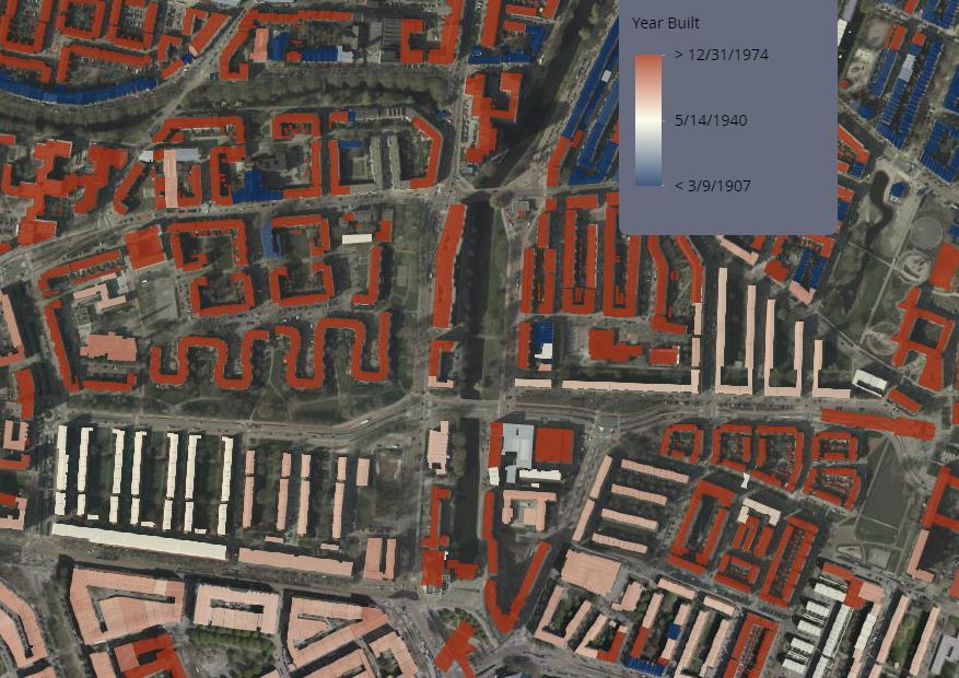
The Before and After theme is useful when showcasing a specific point in time. For example, this map shows the construction date of buildings in Rotterdam. The Before and After theme was set using the Rotterdam Blitz date during World War II (May 14, 1940), which shows many of the re-constructed buildings that were destroyed during this event.
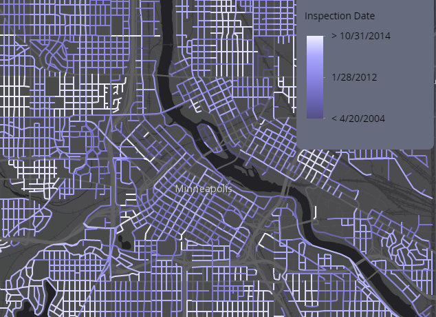
For another example, imagine I have a date in which an important inspection will be overdue. I can select an attribute with the previous inspection date(s), and then choose the date in which the next inspection needs to occur. In this case, I want to see if any fire hydrants will be past their 12 month inspection requirement, by the end of July.
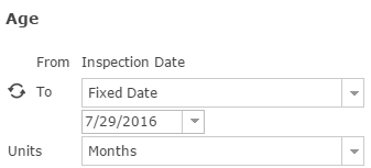
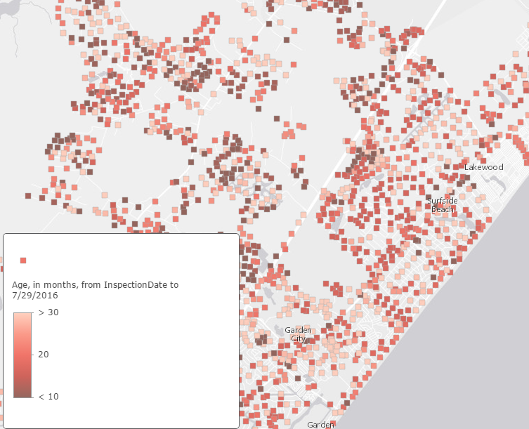
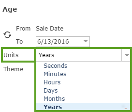
When showing age, smart mapping will suggest a unit of time (hour, day, month, etc), but if you want to show a different unit, just select the one you would like.
Using size to represent time helps to easily show which features are most recent/aging. The largest shapes display the most recent dates, while the smallest features are the oldest. This map uses size to show how recently a fire hydrant was built, in years. Larger hydrants are newer than smaller hydrants, which are older. This style helps communicate where recent infrastructure investments have occurred because the larger symbols draw your attention.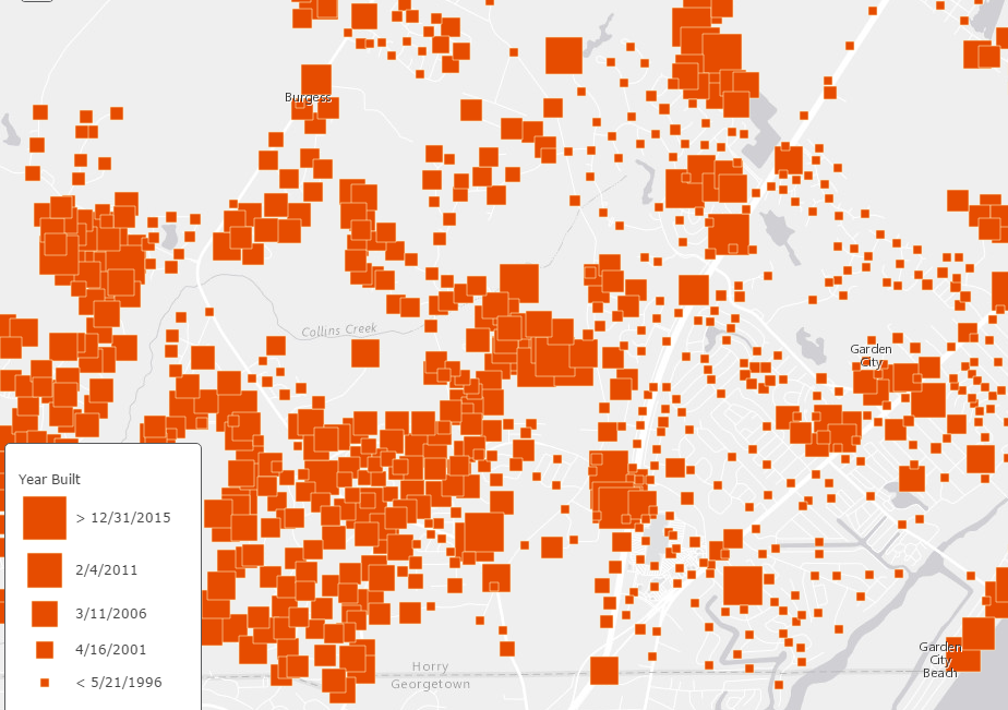
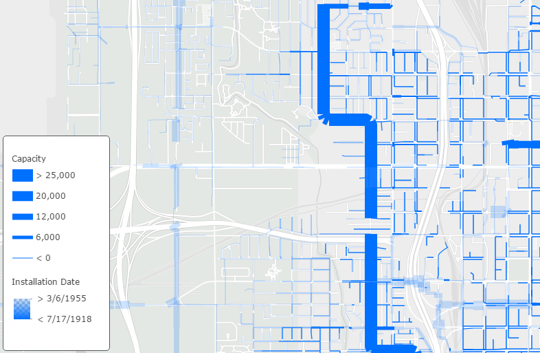
Another way to use a continuous timeline to highlight new or old features, is with transparency. This allows you to emphasize how old or new a feature is by varying the transparency based on the date field. When it comes to infrastructure, older things tend to need more attention. This map shows sewer pipes in Salt Lake City, but emphasizes the pipes installed prior to 1955 by applying 80% transparency to pipes installed after 1955.
There are many different combinations in which you can use color, size, age, and continuous timeline in order to show your date or time attributes. Depending on your audience, and what you want to highlight, the new smart mapping time capabilities help to show your temporal data in an easy-to-understand way. For help, visit the Change Style help pages for more information. Also, check out this Story Map to learn more about the maps within this post, and this Story Map to learn more about the technical application!

Article Discussion: