ArcGIS Dashboards lets you build informative dashboards that convey information using elements like charts, gauges, and more. These elements can interact with each other through the use of actions. Actions provide a more interactive experience and allow you to give your dashboard a more focused context.
Actions are triggered on target elements when a user interacts with the source element. One type of action is a map action. Maps can be both the source or the target of an action. When they’re the source, maps can be used to filter target elements as users change the map’s extent.
Filtering targets based on a map’s extent means that as users pan and zoom around the map, all the target elements will filter to display values for features within the current extent. In the example below, we can see that as the map extent is changing, the indicators and serial chart are updating to match.
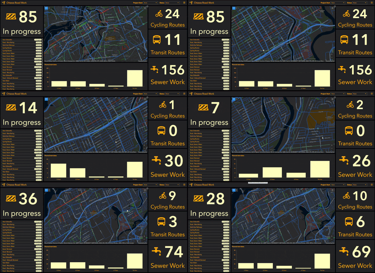
Map actions are set in the map element’s configuration in the Map Actions tab. From here, you can select the other elements on your dashboard that you want to filter as the map extent changes. In the image below, you can see that the map actions are set up so that the four indicators and the serial chart all filter with the map’s extent.
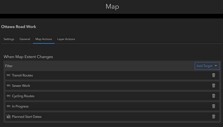
While this action is great in some cases, it doesn’t really allow for the most accurate results. A map’s extent is limited by the basemap’s level of detail. In addition, when authoring a dashboard that is going to be shared with the public, these actions are better left out to allow your dashboard to work seamlessly when it’s getting a lot of traffic. These actions are not cacheable since it’s impossible to predict where users will pan and zoom on a map. As a result, your dashboard can’t leverage the platform’s scalable infrastructure. So, if you have hundreds or thousands of people panning and zooming at the same time, your dashboard’s performance can suffer. You can learn more about how to optimize your dashboard for high demand use here.
A great alternative to filtering using map extent is to use selectors or another element (like a list for example) to trigger filtering actions. Using the same example from above, we’ve added in a category selector that filters the map and other elements based on the selection. Rather than spatially filtering the data, the selector is using an attribute filter to select features that match the selection. Now instead of panning and zooming to a specific area, users can select an area, in this case by selecting an administrative ward, and filter the map, indicators and chart to only show values for that area.
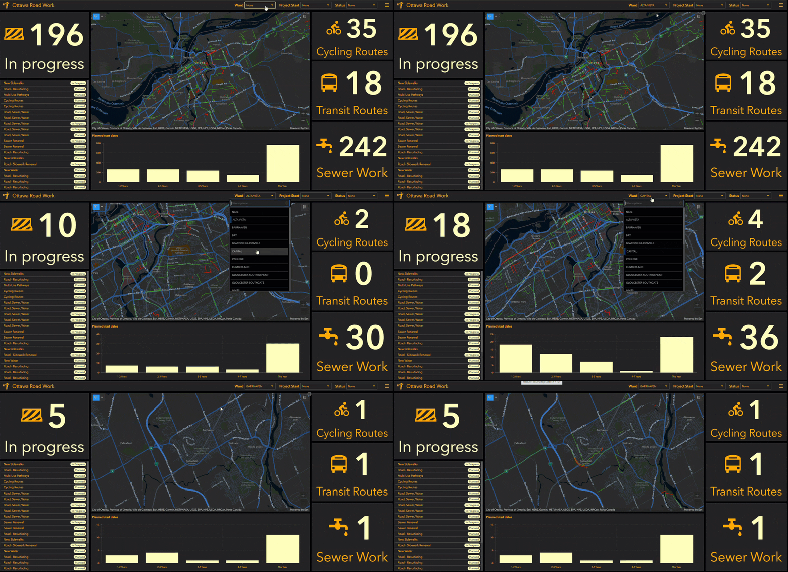
To do this, we added a new category selector in the header of our dashboard and used the administrative wards layer as our categories. In the selector’s configuration, we set up actions so that once a ward is selected, the map will zoom on that ward and filter the other elements to match.
You can learn more about configuring actions on dashboard elements here.
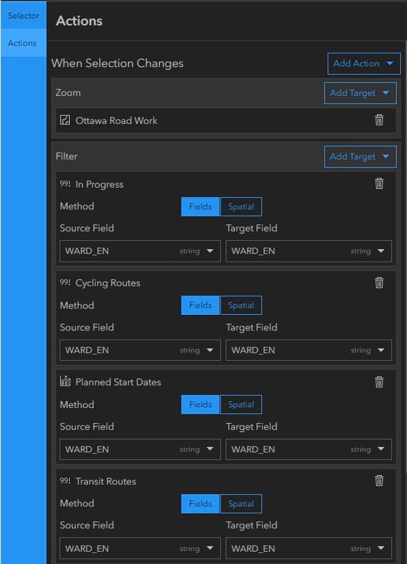
Not only does this allow for dashboard users to more accurately select an area of interest, it also allows the dashboard to work more effectively behind the scenes by sending cacheable queries to the platform. When authoring a dashboard, choosing the right way to give users an interactive experience is important to ensure accurate information can be seen in an effective and efficient way.


Article Discussion: