Getting the most out of your dashboard is as much about choosing the best visualization as it is about having the right data. Charts, gauges, and indicators are typically the go-to visualizations because they communicate concepts quickly and easily. Although ease of communication is important, there are times when you need more granularity. With the December 2021 release of ArcGIS Dashboards, you can now create tables to provide more depth and understanding to your dashboard’s data.
A table displays data in a series of rows and columns. While some elements use abstraction to grab your attention and focus on trends, tables present data in a more raw form and can convey preciseness. Instead of being viewed at a glance, tables are meant to be read. They are ideal when you have data that needs specific attention, or you want to evaluate across multiple dimensions without having to create multiple visualizations.
There are two types of tables you can make in Dashboards; Grouped value tables and Feature tables.
Grouped value tables
In a table based on grouped values, repeating categories in a field are grouped together, with each row being a category. One field is selected as the category field and values in the other fields are summary statistics – like count, sum, average, etc. grouped into the category.
Below is a simple grouped value table we can break down.
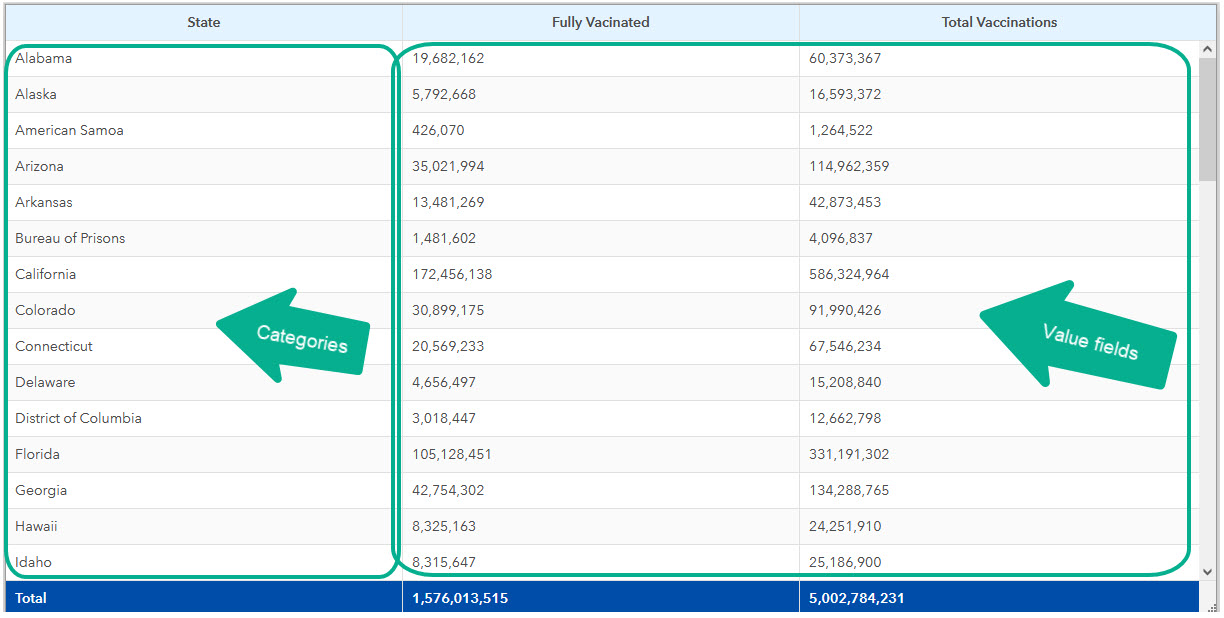
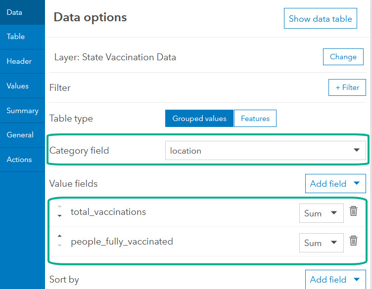
The State column is the category. The subsequent columns are the chosen value fields in your data as the summary statistic chosen. When configuring your grouped value table, you first choose the category field and then select your value fields and the statistics for each. In this case, for both value fields, the table is showing the sum of the values for the total_vaccinations field and the people_fully_vaccinated field.
Feature tables
A table based on features displays the fields in your data and their raw values. Each row in the table is a single data point or record in your data and each column is the value for that field in the record.
Below is a simple feature table broken down.
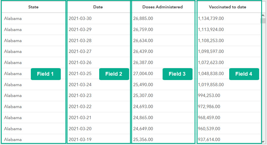
Each column in the table is a field in your data and its raw values. Since there is no data aggregation in this table, the values shown for daily_vaccinations and people_vaccinated are the values in those fields for that specific data point.
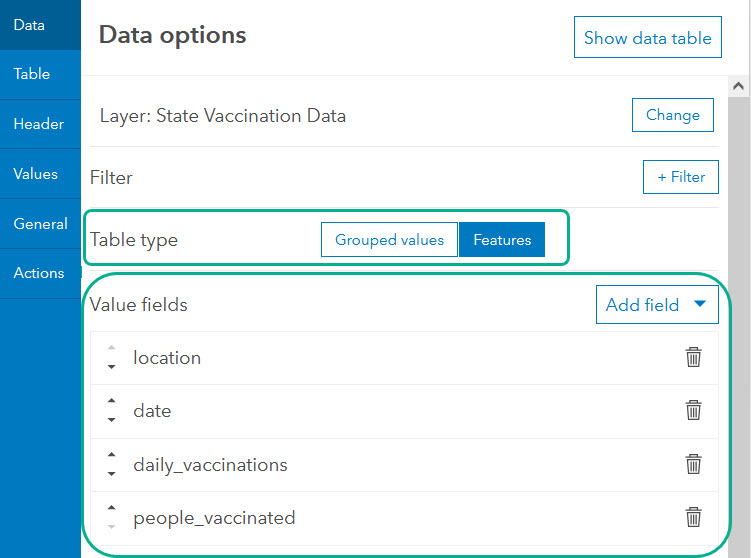
Table configuration
There are so many ways you can configure tables. You can configure the display of your table – including the size of the table and its columns, text, background and selection colors, the table’s grid, and more. Below are some of the configuration possibilities.
Table sizing
Tables can be sized to be small, medium or large. The size changes the display size of the entire table, including text font. The sizing for columns can also be configured to either fit the element’s width or fit the data.
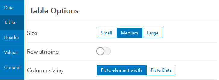
When column sizing is set to fit element width, all columns are sized evenly based on the element’s size on the dashboard. When column sizing is set to fit the data, each column is sized to the widest value in that column, except for the last column, where the width is set to the remainder of the element’s size.
Headers and summary rows
All tables can have a header row. When visible, the header row is frozen at the top as you scroll through a table. Header labels are automatically generated based on the field name in your data but can be customized.
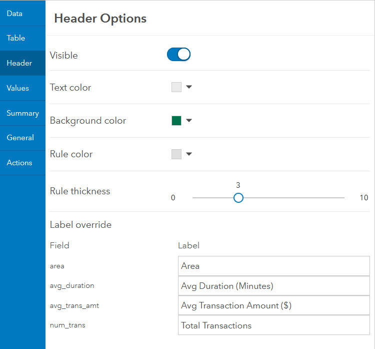
In addition to the header row, tables based on grouped values can also have a summary row showing the summary statistic for the entire column. When visible, the summary row is always frozen at the bottom of the table.
Value fields
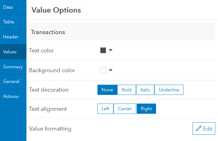
For each value field in your table (each column), you can also choose how the values display. Each value field has its own set of configuration options, so that you can choose how each displays differently.
Advanced formatting
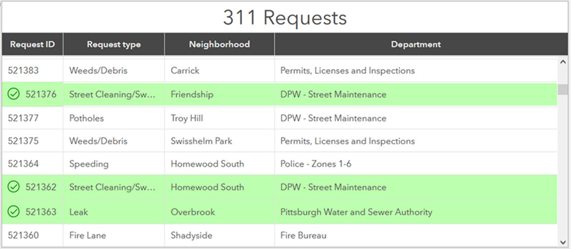
In addition to the out-of-the-box configuration options, you can also choose to enable advanced formatting, allowing you to use Arcade to format how your table displays. With advanced formatting, you can take your tables to a new level by applying conditional rendering (change the display of table properties when a condition is met), including icons, and more.
For example, the 311 Requests table below is using advanced formatting to highlight and add an icon to requests that have been closed.
Tables are incredibly flexible and provide you with fine-tuned control over almost every aspect of their display. Like all data-driven dashboard elements, they can take part in dashboard interactivity using actions, and can be enabled to allow data download.
Get started adding tables to your dashboards and if you can, share them with us on Twitter and LinkedIn using #ArcGISDashboards.


This is a very needed and welcome addition to Dashboards! Now to begin rolling it out on all our Dashboards!
Hi Noora, will this functionality become available in the Operations Dashboards in ArcGIS Enterprise?
Would love to hear when this is coming to Enterprise!
I am in edit mode but do not have “Summary” option and under values I only have Arcade Advanced Formatting options. ???? I can’t seem to attach a screenshot…
Hi @ngolabi-2-2-2-2,
Are you able to use Arcade expressions within a Table to customise individual cells (ie. cell background colours, text, etc.)?
Hello. Which version of Enterprise is this available on? Thanks!
Hello,
this widget was really needed! I much appreciate to have tables now on Dashbaords.
Just a question: is there no EXPORT DATA function? If not, is it planned in the short term?
Thank you very much!
Kindest regards,