In the US, the National Weather Services (NWS) is the government agency that provides weather forecasts and watches and warnings of hazardous weather to the public for protection, safety, and general information. Watches are issued when conditions for a specific type of severe weather are favorable or expected but not occurring or imminent. Warnings are issued when conditions conducive for a particular kind of severe weather are occurring or impending. Warnings and watches issued by the NWS are the primary means of communicating the risk of severe weather to the general public.
How frequently does the threat of severe weather occur in your neighborhood? The answer to this question is not only satisfying, but it can help identify areas where ‘warning/watch fatigue’ may be occurring. When people experience too many warnings/watches, there is a risk that they become desensitized. NOAA concluded that this desensitization might have contributed to the significant loss of life from the 2011 Joplin Missouri EF-5 tornado. The majority of Joplin residents did not immediately seek shelter once the tornado warning was issued.
The predecessor of the NWS, the US Weather Bureau, issued the first official severe watches and warnings in 1965 (Rothfusz et al., 2018). As technology developed, the NWS improved the accuracy and dissemination of watches and warnings culminating in 2007 with the generation of storm-based or polygon level warnings for tornadoes, severe thunderstorms, flash floods, and marine hazards. Before 2007, the NWS often issued warnings and watches for entire counties.
The data
Historically the NWS issued watches and warnings as text. Fortunately for the GIS community, the Iowa Environmental Mesonet acquired, cleaned, and has made available a GIS-friendly archive of NWS watches and warnings. This archive covers the period 1986 to the present. This blog analyzed data from January 1, 2003 through July of 2019. This dataset contains over 7.5 million overlapping polygons ranging in size from small convective storms to large counties. No amount of creative cartography can turn this massive collection of polygons into a meaningful meteorological information product.
GIS can help. Summarizing the data into logical areal units, hexagons in this case, and calculating summary statistics can help you glean more information from the data.

The computational challenge
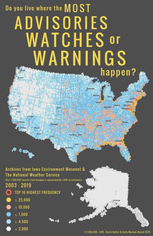
Our goal is to find areas that have high numbers of watches and warnings. The typical GIS workflow would be to intersect the 7.5 million watch and warning polygons. Because of the complexity and high degree of overlap of the polygons, this would result in an estimated over nine billion polygons exceeding the row limit in a file geodatabase and, more importantly, making interpreting the patterns even more difficult. The solution: create a grid of hexagons (approximately ten thousand hexagons each roughly one thousand square kilometers in area) covering the US. Intersect the hexagon grid with the 7.5 million warning and watch polygons using the Pairwise Intersect tool. Pairwise Intersect is designed to distribute the intersection work across multiple logical computer cores and employs a more efficient overlay algorithm. Finally, use the Sort and Summary Statistics tools to calculate the number of warning and watch polygons under each hexagon as well as the predominant warning or watch event type.
The cartographic challenge
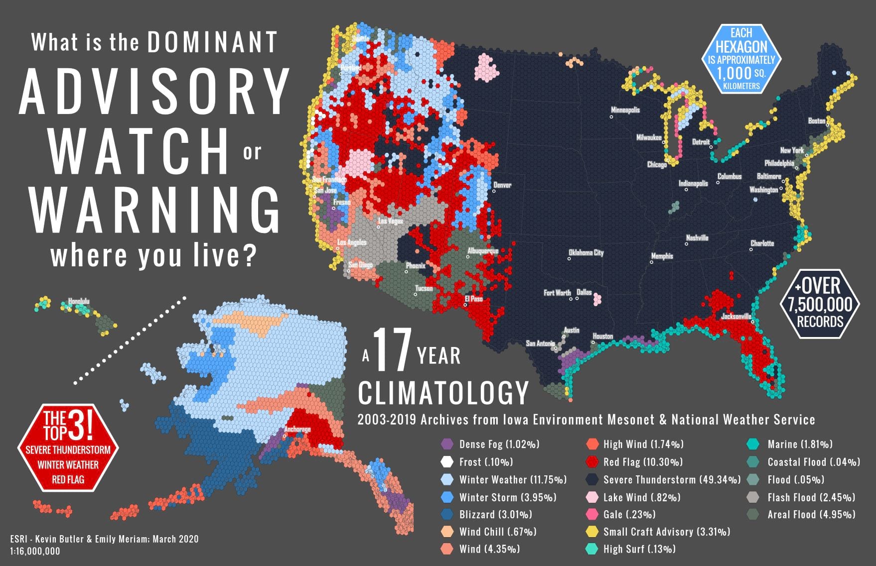
With 19 different advisories, watches, and warnings using an intuitive color palette is a must (i.e. winter events are blue, wind events are orange/pink, red flags are red, and floods are mostly in muddy water hues.) These colors must look cohesive and yet be able to differentiate one another without individually over dominating the map (for example purple Dense Fog must not appear to outcompete turquoise High Surf). This is particularly the case with Severe Thunderstorms. There is a significant portion of the map that has this predominance and by selecting a pleasing navy blue, it is present on the map, but it also shrinks away and does not take over.
The frequency map was the opposite situation. There needed to be a clear ramp up in color for the frequency values but using a standard sequential gradient color palette would not allow the data values to really shine. Because it’s a partner to the Predominance map, by pulling colors from there (Wind Chill orange became ≤ 10,000 and Small Craft yellow became ≤ 25,000) the family resemblance is still there despite their clear differences.
The predominance map confirms that the high number of warnings and watches along the coasts are primarily small craft or marine advisories. Within the continental US, thunderstorm watches and warnings dominate the eastern half of the country. Winter weather dominates in the northern Great Plains transitioning to red flag and flood warnings in the more arid south. In Alaska, unsurprisingly, various winter weather and wind events are dominant. High surf and marine advisories are most prevalent in Hawaii.
Some caveats
There have been vast improvements in climate models, forecasting, and the technologies used to communicate those forecasts over the 17 years of this climatology. Therefore the granularity of the data used to generate this climatology has changed over time. These maps show broad patterns of watches and warnings at the continental scale.
What next?
The data used to generate these maps are available from the Iowa Environmental Mesonet. Here are some suggestions for how you might replicate or extend this climatology:
- Generate a frequency climatology for a specific type of watch or warning. Different severe weather events require different levels of preparedness and response from the public. Understanding where and how frequently a particular kind of warning and watch has been issued can help identify ‘warning and watch fatigue.’
- Explore beyond the predominant class. We chose to include all watch and warning categories in our analysis and map just the predominant type. Mapping the second (penultimate) category might reveal interesting patterns, particularly in the eastern US, where thunderstorms are so dominant.
- Change the scale of the analysis. While the hexagons make our maps more readable, emergency planning, management, and response often happen at the county level. Repeat this analysis using counties instead of hexagons and see if similar patterns emerge.
Rothfusz, L. P., Schneider, R., Novak, D., Klockow-McClain, K., Gerard, A. E., Karstens, C., … & Smith, T. M. (2018). FACETs: A proposed next-generation paradigm for high-impact weather forecasting. Bulletin of the American Meteorological Society, 99(10), 2025-2043.


Article Discussion: