The tools available for customizing Esri Vector Basemaps continue to improve. A recent, and much requested, addition is to the Vector Tile Style Editor released in 2018. Now, you can add, edit or substitute sprites directly into your version of a basemap. Previously sprites for our various basemaps were created by the Basemaps Team (in ArcGIS Pro) before they were released, and were not available for any form of customization.
Sprites
Sprites (small graphic files) are used in Vector Tile Maps to create any point symbol, be it a city dot, the base for a road shield, a picture symbol or something else. They are also used for creating patterns – any fill or line that requires more than just a flat color.
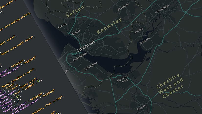
The sprites used in Esri’s basemaps were built in an ArcGIS Pro map. They were added to an aggregated sprite file automatically when a vector tile package was run, and this meant that they were inaccessible to the user. Now, with the Vector Style Editor, custom or pictorial symbols are easy to add to or substitute in our existing maps.
Preparation
You will be working with the ArcGIS Vector Tile Style Editor, and building sprites requires a graphics application. It does not have to be anything sophisticated, but there are some specific requirements that I will cover here. When the graphic is ready it can be added to a copy of one of our (or your) basemaps, and it will become part of that map document (although not part of the aggregated sprite file).
Adding Point Symbols
Point Symbols (or icons, or markers) can be added as sprites to any point data, or as label backgrounds. In our basemaps they are most commonly seen as the shield/rectangle backing for road numbers.
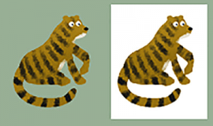
Only PNG format can be imported. In part this is because of the transparency option – A non-rectangular JPG symbol will have a white box around it. In this sample (from the Children’s Map), png is on the left and jpg on the right:
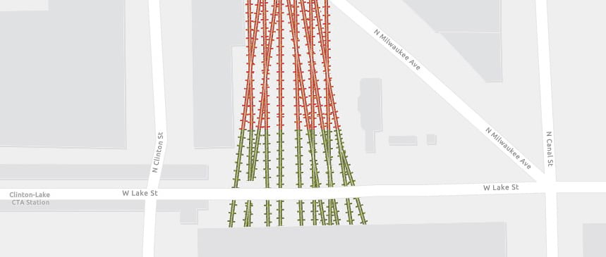
Here is a picture symbol I built to feature railroad stations on a custom copy of the Light Gray Canvas basemap:
Adding it is easy:
Step 1: Open your custom map into the Vector Style Editor.
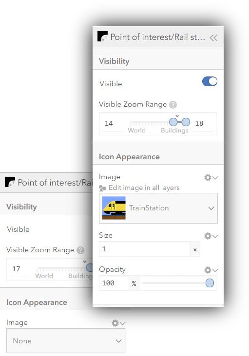
Step 2: Add the picture symbol to the ‘Icons and Patterns’ menu:
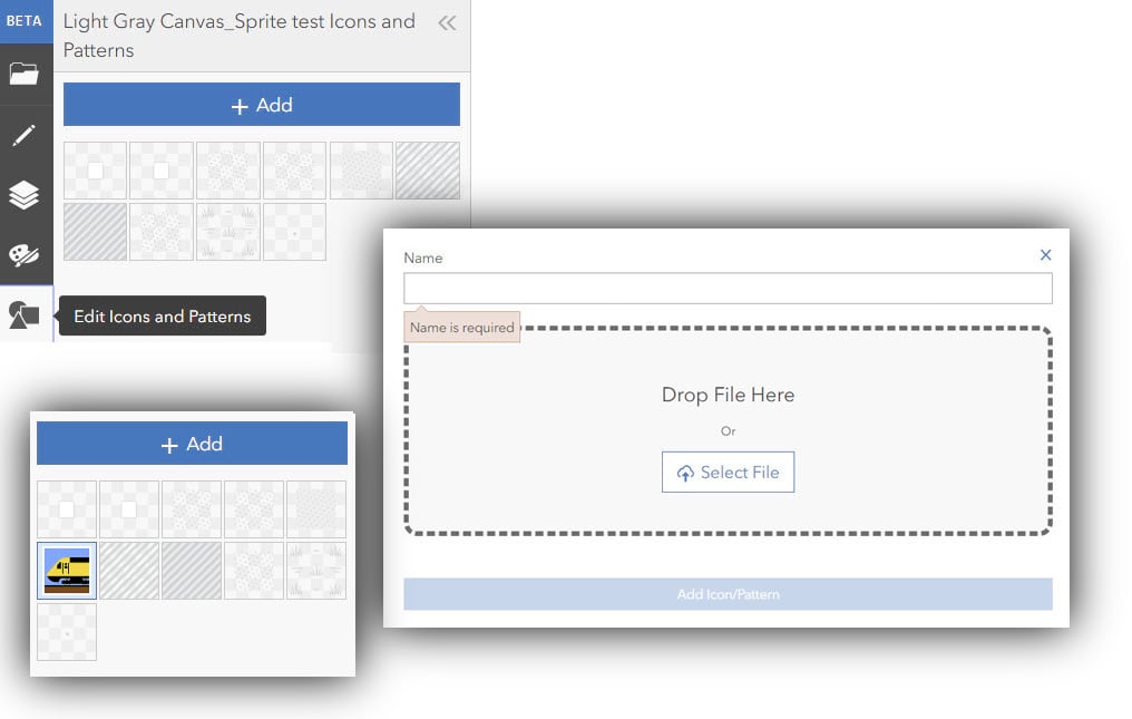
Step 3: Find your symbol layer, either by searching for it or by clicking on a feature in the map. In my case I want the ‘Rail Station’ layer. Click on ‘image’, choose the new symbol, and adjust the size if necessary. Currently, the Canvas maps do not use a symbol for rail stations, so it shows up as ‘None’, but I can still add a new one.
Here is the symbol in the map, with a further adjustment to the label setting to make more of a feature of it:
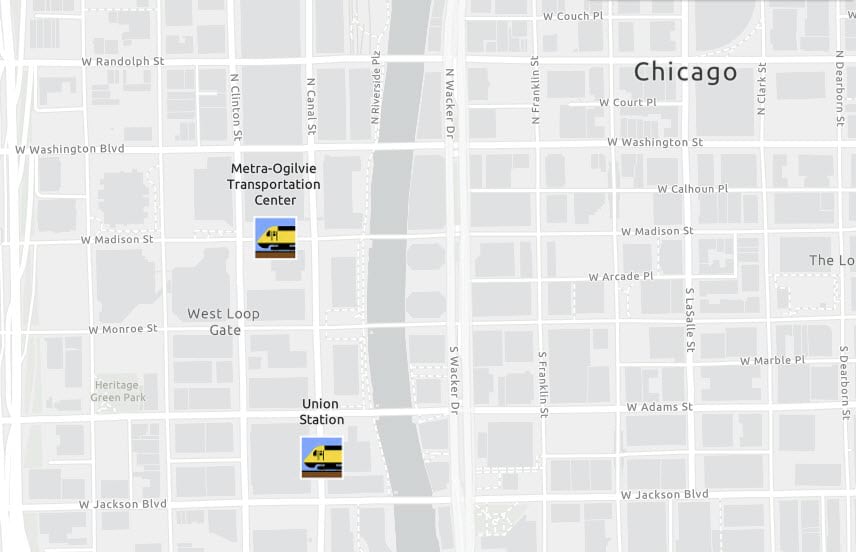
See ‘Pt 4: Labels‘ for more information on working with labels.
Pattern Effects
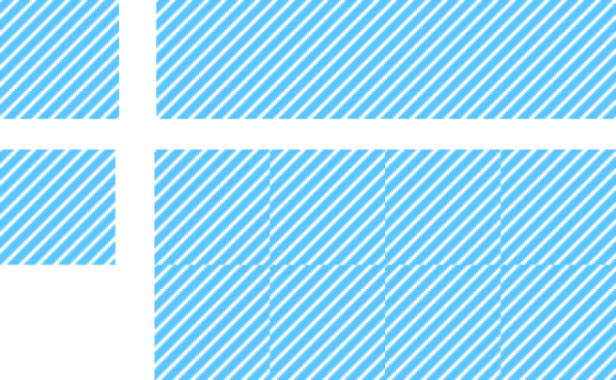
The concept for adding patterns to a map is simple. If you have used them in ArcGIS, or if you are a regular user of graphics packages such as Adobe Illustrator, you’ll be familiar with it – a patterned tile is repeated as many times as is required to fill a polygon (or to run along a line), and is masked by it:
The reality is a bit more complicated.
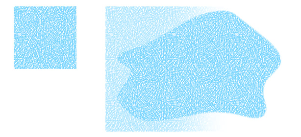
Here is a simple hatched pattern: The tiles repeat the hatch across the whole shape. However the edges of the tile must join seamlessly …
In the bottom row I have deliberately cropped a fraction off the tile to demonstrate what can happen. Even this small of a difference from one side of the tile to the other will create an edge. More complicated patterns need to be built with the same concept in mind.
Textures
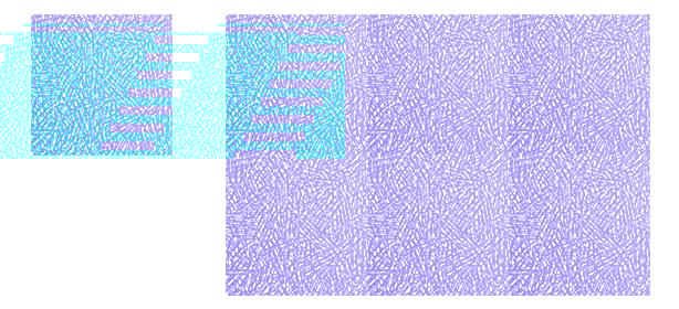
Textured or ‘random’ patterns like this tile from the ‘Colored Pencil’ map are sometimes more difficult to build. Any unevenness across the tile may be seen in the final result. Here, I darkened the bottom-left corner of the tile slightly. It’s hardly noticeable on a single tile, but when applied it can be seen clearly as a repeating pattern.
Working it out
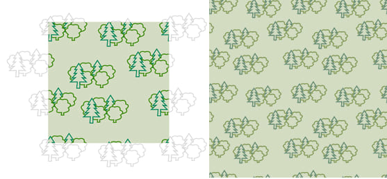
Here is a cartoon-style pattern for woodland and parks, and it is a good example of how pattern tiles work. Notice how the woodland pattern aligns and repeats. I spent some time adjusting the distribution of shapes across the tile to minimize the repeating effect.
Some shapes should overlap the edges of the tile in all directions to break down the tile shape. These need to be aligned carefully from left and right, top and bottom, so that they join seamlessly. It takes time, and some trial and error. Don’t be surprised if you have to rebuild and reload tiles a number of times before you’re satisfied with the result. Here is how they work together:
The size of the tile is important. They may not render correctly if they are not square, and it is safest to build at a resolution that is a multiple of 2 (4,8,16,32,64,128,256,512). In this case I exported the tiles to PNGs at 128 px. Smaller tiles may be more efficient, but the likelihood of the pattern repeating itself is greater. Keep the tile size down if you can though, and don’t go above 512 px.
Line Effects
Tiles/symbols can be added to lines as well. Here, I’ve added a strong red version of a fairly traditional railroad symbol:
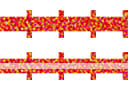
The line symbol is the top one shown above. I added some noise to the finished shape to provide a texture, and in the map it sits under a thin and transparent white line to define the detail.
The renderer does a good job of ‘bending’ the symbol to follow the line, but again, you may need a few attempts to get to a result that you like.
Final Results
The changes are added to this copy of the Light Gray Canvas Map. The ‘tree’ pattern, and a textured effect on water are visible at the opening scale. Zoom in to a major city to see the railroad symbols.

Commenting is not enabled for this article.