By Alex Quitero and Daniel Smith, University of Redlands, Masters of Science in GIS Program
Several weeks ago, after a colloquium given by Dr. Aileen Buckley on the devolution of cartographic theory, we approached her about research opportunities that she mentioned. She was glad to accept our help and put us in contact with Dr. A. Jon Kimerling from the Oregon State University. The research he was undertaking during his sabbatical in Redlands, CA dealt with a particular mapping method in the cartographer’s bag of tricks – dot density mapping. After discussing the research issues with Dr. Kimerling, we were tasked with developing a series of maps to supplement his research (see his presentation: “Dotting the Dot Map, Revisited” and to document the workflow for creating dot density maps with ArcMap. This seemed to be easy enough and in fact was quite easy given ArcGIS provides the tools necessary for completing this task.
Here are the basic steps needed to create a dot density map.
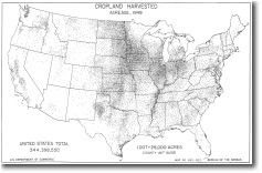
The first thing that is necessary is areal data. For population dot density maps, census data are a good bet.
Identify of the attribute that contains values for each areal unit that you want to map.
Once you have identified the data and attribute to be mapped you need to define the dot size and dot unit value. There are a few ways to do this. You can refer to the Mackay nomograph (slide 6 of “Dotting the Dot Map, Revisited“) that has been used for years or refer to Dr. Kimerling’s work using probability theory to define an optimal dot density from which the dot unit value can be determined (appears later in the same presentation).
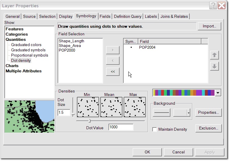
Now comes the ArcMap part. Right-click on your areal unit data in the table of contents and select Properties. Select Symbology tab and on the left hand side of the dialog box select Quantities (see below). The drop down box shows several options, among them Dot Density. Select this option. You will see the display change, and it will give you options for identifying the attribute(s) to be mapped, dot value and dot size. Set these parameters to what you would like and visually inspect the dot density preview. Pay special attention to the “Max” (maximum) preview box. Try to adjust your values, so that in the Max preview the dots begin to coalesce. Click OK and ArcMap will draw the appropriate number of dots according to the dot unit value in a random pattern, giving you a dot density map.
This dot density mapping is great, right? In many cases where features are distributed evenly across your areal units this simple procedure will work well, but what if we want a more realistic depiction of where dots should be placed? ArcMap has the functionality to handle this more complex situation in the form of applying masking to the layer and eliminating unsuitable areas for dot placement. The process for applying a mask is as simple as creating the dot density map, as explained above, but there are additional considerations. The first is defining exclusion or inclusion areas.
- For exclusions you are defining areas that are known to not contain the attribute you are representing with the dot density map. This is an exercise in assessment and knowledge of geography and of your study area, as well as a conceptual exercise of combining layers using various ArcGIS tools. Some examples of possible areas of exclusion from the work we have done creating dot density maps of population are state, local, and national parks, water bodies and airports.
- The concept of inclusion areas is exactly the opposite – areas that are known to contain the attribute you are representing with the dot density map. Examples from our work include road buffers and urban areas (minus airports and parks).
That being said, let’s get to the “how to” for setting the exclusion or inclusion layers. Note that the software will allow you to set one exclusion layer and that that layer must have polygon geometry. So you need to get all the exclusions and inclusion into one layer that you will use to make the map. For our work, we used a series of appends and dissolves, but using these depends on your data and what you are trying to do.
Once you have created your final exclusion or inclusion layer, make sure that it is above your data layer that contains the attribute being mapped using the dot density method (this will save you from banging your head against the wall for thirty minutes like we did trying to figure out why the results didn’t change). Set your exclusion layer to no fill and use no outline color if you wish not show these areas (in dot density mapping we are solely interested in showing the dots with some minor base reference layers such as state or county outlines).
Navigate to the Layer Properties Symbology tab of the layer being used for dot density mapping. Click the Properties button next to the background drawing options (I know that the Exclusion button is tempting but this is used to exclude specific instances or in other words records of your feature being mapped).
Check the Use Masking check box. Select your exclusion or inclusion layer as the Control Layer. As noted above, you can only use one layer to include or exclude dots so be sure to have all your exclusions and inclusions in one final layer. Depending on how you set that up, you will either Exclude dots from these areas (for a final exclusion layer) or Place dots only in these areas (for a final inclusion layer).
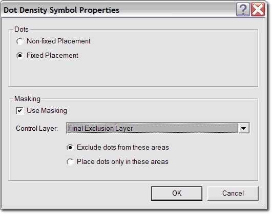
Select Fixed Placement if you do not want your dots to move around every time you zoom in or refresh your map display. Click OK in the Dot Density Symbol Properties dialog box and again in the Layer Properties dialog box. You have just created a dot density map using areas of exclusion or inclusion.
Article Discussion: