By Aileen Buckley, Mapping Center Lead
In a previous blog entry we told you how you can add a simple elevation tint legend to your map. Quite rightly, we got a comment (by “stuskier”) about the lack of labels on the legend (aside from the endpoints).
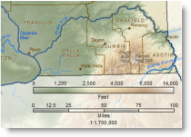
They are important to add to this legend because without them, the map reader will be tempted to interpolate linearly between the labeled values. That is, they will assume that the values range evenly from the low value, 0 on our map, to the high value, about 14,000 feet for our map (figure 1). So the map reader would assume that a color halfway along the legend would represent an elevation value halfway between 0 and 14,000, or 7,000 feet. A color a quarter of the way would relate to 3,500 feet, and so on.
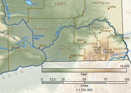
Figure 1. The legend without any useful breaks or labels for intermediate values.
But anyone who is familiar with the state will know when they look at our elevation map of Washington (figure 2), that most of the state has an elevation of less than 7,000 feet which is therefore shown in browns, yellows and greens.
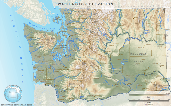
Figure 2. Most of the state of Washington is less than 7,000 feet in elevation — these areas are shown on the map in greens, yellows, and browns.
So we have to make one last edit to the elevation legend. We need to add labels so people do not get the impression that the elevation values are scaled equally across the legend. You can check that the values are not scaled evenly by looking at the Symbology tab of the DEM layer properties – for our map, this layer is shown using a Stretched renderer with two standard deviations (figure 3). A peek at the histogram shows you the minimum, maximum and mean values and the distribution of values in the DEM. Notice that there are very few pixels that have the very high elevation values.
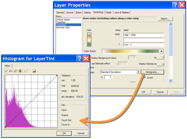
Figure 3. The range of elevation values and some statistics about the elevation data are provided in the Histogram window.
Using the stretched renderer means that we are stretching the data values of the DEM over the whole extent of the color ramp we are using to display it. This is called a contrast stretch. A contrast stretch increases the visual contrast of the raster display. In figure 4, the histogram shows roughly which DEM values are being assigned to colors in the color ramp shown below the histogram. In the histogram on the right, with no contrast stretch applied, you can see that we would need to use a color ramp with a lot more white in it — this leaves very little of the rest of the color ramp for the other DEM values.
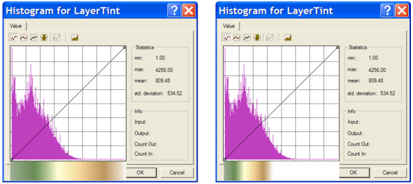
Figure 4. On the left, a contrast stretch is used, and on the right, no contrast stretch is used. I superimposed the color ramp on the bottom of the histogram window so you can see which colors are related to which elevation values in the distribution.
Using the contrast stretch allows more cells to carry color other than white, thus providing more visual detail because there is more contrast in the colors on the display. An alternative to using a contrast stretch on the DEM data is to modify the color ramp by adding a lot more white at the high value end. In essence, this is sort of like “stretching” the color ramp. Notice in the figure below that the results from both methods are similar.
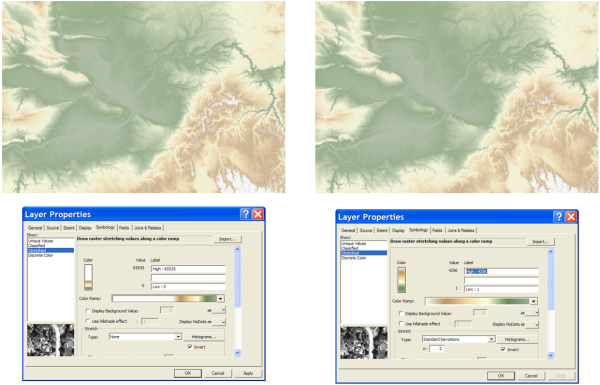
Figure 5. On the left, there is no stretched renderer but there is a modified color ramp with lots of white at the high value end. On the right, there is a stretched renderer and no “stretched” color ramp.
Which brings us back to the legend…since most of the state of Washington is NOT shown in white on the map (see figure 2), we want the legend to provide more detail for the lower elevation areas. We know that we need to use the same color ramp in the legend as we do on the map. BUT, if we were to used the stretched color ramp on our map, the legend would look like the example in figure 6. This does not provide enough detail for the lower elevation areas.
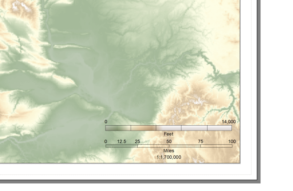
Figure 6. The legend for this map does not provide enough detail for the lower lying areas – which also corresponds to more area of the state and more of the area that is of interest to the map readers.
So the preferred display method is to use the stretched renderer with the non-stretched color ramp. Once we create this legend on our map, all we need to do after we label the ends of the legend is to determine representative interval breaks and their associated elevation values. There are a few ways you can do this — the one I describe below is fairly quick and easy.
First, place some evenly spaced breaks along the legend (figure 7). Use the Eye Dropper Tool to pick a color on the legend near the break – it’s a little easier to find the associated color on the map if you pick the colors from the top of the legend where they would be in full illumination on the map. Then use the Eye Dropper tool to find a color that is very similar on the map – after a few tries, this gets to be really easy. Once you find the color on the map, use the Identify tool to find out what the DEM value is at that pixel location – the DEM layer is called LayerTint on our map. Use a Calculator to convert the values in meters to feet, if necessary, and label the legend accordingly. Since you are only approximately finding the elevation values, you can round the numbers.
NOTE: The Eye Dropper tool can be added to your ArcMap Interface using these steps: click Tools on the top bar menu, click Customize, click the Commands tab, click Page Layout in the categories pane on the left, click and hold the button down on the Eye Dropper Tool in the right pane to drag the tool to any toolbar in your ArcMap interface.
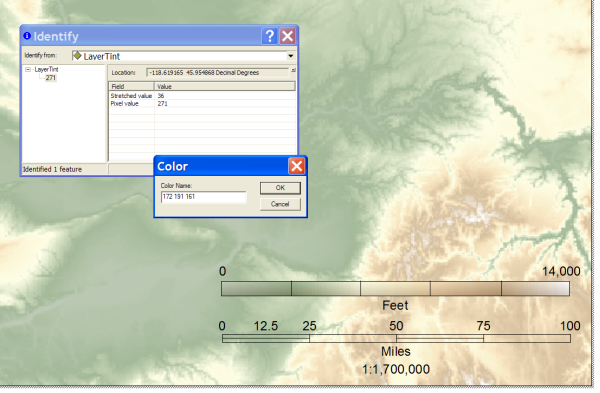
Figure 7. Use of the Eyedropper tool and the Identify tool to determine which elevation values correspond with which colors on the map.
To further assure that your map readers do not try to infer more accuracy than they should, you could take one last step to delete the breaks you added so they can only approximate the labeled values with the colors on the legend and the map (figure 8).
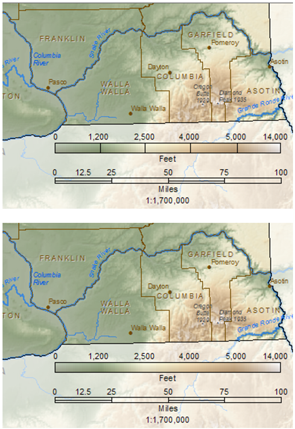
Figure 8. In the map at the top, there are legend breaks associated with the values. In the map at the bottom, the legend breaks are removed.
So how do you know what is the right method for labeling elevation tint legend for your map? You have to decide based on the area you are mapping, the color ramp you used, the symbol renderer you used, and the intended use of the map. There are many examples of different elevation tint legends used by cartographers. If we survey just the maps of the “cartography virtuoso” (as he was called in the book, Virtuoso by Ken Carbone), we can see that Stuart Allan of Allan Cartography and Benchmark Atlases, uses a variety of layer tint legend styles.
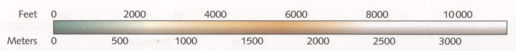
Figure 9. Oregon Benchmark Atlas and Gazetteer
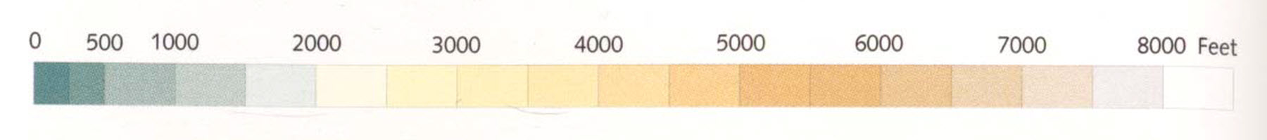
Figure 10. Oregon Atlas
Figure 11. Alaska Raven wall map

Figure 12. North America Raven wall map

Figure 13. Arizona Benchmark Atlas and Gazetteer
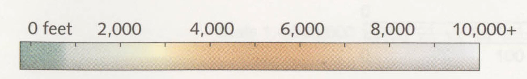
Figure 14. Washington Benchmark Atlas and Gazetteer
Some legends have abrupt breaks in the colors and associated break lines in the legend (figure 10), some have tics along the edges to label the elevation values (figures 11, 12, 14), and some have no tics (figure 9 and 13). Some have tics outside (figures 11 and 12) and others have tics inside (figure 14). You can also see that some label the highest value (figures 11 and 12), some label an approximate highest value (figures 10 and 13), and some do not indicate the highest value at all (figures 9 and 14). Some stretch the color ramp by including the all of the values at the extremes (figures 9 and 13), and others stretch the elevation values to the end of the color ramp but don’t show all the values at the extremes (figures 11 and 12).
Clearly, there is no one formula that will work for every map. Each map must be regarded individually. Similary, there is more than one way to determine the elevation values for the legend. If you have a method that you have tried out and like, please send us a comment to share it with others!

Article Discussion: