By Wes Jones, Esri Design Cartographer
This blog entry is about maps and infographics. A map takes a very complex thing, the earth, and cartographically represents it so you can more easily understand it. An infographic takes information—the more complex, the better—and graphically represents it so you can more easily understand it. The two have much in common. This entry explains how to make a comparative distance line infographic that shows how far features are from a baseline that represents a geographic entity. The example here is the distance of cities from the coast in Australia (the mainland).
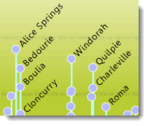
In this infographic (figure 1), the coastline has been converted into a straight line (split between Sydney and Melbourne). The area below the line shows the location of the seas and oceans, and the area above shows the cities and their distances from the coast. Larger cities are represented by larger, darker circles, and the farther a circle is from the baseline, the more inland it is. Click on the figure to see a PDF of the infographic at full resolution.
?
Figure 1: The infographic
The concept of compromising the geography to show features in an infographic is not new, as figure 2 illustrates. On this map from 1846, the major rivers of the world are straightened out to some extent and displayed in the same orientation to allow readers to compare their lengths.
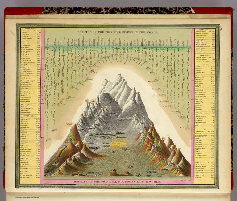
The main differences between the rivers map above and the comparative distance line infographic are that the infographic completely straightens out the geographic feature into a straight line and it shows the distance of features to the line. The power of this infographic is that it quickly reveals a lot of information, like the relative size of each city, what the nearest ocean feature is to each city, which cities are neighbors, and how far each city is from the coast.
What exactly is happening to create the infographic?
A script tool is used to create the infographic. Thanks go to Charlie Frye up front for providing the script tool to run these calculations. Figure 3 is a visualization of how the infographic is created.
1. The script tools records the coastline and the cities.
2. It finds the segment of coastline closest to each city and attaches a distance line to each city.
3 and 4. The coastline unfurls, but as it does, it keeps the point of contact between the cities and coastline and their distances intact.
5. The result is an image in which all the cities are positioned above the coastline according to their actual distances from the shore.
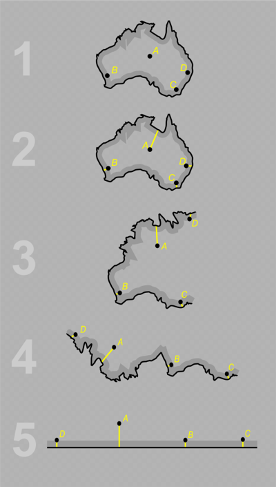
Figure 3: A visualization of how points are assigned to the nearest coastline and how the coastline, cities, and distance lines are converted into the infographic
Making the infographic
Here are the steps in making this type of infographic.
Step one: Assemble the data
The first step is to assemble the necessary data. For this example, Natural Earth and Global Self-Consistent, Hierarchical, High-Resolution Shoreline Database (GSHHS) data were used, but you can use any datasets as long as you have polygon/line data (a coastline or some type of feature you are measuring distance from) and point data (cities or some type of feature you are measuring distance to).
Step two: Use the Comparative Distance Line script tool
Download and open the Comparative Distance Line script tool (figure 4).
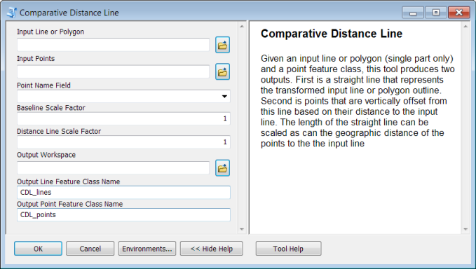
Figure 4: The Comparative Distance Line script tool dialog box
Input these settings:
- Input Line or Polygon: Select the line or polygon feature class that you want to use as the input to create the infographic baseline, in this example, the Australian shoreline.
- Input Points: Select the point feature class that you want to use as the input to create the infograpic distance points, in this example, Australian cities.
- Point Name Field: Select the field in the input point feature class that contains the values that will be used to label the infographic points.
- Baseline Scale Factor and Distance Lines Scale Factor: These options allow you to scale the infographic baseline and distance lines so that the infographic has more visually pleasing proportions. The Australia example uses .25 and 2, respectively.
- Output Workspace: Select a workspace that the outputs will be written to.
- Output Line Feature Class Name: Input a name for the output line feature class—this will contain the infographic horizontal baseline and vertical distance lines connecting the distance points to the baseline.
- Output Point Feature Class Name: Input a name for the output point feature class—this will contain the distance points positioned vertically relative to the infographic baseline.
After running the script, the result will look something like figure 5:
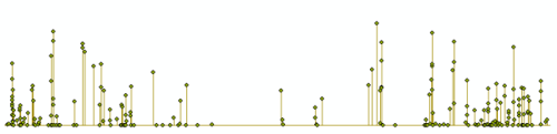
Figure 5: The distance points (cities) and distance lines connecting the points to the infographic baseline
Step three: Symbolize the infographic
The next step is to symbolize the output from the script tool.
First, symbolize the distance points (cities) to differentiate cities of different sizes and to designate the capital city. The example here uses symbol size and color value (lightness/darkness) to distinguish larger cities from smaller cities (a larger 40 point circle in darker blue for the larger cities and a smaller 14-point circle in lighter blue for the smaller cities). It also uses color hue (e.g., red, green, blue) to distinguish the type of city (cities that are not the capital are blue and the capital is yellow) (figure 6).
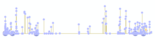
Figure 6: The distance points (cities) are symbolized by size and type
Second, symbolize the lines so that the baseline is one color and the distance lines are another color. In figure 7, a thicker black line was used for the baseline and a thinner gray line was used for the distance lines (figure 7).
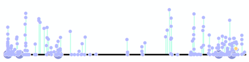
Figure 7: The baseline and distance lines are symbolized
Third, label the distance points. The Name attribute, designated in the script tool, was used to label the distance points. The labels are slanted at a 45-degree angle, with the largest cities in bold with 16 point font and the smallest ones with 10 point font (figure 8).
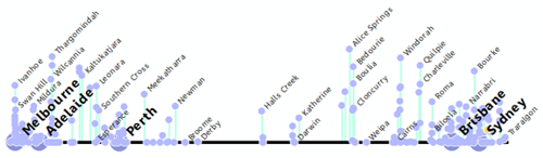
Figure 8: The distance point (city) labels are added and symbolized
Step four: Add any desired surrounds
The last step is to add any desired surrounds to the infographic. In this example, two gradient fills were used to symbolize the background—one representing the ocean (below the baseline) and the other the land (above the line). A blue gradient fill was used for the ocean area, and a green gradient fill was used for the land area.
Repeating text that reads “250 km”, “500 km”, and “1,000 km” was inserted above and parallel to the baseline to allow readers to gauge the distance of the cities from the coastline. The Measure tool was used to find the correct distances for placing the text.
For the title, this example used a color from the middle of the land gradient fill so that it looks like “Australia” is fading into the background.
Last, water body text was added below the baseline positioned relative to the cities along the baseline, with the text for the oceans larger than that for the seas (figure 9). The label color is from the light end of the ocean gradient fill so that the largest labels fade into the background.
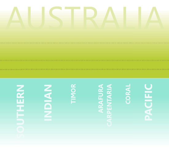
Figure 9: The infographic surrounds are added and symbolized
The final infographic is shown in figure 10. It is simple but revealing. You can clearly see Alice Springs is the farthest inland city (in the example dataset). You can also see that most Australian cities are located along the coast, especially near the Pacific and Southern Oceans.
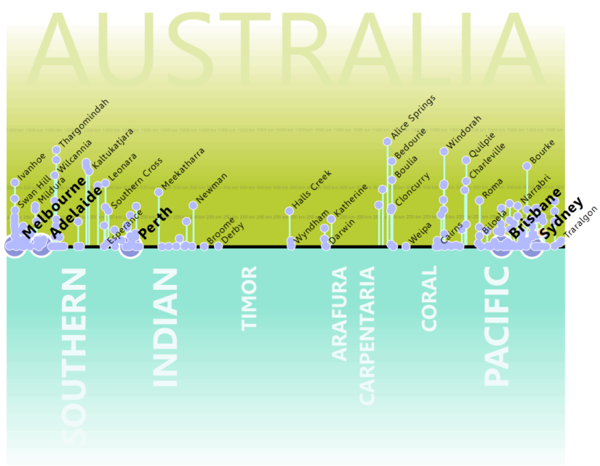
Figure 10: The final infographic
Using your data and the Comparative Distance Line script tool, you can now make a similar infographic yourself. Send us comments to let us know what you think about this infographic, and Tweet it or share it with others if you like it!
Thanks to Charlie Frye, Chief Cartographer, for the script tool and Aileen Buckley, Mapping Center Lead, for her help with this blog entry.

Commenting is not enabled for this article.