By Aileen Buckley, Mapping Center Lead
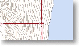
In the United States, the Public Land Survey System (PLSS) is a way of subdividing land. The USGS topographic map symbols for displaying PLSS data are an excellent way to symbolize PLSS data on not only topographic maps, but because the topographic symbols are so well recognized, the same symbols can be used on many other kinds of maps. In the image to the left, the “plus” marker symbol shows where a found corner is located, however, if no corner has been found, then no marker should be shown, leaving a gap that signifies the doubtful location of the corner. Next we will describe how to use cartographic representations to symbolize township, range, or section lines to leave a gap at the corners, allowing corners to be added (as point features) or gaps to be shown.
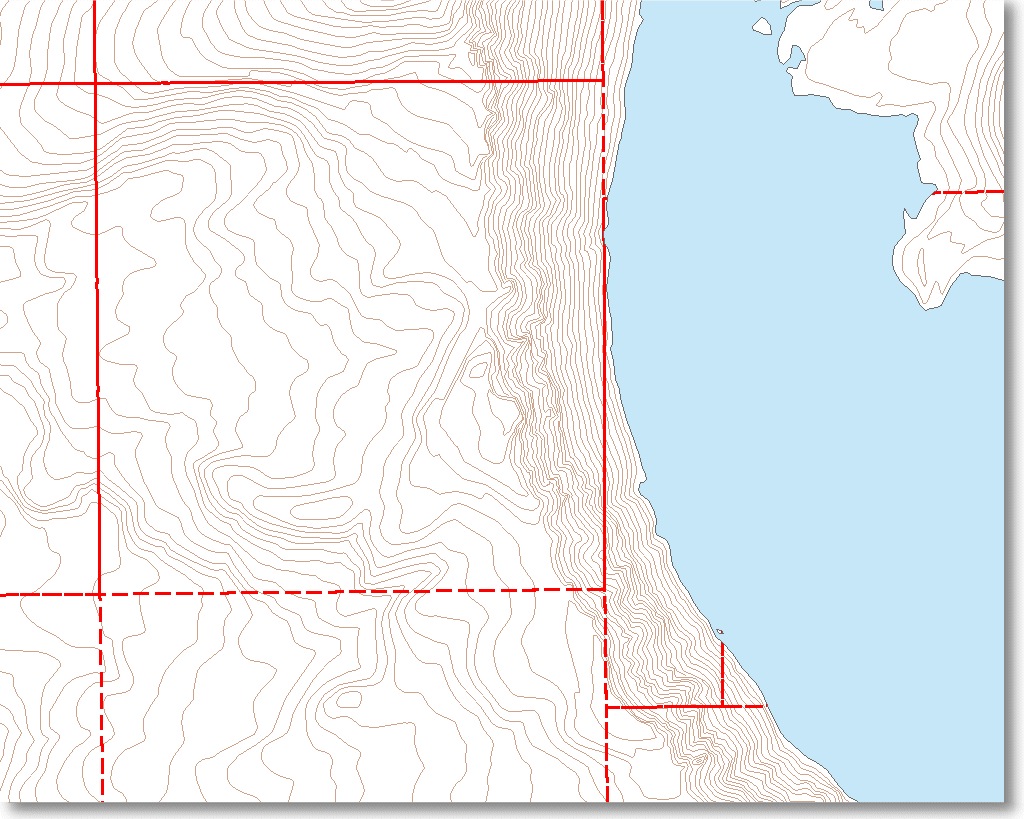
The image below shows what happens when a dashed line symbol is applied to polygon outlines when using ArcMap’s standard symbols. The overprinting of the dashes along shared polygon edges occurs because polygon start and end nodes are not always coincident, and the dash line pattern will always start at a polygon’s start node (the first vertex).
To solve this problem, the feature class containing the PLSS polygons should be converted to lines by using the Polygon To Line tool. (Make sure to save the lines in a geodatabase because the next step requires using cartographic representations which can only be used in geodatabases.)
Next, right-click on your layer and choose Convert Symbology to Representation. In this case the dash pattern is 6:2. The result is partially satisfactory because the lines are consistently drawn with the correct dash pattern. However, this initial solution creates a new problem. As shown below, the “T” or “+” symbol has a specific meaning when depicting PLSS information on USGS maps. This indicates “found-indicated” section or closing corners, which is not actually the case for this map.

Since the representation is incorrect, the representation rule requires enhancement. The solution is to apply the “Cut Curve” geometric effect to the representation symbol layer. Click the “+” button (circled in red below) to add the Cut Curve geometric effect. This will create a feature representation line pattern that is shortened on one or both ends by a defined distance. In this case cut values of 2.5 points resulted in the correct symbol appearance (below).

Below is the result:

To complete the display of PLSS data, add the point features representing the corners and symbolize them. You may need to adjust the Begin Cut and End Cut parameters for the Cut Curve geometric effect to accomodate your corner symbols.

Article Discussion: