This blog explains how to create a unified visual style in a story map through the use of Photoshop image filters. The Seven Wonder series of Story Map Tours provides examples of such filters with their watercolor, illustration, and schematic effects. This blog also discusses the broader concepts of visual consistency, pace, and rhythm.
If you’re in a hurry, jump straight to the step-by-step instructions for watercolor, illustration, and schematic filters in Photoshop. For general concepts of image filtering and storytelling, continue reading below.

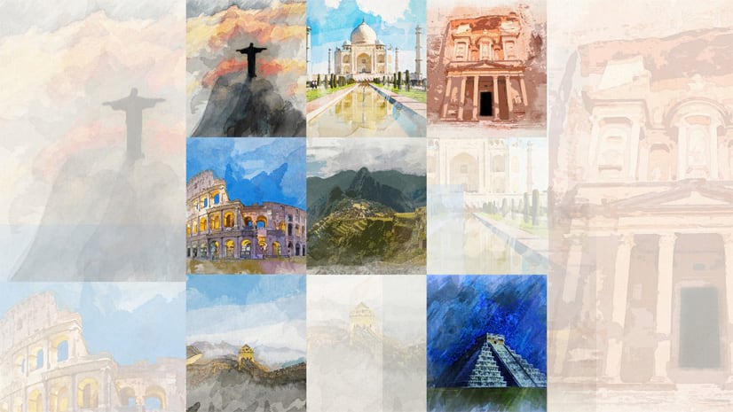
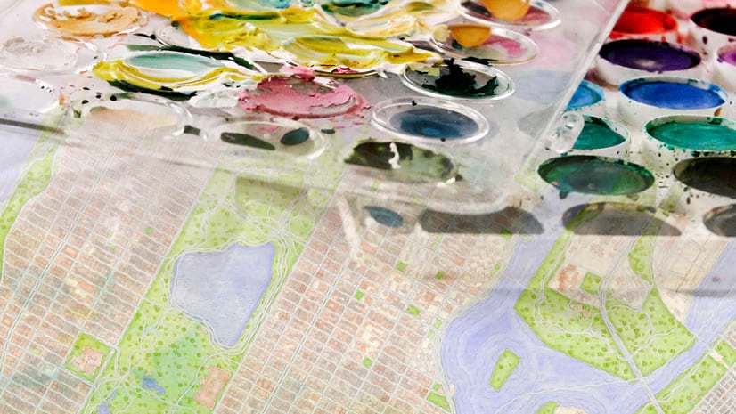
In Seven Wonders, each list of remarkable built and natural monuments takes its own visual style and pairs it with a thematic Esri basemap.

- The Ancient List: Historic plates / Modern Antique basemap
- The New List: Watercolors / Imagery basemap
- Natural Wonders: Illustrations / NatGeo basemap
- Engineering Feats: Schematics / Light Gray basemap
Why create a unified visual style?
An often overlooked strategy in storytelling is to maintain a unified look and feel. We at Esri Story Maps sometimes call this creating a little world.

The Amazon Conservation Team’s Map Series about Richard Evans Schultes creates a little visual world by combining historic photos with a consistent color palette and typography.
For users of a social image sharing service such as Instagram, the aesthetic delight of image filters is familiar. But more than just passive aesthetics, maintaining a consistent style across graphical elements in a story map can be active. Results can be quite practical.
Consistent and unified visual design:
- Invites readers to engage with—and thereby better absorb and retain—the message;
- Helps readers to connect the dots between disparate pieces of information;
- Provides that final touch of polish to make a visual product look professional—and therefore credible and authoritative.
The basics of image filtering
There are many ways to go about editing a photograph to achieve a specific effect. In general, when attempting to create an effect:
- Have a specific end goal in mind (watercolor, schematic, other); and
- Choose a high-resolution photograph with characteristics appropriate to achieve that effect.
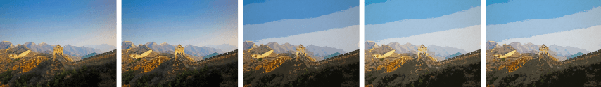
For example, if we want to create a watercolor effect over a photograph, we should choose a well-lit image with rich colors. But we should avoid too much detail because the visual noise can become muddled and confusing in the filtering process.
The process for generating a visual effect can be summed up broadly in a few steps:
- Apply a texture to a photograph by layering a texture image (such as parchment) on top of the photograph. Set the texture image layer’s Blending Mode to Multiply.
- Under Image Adjustments, adjust the brightness/exposure, saturation, and contrast of your photograph appropriately to achieve the desired end effect.
- Generalize or reduce the detail of the image using Artistic Filters plus a blur.
- Find Edges in your photograph and blend them into the base image by setting the edge effect Blending Mode to Multiply.
- If desired, apply a vignette to direct the reader’s attention—this can be as simple as a a gradient transparency, or as complex as watercolor paintbrush splotches.
For specific image filter guides, continue on to these step-by-step instructions for watercolor, illustration, and schematic effects.
What is visual consistency, pace, and rhythm?
Particularly when we talk about pace and rhythm, it is music and poetry that first come to mind—not visual communications. But just as the human ear recognizes harmony in the sonic qualities of music, so the human eye perceives—and is attracted to—optical patterns of visualizations.
While the tutorials linked in this blog focus on image filters specifically, there are many approaches for creating a unified visual style. To help with creating visual patterns in graphics and stories, three useful concepts are consistency, pace, and rhythm.
Consistency: The fidelity of a story in following a visual pattern appropriate to the mood of its topic.
While the order of text and types of media can (and should) vary so as to avoid boring the reader, the color palette (for example) should remain consistent—if the subject is wealth and poverty, one hue should always mean “wealth” and another hue should always mean “poverty.” Additionally, the method of symobolizing data should remain consistent—if dense colors or large symbols in one map represent “positive” results, in a subsequent map density and largeness should not represent “negative” results. Meanwhile, the choice of color palette and basemap theme (eg. dark versus light) should evoke the subject matter—a rainbow color palette is suited to a map of Skittles factories, but may be off-putting for a map of violent crime locations. Regardless of which color palettes or design choices are made, the most important takeaway is to apply those choices consistently and in-line with the topic.
Pace: The rate at which visual components are presented to, and interpreted by, the reader.
Do text, images, and maps appear in quick succession, occupy little screen space, and disappear with a short scroll? Or are long paragraphs of text interspersed with extensive photo or map montages, and require a lot of scrolling? Does the complexity of images, videos, and maps require readers to stop scrolling completely and take time to explore and interpret what they’re seeing? Or are graphics simple, short, and understandable at a glance? Any of these pacings are valid; the key is to be aware of the tempo of the story and instrumentalize its pace to achieve the desired storytelling experience.
Rhythm: The alternation or repetition of media types and visual qualities that generate a discernible pattern.
Like in poetry, visual components can have rhyme schemes such as the alternating A-B-A-B, C-D-C-D scheme (eg. image-text-image-text, map-video-map-video), or any number of other patterns. Such a rhythm can be achieved in the patterned order of media types. It can also be created in the alternation or repetition of specific qualities across the entirety of a story’s media, such as the use of a certain color or shape.
Qualities of a graphic
To actually begin to create patterns within and across visualizations, let’s break a graphic down into some specific qualities. These qualities might include:
- Color (or hue)
- Shape
- Size
- Directionality (pointing or leading)
- Perspective (or depth)
- Density (both the richness of colors and of detail)
- Subject matter (the person, place, or thing represented)
The concepts of consistency, pace, and rhythm can in turn be applied to the arrangement of these qualities within and across graphics. In some of the best examples of this, the result is a well designed experience akin to visual poetry. The more poetic the visualizations, a story is better equipped to project a unified visual style and capture a reader’s attention.
Now, if you’d like to dive back into image filters, check out these step-by-step instructions on how to create watercolor, illustration, and schematic effects. For more storytelling inspiration from Esri Story Maps, sign up for our monthly newsletter Planet Story Maps and follow us on Twitter @EsriStoryMaps.


Commenting is not enabled for this article.