Over the course of the Vietnam War, the United States and its allies dropped over 7.5 million tons of bombs on Southeast Asia. But until recently, few people outside the U.S. military really knew where all these bombs fell. That changed in late 2016, when the U.S. Department of Defense released its Theater History of Operations (THOR) data, a comprehensive database of U.S. bombing missions from World War I through the Vietnam War. Touted as a means of increasing the public’s understanding of the U.S. military, the datasets were as rich as they were novel. And they simply begged to be mapped.
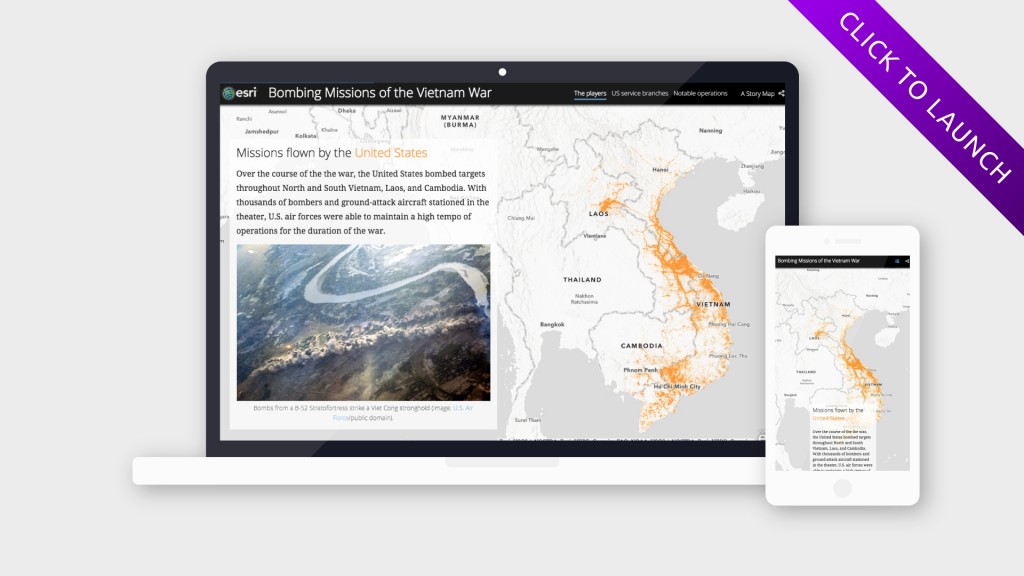
With Ken Burns’ documentary about the Vietnam War airing last Sunday, I thought it was a good time to create an interactive Story Map exploring the THOR Vietnam War dataset. In order to keep the piece short and punchy, I decided to focus on three different aspects of the aerial bombardment: the overall mission distribution; the actors involved (both by country, and by military branch); and the most significant operations.
Fortunately, I wasn’t going into this blind; a few months ago, I used the same dataset to create a static map of bombing missions of the Vietnam War using ArcGIS Pro. (More on that here.) But this time around, I was keen to explore the data in greater depth, and to present it in a more interactive, and engaging, form. So, I decided to create a Story Map.

Getting started
But where to begin? After loading the raw CSV into ArcGIS Pro and converting it into a geodatabase feature class, I began to push and pull the data in different directions, using definition queries to isolate specific subsets, and statistical summaries to then analyze them.
The data can be manipulated in a million different ways, and I had fight temptations to broaden the scope of the story map. Which branch of the U.S. military flew the most daytime ground-attack missions in Cambodia? Which U.S. Air Force unit dropped the greatest overall tonnage of bombs? What was the average duration of carrier-based U.S. Navy missions? Was napalm used more frequently in some countries than others? These are all questions that I mulled at some point or another, and that I knew the data could answer. But sometimes, less is more, and I knew that by only focusing on a few key aspects of the data, my story map would be more accessible to a general audience.
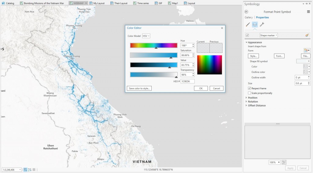
The points themselves were exceptionally dense, with tens, and in some cases hundreds, of overlapping missions. After experimenting with different aggregation techniques (namely, hexbins that dynamically resized at different scales), I decided on a simpler approach: showing one point per mission, with each point set to 98 percent transparency. This allowed isolated missions to fade into the background, while areas of dense saturation bombing remained fully opaque.
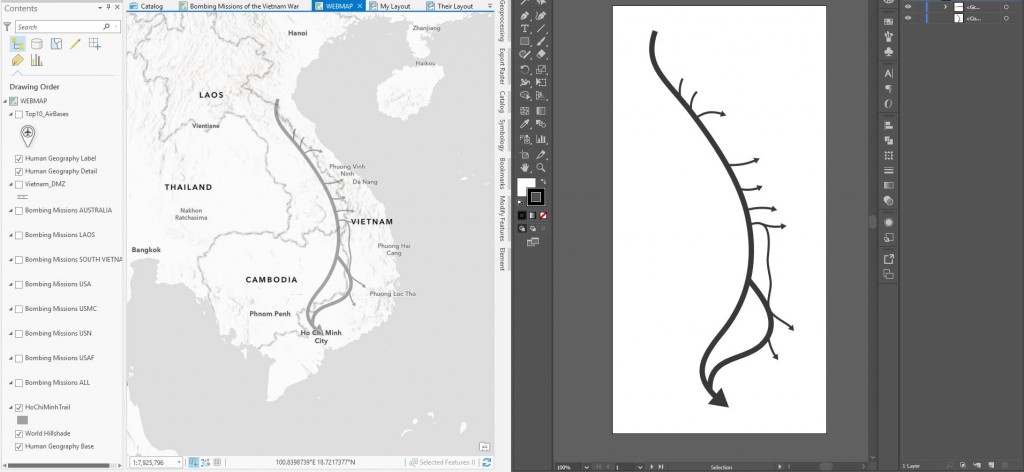
While the bombing data alone was immensely rich and interesting, I wanted to add some additional layers to provide context: namely, the locations of major air bases, and the general location of the Ho Chi Minh Trail, a target of U.S. bombing missions throughout the war. The THOR data includes a “takeoff location” attribute, so I ran a quick statistical summary to identify the most frequently used bases of each military branch. Then, I created a new point feature layer in Pro, and manually added the bases, obtaining geographic coordinates from Wikipedia. I whipped up a quick icon in a Illustrator to symbolize the bases.
To recreate the Ho Chi Minh Trail, I traced a creative commons map of the route in Adobe Illustrator. I then exported the vector shape as a CAD file, and brought it into Pro. Since the CAD file had now spatial information, I manually resized and georeferenced it, and exported it as a GDB feature class, to preserve these attributes. (The whole workflow is documented in this Cascade, created by former Esri Story Maps intern Clare Trainor.) I also created a polyline feature class to represent the demarcation line separating North and South Vietnam, using an archival map for reference.
After processing and visualizing all the data in ArcGIS Pro, I published each subset of the THOR dataset as a cached tile layer, deliberately limiting their extents in order to improve performance. (I used the original layer, which included missions with missing coordinates but otherwise valid data, for the statistical analyses.) I published the other layers as hosted feature layers. Next, I brought everything into a fresh webmap, from which I created a new Story Map Cascade.
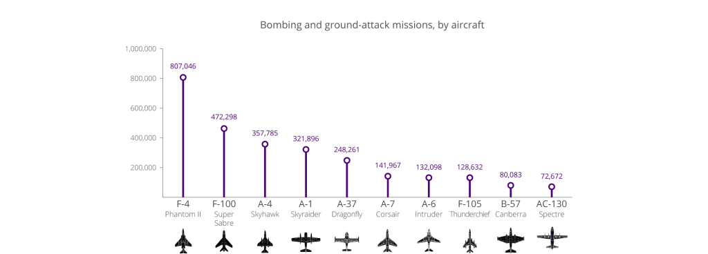
Finally, I set about adding some explanatory text, creating some simple charts in Illustrator using the summary tables generated in Pro, and sorting through troves of relevant public domain photos to locate compelling imagery.
I also decided to create a short animation to show the mission distribution by year. In Pro, I used definition queries to isolate each year of data, and then used the animation tools to export an image sequence. I then combined the images in into a GIF in Photoshop, using the tweening tool to automatically add in-between frames in order to smooth the animation.

I hope this story map will encourage others to explore the data, to address the questions I left unanswered, and produce their own visualizations. After all, that’s the fundamental purpose of the THOR initiative.
Note: an abridged version of this post originally appeared on GeoAwesomeness.com.

Article Discussion: