[Original source: Survey123 Geonet Blog]
While you may be familiar with the use of the Survey123 mobile app to support field workflows, in this occasion we are going to touch on web surveys. That is, on smart forms meant to be used right from within a web browser. Survey123 Web Designer is often being used to create web surveys for crowdsourcing, citizen-science and citizen engagement. For these high visibility, public surveys, it is critical to deliver a great user experience and visual appeal. Using Custom Themes in Survey123 Web Designer, you can now tightly control many visual aspects of your Web Forms. This includes everything from defining the look of your survey header, the style of its background, the alignment, color and size of text used in questions, the placement of logos, etc. Custom Themes is what you need to truly reflect in your surveys the feel and brand identity of your organization or project.
Before we start, I want to emphasize that in good survey design, the looks are just half of the story. Carefully crafting the questions to be included in a survey, their order, wording, grouping and the best fit for the available question types, is the other half. Trying to detail all of this at once would make a very lengthy post, so this time I will focus strictly on the visual aspects of surveys: the looks.
Below you have a few examples illustrating different techniques to make your surveys shine: Custom banners, backgrounds, in-line photos and a few other tricks.
In this blog post, I will describe a handful of techniques to give your surveys a unique touch, making them look more professional. While some of the features I am about to describe will be honored by the Survey123 field app, I will mostly focus on the design of Web Forms.
Basic Layout Elements: Header, Description and Footer
The basic elements around questions in your survey are the Header, Description and Footer. Right from the Appearance tab, you can choose to show, or hide them. For example, the Description element is typically made out of text or a combination of text and images describing the purpose of your survey. If you feel like the title shown in your header is descriptive enough, you can choose to hide the Description element all together but it is good practice to provide a succinct description for context.
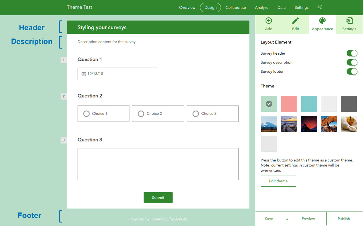
By simply clicking on the Header, Description and Footer in the design preview, their properties will be made editable in the right panel of Web Designer.
Survey Header
The header typically holds the title of your survey, but it is also a great location to display an organization logo. You can choose a Text Header, for which you can control its background color and text alignment, or an Image Header.
If you choose an Image Header, your image will be adjusted so it fits the entire width of the survey, which will not be larger than 680 pixels. For this reason, as a general rule, your header images do not need to be wider than 680 pixels. The height will be set so your image aspect ratio is preserved. It is best to go with a wide image to avoid taking too much vertical space. The header is taking the top most part of the display, so with such prime real estate on your screen, you do not need a big, tall header to make a point.
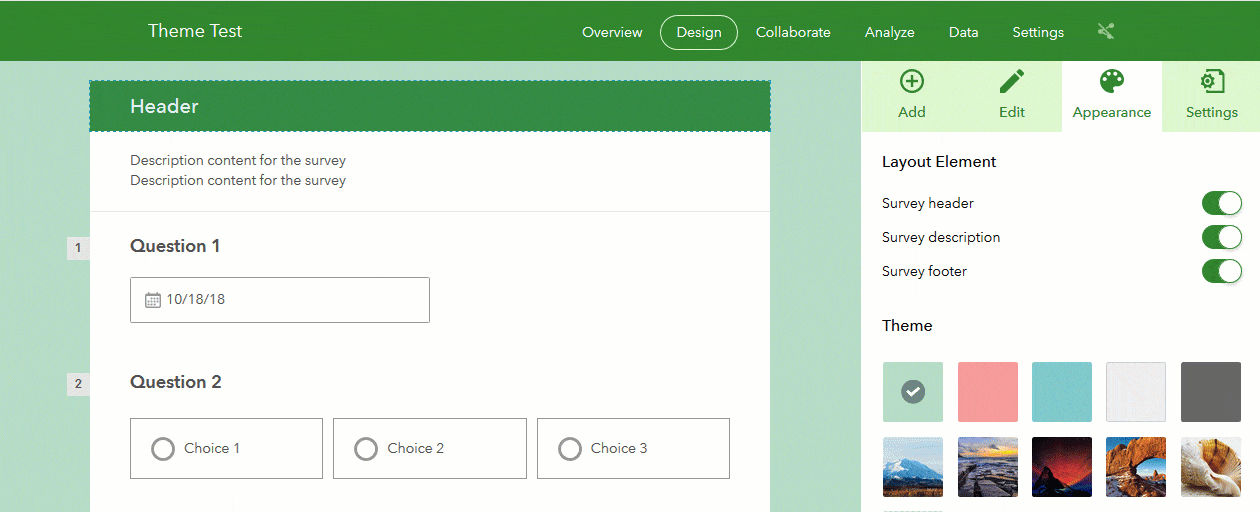
Survey Description
The Survey Description element, in Survey123 jargon, is a Note question type. Just like with the Survey Header, you can easily hide the Survey Description element from the Appearance tab. To set the content of the Description, simply click on the element in the preview, and all the settings will appear in the right panel.
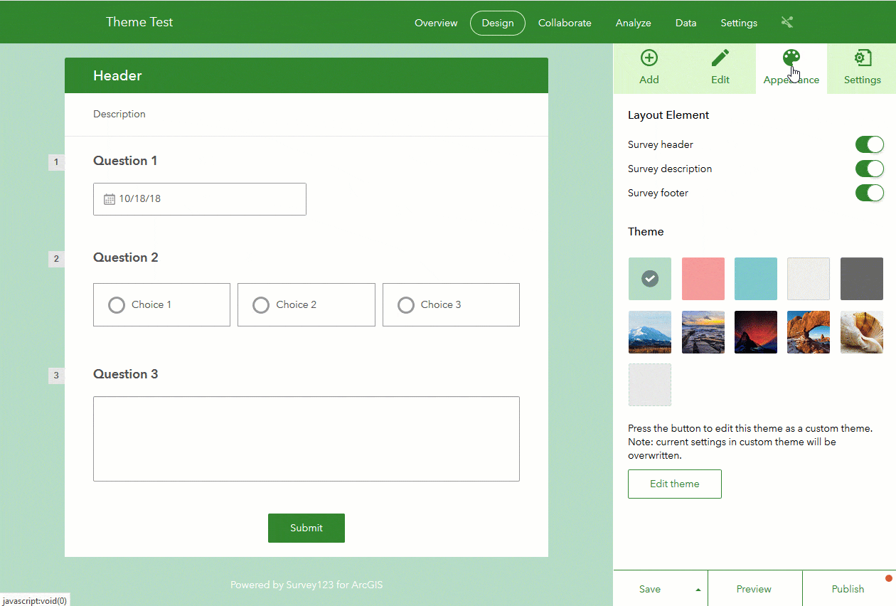
Note that the contents of the Description element accept rich text, so you can add entire paragraphs controlling the font color, size, text alignment, images, links, etc. This makes the Description very flexible, allowing you to provide context about the survey itself.
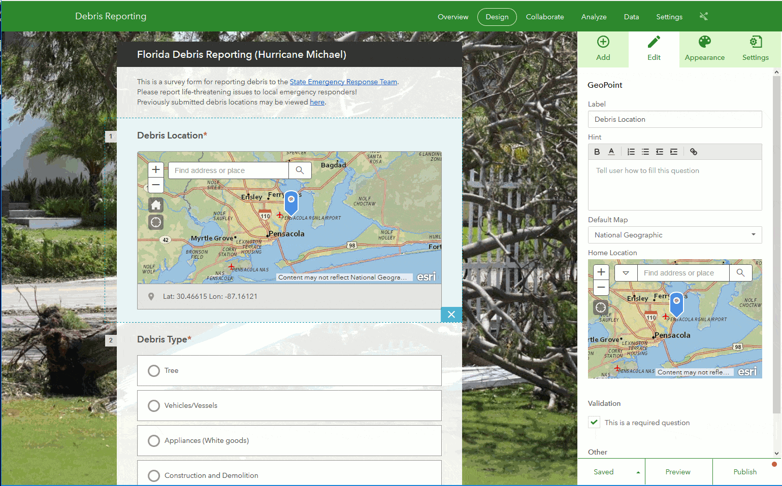
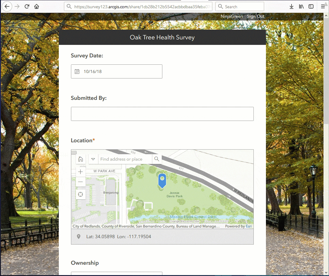
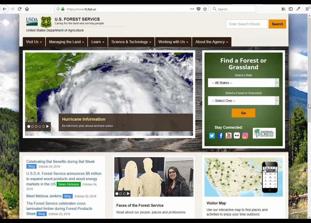
To support recovery effort after hurricane Michael, the Florida Department of Environmental Protection and the Florida State Emergency Response Team, published a public survey to help citizens report the location of debris. Note how they used the Survey Header to include a simple form title, and then leveraged the Survey Description element to place their organization logos as well as a brief note about the purpose of the survey. The Survey Description element also included links referencing the organizations website and other relevant documents.
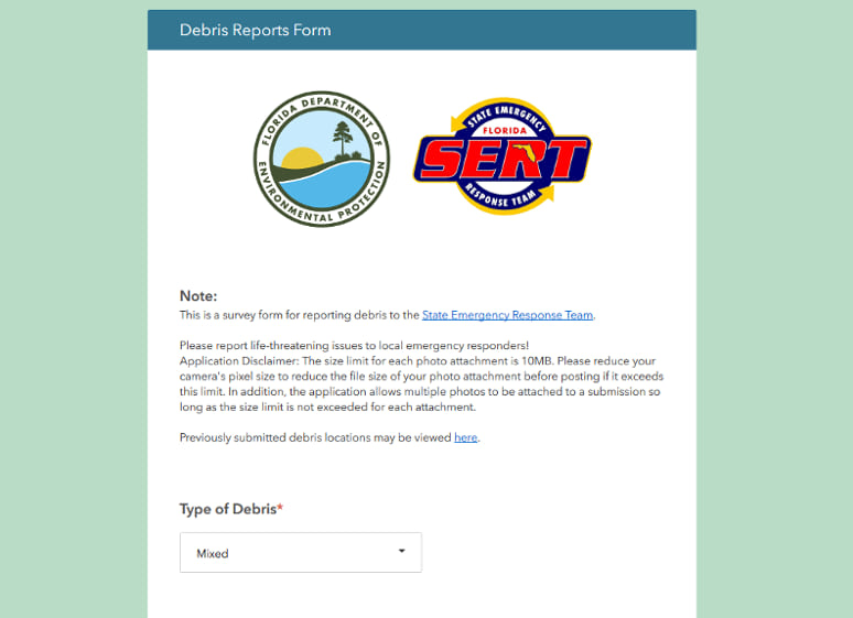
The Survey Description element is particularly critical for public web surveys where you cannot assume that people know what your survey is all about. A bit of context, is always good!
Right below the Description element is where questions in your form will appear. I will describe later how you can use Themes to control visual aspects of your questions, but for now, let’s jump into the footer.
Survey Footer
The Survey Footer obviously sits at the very bottom of the survey. This is a good place to link back to your organization’s website or solicit feedback. Similar to the Header and Description, you can choose to hide or show the footer from the Appearance tab, and you can edit its properties (text and URL link) by simply clicking on the Footer in the preview. Look carefully at the animation to see how you can bring the window to edit Footer properties.
The URL for your footer does not need to necessarily be a URL to a website. You can also include a mailto link. For example, if your URL is set to mailto:myemail@acme.com , you can help survey takers send you feedback to your email account.
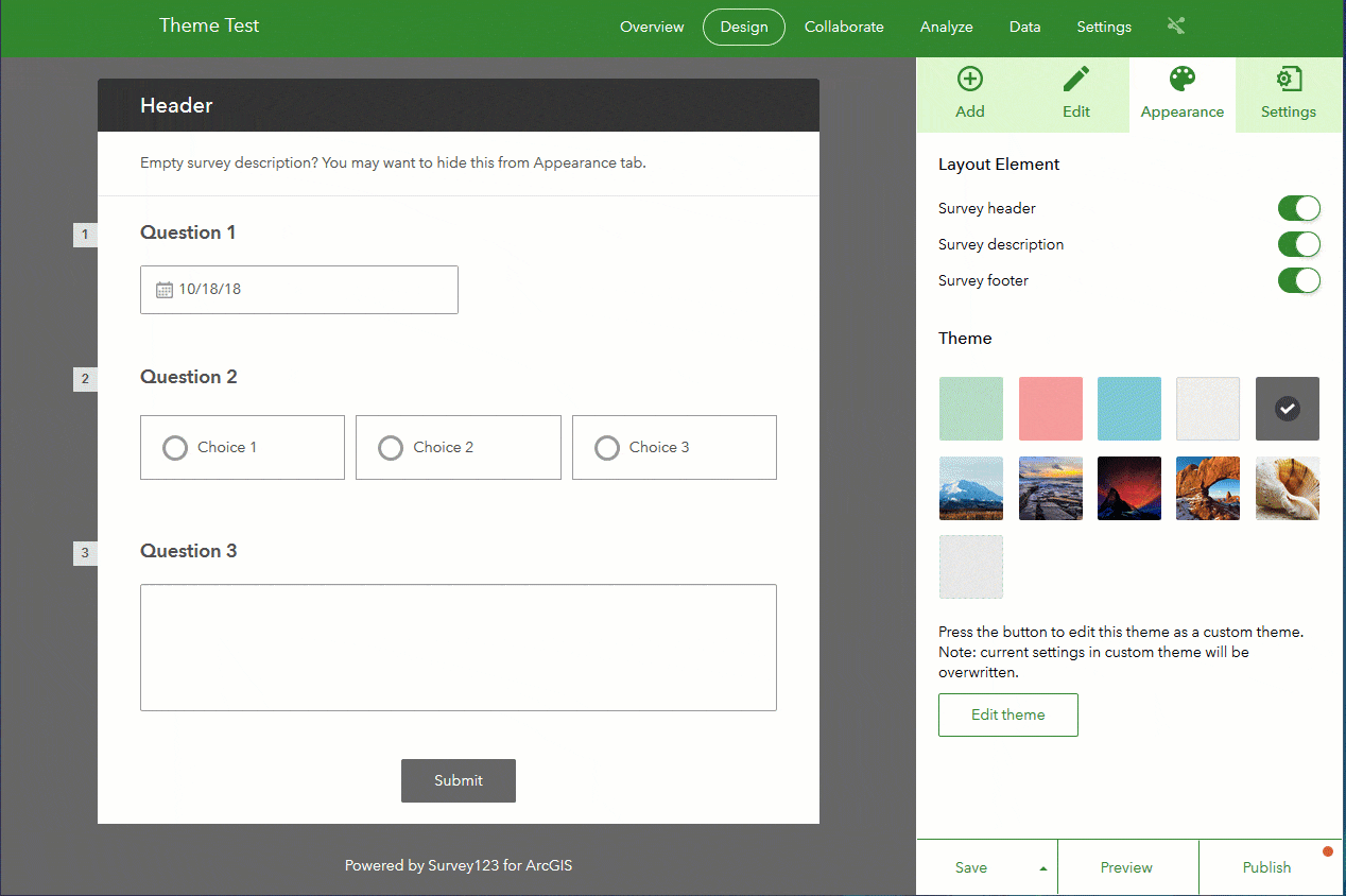
Survey Themes
Survey Themes help you easily define the color scheme of the most relevant visual aspects of your survey. A gallery of basic themes is included with Survey123. Most themes are based on a primary color applied to the background page of the survey. Different shades of that color are then applied to the header, background of the form and submit button. The Theme also defines the color assigned to the text in your form, so it contrasts over the background. A second group of default themes uses a background image as the driver for all the visual components in the form. You can use the themes included as they are. We added a good set of them and you can switch and see how they play out with your own surveys very quickly.
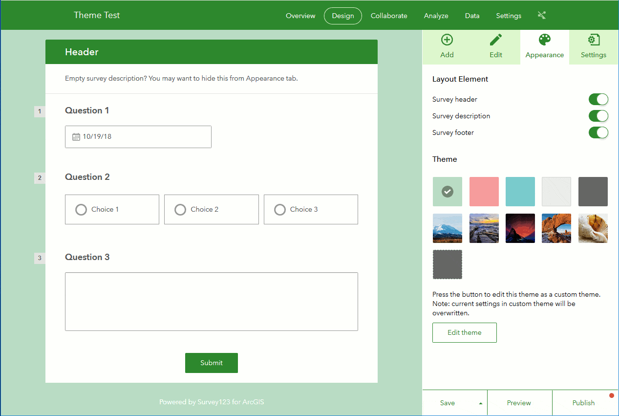
You can also use the included Survey Themes as a starting point to your own design. That is, you can select a basic theme and then edit it. The editable properties of a Theme are split as follows:
- Header: You are already familiar with this element. The theme sets the background color of the header and also the text color. You can easily tweak this as you see fit.
- Content:The content category refers to the portion of your form containing all the questions. There are a number of important properties:
Content Background: The content background sits right underneath your survey questions and should not be confused with the page background, which I will describe later. The purpose of the Content Background is to ensure that all questions in your survey are legible. You will want a nice contrast between your questions and the content background: A light background goes with dark question text and inputs, and vice versa. In the vast majority of cases, you will want to use a solid color for your Content Background.
If you want to get creative, you can experiment with images for the Content Background as well, but you need to be careful not to overload it with colors, which would only create distractions. When it comes to images for the Background Content, it is best to use lightly textured images. Below are a couple of examples using images to create a notebook and wrinkled paper feel.
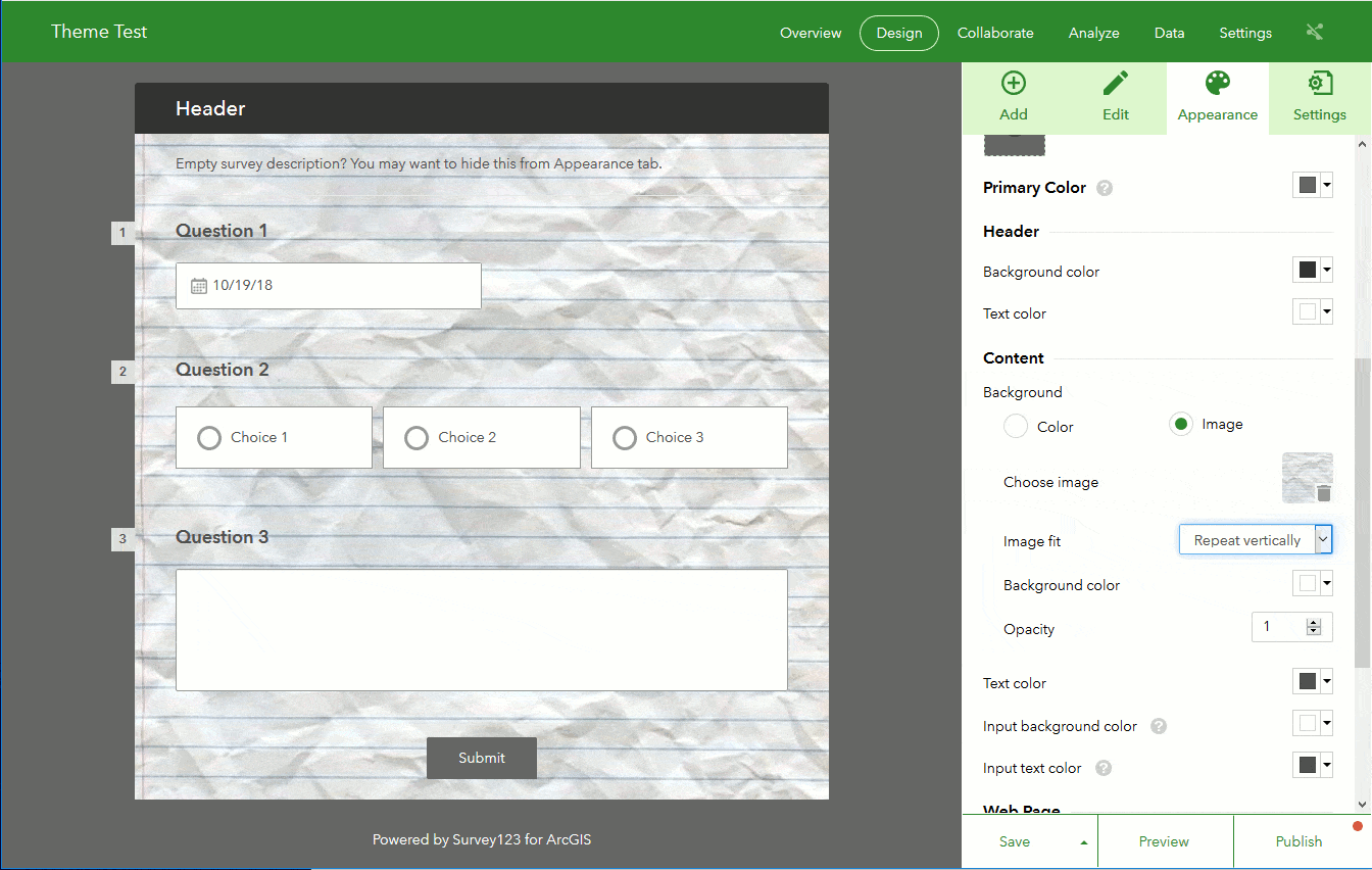
When using content background images, you will want to play with the different Image Fit strategies available (Repeat, Repeat Vertically, Fit and Center).
For both color and image custom content backgrounds, you can adjust the opacity level, which can give you interesting effects when working in combination with the page background.
Content Text Color: This setting refers to the color used for labels in your questions. As described above, the color choice for the text depends on the background color. You will always want to look for good contrast to make your questions more legible. The content text color is not necessarily applied to hints and notes, as those can override the font colors as specified in the Design view.
Input Background Color: This refers to all the space used to input data. Think of the color of text input boxes for example, but also the background for choices in lists, signature pad, etc.
Input Text Color: This applies to all response text.
- Web Page: The Web Page element represents all the background behind your actual form content. This element is visible in desktops and tablets, but it is mostly hidden in smartphone form factors. You can manipulate the color and image shown in the Web Page background, allowing you to give a strong look to your smart form. The Web Page background is probably the element that can bring the most character to your design. In the following example, I set a colorful image as the background of the page, for my form to stand up strongly, and to highlight the core mission of the form: trees.
As mentioned above, you can use the opacity setting in the Content Background to create interesting visual effects against the Page Background. The next screenshot shows a medium opacity level applied to the Content Background, to create a subtle translucent effect.
The Web Page Background is only shown by the Survey123 Web App. The Survey123 Field App ignores the background because the from content is always expanded to take advantage of all the real estate of your device.
Thank You Screen
The Thank You Screen can be optionally presented in Web Forms right after a survey is submitted. This is the perfect place for you to thank the survey respondent for taking the time to complete the form, acknowledge the work of your project sponsors or highlight your own organization.
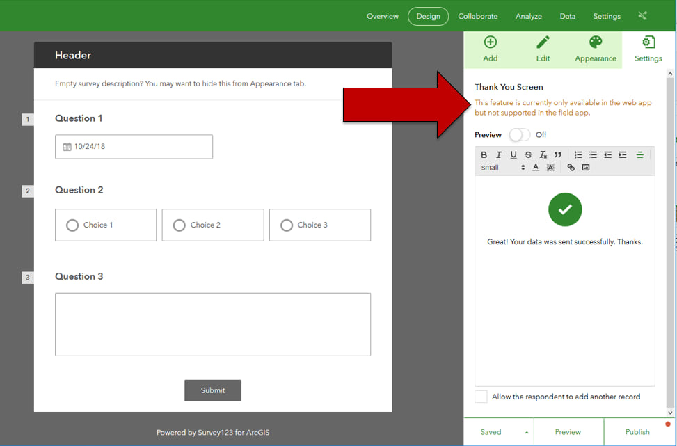
You can include formatted text, links and even custom images within the Thank You Note. I like to give some love to the Thank You Screen in my surveys, particularly when they are public, because they give it a nice touch.
If you look carefully at the bottom of the Thank You Screen dialog, you can optionally enable users to take submit data again with your survey, right after submitting. This option simply adds a link in the Thank You Screen that will quickly take you back to the survey.
Miscellaneous tips and other things to keep in mind
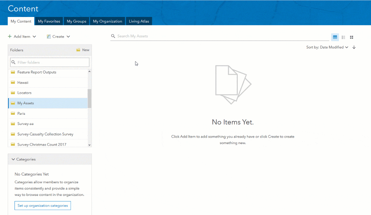
- Making image assets available to Web Designer: When using Web Designer, all image assets are referenced through a URL. That is, you cannot use Web Designer to upload your image assets directly from your local computer. You must host them somewhere first. Aside from keeping images in your own web server, there are a number of popular options for you to host images, including Box, Google Drive and others. You can also upload your images into your ArcGIS account, share them and then get their URL as shown in the next animation:
- Maximum size of images: The maximum size of images you can use in your survey designs is 1Mb. You should always optimize the size of your images to minimize their size without compromising quality. Every image you add will eventually need to be downloaded and that will slow down the initial loading time of the form.
- Setting custom colors: When setting up the colors for your text and backgrounds, you can use hexadecimal values. Using web browser plugins such as ColorZilla you can easily obtain these hexadecimal values from a website and apply them to your survey visual elements. See the next animation for details.
- The bottom line: Never underestimate the importance of making your surveys look great. A good look, can go a long way in terms of helping you get the best data from users.

Commenting is not enabled for this article.