Suppose you are just joining us–welcome to our series on understanding network diagrams. This is the second topic in our series that began with an introduction to network diagrams and focused on defining what diagrams are. Network diagrams are a new topic, even if you have previous ArcGIS schematics experience. As part of a series, our aim is to help you establish a strong foundation for working with diagrams, allowing you to extract enhanced value from your utility or trace network. This post will help you know when to use them.
Do you know when to employ network diagrams? Or why you would want to use one? Network diagrams are ideally used to aid quality control and assurance to verify network data accuracy. This helps in understanding network connectivity. You can produce clear and synthetic views focusing on specific network elements with diagrams, often used for simplifying things. Another key advantage is when you want to quickly create and update diagrams. This can be done using preset network traces. We will explore each of these topics in detail.
Quality control and assurance, checking network data
One of the primary uses of network diagrams is in the quality assurance and quality control (QAQC) process. Let’s briefly introduce a configuration concept that’ll help understand data checking. We introduce this concept here because it is an important background capability that enables efficiency in QAQC tasks.
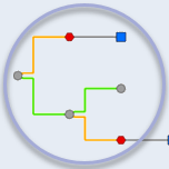
In data quality control and assurance workflows, specific settings on the diagram template are used to build them, which helps visualize and check network connectivity or containment associations faster. It is made faster because you use diagram rules configured on your diagram template to highlight existing or missing relations between network features. For example, you can highlight connectivity associations or structural attachments as part of the diagram template. Additionally, we can identify existing or missing features by systematically expanding network containers in the diagrams. Automatic diagram layouts can complete the template configuration and be set up to spread overlapping features consistently. This allows users to verify how network elements are connected in one glance.

Remember that we’ll cover configuration in more detail for the final post knowing it is essential to data verification.
Additionally, checking data can be time-consuming. However, dynamic diagram mode can improve efficiency and reduce the time spent on this task. Here’s how: first select a small set of network features in your network map and generate a diagram to verify network data quality on this specific location. Then, enable the dynamic diagram mode on this diagram. With the dynamic mode enabled, changing the selection in the network map automatically overrides the current diagram using the new selection set.
Dynamic diagram mode reduces time spent managing a new diagram creation.
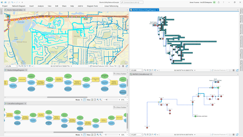
Leveraging side-by-side displays between the network map and diagram map is helpful because it increases control of your network data. Changing the selection in your network map dynamically reflects in the diagram, allowing you to see changes in tandem real time. In the side-by-side view, you can immediately check whether network connectivity and associations are shown as expected in the diagram. This can be an iterative process in that you repeat the control operation for another set of network features you select in the network map, and so on.

For added value, various commands are available to use with extending diagram content. The advantage of this is the additional capability to check network data by connectivity, containment, structural attachment, and traversability while confirming correctness. The next video shows how diagrams can be used to control connectivity correctness versus traversability correctness in the network precisely.

Producing synthetic network views
Aside from checking network data, diagrams can be used when we need to produce very detailed visualizations like a CAD drawing. When working in your geographic or network map, you may have map scale constraints preventing you from visualizing specific network features simultaneously and in detail. We can remove the need to zoom to a particular scale repeatedly. For example, let’s say we want to see everything inside the several substations far apart from each other. So, instead of zooming to each substation, we can use a diagram to visualize the content.
Producing synthetic or simplified network views can be an essential workflow for managing critical devices.
Here are two use cases: one, identifying critical devices related to specific parts of the network, and two, critical devices can also be related to multiple subnetworks. In both cases, the critical devices can be drowned out in your map by other network features, preventing you from efficiently editing or analyzing how they impact the upstream or downstream network.
Let’s look at an example of a diagram focusing on specific network elements. The diagram below shows details of a few substations that are interconnected to each other. The network map on the left side shows that those substations are far apart, preventing users from quickly seeing their contents. On the right side, the same substations are represented in a network diagram, simplifying the network elements that relate them. With the diagram or synthetic view, we can compress the distances between them, allowing a better view of their contents. In this case, we created a diagram focusing on specific network elements to show features typically with limited scale constraints or visibility using only a geographic map (or the map on the left).

Another example of simplifying dense map features is the sample diagram below. On the right we have six electric distribution networks. These six electric distribution networks involve over 63,000 network features highlighted. Using the coordinated colors in the network and diagram maps we can see which features belong to each network.
In the side-by-side views there is no scale difference between the diagram and network maps. However, since the diagram focuses primarily on the critical devices along each distribution subnetwork, there are only about 300 diagram features. This allows for a synthetic visualization showing critical devices that are well organized and related. Bringing it full circle, this is a simplified approach to managing switching operations on critical devices from diagram to map view.

You are probably getting the idea that knowing when to produce a diagram or synthetic view of your network helps to unpack dense data or show data relative to some part of your network or subnetwork.
Diagrams from preset network traces
So far, we’ve covered using network diagrams when we need to check our data and when we need to simplify dense network features. Now, we will cover what happens when you create a diagram from a preset trace.
To be clear, a preset trace is a trace run from network elements shown in a diagram.
Okay! Let’s say you want to create diagrams representing preset trace results without running any trace operation in your network map. This can be done thanks to a Trace rule configured on the diagram template. Such a Trace rule can be set up to run various kinds of traces, such as subnetwork traces, find connected traces, and upstream or downstream traces. Its configuration is generally combined with other settings, allowing the creation process to identify and filter out specific starting points, such as subnetwork controllers or particular network features among the diagram input. Then, the configured trace rule starts from these specific input elements and runs in memory to build the diagram graph reflecting this trace result.
Without any other diagram rule set up on the template, the newly created diagram represents the exact trace result with any traced features at their geographic positions. With extra rules arranged on the template, it can represent a simplified trace. This simplified trace can highlight specific network elements, such as the service points. Also, the resulting trace diagram can be automatically laid out with some other template customization, such as single-line diagrams.
Creating diagrams from a preset trace is exciting because we can leverage trace operations without running a trace. This comes in handy and allows quick diagram updates.
Here are a few demo samples showing diagram creation using preset trace. The first sample below shows a diagram generated from an upstream trace configured to start from an elbow selected as an input in the network map. The diagram content is automatically laid out using a Smart Tree layout from bottom to top, with the input elbow at the bottom. The related upstream subnetwork controller is at the top of the hierarchical tree.

The following sample diagram results from a preset downstream trace rule run from the same input elbow. It shows that this elbow is related to 40 service points placed at the bottom of a tree.

The third sample below shows a single-line diagram. It is created using a subnetwork trace rule preset to start from any medium voltage distribution subnetwork controller used as an input for the diagram generation. The traced features are simplified only to keep critical devices such as switches/switch banks, fuses/fuse banks, transformers/transformer banks, and subnetwork controllers. The resulting simplified diagram is arranged using a Smart Tree layout from left to right, with the input subnetwork controller as the root junction of the tree.

The last demo below shows diagrams representing fiber junction and edge objects. They are created thanks to a preset upstream trace, which starts from any input fiber connector. The trace rule is configured to stop at the related upstream switch equipment. The generated diagram highlights the succession of fibers from the input connector to the upstream switch.

This wraps up our second topic in the Understanding Network Diagrams series. In this blog, we learned when to use network diagrams to perform quality control and assurance, check network data, and create synthetic views of network data and the applications they are best suited for. We will culminate the series with a post covering configuring network diagrams. All three of these posts will cover foundational pieces to developing a solid understanding of diagrams.

Article Discussion: