Skip to Content

How to build a benchmark map

Which areas are notably above or below average?

Watch how-to video
Explore map

Benchmark map


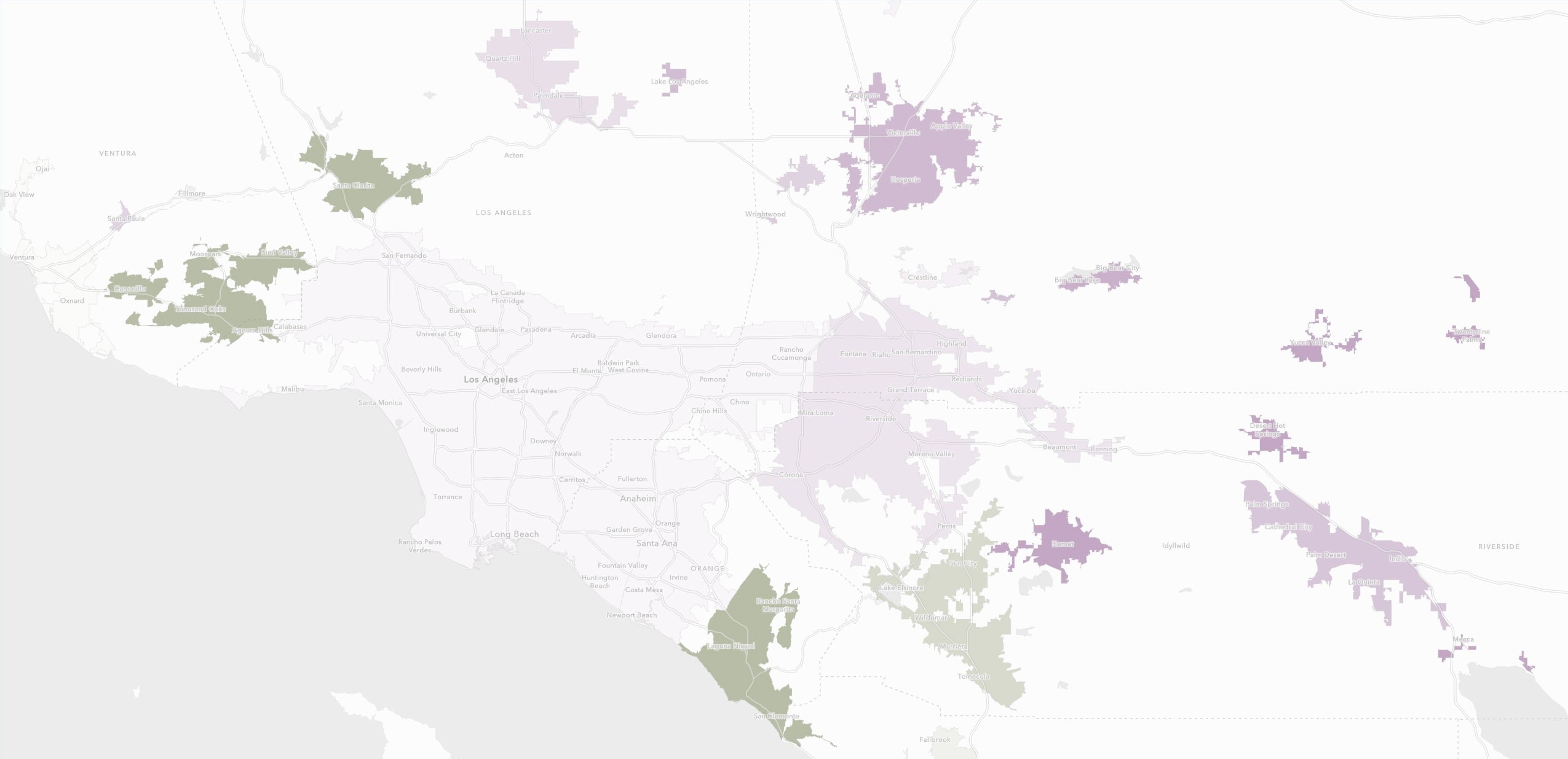
It’s difficult to map unfamiliar data. The Benchmark Map helps you understand your data by coloring it based on a benchmark, such as a national or regional average. In this map of median income, the values near the average receive a white color. Areas above the average are green. The intensity of the green increases as the values increase. Purple areas indicate areas below average. Areas far below average are deep purple. In this way, color is used to express the detail and nuance hidden in your data. 

Key steps

Previous
Next

Ready to buy ArcGIS Online?

Purchase