Select a drawing style
Choose the attribute you would like to map and select the “Counts and Amounts (Color)” drawing style. The attribute is a field in your data that represents a number.
Where are the highest magnitudes?
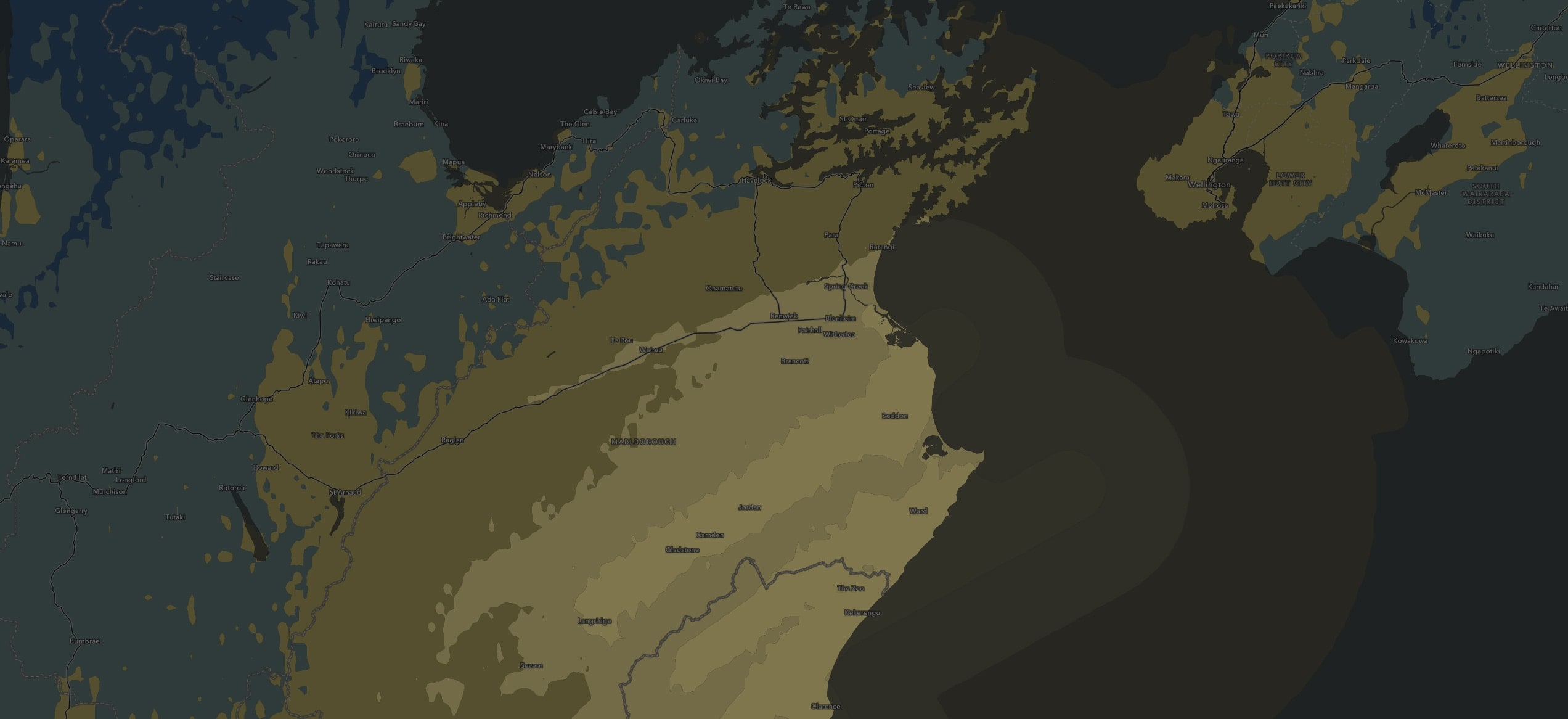
In the Magnitude Map, color distinguishes how much of something is present in an area. For example, in this Kaikoura Earthquake Map, bright yellows represent higher earthquake magnitudes while dark blues represent lower magnitudes. This color ramp is effective on a dark gray basemap. The dark blues fade into the background while the bright yellows shine, emphasizing the higher magnitudes.