GIS and geospatial analysis are powerful in putting together a plan that leaders can take on, and that is where these tools have been invaluable.
case study
Suffolk County Maps COVID-19 Transmission and Vaccination Vulnerabilities
Customer
Suffolk County Government
Challenge
Suffolk County, New York, officials needed a holistic view of COVD-19 transmission and vaccination rates across the county. They needed to develop targeted strategies to ensure equitable access and address vaccine hesitancy. Obtaining this information would require data cleaning processes and geospatial technology.
Solution
Using GIS technology and bivariate analysis, county officials identified priority ZIP codes to improve vaccination outreach.
Result
Geospatial analysis and location-based data were critical to Suffolk County's vaccination outreach strategies. From the maps, officials targeted specific geocoded neighborhoods and learned the possible barriers to vaccination, such as language and transportation. Officials then modified their strategy to include language assistance and a rideshare partnership with Lyft and identified locations for community pop-up PODs.
Founded in 1683 and the fourth most populous county in New York State, Suffolk County spans over 911.8 square miles. For this extensive and diverse county, geographic information system (GIS) technology has played a critical role in business operations since the nineties. Suffolk County's dedicated GIS team provides geospatial support and spatially enables data from different departments. The team's efforts were critical during the COVID-19 pandemic.
Like many US counties, Suffolk County officials found themselves repeatedly asking location and geography-based questions: Where are the worst affected neighborhoods? Where is testing accessible and not accessible? Where should resources be allocated? Simply put, Suffolk County officials needed a comprehensive picture of COVID-19 transmission and its impact across the county to make context-driven decisions. Having the full picture required multiple types of data such as population demographics and social vulnerabilities.
"Maps are so powerful," says Dr. Harsha Rajashekharaiah, senior project coordinator for the county's COVID-19 response. "When I want to communicate to the County Executive office a correlation between factors, maps speak for themselves. So it's easy for me to explain the correlation and what needs to be done."
Inspired by other government agencies such as Milwaukee County's use of GIS tracking for the pandemic, Dr. Rajashekharaiah worked in tandem with Suffolk County's GIS team and Business Intelligence (BI) team to uncover the inequalities and vulnerabilities affecting county residents.
Challenge
In the beginning, Suffolk County officials only reported case numbers by county. But the numbers alone did not provide enough context or breakdown the impact of COVID-19 at the community level. GIS-based dashboards offered a solution to provide that information to leaders and community members alike. But dashboards require detailed data to generate maps and supplemental materials like charts, graphs, or other visuals. The challenge was in collecting data to implement dashboards.
The BI team needed to find an automated solution that moved address data from the state's Electronic Clinical Laboratory Reporting System (ECLRS) into a workable data warehouse. "David Bellizzi, executive data analytics at Suffolk County, worked in conjunction with the robotic process automation (RPA) team, implementing screen scraping solutions that were eventually upgraded to more reliable automated text file downloads," says Tim Mullady, senior business intelligence systems developer at Suffolk County.
"The big hurdles from the data side was not having automated data feeds and handling large volumes of dirty data," continues Mullady. "So, we would create extract, transform, load (ETL) processes for loading, parsing, and cleaning data before moving it on to our GIS team to geocode and create reports. "With the data available, there were a lot of background processes before it could go to the GIS team."
The team's RPA solution parsed and cleaned the data into patient demographics (name, address, date of birth, age, etc.) and type of COVID test (rapid, polymerase chain reaction [PCR], antibody). Data on reported vaccinations collected from the MTX Group COVID-19 vaccine management solution (built on the Salesforce platform) and data for contact tracing from CommCare also underwent cleaning processes before the GIS team could use it. Eventually, the team automated these processes with an application programming interface (API) and Python scripts. The team now had a daily snapshot of the pandemic to do trend analysis and identify factors affecting the population.
Solution
For its dashboards, Suffolk County currently geocodes close to 1.7 million records a day. That data is integrated to create internal and external dashboards. The external Suffolk County COVID-19 dashboard provides residents with case tracker information including positive case numbers by town and a number of administered tests.
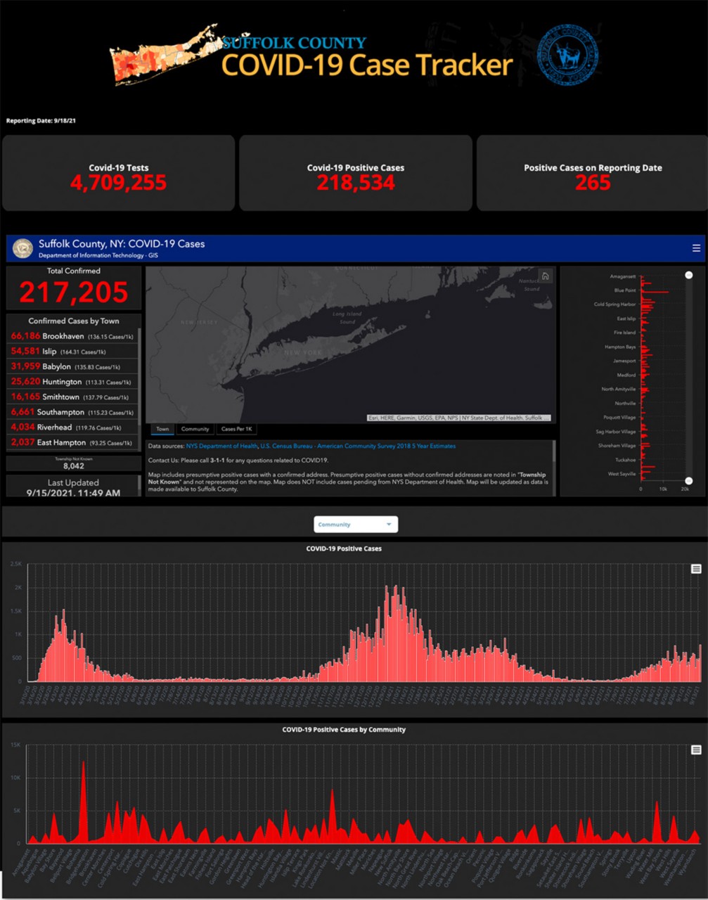 Suffolk County’s GIS and Business Intelligence teams created the external COVID-19 dashboard (above) providing residents with positive case information by town, so residents had a clear understanding of the impact the virus was having in their community.
Internally, maps were first developed in ArcGIS Enterprise portal at a granular level with visuals such as case clusters, kernel density maps, and heat maps. The initial work by the team evolved as they moved to dashboards. The later dashboards incorporated various thematic maps such as trend and emerging hot spots analysis maps and bivariate maps. Later the team created digital maps with geocoded data related to case numbers, tests, vaccinations, and the 15 Centers for Disease Control and Prevention (CDC) social vulnerability indicators such as disability, housing, transportation, socioeconomic status, household composition, and race and ethnicity. The goal was to see patterns and trends, factoring in potential geographic nuances.
"Trend analysis spoke indirectly about either exposures or unsafe activities people were engaging in and the virus was transmitting," says Dr. Rajashekharaiah. "We wanted to tease out these variables that were increasing exposures. That's when we overlayed these different social vulnerabilities on top of the transmission metrics."
Using ArcGIS Enterprise portal, Dr. Rajashekharaiah accessed these multivariate maps to analyze correlations and patterns. "Out of the 20 different variables we looked at, there were a few of them where the correlation was very strong. And it gave us a good explanation of the factor's role in transmission, vulnerability, and so forth," continues Dr. Rajashekharaiah.
By the time the team had refined their process for understanding transmission, a vaccine was ready. Their established process and geospatial analysis could now be applied for vaccination tracking as well. The team reverse engineered their previous data process for dashboards, creating a bivariate analysis to understand how variables correlated with vaccination rates. The data was presented in digital maps and color-coded for indicators. The maps revealed several patterns. For example, in March, the western side of the county began showing magenta-colored blocks indicating neighborhoods where vaccination rates were low and a high number of residents who speak a language(s) other than english.
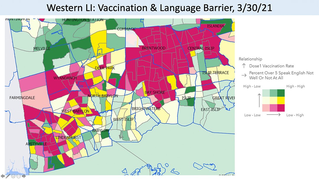 Maps were produced by Suffolk County to track vaccination rates by zip code in March. With the maps, Dr. Rajashekaraiah used a bivariate analysis to identify vaccination patterns, here magenta blocks represent neighborhoods with lower vaccination rates and that have a higher percentage of residents who speak language(s) other than English.
"We put ourselves in the shoes of a person who wants to get vaccinated and mapped our way through all the barriers preventing them from getting vaccinated," says Dr. Rajashekharaiah. One analysis using housing and transportation vulnerability data highlighted entire neighborhoods where households did not own vehicles, which acted as a barrier to vaccination.
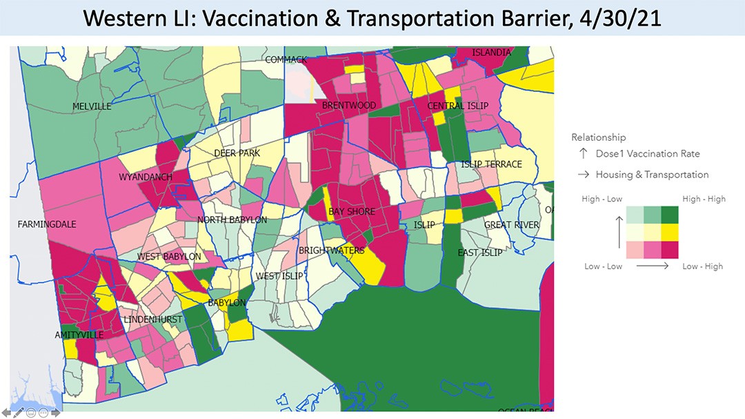 Maps were produced by Suffolk County to track vaccination rates by zip code in March. With the maps, Dr. Rajashekaraiah used bivariate analysis to identify vaccination patterns, here magenta blocks represent neighborhoods with lower vaccination rates and with households that did not own a vehicle.
Dr. Rajashekharaiah adds that maps empower him to present his findings daily to county officials, expediting precise decisions. "Instead of a decision-maker or policy maker creating a blanket approach throughout the county, now they were able to target their interventions."
Result
The combined efforts of the BI team and GIS team under Dr. Rajashekharaiah's guidance were critical to Suffolk County's vaccination campaign efforts. Geospatial analysis and dynamic digital maps supported Suffolk County officials to take a targeted approach. By geocoding the vaccination sites, county officials could spot vaccine deserts in communities comprised of people of color and identify community pop-up points of dispensing (PODs) locations. By mapping ZIP codes, decision-makers gained insight into neighborhoods with high transmission rates and were able to prioritize them when scheduling vaccine appointments.
Dr. Rajashekharaiah shared his vaccine barrier findings with county officials in regularly scheduled pandemic response meetings to advocate for corrective measures. For example, the language barrier map led to the addition of Spanish and Haitian Creole language assistance on the county vaccine hotline, improving access to more individuals to schedule appointments. In response to Dr. Rajashekharaiah's transportation findings, Suffolk County partnered with Lyft to provide free rides to and from vaccination appointments.
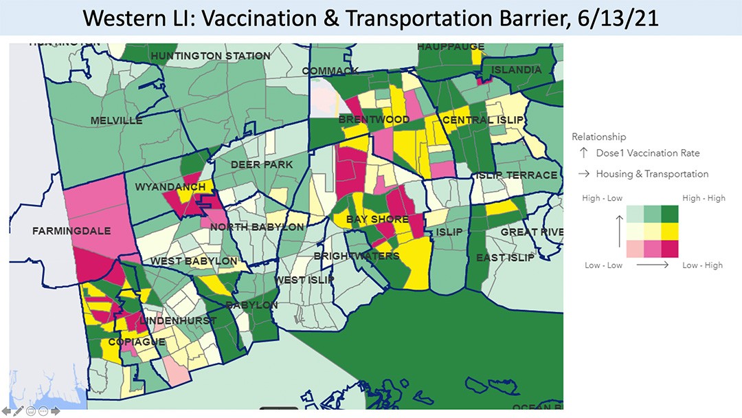 The maps produced by Suffolk County and bivariate analysis directly impacted leadership action, leaders partnered with Lyft to provide free rides to vaccination appointments. Pictured in the same neighborhoods from April, green blocks indicate higher vaccination rates among previously magenta neighborhoods.
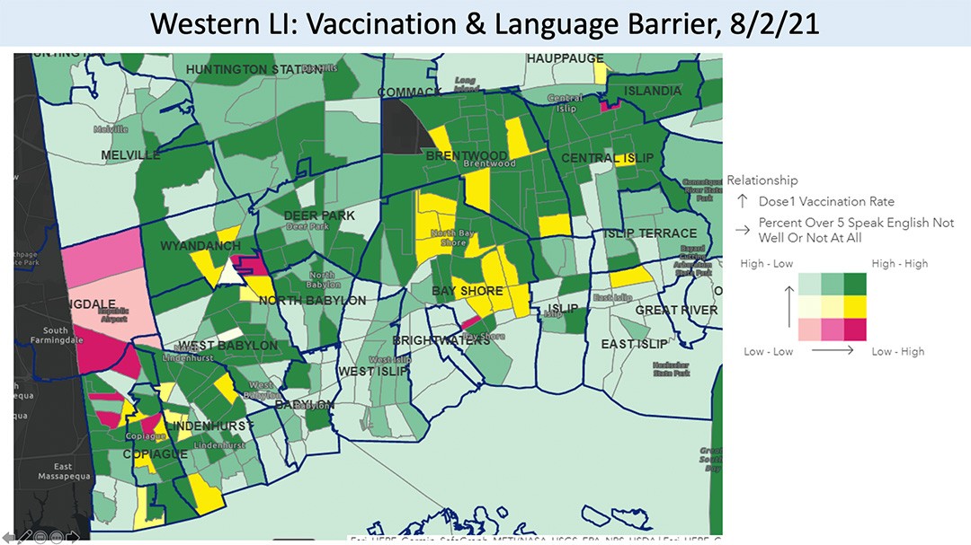 The maps produced by Suffolk County and bivariate analysis directly impacted leadership action in this case officials added Spanish and Haitian Creole languages to the vaccine hotline expanding access to schedule appointments. Above are the same neighborhoods from March, green blocks indicate higher vaccination rates among previously magenta neighborhoods.
"Without this sort of bivariate analysis, without these maps, it is hard to communicate the barriers for vaccination and create an actionable plan," says Dr. Rajashekharaiah. "GIS and geospatial analysis are powerful in putting together a plan that leaders can take on, and that is where these tools have been invaluable."
Suffolk County officials continue to rely on GIS dashboards and bivariate analysis to tailor their pandemic response, most recently monitoring breakthrough COVID-19 cases. For the teams involved, this collective effort has been critical to the county's successful response.
"This came together nicely, but it took more than one person or agency to do so, and that's where the success of this story exists," says Jim Daly, GIS coordinator at Suffolk County. "Being a GIS coordinator, it's fun to be a part of this because you see that this was a great cooperative venture where everyone did their part as a team of true professionals."