We often get asked why some features exist in MapView (2D) but not SceneView (3D). We hear you, and we’d preferably like to have perfect parity between the views. However, we can’t just expose methods to SceneView and call it a day. Bringing a feature into the third dimension often requires significant changes to its design before it’s in any way presentable to our users. Think of 3D as the extra dimension where all the hidden complexity lives. Kind of like cleaning a room by pushing everything under the bed. From a top-down view, everything looks tidy. Tilt the camera, peek under the bed, and suddenly you find there’s much more work to be done.
To provide an example of the process of porting a 2D feature into 3D, I’d like to pull back the curtain and share the story behind our development work to bring coordinate grids into SceneView for the 200.6 release of the ArcGIS Maps SDK for Native Apps. This post is a behind-the-scenes tour of the problems we ran into, and the engineering choices made when drawing some simple lines on an oblate spheroid (that turned out to be not so simple at all).
Please note, this isn’t an exhaustive list, but rather, some of the more interesting issues we tackled. I’ll try to include as many screenshots as possible. However, I only have what’s available from our issue notes and discussion threads.

Why 2 != 3
It may seem like a very basic place to start—of course 2D isn’t the same as 3D—but I feel it’s important to note how specifically they differ.
Here are a few key points to consider:
- Scale isn’t uniform: In 2D, the whole MapView shares one scale. In 3D, the near ground and the far horizon live at wildly different scales within the same view.
- The Earth’s surface is dynamic: Distance to the surface—looking at a mountain or a valley—affects the scale and level of detail.
- The view is a pyramid, not a square: SceneViews use a camera frustum—a pyramid-shaped volume defined by the camera eye, field of view, and screen edges.
- The Earth is not flat: Despite what 2D maps may want you to think, the Earth is not a rectangle, but instead an oblate spheroid.
With the basics now out of the way, let’s talk about the specific challenges we faced when bringing coordinate grids into the 3rd dimension.
Challenges We Expected
Coordinate grids, for the purposes of this story, are comprised of two distinct parts: the lines themselves and the labels that tell you what the lines are.
Challenge 1: Spacing Grid Lines in 3D
In 2D, the map scale determines the grid spacing. At a given zoom, we know exactly how many lines to draw. We start at every 10º of latitude and longitude for a default initial MapView and subdivide as you zoom in. It’s straightforward. But in 3D, not so much. Especially near the poles where every meridian converges, or when the user pitches the camera, or looks at a mountain.
So we couldn’t just reuse the grid line placement logic from 2D and tie the grid line density to the camera altitude. We had to rebuild the logic from the surface up to evaluate several parameters:
Latitude
When we ported the 2D implementation to 3D, the lines were no longer drawn on a rectangle with parallel meridian lines. Instead, the lines converged at the poles (or at ±85° in Web Mercator contexts, due to the projection limit). When we zoomed in and pitched the camera towards the horizon, the Grid class tried to draw so many lines that it crashed our test application.

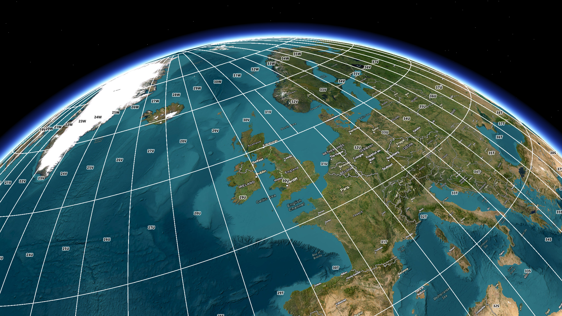
Fortunately, this issue was fairly easy to resolve, and we were able to include the latitude of the Camera in the algorithm that determined the interval at which to draw meridian lines. When the Camera’s position moves to latitudes of ±70° we begin to cull grid lines much more aggressively. This way, we can make the the grids form more square-ish rectangles, consistent with what one would see near the equator. For example, in the image below, latitude lines are placed every 1°, and longitude lines are placed every 15°.

Elevation
When computing the grid line density solely based off the camera’s altitude above sea level, the grid lines were far too sparse in mountainous regions.
We opted to query the minimum and maximum elevation of all visible tiles within the view and then use the lowest visible elevation to measure camera height, not sea level. This approach keeps spacing perceptually consistent in high altitudes and dynamic terrain.

Pitch
When pitching the camera, grid lines were far too sparse in the foreground and far too dense in the distance–neither of which were useful. We tried varying density per tile (more lines in the foreground, fewer in the distance), but having grid lines abruptly end at tile boundaries was difficult to parse in a geographic context.

In the end, we determined that coordinate grids just weren’t meaningful or useful when the user was pitching the camera at extreme angles. Either they would want coordinate grids to evaluate their data within a geographic context, or they wanted to inspect specific features from multiple angles—rarely, if ever, would they be doing both at the same time. Therefore, we opted to start fading the grid out at 40° pitch until it becomes fully transparent at 50°.
The result is a coordinate grid that’s present when you’re looking at a scene from the top down but fades out of the way when you want to inspect your scene from different angles.
Challenge 2: Keeping Labels Readable
With grid lines mostly under control, we turned our attention to labels. Grids support two different categories of label placement strategies, geographic and screen aligned. Geographic labels are placed at specific intervals along the grid lines. Screen aligned labels denote the lines where they intersect with the edge of the screen. Because the 3D labels are billboarded to always face the camera and must follow terrain and odd camera angles, we had to rebuild the labeling logic for grids in 3D from the ground up.

Overlap
The billboarded nature of grid labels in 3D caused repeating labels to overlap when viewed at oblique angles. This required us to cull labels more aggressively. Fine tuning exactly when to cull the labels took some trial and error.

Orientation
In 3D, it’s common to view a scene from multiple angles. So we needed to make sure the grid labels were readable regardless of camera orientation. The 2D geographic labeling scheme placed labels at the intersection of the grid lines, with vertical North-South labels and horizontal East-West labels. While that works for MapView, where the map seldom rotates, that quickly becomes confusing in a 3D workflow.

After quite a bit of ad-hoc testing, we opted to move the labels in between grid intersections and align them to the direction of the line. We also calculate if the labels would be drawn upside down, and flip them 180° if that would be the case.

Screen-Aligned Placement
In 2D, it’s easy to predict where a line will hit the edge of the screen and place them accordingly—in 3D, not so much. In 3D, the grid lines are not only drawn with perspective, but they’re also affected by terrain and elevation. Therefore, we have to sample the elevation to place the labels correctly, and account for any terrain exaggeration the user may have applied.

Challenges We Did Not Expect (but helped harden our product!)
Grids span everything—from below sea level to extreme peaks—and they are thin, straight, and global. That combination of attributes brought to light some edge cases for our graphics rendering pipeline (the rendering system responsible for drawing grid lines) that we hadn’t yet encountered in practice. Two stood out:
Elevation Made Lines Look Blurry or Clipped
Symptom: At high elevation (e.g., Himalayas) lines looked a bit blurry. At negative elevations (e.g., Dead Sea) parts appeared shrunken or clipped.


Root cause: Our graphics pipeline drew graphics at elevation 0 and applied terrain afterward. This allowed our graphics to remain consistent regardless of the terrain beneath them and was sufficient for most use cases. However, like drawing an image on a balloon, the image would expand if the balloon was inflated.
Fix: Base calculations on the lowest visible elevation among tiles in the current view.
Impact: Crisper graphics at elevation, no more clipping below sea level, and better resolution for draped content at any elevation.
Graphics Visible Through the Horizon
Symptom: When pitching the camera at high altitudes, lines from the far side of the Earth could be visible through the globe.
Root cause: Clipping was perpendicular to the camera, not the horizon, so geometry beyond the horizon could be visible if the horizon was not perpendicular to the camera.

Fix: Add an internal occluder (an inner‑globe disc/texture) that acts as a hard horizon mask within the globe.
Impact: Clean silhouettes at high pitch, predictable culling for global content, and less visual noise during fast camera moves.
When implementing line graphics at a global scale, we uncovered edge cases for our rendering engine that we hadn’t previously found. In fixing these issues for Grids, we improved the graphics rendering pipeline for SceneView as a whole.
Lessons learned
- Even the simplest 2D features can be messy in 3D. Three dimensional properties like latitude, elevation, and camera orientation require developers to reimagine 2D features from the ground up.
- Not every 2D feature belongs in 3D. Past ~40°–50° of pitch, coordinate grids are no longer useful nor user friendly, so we fade them out.
- Labeling is a system of its own in 3D. Our data isn’t useful unless it’s labelled, and labels aren’t useful if users can’t read them. In 3D, labels need to make sense from every angle and over every surface.
- Small details make big differences in perceived quality. Users want to see clean, crisp visuals that they can make sense of immediately. The small decisions we make under the hood are what make that possible.
From the poles to the peaks, we have a coordinate grid system that looks clean and performant in 3D!
Conclusion
Coordinate grids look simplistic but bringing them to SceneView in 200.6 meant rethinking fundamentals. Scale isn’t uniform, features need to look good from every angle, and the Earth is indeed not flat. We ended up with a grid system that adapts to latitude, elevation, and pitch; labels that prioritize clarity; and a rendering engine that’s more robust than when we started.
Want to see the result of our work in action? Take look at the “Show Grid” sample apps and code, available for Flutter, Kotlin, .NET MAUI, Qt, and Swift!
And if these sorts of technical challenges appeal to you and you’d like to become a part of making the most robust GIS technology on the market, please check out our open opportunities!